UI Toolkit introduction
UI Toolkit is the latest UI system of Unity. It is mainly designed to optimize the performance of different platforms. This technology is developed based on standard web technologies. You can use UI Toolkit to expand Unity Editor, or use Runtime UI in packaged games and Applications (but you need to install UI Toolkit Package)
The UI Toolkit includes the following contents:
- A retained mode UI system has the core features and functions of creating UI
- UI resource types, which are inspired by standard web formats, such as HTML, XML and CSS. Using these resource files, the whole UI interface can be constructed
- Tools and resources for learning UI Toolkit. These tools and resources can also be used to create and Debug your interfaces
Unity wants to recommend the UI Toolkit as the UI system of the new project, but it still lacks some functions compared with the traditional uGUI and IMGUI, which will be mentioned later.
UI Toolkit is a collection of resources, functions, features and tools used to create UI. It can be used to create regular UI, expand Unity Editor, make Runtime debugging tools and create Runtime game UI.
The UI Toolkit is inspired by standard web technologies, and many core concepts are similar.
UI toolkits are divided into the following three categories:
- UI System: contains core features and functionality
- UI Assets: a file type inspired by the standard web format, which can be used for structure and style UI
- Tools and resources: Create and debug your interfaces, which can also be used to help learn ui toolkits
UI System
The core of the UI Toolkit is a retained mode UI System Based on recognized web technology. It supports stylesheets and dynamic and contextual event handling
The UI System has the following contents:
- Visual tree: defines all UI created by the UI Toolkit (defines every user interface you build with the UI Toolkit). A visual tree is an object graph, which is composed of lightweight node s that store all UI elements in the window or panel.
- Controls: provides standard UI Control libraries, such as buttons, pops, list views, and color pickers. You can use them as is, customize them, or create your own controls.
- Data binding system: relevant properties can be linked to Control, so that their values can be changed through the UI
- Layout Engine: a layout system based on the Flexbox model of CSS, which can place UI elements based on layout and styling properties
- Event System: event interaction, including input, touch and pointer interactions, drag and drop operations, etc. The system includes: a dispatcher, a handler, a synthesizer and a lot of event types
- UI Renderer: a rendering system created directly on the graphics device layer of Unity
- UI Toolkit Runtime Support(via the UI Toolkit package): contains relevant components for runtime, but UI Toolkit package is currently in preview
UI Assets
UI Assets are the resource files used in the UI Toolkit. The UI Toolkit provides two resource files to help build the UI, similar to web applications:
- UXML documents. The file suffix is. uxml
- uss, the file suffix is. uss
The full name of UXML is unity extensible markup language. It is a markup language inspired by HTML and XML. It is used to define UI structure and reusable UI template. Unity recommends using UXML to create UI instead of in C# script
The full name of USS is Unity Style Sheets: visual styles and behaviors can be used for the UI, which is similar to the CSS of the web. As above, Unity recommends using the USS file to define the style, rather than directly modifying the style property in the C# script
UI Tools and resources
The following tools and resources are available:
- UIDebugger: similar to the debug window of a web browser, you can see the corresponding UXML structure and the hierarchy information related to the style corresponding to USS in window - > UI Toolkit - > debugger
- UI Builder (package): help create UI resource files in a visual way, such as uss and hxml documents. The corresponding package needs to be installed
- UI Samples: many code examples about UI Control can be seen under window - > UI Toolkit - > samples
Accessing UI Toolkit
There are two methods or versions of UI Toolkit:
- Get it directly in Unity Editor, that is, the built-in version in the engine editor provided by Unity
- Get it from Unity Package (com.unity.ui)
The differences between the two are as follows:
- For different purposes, the built-in UI Tooklit aims to strengthen the editing of Unity Editor. Many of the built-in UI toolkits are used for the built-in functions of Unity Editor, while the version in Unity Package adds many features to make the UI under runtime
- Both are used in the same way. They are used under the namespaces of UnityEditor.Elements and UnityEngine.Elements
Select which of the two versions of the UI Toolkit
If the relevant UI can only be used in Editor, use the built-in UI Toolkit. If the UI needs to be used in both Editor and Runtime, use the corresponding Package version, and the corresponding version can also install the latest
Install UI Toolkit package
Open the Package Manager of Unity Editor:
- Click Add (+)
- From the menu, choose Add package from git URL...
- In the text field, type com.unity.ui
- Click Add
The Visual Tree
The most basic building unit of the UI in the UI Toolkit is called visual elements. These elements will be sorted to form a hierarchical tree called Visual Tree. The following figure is an example:
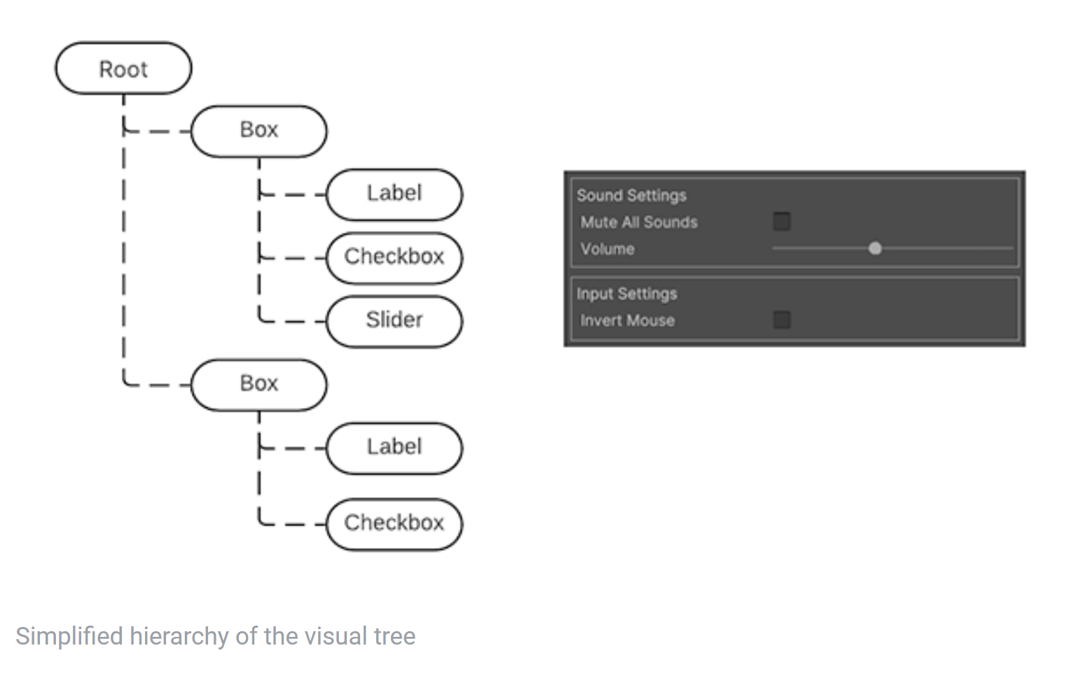
Visual elements
VisualElement class is the base class of all nodes in Visual Tree. It defines common properties, such as style, layout data and event handles. have access to
stylesheet can be used to define the shape of Visual Element, or event callback can be used to define the behavior of Visual Element
The derived class of VisualElement can add behavior and functions, such as UI Controls. The following are derived from Visual Element:
- Button
- Toggles
- Text Input fields
More built-in Controls will be introduced later
Panels
Panel is the parent object of Visual Tree. For a Visual Tree, it needs to be connected to the panel to be rendered. All Panels belong to Window, such as EditorWindow. In addition to the rendering of Visual Tree, the panel also handles related focus control and event dispatching.
Each Visual Element in the Visual Tree will record the reference of the panel. The property called panel in the Visual Element object can be used to detect whether the Element is connected to the panel. If the panel is null, it means it is not connected
Draw Order
In Visual Tree, elements are drawn in depth traversal order by default. If you want to change the order, you can use the following function:
VisualElement e;

// Note that the following front and back are visual drawing relationships, and front means that the overlapping parts will not be obscured
// This element will be moved to the end of the children list of its original parent, so this element is drawn at the end, so it is on the top
e.BringToFront();
// Ibid., just the opposite
e.SendToBack();

// In the parent's children list, put e in front of sbling, that is, draw e first and then sibling, so e is at the bottom
e.PlaceBehind(UIElements.VisualElement sibling);
// Ibid., just the opposite
e.PlaceInFront(UIElements.VisualElement sibling);
Coordinate and position systems
The UI Toolkit has a powerful layout system. According to the property named style in each Visual Element, the location and size of each Element can be calculated automatically. The Layout Engine will be mentioned in detail later
UI Toolkit has two coordinates:
- Relative: Coordinates relative to the element's calculated position based on the calculated position of the element, that is, the position of the element is equal to the position of its parent plus the offset corresponding to coordinates. In this case, the position of the child element will affect the position of the parent element (because the Layout system needs to arrange sections reasonably to place all elements)
- Absolute: coordinates relative to the parent element. In this way, the position of the element is no longer automatically calculated by the layout system, but directly set to position. The positions of sub elements under the same element will not be affected by each other, that is, the position relationship between the element and its parent is fixed (it means Anchor)
The method to set the Coordinates of an Element is as follows:
var newElement = new VisualElement();
    newElement.style.position = Position.Relative;
    newElement.style.left = 15;
    newElement.style.top = 35;
When actually calculating pos, the layout system will calculate the position and size for each element, add the coordinate offset of the previous relative or absolute, and calculate the final result and save it in element.layout (type Rect)
The layout.position is expressed in points, relative to the coordinate space of its parent.
The VisualElement class also has an inherited Property called ITransform. Modifying it can add additional changes to the position and rotation of the Local. The relevant changes will not be displayed in the layout Property. ITransform defaults to Identity
Visualelement.worldboundaries represents the final coordinate boundaries of the Element in the window space. It considers both layout and ITransform. This position includes the height of the header of the window
The following is an example of using the built-in UI Toolkit to create a window under Editor. First, you can create a script. The script content is as follows:
using UnityEditor;
using UnityEngine;
using UnityEngine.UIElements;
public class PositioningTestWindow : EditorWindow
{
[MenuItem("Window/UI Toolkit/Positioning Test Window")]
public static void ShowExample()
{
var wnd = GetWindow<PositioningTestWindow>();
wnd.titleContent = new GUIContent("Positioning Test Window");
}
public void CreateGUI()
{
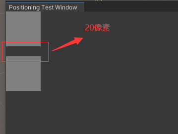
// Create as like as two peas of two Element, and notice that there is no specified location, because the location is Layout system.
for (int i = 0; i < 2; i++)
{
// Create two elements as a square with a gray background
var temp = new VisualElement();
temp.style.width = 70;
temp.style.height = 70;
// marginBottom means that 20 pixels will be reserved below this Element when the Layout system calculates the Layout
temp.style.marginBottom = 20;
temp.style.backgroundColor = Color.gray;
rootVisualElement.Add(temp);
}
}
}
Click the corresponding menu operation to open the window, as shown in the following figure:
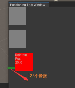
Continue to supplement the CreateGUI code. Now draw a Label and change the pos in its style. The code is as follows:
public void CreateGUI()
{
    // Create as like as two peas of two Element, and notice that there is no specified location, because the location is Layout system.
	...//Original unchanged

    // Create a label, which is a derived class of VisualElement
    var relative = new Label("Relative\nPos\n25, 0");
    // relative.style.position = Position.Relative; / / the default mode is relative, so you don't have to write it deliberately
    relative.style.width = 70;
    relative.style.height = 70;
    relative.style.left = 25;
    relative.style.marginBottom = 20;
    relative.style.backgroundColor = Color.red;
    rootVisualElement.Add(relative);
}
Now the result is as shown in the figure below. It can be seen that the original Label should be drawn 20 pixels down as before, but there is style.left = 25. Therefore, on the basis of the original, add offset(25, 0) to get the position of the last right shift:
After showing the Relative method, let's take a look at the example of Absolute. The code is similar:
public void CreateGUI()
{
	...// The code of the original three elements remains unchanged

	// Draw two more identical squares for comparison
	for (int i = 0; i < 2; i++)
    {
        var temp = new VisualElement();
        temp.style.width = 70;
        temp.style.height = 70;
        temp.style.marginBottom = 20;
        temp.style.backgroundColor = Color.gray;
        rootVisualElement.Add(temp);
    }

    // Draw blocks of Absolute type: Absolute Positioning
    var absolutePositionElement = new Label("Absolute\nPos\n25, 25");
    // The type is Absolute, the benchmark is parent element, and its parent element is the rootVisualElement in the window
    absolutePositionElement.style.position = Position.Absolute;
    absolutePositionElement.style.top = 25; // Set spacing above
    absolutePositionElement.style.left = 25; // Set left spacing
    absolutePositionElement.style.width = 70;
    absolutePositionElement.style.height = 70;
    absolutePositionElement.style.backgroundColor = Color.black;
    rootVisualElement.Add(absolutePositionElement);
}
The final effect is shown in the figure below, with black squares:
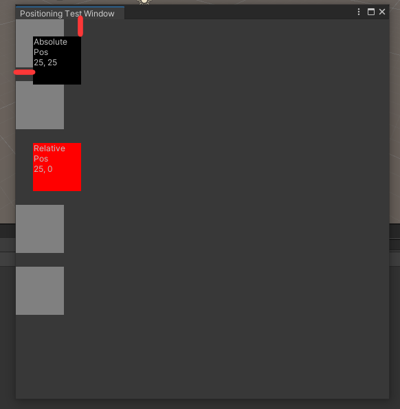
Note that in the EidtorWindow class, there is a Property called public visualelement rootvisualelement {get;}, which can be used to obtain the root visual element of the Visual Tree of the window.
Transformation between coordinate systems
The VisualElement.layout.position and VisualElement.transform parameters determine the direct conversion between the local coordinate system and the parent coordinate system. The static class VisualElementExtensions provides some methods for these transformations:
- WorldToLocal: convert a Vector2 or Rect from Panel Space to element local space
- LocalToWorld: same as above, in the opposite direction
- ChangeCoordinatesTo: convert Vector2 or Rect from the local space of one Element to the local space of another Element
The Layout Engine
The Layout Engine can automatically calculate the UI layout based on the layout and style attributes of Visual Elements. It is developed based on the open source project yoga on Github (Yoga implements a subset of Flexbox: a HTML/CSS layout system).
To learn Yoga and Flexbox, you also need to look at the links provided in the document. There is no link here.
The Layout System has the following features by default:
- A container will distribute its children vertically (what is the specific definition of a container?)
- The position of a container rectangle will contain its chidren rectangles. This feature can be affected by other layout attributes
- Visual Element with text will use its font size when calculating size. This feature can be affected by other layout attributes
Some methods of using layout engine:
- Use width and height to specify the size of the element
- The flexible size (in us: Flex growth: < value >;) is realized through the flexgrowth attribute. When the size of an element is determined by its brother element, the value of the flexgrowth attribute is used as the weight.
- By setting the flexDirection property to row, you can change the layout from vertical to horizontal
- If you want to offset the position of an existing element, use relative positioning
- If you want an element to be like an anchor and maintain its positional relationship with its parent, using absolute positioning will not affect the layout of other elements and parents
The UXML format
UXML is a text file that defines the logical structure of the UI. This chapter will introduce the syntax of UXML, how to write, read and define UXML templates, as well as some methods for customizing new UI elements and using UQuery.
In UXML can:
- Define the structure of UI in XML
- Define UI layout in USS styleshhets
The resource loading part related to these is left to the developers themselves, such as importing assets and compressing data.
How to understand USS and UXML files
Here's a question I didn't understand when I first saw this. What's the difference between UI structure and UI layout?
In fact, Structure represents the organizational relationship of nodes, that is, the parent-child relationship in Hierarchy, while UI Layout represents the specific style and other parameters of each UI node. As shown in the figure below, the HTML file records Structure, and the CSS file records the drawing information of each node. It should be clear at first glance:
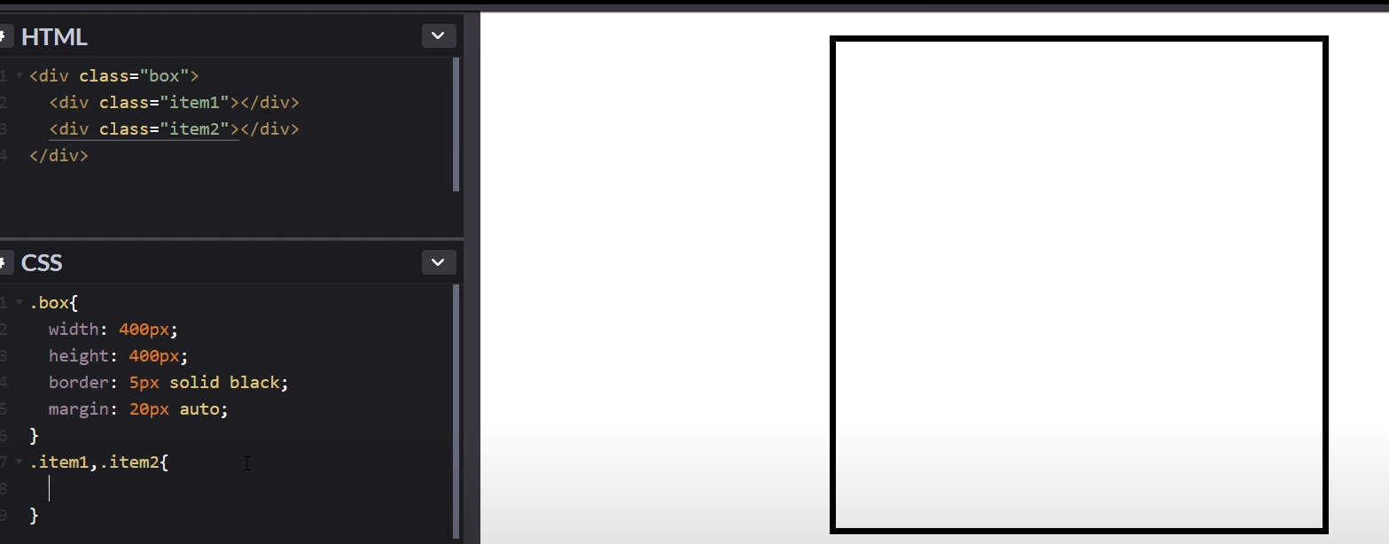
In the UI Toolkit, UXML files are used to describe the Structure between the overall nodes, that is, the corresponding parent-child connection relationship, and each node has its own USS file to describe the size and other UI information of that node.
Customize Visual Element
The original document of Unity is connected here: https://docs.unity3d.com/2020.1/Documentation/Manual/UIE-UXML.html
Frankly speaking, the official document of this document is not matched with the specific code display. It feels that what the official writes is a piece of shit. The following will explain based on this piece of junk, and then add your own explanation and examples to help you understand.
- Create the basic definition of the class
UI Toolkit is an extensible toolkit that can customize UI elements based on visual elements. The relevant codes are as follows:
// Need to inherit from VisualElement
class StatusBar : VisualElement
{
	// You must implement a default constructor
    public StatusBar()
    {
    }

    public string status { get; set; }
}
Then I tried to create an EditorWindow with the following code:
public class MyEditorWindow :EditorWindow
{
    [MenuItem("Window/Open My Window")]
    public static void OpenWindow()
    {
        var window = GetWindow<MyEditorWindow>();

        StatusBar statusBar = new StatusBar();

        statusBar.status = "Hello World";
        statusBar.style.width = 50;
        statusBar.style.height = 50;
        window.rootVisualElement.Add(statusBar);
    }
}
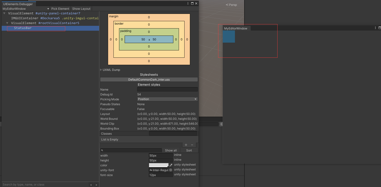
Then open the EditorWindow and find that there is no display, but I open the UIElements Debugger and find that there is something, but there is no display of String and UI, as shown in the following figure:
- Create a related factory class
Although this class has been created, it seems that new comes out. After setting width and height, there is no display in Window.
This is because the corresponding UXML has not been read to determine the structure of the element. In order to read the UXML file, you need to create a corresponding factory class, which can inherit from uxmfactory < T >, which is generally recommended to be defined in the element class. The code is as follows:
class StatusBar : VisualElement
{
	// After defining this class, you can write the StatusBar element in the UXML file,
	// But I'm not familiar with the way this new class is written
	public new class UxmlFactory : UxmlFactory<StatusBar> { }
	...
};
- Create Attribute of Element
The concept of Attribute is derived from XML. For details, see the appendix below.
Here, you need to create an object of UxmlTraits to create related attributes:
class StatusBar : VisualElement
{
    public new class UxmlFactory : UxmlFactory<StatusBar, UxmlTraits> {}

	// The selected class name remains unchanged
	public new class UxmlTraits : VisualElement.UxmlTraits
    {
    	// Create a StringAttribute object. StatusBar has only one Attribute and its name is status
        UxmlStringAttributeDescription m_Status = new UxmlStringAttributeDescription { name = "status" };

        // Defining the UxmlChildElementDescription function
        // The function returns an empty IEnumerable, indicating that the StatusBar does not have any child element s and does not accept any children
        public override IEnumerable<UxmlChildElementDescription> uxmlChildElementsDescription
        {
            get { yield break; }
        }

		// The corresponding bag will be read from the XML parser and assigned to m_status
        public override void Init(VisualElement ve, IUxmlAttributes bag, CreationContext cc)
        {
	        // calls base.Init() to initialize the base class properties.
            base.Init(ve, bag, cc);
            // By defining this class inside the StatusBar, you can directly obtain the private member status
            ((StatusBar)ve).status = m_Status.GetValueFromBag(bag, cc);
        }
    }

	public StatusBar()
    {
        m_Status = String.Empty;
    }

    string m_Status;
    public string status { get; set; }
}
The UxmlTraits class serves two purposes:
- The Factory object is used to initialize the newly created object
- In the process of schema generation, the information of element can be obtained from it for conversion into XML schema directives
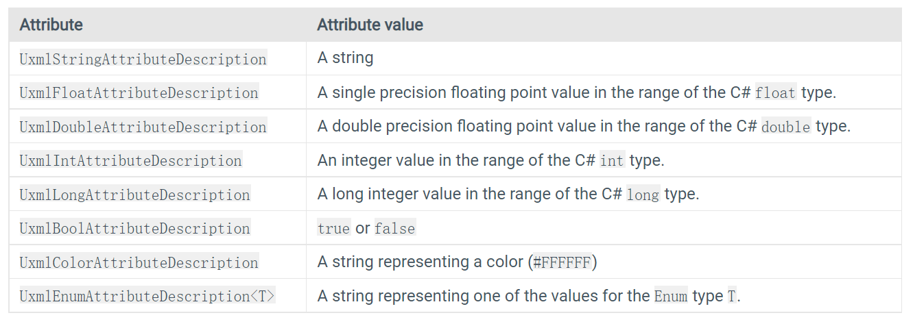
The above trail class defines the UxmlStringAttributeDescription object to represent the Attribute of String. There are the following types:
In the previous uxmlChildElementsDescription function, the code written does not support any Children. If you want to support any Children, you can write this:
public override IEnumerable<UxmlChildElementDescription> uxmlChildElementsDescription
{
    get
    {
        yield return new UxmlChildElementDescription(typeof(VisualElement));
    }
}
UxmlFactory and UxmlTraits instances
The document of Unity doesn't give an example. It's really spicy chicken. Here's an example.
- UxmlFactory class is used to identify this class in UXML and create the Tag corresponding to this class
- UxmlTraits class is used to add custom Attributes in UXML files, which can be seen in UI Builder
For example, after defining such a class:
class TwoPaneSplitView : VisualElement
{
    // Defines the UxmlFactory class, which is used to identify this class in UXML and create the Tag corresponding to this class
    public new class UxmlFactory : UxmlFactory<TwoPaneSplitView, UxmlTraits> {}

    // UxmlTraits class is used to add custom Attributes in UXML files, which can be seen in UI Builder
    public new class UxmlTraits : VisualElement.UxmlTraits{}
}
You can write this in Uxml only if you add UxmlFactory:
<BuilderAttributesTestElement/>// No Attribute has been added at present
Defining a namespace prefix
After completing the above code, you can use the corresponding Element in the UXML file. If you customize the Element in the Namespace, you need to do additional processing.
A namespace prefix needs to be defined. Namespace prefixes are actually the attributes declared on the root element of UXML, which will replace the full namespace name when scoring elements
It is written as follows:
// This can be done at the root level (outside any namespace) of any C# file of the assembly.
[assembly: UxmlNamespacePrefix("My.First.Namespace", "first")]
[assembly: UxmlNamespacePrefix("My.Second.Namespace", "second")]
The schema generation system will do these things:
- Check all attributes and use them to create a schema, that is, the organizational structure in the XML file
- For each newly created UXML file, add the definition of namespace prefix on the < UXML > element
- includes the schema file location for the namespace in its xsi:schemaLocation attribute.
Next, you need to update the UXML schema in the project. Select assets > update UXML schema to ensure that the text editor can identify the new element.
The defined prefix is available in the newly created UXML by selecting Create > UI Toolkit > Editor Window in the Project/Assets/Editor folder.
Advanced usage
Customizing a UXML name
You can inherit the Property of UxmlFactory class through override. The code is as follows:
public class FactoryWithCustomName : UxmlFactory<..., ...>
{
	// I don't know where it will be displayed at the moment
    public override string uxmlName
    {
        get { return "UniqueName"; }
    }

    public override string uxmlQualifiedName
    {
        get { return uxmlNamespace + "." + uxmlName; }
    }
}
Selecting a factory for an element
By default, IUxmlFactory will create an element and select the corresponding element according to its name, mainly to enable it to be recognized in the UXML file
Writing UXML Templates
In fact, it is an uxml file written in XML language to represent the logical structure of the UI. For example:
<-- The first line is XML declaration, it is optional, Can only appear on the first line, No spaces are allowed before-->
<-- version of attribute Must write, encoding Can not write, If you write, You must make clear the characters of the file encoding -->
<?xml version="1.0" encoding="utf-8"?>
<-- UXML representative document root, Contains for namespace prefix definitions and schema The location of the source file attributes -->
<UXML
    xmlns:xsi="http://www.w3.org/2001/XMLSchema-instance"
    <-- The following sentence is a bit like using UnityEngine.UIElements, Indicates the following Label This is everything ns Lower, there ns Yes as default ns -->
    xmlns="UnityEngine.UIElements"
    xsi:noNamespaceSchemaLocation="../UIElementsSchema/UIElements.xsd"
    xsi:schemaLocation="UnityEngine.UIElements ../UIElementsSchema/UnityEngine.UIElements.xsd">

	<-- Here's the bottom Label,Box,Button And so on Visual Element -->
	<-- ahead Label Representative inherits from VisualElement Class name of, And the back text be called Element of Attributes--->
    <Label text="Select something to remove from your suitcase:"/>
    <Box>
        <Toggle name="boots" label="Boots" value="false" />
        <Toggle name="helmet" label="Helmet" value="false" />
        <Toggle name="cloak" label="Cloak of invisibility" value="false"/>
    </Box>
    <Box>
        <Button name="cancel" text="Cancel" />
        <Button name="ok" text="OK" />
    </Box>
</UXML>
Additional points:
- xmlns:engine="UnityEngine.UIElements", which is equivalent to typedef, and then < engine: button / >, which is equivalent to < unityengine. Uielements: button / >
- If you have customized UI elements under your own namespace, you need to include the corresponding namespace definition and schema file location in the tag of < uxml >, as well as the original namespaces of Unity
Common Attribute for VisualElement
There are:
- Name: the name of the element should be unique
- Picking mode: Position or Ignore, used for mouse events
- focus-index: (OBSOLETE) Use tabIndex and focusable.
- tabindex: an int that determines the tabbing position of the current element?
- focusable: a boolean indicating whether the element is focusable.
- class: a space-separated list of identifiers that characterize the element. Use classes to assign visual styles to elements. You can also use classes to select a set of elements in UQuery.
- tooltip: a string
- View data key: a string that defines the key for serializing element s
Create UXML template asset
When you create a new UXML template asset by selecting Asset > Create > UI Toolkit > Editor Window, the Editor automatically defines namespaces for you.
Adding styles to UXML
The UXML file can reference the USS file. You need to use the < style > element under the declaration of any element, for example:
<engine:UXML ...>
    <engine:VisualElement class="root">
    	<-- Meaning all VisualElement Are calling this style.uss As layout? -->
        <Style src="styles.uss" />
    </engine:VisualElement>
</engine:UXML>
At this time, the USS culture and UXML need to be in the same folder. The specific contents of the style.uss file are as follows:
#root {
    width: 200px;
    height: 200px;
    background-color: red;
}
Instead of using the uss file, you can directly set style:
<engine:UXML ...>
    <engine:VisualElement style="width: 200px; height: 200px; background-color: red;" />
</engine:UXML>
Reusing UXML files
UXML files can also be reused as things like prefab. For example, here is a UXML file used as a portrait. Its UI has a figure and person name:
<engine:UXML ...>
    <engine:VisualElement class="portrait">
        <engine:Image name="portaitImage" style="--unity-image: url(\"a.png\")"/>
        <engine:Label name="nameLabel" text="Name"/>
        <engine:Label name="levelLabel" text="42"/>
    </engine:VisualElement>
</engine:UXML>
In other UXML files, the UXML of this portrait can be used as a template:
<engine:UXML ...>
	<-- Class name Template, route src by...., Element Your name is Portrait, It feels like this is a class that has created a template -->
    <engine:Template src="/Assets/Portrait.uxml" name="Portrait"/>
    <engine:VisualElement name="players">
    	<-- Instance Represents an example of a template, behind template Followed by the class name, Then according to name Create specific Instance  -->
        <engine:Instance template="Portrait" name="player1"/>
        <engine:Instance template="Portrait" name="player2"/>
    </engine:VisualElement>
</engine:UXML>
To sum up, you can use Template and Instance keywords in UXML and use class es created in other UXML
Overriding UXML attributes
Even if you create an Instance based on the UXML Template, you can override the default Attribute value in its elements.
The specific operations are as follows. Write a line of xml statement to name the following contents:
- The Element name attribute of the Element who attributes you want to override
- The name of the Attribute to override
- The new attribute value
Take the following code as an example:
<-- because override Yes Instance no Template, So you can enter multiple parameters, such as here
 Two parameters: one is the class name and the other is Element The name that meets these two conditions Element, his text of attribute Will be Override -->
<AttributeOverrides element-name="player-name-label" text="Alice" />
For another example, suppose there are different players who want to display the same Template, but each person's specific value is different:
<-- to specify namespace -->
<UXML xmlns="UnityEngine.UIElements">
		<-- Actually UnityEngine.UIElements.Label -->
		<-- Create two Label, The names are player-name-label and player-score-label -->
        <Label name="player-name-label" text="default name" />
        <Label name="player-score-label" text="default score" />
</UXML>
After creating a template, you can create its Instance and override its attributes. In fact, it is grammar learning. There is no difficulty:
	<-- Add two namespace of include -->
    <UXML xmlns="UnityEngine.UIElements" xmlns:uie="UnityEditor.UIElements">
    	<-- Declare the template and path used -->
        <Template src="MyTemplate.uxml" name="MyTemplate" />
        <-- Based on the name MyTemplate Template creation Instance -->
        <Instance name="player1" template="MyTemplate">
        	<-- Override Two element of text Corresponding attribute -->
            <AttributeOverrides element-name="player-name-label" text="Alice" />
            <AttributeOverrides element-name="player-score-label" text="2" />
        </Instance>
        <Instance name="player2" template="MyTemplate">
            <AttributeOverrides element-name="player-name-label" text="Bob" />
            <AttributeOverrides element-name="player-score-label" text="1" />
        </Instance>
    </UXML>
Overriding multiple attributes
In the above examples, only one attribute is overridden. You can ovverride multiple attributes in the same way:
<-- ovverride text and tooltip Two attribute -->
<AttributeOverrides element-name="player-name-label" text="Alice" tooltip="Tooltip 1" />
Nesting attribute overrides
When you override attributes in nested templates, the deepest override takes precedence.
Reference other files in UXML
UXML files can reference other UXML files and USS files
Among them, < template > and Style elements can accept src or path attribute s, which are slightly different.
src
The saved path is relative, either relative to the Project Root path or relative to the UXML file. For example, my UXML file is under Assets\Editor\UXML, and the USS file is under Assets\Editor\USS:
- If you want to read another USS file from UXML, src is src="../USS/styles.uss". If you want to read another UXML file, src="template.uxml"
- Use the path of Project Root src="/Assets/Editor/USS/styles.uss" or src="project:/Assets/Editor/UXML/template.uxml"
path
path only supports files in folders under Resources or Resources in Editor:
- In the normal Resources folder, there is no need to expand the file. For example, path="template" represents Assets/Resources/template.uxml.
- If it is in the Editor Default Resources folder, the extended name of the file is required. For example, path="template.uxml" represents Assets/Editor Default Resources/template.uxml
****
C# read UXML file
It's simple. Write it down:
// Writing method I
var template = EditorGUIUtility.Load("path/to/file.uxml") as VisualTreeAsset;
// The parentElement here can be the rootVisualElement under EditorWindow
template.CloneTree(parentElement, slots);

// Writing method 2
var template = AssetDatabase.LoadAssetAtPath<VisualTreeAsset>("path/to/file.uxml");
template.CloneTree(parentElement, slots);
The actual use is about this:
public class MyWindow : EditorWindow  {
    [MenuItem ("Window/My Window")]
    public static void  ShowWindow () {
        EditorWindow w = EditorWindow.GetWindow(typeof(MyWindow));

        VisualTreeAsset uiAsset = AssetDatabase.LoadAssetAtPath<VisualTreeAsset>("Assets/MyWindow.uxml");
        VisualElement ui = uiAsset.CloneTree(null);

        w.rootVisualElement.Add(ui);
    }

    void OnGUI () {
        // Nothing to do here, unless you need to also handle IMGUI stuff.
    }
}
UQuery
UQuery is the own version of JQuery/Linq implemented by Unity. You can use UQuery to obtain specific elements in the child node Tree of VisualElement. The example code is as follows:
// Find the first Button called foo
root.Query<Button>("foo").First();
// For each Button called foo
root.Query("foo").Children<Button>().ForEach(//do stuff);
UXML elements reference
Summarizes the uxml elements that can be used under the UnityEngine.UIElements and UnityEditor.UIElements namespaces:
Basic Element
There are two:
- Visual Element:
- Bindable Element: it can be bound to an Element on a SerializedProperty, which is equivalent to binding UI objects and properties together. It has a binding Path Attribute that represents the Path of the bound Property
Both base elements are under UnityEngine.UIElements. In fact, bindablelement is also a visual element:
public class BindableElement : VisualElement, IBindable
Utilities
Common UI elements provided are:
- Box: there can be any number of child elements. The Attribute is the same as the Visual Element, but there are multiple boxes around the Content on the UI
- TextElement: VisualElement has one more Text Attribute and cannot have Child Element
- Label: Attribute is the same as Visual Element, and Child Element is not allowed
- Image: Attribute is the same as Visual Element, and Child Element is not allowed
- IMGUIContainer: inherits from Visual Element and cannot have Child Element. It is used to draw ImGUI. Two attributes, focus index and focusable, are added
- Foldout: there can be any number of child elements, and a Toggle can open or hide its content. It should be a BinndableElement in essence
These elements are under UnityEngine.UIElements
Templates
There are three types:
- Template:
- Instance:
- TemplateContainer:
Too many, see for yourself....
https://docs.unity3d.com/2021.2/Documentation/Manual/UIE-ElementRef.html
Unity style sheets (USS)
Each Visual Element has a style attribute. You can use the USS file to define its UI. The rules are as follows:
- The suffix is. uss
- Only style rules(?) are supported
- Style rules consists of a Selector and a declaration block
- The selector identifies which visual element the style rule affects.
- The declaration block, enclosed by curly braces, contains one or more style declarations. Each style declaration is comprised of a property and a value. Each style declaration ends with a semi-colon.
- style property is a literal, when parsed, must match the target property name
Style Rule
What I understand is the grammar rules, as follows:
selector {
  property1:value;
  property2:value;
}
Attaching USS to visual elements
- After uss is added to visual element, it will also be applied to all its child elements
- Use AssetDatabase.Load() or Resources.Load() to load files, and use VisualElement.styleSheets.Add() to add stylesheet s
**Style matching with rules * * the stylesheet can be directly added to a Visual Tree, which will automatically match: ` ` ` css / * automatically match the visual element called Button * / Button {width: 200px;}```
USS Selector
The USS Selector is responsible for finding the corresponding matching Style Rule according to the content name in the uss file. In my understanding, the essence of the Selector is some syntax. Through different syntax, the Style Rule in uss can be applied to the specified Visual Element
Common writing methods:
#name{}
Button{}
.classlist{}
appendix
Delete the writing method of Visual Element
// Delete an entire array of UI elements
for (int i = 0; i < modelAreasUI.Count; i++)
{
    modelAreasUI[i].parent.Remove(modelAreasUI[i]);
}
modelAreasUI.Clear();
XML Elements vs. Attributes
XML elements can have attributes, which are subordinate relationships, such as the following
<person gender="female">
person in is Element, and gender is Attribute
Look at two more examples:
 <!-- First example -->
<person gender="female">
  <firstname>Anna</firstname>
  <lastname>Smith</lastname>
</person>

 <!-- Second example -->
<person>
  <gender>female</gender>
  <firstname>Anna</firstname>
  <lastname>Smith</lastname>
</person>
In the first example, gender is Attribute. In the second example, gender is element
What is an XML Schema
Reference source: https://www.w3schools.com/xml/schema_intro.asp
https://www.differencebetween.com/difference-between-xml-and-vs-xsd/
Schema translates into schema, summary, and agenda. In computer terminology, schema is often used to describe the structure of different types of data. The most common is the schema of data and XML.
An XML Schema describes the structure of an XML document. The XML Schema language is also referred to as XML Schema Definition (XSD)
<?xml version="1.0"?>
<xs:schema xmlns:xs="http://www.w3.org/2001/XMLSchema">

<xs:element name="note">
  <xs:complexType>
    <xs:sequence>
      <xs:element name="to" type="xs:string"/>
      <xs:element name="from" type="xs:string"/>
      <xs:element name="heading" type="xs:string"/>
      <xs:element name="body" type="xs:string"/>
    </xs:sequence>
  </xs:complexType>
</xs:element>

</xs:schema>
The core is that xml schema aims to define the structure and content of XML documents. The difference between XML and xml schema can also be regarded as the difference between XML and XSD. In my understanding, for example, for the node relationship of node in XML, attribute can be added to element, which should be set by schema.
What is the flex growth attribute
Reference link: https://css-tricks.com/snippets/css/a-guide-to-flexbox/
There is a Property in VisualElement:
StyleFloat flexGrow: Specifies how much the item will grow relative to the rest of the flexible items inside the same container.
In essence, flexGrow is a float value. This concept originates from Flexbox Layout. It is used to allocate the layout for those boxes whose size is uncertain or dynamic. Its core lies in how to flexibly change the size of the Box in a fixed size Container so that they can be arranged in the Container
The Flexbox Layout (Flexible Box) module (a W3C Candidate Recommendation as of October 2017) aims at providing a more efficient way to lay out, align and distribute space among items in a container, even when their size is unknown and/or dynamic (thus the word "flex").
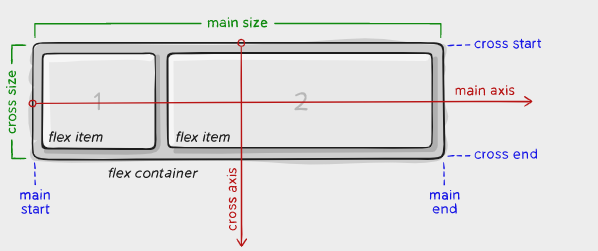
The following figure shows the related concepts of Flexbox:
The specific concepts are as follows:
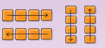
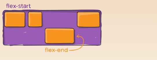
- main axis: the direction of this axis determines the placement direction of flex item s. Whether they are placed horizontally or vertically depends on the flex direction attribute
- Main start | main end: represents the placement interval of flex items along the main axis
- main size: the size of the flex container along the main axis
- The related properties at the beginning of cross are similar to those of main
The layout codes related to uss or css can be divided into two types according to the function object. Since Visual Element is often the Parent as the container for all Children, it is divided into:
- Attributes that act on the parent node, that is, the container
- Attributes that act on child nodes
Attributes that act on the parent node, that is, the container
display
As shown below, you can define a container that allows child nodes to change flexibly:
/* You can select flex or inline flex */
.container {
  display: flex; /* or inline-flex */
}
flex-direction
Determines the direction of the main axis, that is, the arrangement direction of the elements in the container. There are four kinds: left to right, right to left, top to bottom, and bottom to top
.container {
  flex-direction: row | row-reverse | column | column-reverse;
}
As shown in the figure below:
flex-wrap
Under normal circumstances, the flex items in the flex container will be placed in one row (or column) as much as possible. Here, you can set flex wrap to allow it to be placed in multiple rows when needed
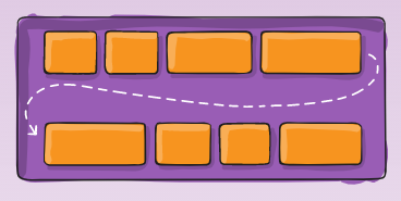
.container {
  flex-wrap: nowrap | wrap | wrap-reverse;
}
- nowrap(default): by default, all flex items are on one line
- wrap: multiline, top-down
- Wrap reverse: multiline, bottom-up
flex-flow
It is the general abbreviation of flex direction and flex wrap. The default is row nowrap:
/* main axis Along the vertical direction, and there is wrap */
.container {
  flex-flow: column wrap;
}
justify-content
This defines the alignment along the main axis
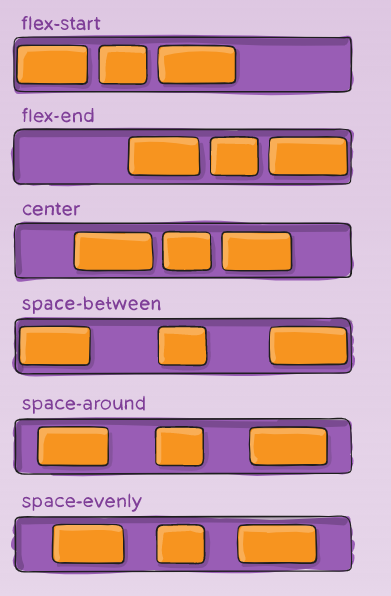
The code is as follows:
.container {
  justify-content: flex-start | flex-end | center | space-between | space-around | space-evenly | start | end | left | right ... + safe | unsafe;
}
align-items
This defines the default behavior for how flex items are laid out along the cross axis on the current line
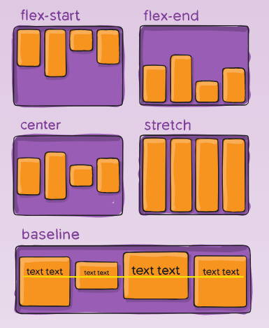
It is written as follows:
.container {
  align-items: stretch | flex-start | flex-end | center | baseline | first baseline | last baseline | start | end | self-start | self-end + ... safe | unsafe;
}
align-content
It feels like align items, as shown in the following figure:
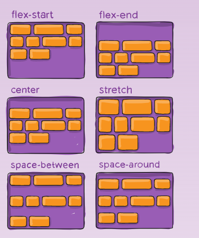
The code is as follows:
.container {
  align-content: flex-start | flex-end | center | space-between | space-around | space-evenly | stretch | start | end | baseline | first baseline | last baseline + ... safe | unsafe;
}
Attributes of child nodes themselves
The flex attributes mentioned above are all for the flex container and are used to adjust the layout of the elements in the container. The following describes the properties of the specific item s in the container
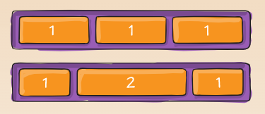
order
flex item has an attribute called order, which is used to determine its sorting, as shown in the following figure:
.item {
  order: 5; /* default is 0 */
}
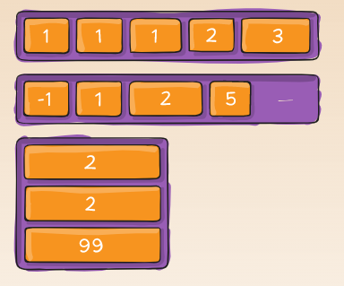
flex-grow
This defines the ability for a flex item to grow if necessary. In fact, it is the weight value it tries to occupy among all its brothers, as shown in the figure below. If the weight is 2, the length is also 2 times. If the flex growth of all flex items is 1, their length will be the same:
.item {
  flex-grow: 4; /* default 0 */
}
flex-shrink
If necessary, a flex item shrinks
.item {
  flex-shrink: 3; /* default 1 */
}
flex-basis
Represents the default size before the element is assigned a size. The code is as follows:
.item {
  flex-basis:  | auto; /* default auto */
}
- auto: calculates additional space based on flex growth
In addition to auto, there are: - content: calculate size based on item
- 0: the extra space around content isn't factored in.
flex
The general abbreviations of flex grow (child node expansion weight), flex shrink (allowable shrinkage) and flex basis (basic default size) are as follows:
/*It is recommended that you use this shorthand property rather than set the individual properties. The shorthand sets the other values intelligently.*/
.item {
  flex: none | [ <'flex-grow'> <'flex-shrink'>? || <'flex-basis'> ]
}
align-self
Customize the alignment of an element:
.item {
  align-self: auto | flex-start | flex-end | center | baseline | stretch;
}
Summary of relevant layout information of UI Element
// Gets the actual size of the Visual Element
element.resolvedStyle.width //(recommended)
element.resolvedStyle.height //(recommennded)

element.worldBound //(relative to the EditorWindow)
element.transform
element.layout
However, it should be noted that these parameters will not take effect immediately after the corresponding element is created in the first frame. They can only take effect after Unity calculates the size and position of each element.
If you want to read the value as soon as it is available, you can register the GeometryChangeEvent callback function on the element
VisualTreeAsset
We can see this class in the code, mainly in terms of API. The definition of the class is as follows:
// An instance of this class represents a Tree of Visual Element, which is read from UXML file
// In the UXML file, each node (node in XML concept) represents a visual element asset
public class VisualTreeAsset : ScriptableObject
{
    public VisualTreeAsset();
   	...
}
In fact, this class is to help get the corresponding Visual Element from UXML file. The code is as follows:
VisualTreeAsset template = EditorGUIUtility.Load("Assets/TrainningDataViewer.uxml") as VisualTreeAsset;
VisualElement root = template.CloneTree();
Manipulator provided by Unity
As shown in the following figure, the source code of UnityC# is referenced:
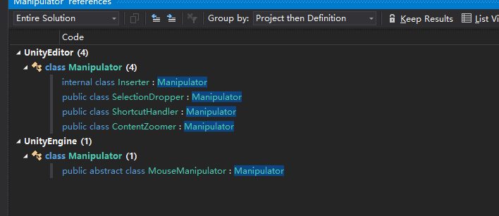
There are two types. One is used under UnityEditor. The Inserter, SelectionDropper, ShortcutHandler and ContentZoomer mentioned here are provided in the Namespace of GraphView, and the MouseManipulator is under the Namespace of Unity UI Elements.
Inheriting MouseManipulator are:
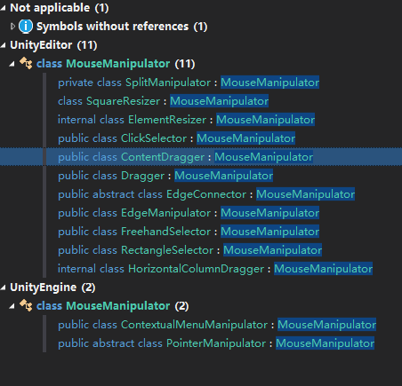
ElementResizer, ClickSelector, ContentDragger, Dragger, EdgeConnector, EdgeManipulator, FreehandSelector and RectangleSelector are all under the namespace of GraphView
How UI Element creates Enum Field
In fact, it is introduced in UI Samples. The code is as follows:
// Add enum field in uxml (or in code)
<uie:EnumField label="MyEnum" value="2D" name="MyEnum"/>

// In the C# script
enum MyEnum
{
	One,
	Two
}

var enumField = rootVisualElement.Q<EnumField>("MyEnum");
enumField .Init(MyEnum.One);// Initial value
enumField .value = MyEnum.Two;// Set another value
Use of PopuoField of UI Element
Reference link: https://docs.unity3d.com/Packages/com.unity.ui@1.0/api/UnityEditor.UIElements.PopupField-1.html
Constructor interface:
public PopupField(string label, List<T> choices, T defaultValue, Func<T, string> formatSelectedValueCallback = null, Func<T, string> formatListItemCallback = null)
Actual use:
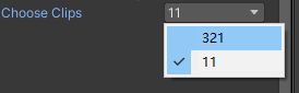
List<string> s = new List<string>();
s.Add("321");
s.Add("11");
var ClipsField = new PopupField<string>("Choose Clips", s, "11");
Add(ClipsField);// Add to a Visual Element
The effect is shown in the following figure, which is a bit like EnumField:
You can select directly in the following ways:
// It is equivalent to clicking the 21st choice
ClipsField.index = 20;