Transition means transition in English. Transition can be an element that switches between different states with different transition effects. It consists of four parts: the name of transition attribute, the time required for transition, the mode of transition and the delay time of transition.
1. Name of transition attribute
- Transition property transition style
There must be changes in the transition. Changes in css are styles. For example, if we need to transition a color, the attribute name you want to transition is background color - When transitioning multiple styles, you can write all
- 2. Time required for transition
- Transition duration if the transition feeling is softened, it is that the transition time is not instantaneous, but slow.
- The transition time is directly in seconds s or ms, and the default is 0s
<!DOCTYPE html>
<html lang="en">
<head>
    <title>Document</title>
    <style>
        .d1{
            width: 100px;
            height: 100px;
            background-color: yellow;
             /* Transitional style */
            transition-property:
            background-color;
              /* Transition time */
            transition-duration: 1s;
        }

        .d1:hover{
            background-color: red;
        }

    </style>
</head>
<body>
    <div class="d1">
    </div>
</body>
</html>
3. Mode of transition
- Transition timing function transition mode, which changes the speed in motion according to different transition modes
- Bessel curve function is very complex http://www.css3beziercurve.net/ Functions are very complex, but in
- css encapsulates five for us
- The default value is slow first, then fast, and finally slow transition timing function: ease;
- Transition timing function: ease in;
- The speed is very slow at the beginning and end, and the transition timing function: ease in out is not accelerated in the middle;
- Transition timing function: ease out;
- Uniform transition timing function: linear;
- div {
transition-property: all;
transition-duration: 1s;
/The default value is slow first, then fast, and finally slow/
transition-timing-function: ease;
/Slow first, then faster and faster/
transition-timing-function: ease-in;
/The speed is very slow at the beginning and end, and does not accelerate in the middle/
transition-timing-function: ease-in-out;
/First fast, then slower and slower/
transition-timing-function: ease-out;
/Uniform velocity/
transition-timing-function: linear;
}
4. Delay time of transition
- Transition delay is the time to wait before the transition effect begins to work. The value is in seconds (s) or milliseconds (ms).
- When the value is positive, it will delay for a period of time to respond to the transition effect; A negative value causes the transition to begin immediately.
<!DOCTYPE html>
<html lang="en">
<head>
    <title>Document</title>
    <style>
        .d1{
            width: 100px;
            height: 100px;
            background-color: yellow;
             /* Transitional style */
            transition-property:all;
              /* Transition time */
            transition-duration: 1s;
             /* Transition mode linear uniform ease default */
             transition-timing-function: linear;
              /* delay time  */
            transition-delay: 1s;
        }

        .d1:hover{
            background-color: red;
            width: 600px;
        }

    </style>
</head>
<body>
    <div class="d1">
    </div>
</body>
</html>
5. Simplified writing
- The order is transition: transition time delay time transition mode transition style
- Note that the "order of execution time and delay time" cannot be changed, and the other two orders can be changed
- The simplest way to write: Transition: transition time;
6. Multi style transition
When transition is used for multiple styles and different transition styles at the same time, each transition style at different times needs to be separated by commas.
<!DOCTYPE html>
<html lang="en">
<head>
    <title>Document</title>
    <style>
        .d1{
            width: 100px;
            height: 100px;
            background-color: yellow;

            transition: 1s linear width,1s 1s linear height,1s 2s linear background-color;
        }

        .d1:hover{
            background-color: red;
            width: 300px;
            height: 500px;
        }

    </style>
</head>
<body>
    <div class="d1">
    </div>
</body>
</html>
change
The change attribute in css is a wonderful innovation of css. The transform attribute allows a variety of functions with change effects to change elements.
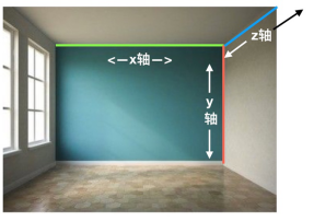
There are two kinds of transformations: 2D (focus) and 3D. You need to know three axes xyz.
1.transform change attribute
The four most commonly used variation functions are:
- translate displacement
- scale
- rotate
- skew twist
- 2.translate() displacement function
translate() in the transformation, the displacement can have X-axis, Y-axis and z-axis displacement directions. The parameters can use length units. The percentage corresponds to its own width and height, and can be straight or negative. The displacement of the Z axis can only be seen when the parent element has a perspective effect. - transform: translateX(x); Translate along the X-axis. Positive values move to the right and negative values move to the left
- transform: translateY(y); Translate along the Y axis. Positive values move down and negative values move up
- transform: translate(x, y); Translate along the X and Y axes simultaneously
- Note: displacement and fixation are different. They are not separated from the document flow and will not affect the layout of other elements
The element is centered. Before the negative margin value, you need to know the width and height of the element, but you don't need to use the translate percentage value
<!DOCTYPE html>
<html>
<head>
  <meta charset="UTF-8">
  <title>Document</title>
  <style>
    .d1 {
      width: 100px;
      height: 100px;
      background-color: red;
      font-size: 30px;
      color: white;
      /* displacement */
      /* Positive right, negative left */
      transform: translateX(300px);
      /* Positive down, negative up */
      transform: translateY(50px);
      /* Parameter 1x axis, parameter 2y axis */
      transform: translate(300px,50px);
    }
    .d2 {
      width: 800px;
      height: 500px;
      background-color: yellow;
      position: relative;
    }
    .d2 div {
      width: 200px;
      background-color: brown;
      position: absolute;
      top:50%;
      left: 50%;
      /*
      1.Using the element of the transform attribute, the origin of the change becomes its own center point
      2.Using the translate attribute, the percentage value refers to its own width and height
      */
      transform: translate(-50%,-50%);
    }

  </style>
</head>
<body>
  <div class="d1">Zhu</div>
  <div class="d2">
    <div>Lorem ipsum dolor sit amet consectetur, adipisicing elit.
      Commodi ab repudiandae laborum architecto voluptatem laudantium
      eum eveniet natus odit deleniti consequuntur, soluta modi
      aliquam eius aliquid fugit consectetur quis! Provident.</div>
  </div>
</body>
</html>
3.rotate() rotation function
- The rotate() function can only rotate on the Z axis in 2d transformation, so the rotate() function defaults to the Z axis rotation function.
- The parameter is the rotation angle, and the deg unit is the rotation angle. The angle can be positive or negative.
- The rotation center point is the most central point of the element
<!DOCTYPE html>
<html>
<head>
  <meta charset="UTF-8">
  <title>Document</title>
  <style>
    div {
      width: 100px;
      height: 100px;
      color: white;
      font-size: 30px;
      margin: 50px auto;
    }
    .d1 {
      background-color: red;
      /* Positive values rotate clockwise and negative values rotate counterclockwise */
      transform: rotate(50deg);
    }
    .d2 {
      background-color: blue;
      transition: 3s;
    }
    .d2:hover {
      transform: rotate(6284deg);
    }
  </style>
</head>
<body>
  <div class="d1">word</div>
  <div class="d2">word</div>
</body>
</html>
4.scale() scaling function
- The parameters in the scale() scaling function are based on multiples, and 1 represents the current size
- Positive numbers above 1 are multiples of the current size.
- The "positive number" below 1 and above 0 is the reduction multiple.
- 0 times to disappear
- When the parameter value is negative, the element is specular flipped, and the same multiple will work
<!DOCTYPE html>
<html>
<head>
  <meta charset="UTF-8">
  <title>Document</title>
  <style>
    div {
      width: 100px;
      height: 100px;
      font-size: 20px;
      color: white;
      margin: 50px auto;
    }
    .d1 {
      background-color: red;
      /* zoom */
      transform: scaleX(0.5);
      /* Zoom out to 0 */
      transform: scale(0);
    }
    .d2 {
      background-color: green;
      /* transform: scaleY(0.5); */
      /* Without x, y is two-way */
      /* transform: scale(2); */
      /* x Axis mirror flip */
      transform: scaleX(-1);
      /* y Axis mirror flip */
      transform: scaleY(-1);
      /* Both axes are mirror flipped */
      transform: scale(-1);
    }
  </style>
</head>
<body>
  <div class="d1">Fat new</div>
  <div class="d2">Liang Lang</div>
</body>
</html>
5.skew() skew function
- skew() can have X-axis and Y-axis tilt angles in 2d transformation
- Fill in the rotation angle. The deg unit is the rotation angle. The angle can be positive or negative.
- skew() defaults to the X-axis tilt function
<!DOCTYPE html>
<html>
<head>
  <meta charset="UTF-8">
  <title>Document</title>
  <style>
    div {
      width: 200px;
      height: 200px;
      background-color: red;
      margin: 100px auto;
      transform: skewX(-50deg);
      transform: skewY(50deg);
      transform: skew(50deg);
    }
  </style>
</head>
<body>
  <div></div>
</body>
</html>
7. Execution sequence of transformation function
When transform attributes need to be superimposed, multiple transform attributes cannot be generated, but all transform functions to be used need to be added to one transform attribute, separated by spaces. However, there is a problem of sequence.
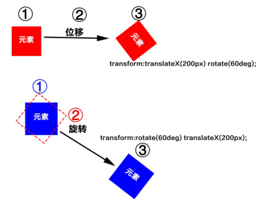
Using the console to change the rotation angle to see the effect div: nth child (1): hover{
transform: translateX(200px) rotate(60deg);
}
Using the console to change the rotation angle to see the effect div: nth child (2): hover{
transform: rotate(60deg) translateX(200px);
}
<!DOCTYPE html>
<html>
<head>
  <meta charset="UTF-8">
  <title>Document</title>
  <style>
    div {
      width: 100px;
      height: 100px;
      color: white;
    }
    .d1 {
      background-color: red;
      transform: translateX(200px) rotate(60deg);
    }
    .d2 {
      background-color: blue;
      transform: rotate(60deg) translateX(200px);
    }
    .d3 {
      margin: auto;
      background-color: green;
      transform-origin: bottom left;
      transition: 1s;
    }
    .d3:hover {
      transform: rotate(60deg);
    }
  </style>
</head>
<body>
  <div class="d1">element</div>
  <div class="d2">element</div>
  <div class="d3">element</div>
</body>
</html>