1, viewport
On the PC side, the HTML page we developed runs in the browser. How wide the browser is (generally, the browser represents the width of the device) the html is, that is, render and render our page in the browser wide viewport
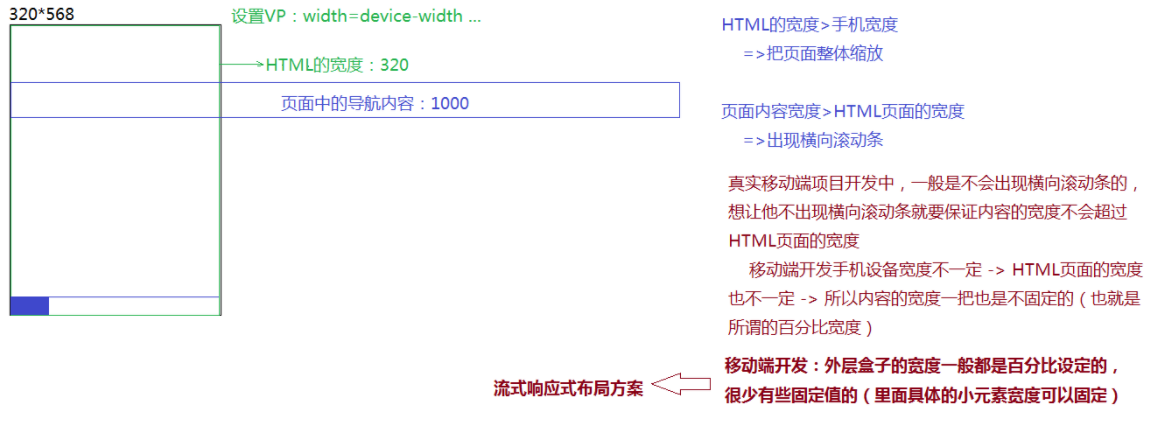
There are differences between the mobile terminal and the PC terminal: no matter what the width of the mobile terminal device (referring to the open browser), the width of the HTML page is 980 (or 1024) = > the problem caused: if we want to fully present the whole page in the device window (the large page is fully displayed in the small window), we can only zoom the large page, and the HTML page is zoomed, Then everything on the page is scaled
[solution] as long as the width of the H5 page is consistent with the width of the mobile device, there will be no scaling of the page when the mobile phone renders the page
<meta name="viewport"
      content="width=device-width, initial-scale=1.0">

this META The label is set VP(Viewport)Rules of
   width=device-width: Give Way HTML The width of the page is equal to the width of the device
   height=: set up HTML Page height (generally not used)
   initial-scale=1.0: The initial scale is 1:1(That is, it is neither enlarged nor too small)
   user-scalable=no: Prevent users from scaling manually
   maximum-scale=1.0
   minimum-scale=1.0: Set the maximum and minimum scale 1:1(Neither zoom in nor zoom out =>Only set in some Android machines user-scalable It doesn't work and needs to be used with these two)
layout viewport: layout (page) viewport (related to developing CSS, etc.)
visual viewport: mobile phone viewport
Ideal viewport: ideal viewport
2, Mobile terminal items normally processed
1.PC terminal and mobile terminal share a set of projects (relatively simple structure: generally display enterprise stations) [designers generally only give one set of design draft]
A: Make the PC side first (the design draft is generally for the PC side)
Generally, the width is adaptive (the specific situation is different)
B: Switch to the mobile terminal and use @ media (media query) to modify inappropriate styles on different devices
*We can understand @ MEDIA as conditional judgment in JS: different CSS styles are used for rendering under different conditions
* @ Media [media device]
* All - > all devices
* Screen - > all screen devices (PC + computer)
* Print - > printer equipment
* ...
*
* @ Media device and media condition
*
* Common device sizes for mobile phones
* Apple: 320, 375, 414
* Android: 320, 360, 480, 540, 640, (760...)
* PAD: 768*1024,1024*1366 ...
    @media all and (max-width: 640px) {
            /*The width of the current page is less than or equal to 640PX*/
            .box {
                width: 150px;
                height: 150px;
                background: orange;
            }
        }

    @media all and (max-width: 480px) {
            .box {
                width: 100px;
                height: 100px;
                background: lightgreen;
            }
        }

    @media all and (max-width: 375px) {
            .box {
                width: 50px;
                height: 50px;
                background: lightpink;
            }
        }

    @media screen and (orientation: portrait ) {
            !*portrait (Vertical) | landscape (Horizontal)*!
            Windows( viewport)Rotation direction of (horizontal or vertical screen mode)
            body {
                background: lightcoral;
            }
        }

    @media screen and (orientation: landscape ) {
            body {
                background: lightblue;
            }
        }
2.PC terminal and mobile terminal are two separate sets of different projects
[designers usually give two sets of design drafts (PC + Mobile)]
=> The PC end does it alone (the mobile end response does not need to be considered when doing it)
Fixed layout
=> The mobile terminal does it alone (only the responsive adaptation of the mobile terminal needs to be considered)
Responsive layout
A: It can still be handled based on @ MEDIA (more troublesome)
B: Fixed layout (viewport = > width = 320px): write the size of 320 according to the design draft (all sizes can be fixed and are half of the design draft [because the design draft is twice as large]). On other devices, let the page of 320 be displayed in the middle
C:SCALE scale layout (the style is written strictly according to the size of the design draft [there is no adaptive width, but all are fixed values]. On other devices, first obtain the width of the device, divide it by the width of the design draft, and then reduce the original written page according to this proportion) = > will cause some problems, such as blurred font
    <script>
        window.addEventListener('load', () => {
            let container = document.querySelector('.container'),
                winW = document.documentElement.clientWidth;
            container.style.transform = `scale(${winW / 750})`;
        });
    </script>
D:REM proportional scaling: it refers to SCALE and is only achieved in rem units (written strictly according to the size of the design draft [but the general width makes it adaptive] , other values can be written as fixed values - > when writing CSS styles, we convert all PX units into REM units - > when loading the page, divide the size of the current device by the design draft, and dynamically adjust the conversion ratio of REM and PX according to the ratio)
<style>
        /*REM Is the relative unit, which is set relative to the font size of the root element (HTML tag)*/
        html {
            /*font-size: 10px; !*1REM=10PX Browsers have their own default minimum font. For example, Google is 12PX, so to be accurate, this is equivalent to 1REM=12PX *!*/
            /*font-size: 14px; !*1REM=14PX This ratio calculation conversion is too troublesome *!*/
            font-size: 100px; /*1REM=100PX =>750 Design draft*/
        }

        .headerBox {
            height: 2rem;
            border: .02rem solid lightcoral;
        }

        .headerBox h1 {
            float: left;
            width: 3rem;
            line-height: 2rem;
            text-align: center;
            font-size: .36rem;
        }

        .headerBox ul {
            float: right;
        }

        .headerBox ul li {
            float: left;
            padding: 0 .2rem;
            height: 2rem;
            line-height: 2rem;
            font-size: .28rem;
        }
    </style>
    <script>
        window.addEventListener('load', () => {
            let HTML = document.documentElement,
                winW = HTML.clientWidth;
            HTML.style.fontSize = `${winW / 750 * 100}px`;
        //=>Resize the HTML font (readjust the conversion scale of REM), so that all previous style values in rem will be rendered according to the latest scale center
        });
    </script>
E:CSS3 provides a flex box model. Based on this property, some effects can be processed more conveniently
A & & D & & E is the most commonly used responsive layout scheme at present
The mobile terminal design draft given by the designer is generally 640 * 1136 (980 or variable height), 750 * 1334
A: Why are our design drafts twice as large as the reference mobile phone?
The purpose is to ensure that the material resource pictures we cut are large pictures
B: Why make sure it's a big picture?
Because many mobile phones are twice and triple the screen pixel density ratio (DPR)
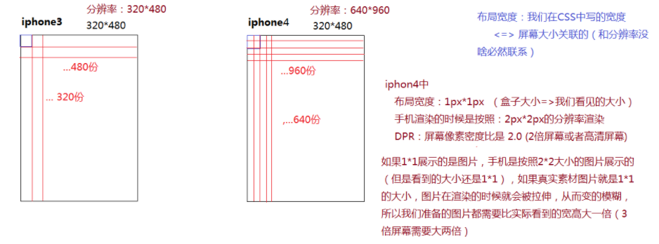
C: Even if the design draft is given twice, the equipment size of some mobile phones is larger than half of the design draft, and some mobile phones are three times DPR, which leads to a problem: some pictures will become blurred. At this time, we can find a designer to ask for a large picture of the blurred picture alone