The radial gradient() function is used to create an "image" of radial gradient. Its general call format is:
background-image: radial-gradient(shape size at position, start-color, ..., last-color);
1. The parameter shape defines the shape of the gradient,
- The default value is ellipse, which is an elliptical radial gradient,
- The value circle is a radial gradient of a circle.
2. The parameter size defines the size of the gradient. Possible values are:
- Farthest corner (default): Specifies that the radius length of the radial gradient is from the center of the circle to the angle farthest from the center of the circle;
- Closest side: Specifies that the radius length of the radial gradient is from the center of the circle to the edge closest to the center of the circle;
- Closest corner: Specifies that the radius length of the radial gradient is from the center of the circle to the angle closest to the center of the circle;
- Farthest side: Specifies that the radius length of the radial gradient is from the center of the circle to the edge farthest from the center of the circle;
3. The parameter position defines the position of the gradient. Possible values are:
- Center (default): set the center as the ordinate value of the radial gradient center.
- Top: set the top to the ordinate value of the radial gradient center.
- Bottom: set the bottom to the ordinate value of the radial gradient center.
4. The parameters start color,..., last color are used to specify the start and end color of the gradient. You can use the length value or percentage to specify the start & & stop color position, but negative values are not allowed.
The repeating radial gradient() function is used to create a repeated radial gradient "image". Its general call format is:
background-image: repeating-radial-gradient(shape size at position,start-color, ..., last-color);
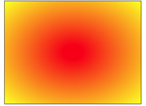
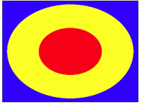
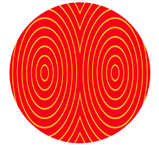
Radial gradient starts from the center point and gradients outward in the form of ellipse
The color starts in red and changes to yellow in an elliptical gradient.
<div class="shape"></div>
<style>
.shape{
	margin: 0 auto;
	width: 400px;
	height: 300px;
	border: 1px solid;
	background-image:radial-gradient(red , yellow);
}
</style>
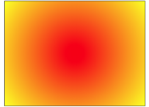
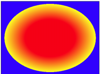
If the background image attribute of css is defined as: background image: radial gradient (circle, red, yellow);
The gradient is carried out in a circular way. The color also starts from red and changes to yellow.
<div class="shape"></div>
<style>
.shape{
	margin: 0 auto;
	width: 400px;
	height: 300px;
	border: 1px solid;
	background-image:radial-gradient(circle, red , yellow);
}
</style>
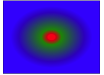
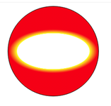
If the background image attribute of css is defined as: background image: radial gradient (closest side, red, yellow);
At this time, since the radius length of the specified radial gradient is from the center of the circle to the edge closest to the center of the circle (upper and lower edges), the yellow area increases significantly.
<div class="shape"></div>
<style>
.shape{
	margin: 0 auto;
	width: 400px;
	height: 300px;
	border: 1px solid;
	background-image:radial-gradient(closest-side , red , yellow);
}
</style>
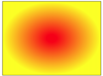
You can try to modify the closest side to the farthest corner (default), the closest corner and the farthest side, and the graphics will change.
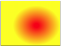
If the background image attribute of css is defined as: background image: radial gradient (close side at 60% 55%, red, yellow);
The gradient center is shifted to the lower right, and the effect is shown in the figure:
<div class="shape"></div>
<style>
.shape{
	margin: 0 auto;
	width: 400px;
	height: 300px;
	border: 1px solid;
	background-image:radial-gradient(closest-side at 60% 55%, red , yellow);
}
</style>
Radial gradients can specify multiple colors
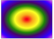
If the background image attribute of css is defined as: background image: radial gradient (red, orange, yellow, green, indigo, blue, violet);
<div class="shape"></div>
<style>
.shape{
	margin: 0 auto;
	width: 400px;
	height: 300px;
	border: 1px solid;
	background-image:radial-gradient(red,orange,yellow,green,indigo,blue,violet);
}
</style>
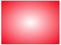
The color specified in the radial gradient can use transparency
<div class="shape"></div>
<style>
.shape{
	margin: 0 auto;
	width: 400px;
	height: 300px;
	border: 1px solid;
	background-image:radial-gradient( rgba(255,0,0,0), rgba(255,0,0,1));
}
</style>
The color specified in the radial gradient also defines the stop position
<div class="shape"></div>
<style>
.shape{
	margin: 0 auto;
	width: 400px;
	height: 300px;
	border: 1px solid;
	background-image:radial-gradient(red 5%, green 15%, blue 60%);
}
</style>
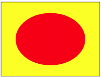
The boundary is clear and the gradient effect is cancelled
If the background image attribute is modified, it is defined as: background image: radial gradient (red 50%, yellow 50%); The boundary between red and yellow colors is clear, and the gradient effect is cancelled
<div class="shape"></div>
<style>
.shape{
	margin: 0 auto;
	width: 400px;
	height: 300px;
	border: 1px solid;
	background-image:radial-gradient(red 50%, yellow 50%);
}
</style>
If the background image attribute is modified, it is defined as: background image: radial gradient (red 33%, yellow 33%, yellow 66%, blue 66%);
<div class="shape"></div>
<style>
.shape{
	margin: 0 auto;
	width: 400px;
	height: 300px;
	border: 1px solid;
	background-image:radial-gradient(red 33%, yellow 33%, yellow 66%,blue 66%);
}
</style>
<div class="shape"></div>
<style>
.shape{
margin: 0 auto;
width: 400px;
height: 300px;
border: 1px solid;
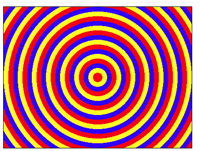
background-image: repeating-radial-gradient(circle, red 0, red 10px, yellow 10px, yellow 20px, blue 20px, blue 30px) ;
}
</style>
Some boundaries are clear, and some have gradient effect
<div class="shape"></div>
<style>
.shape{
	margin: 0 auto;
	width: 400px;
	height: 300px;
	border: 1px solid;
	background-image:radial-gradient(red 33%, yellow 66%,blue 66%);
}
</style>
<div class="shape"></div>
<style>
.shape{
	margin: 0 auto;
	width: 400px;
	height: 300px;
	border: 1px solid;
	background-image: repeating-radial-gradient(red, yellow 10%, blue 15%);
}
</style>
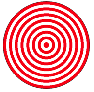
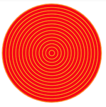
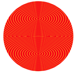
Drawing graphics with radial gradient
(1) Concentric circle
<div class="shape"></div>
<style>
.shape{
	margin: 0 auto;
	width: 300px;
	height: 300px;
	border: 1px solid;
	border-radius: 50%;
	background-image: repeating-radial-gradient(red 0px, red 10px, #fff 10px, #fff 20px);
}
</style>
<div class="shape"></div>
<style>
.shape{
margin: 0 auto;
width: 200px;
height: 200px;
border: 1px solid;
border-radius: 50%;
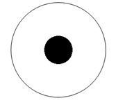
background-image: radial-gradient(60px at center center ,#fff 50% ,#000 50%);
}
</style>
<div class="shape"></div>
<style>
.shape{
margin: 0 auto;
width: 200px;
height: 200px;
border: 1px solid;
border-radius: 50%;
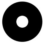
background-image: radial-gradient(60px at center center ,#000 50%,#fff 50%);
}
</style>
<div class="shape"></div>
<style>
.shape{
	margin: 0 auto;
	width: 300px;
	height: 300px;
	border-radius: 50%;
	background: repeating-radial-gradient(#f00, #f00 4px, #ff0 5px, #f00 6px);
	background-size: 100% 100%;
}
</style>
<div class="shape"></div>
<style>
.shape{
	margin: 0 auto;
	width: 300px;
	height: 300px;
	border-radius: 50%;
	background: repeating-radial-gradient(#f00, #f00 4px, #ff0 5px, #f00 6px);
	background-size: 50% 100%;
}
</style>
<div class="shape"></div>
<style>
.shape{
	margin: 0 auto;
	width: 300px;
	height: 300px;
	border-radius: 50%;
	background: repeating-radial-gradient(#f00, #f00 4px, #ff0 5px, #f00 6px);
	background-size: 100% 50%;
}
</style>
<div class="shape"></div>
<style>
.shape{
	margin: 0 auto;
	width: 300px;
	height: 300px;
	border-radius: 50%;
	background: repeating-radial-gradient(#f00, #f00 4px, #ff0 5px, #f00 6px);
	background-size: 50% 50%;
}
</style>
<div class="shape"></div>
<style>
.shape{
	position: absolute;
	width: 262px;
    height: 262px;
    border-radius: 50%;
    background: repeating-radial-gradient(#2a2928, #2a2928 4px, #ada9a0 5px,#2a2928 6px);
}
.shape:after
  {
    content: '';
    position: absolute;
    top: 50%;
    left: 50%;
    margin: -35px;
    border: solid 1px #d9a388;
    width: 68px;
    height: 68px;
    border-radius: 50%;
    box-shadow: 0 0 0 4px #da5b33, inset 0 0 0 27px #da5b33;
    background: #b5ac9a;
  }
</style>

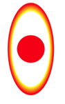
(2) Circle and ellipse
<div class="shape"></div>
<style>
.shape{
	margin: 0 auto;
	width: 200px;
	height: 200px;
	border-radius: 50%;
	border: 1px solid;
	background: radial-gradient(50px 100px ellipse, transparent 40px, yellow 41px, red);
}
</style>
<div class="shape"></div>
<style>
.shape{
	margin: 0 auto;
	width: 200px;
	height: 200px;
	border-radius: 50%;
	border: 1px solid;
	background: radial-gradient(100px 50px ellipse, transparent 80px, yellow 81px, red);
}
</style>
<div class="shape"></div>
<style>
.shape{
	margin: 0 auto;
	width: 200px;
	height: 200px;
	border-radius: 50%;
	background: radial-gradient(50px 100px ellipse, transparent 40px, yellow 41px, red 49px, transparent 50px),
     radial-gradient(30px circle, red, red 29px, transparent 30px);
}
</style>
<div class="shape"></div>
<style>
.shape{
	margin: 0 auto;
	width: 200px;
	height: 200px;
	border: 1px solid;
	background:radial-gradient(10px 18px ellipse, transparent 8px, yellow 9px, red 11px, transparent 13px),
    radial-gradient(6px circle, red, red 6px, transparent 7px);
	background-size: 50px 50px;
}
</style>
<div class="shape"></div>
<style>
.shape{
	margin: 0 auto;
	width: 200px;
	height: 200px;
	border: 1px solid;
	background:radial-gradient(10px 50px ellipse, transparent 8px, yellow 9px, red 11px, transparent 13px),
	radial-gradient(6px circle, red, red 6px, transparent 7px);
	background-size: 50px 50px;
}
</style>
(3) Eyes
<div class="shape"></div>
<style>
.shape{
	margin: 50px auto;
	width: 224px;
	height: 128px;
	background-color: #333;
	border-radius: 50% 50% 45% 42%;
	background-image:radial-gradient(circle at 128px 64px, white 10px, transparent 10px),
        radial-gradient(circle at 112px 64px, #333 22px, transparent 22px),
        radial-gradient(circle at 112px 64px, white 32px, transparent 32px);
}
</style>

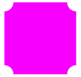
(4) Arc chamfer
<div class="shape"></div>
<style>
.shape{
	margin: 50px auto;
	width:200px;
	height: 200px;
	background:#f0f;
	background:radial-gradient(circle at top left,transparent 25px,#f0f 0) top left,
          radial-gradient(circle at top right,transparent 25px,#f0f 0) top right,
          radial-gradient(circle at bottom right,transparent 25px,#f0f 0) bottom right,
          radial-gradient(circle at bottom left,transparent 25px,#f0f 0) bottom left;
	background-size: 50% 50%;
	background-repeat: no-repeat;
}
</style>
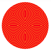
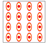
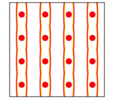
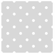
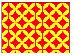
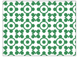
(5) Background pattern
<div class="shape"></div>
<style>
.shape{
	margin: 50px auto;
	width: 400px;
	height: 400px;
	background: radial-gradient(white 15%, transparent 16%),
       radial-gradient(white 15%, transparent 16%), #d8d8d8;
	background-position: 0 0, 50px 50px;
	background-size: 100px 100px;
}
</style>
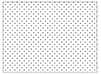
<div class="shape"></div>
<style>
.shape{
	margin: 50px auto;
	width: 400px;
	height: 300px;
	border: 1px solid rgba(50, 50, 50, 0.9);
	background-image:radial-gradient(rgba(255,255,255,0.4) 15%,transparent 16%),
		radial-gradient(rgba(255,255,255,0.4) 15%,transparent 16%),
		radial-gradient(black 15%,transparent 16%),
		radial-gradient(black 15%,transparent 16%);
	background-position: 0 0px,10px 10px,0 1px,10px 11px;
    background-size: 20px 20px;
}
</style>
<div class="shape"></div>
<style>
.shape{
	margin: 50px auto;
	width: 400px;
	height: 300px;
	border: 1px solid rgba(50, 50, 50, 0.9);
	background:#ff0;
	background-image:radial-gradient(closest-side, rgba(255,0,0,0) 98%,rgba(255,0,0,1) 99%);
	background-size: 80px 80px;
}
</style>
<div class="shape"></div>
<style>
.shape{
	margin: 50px auto;
	width: 400px;
	height: 300px;
	border: 1px solid rgba(50, 50, 50, 0.9);
	background:#ff0;
	background-image:radial-gradient(closest-side, rgba(255,0,0,0) 98%,rgba(255,0,0,1) 99%),
		radial-gradient(closest-side,rgba(255,0,0,0) 98%,rgba(255,0,0,1) 99%);
	background-position: 0 0px,40px 40px;
	background-size: 80px 80px;
}
</style>
<div class="shape"></div>
<style>
.shape{
	margin: 50px auto;
	width: 400px;
	height: 300px;
	border: 1px solid rgba(50, 50, 50, 0.9);
	background:#ff0;
	background-image:radial-gradient(closest-side, transparent 0%, transparent 75%, #B6CC66 76%, #B6CC66 85%, #EDFFDB 86%, #EDFFDB 94%, #FFFFFF 95%,#FFFFFF 103%, #D9E6A7 104%, #D9E6A7 112%);
	background-size: 100px 100px;
}
</style>
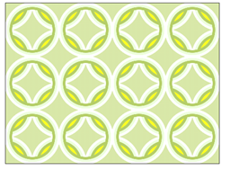
<div class="shape"></div>
<style>
.shape{
	margin: 50px auto;
	width: 400px;
	height: 300px;
	border: 1px solid rgba(50, 50, 50, 0.9);
	background:#ff0;
	background-image:radial-gradient(closest-side, transparent 0%, transparent 75%, #B6CC66 76%, #B6CC66 85%, #EDFFDB 86%, #EDFFDB 94%, #FFFFFF 95%,#FFFFFF 103%, #D9E6A7 104%, #D9E6A7 112%),
		radial-gradient(closest-side, transparent 0%, transparent 75%, #B6CC66 76%, #B6CC66 85%, #EDFFDB 86%, #EDFFDB 94%, #FFFFFF 95%,#FFFFFF 103%, #D9E6A7 104%, #D9E6A7 112%);
	background-position: 0 0px, 50px 50px;
	background-size: 100px 100px;
}
</style>
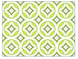
<div class="shape"></div>
<style>
.shape{
	margin: 50px auto;
	width: 400px;
	height: 300px;
	border: 1px solid rgba(50, 50, 50, 0.9);
	background:#ff0;
	background-image:radial-gradient(closest-side, transparent 0%, transparent 75%, #B6CC66 76%, #B6CC66 85%, #EDFFDB 86%, #EDFFDB 94%, #FFFFFF 95%,#FFFFFF 103%, #D9E6A7 104%, #D9E6A7 112%, #798B3C 113%, #798B3C 121%, #FFFFFF 122%, #FFFFFF 130%, #E0EAD7 131%, #E0EAD7 140%),
		radial-gradient(closest-side, transparent 0%, transparent 75%, #B6CC66 76%, #B6CC66 85%, #EDFFDB 86%, #EDFFDB 94%, #FFFFFF 95%,#FFFFFF 103%, #D9E6A7 104%, #D9E6A7 112%, #798B3C 113%, #798B3C 121%, #FFFFFF 122%, #FFFFFF 130%, #E0EAD7 131%, #E0EAD7 140%);
	background-position: 0 0px, 50px 50px;
	background-size: 100px 100px;
}
</style>
<div class="shape"></div>
<style>
.shape{
	margin: 50px auto;
	width: 400px;
	height: 300px;
	border: 1px solid rgba(50, 50, 50, 0.9);
	background:#fff;
	background-image: radial-gradient(SeaGreen  9px, transparent 10px),
		repeating-radial-gradient(SeaGreen  0px, SeaGreen  4px, transparent 5px, transparent 20px, SeaGreen  21px, SeaGreen  25px, transparent 26px, transparent 50px);
    background-position: 0 0;
    background-size: 30px 30px, 90px 90px;
}
</style>
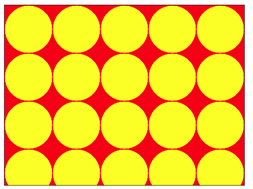
<div class="shape"></div>
<style>
.shape{
	margin: 50px auto;
	width: 400px;
	height: 300px;
	border: 1px solid rgba(50, 50, 50, 0.9);
	background:#ff0;
	background-image: radial-gradient(closest-side circle at 60% 43%, #ff0 26%,rgba(255, 255, 0, 0) 27%),
		radial-gradient(closest-side circle at 40% 43%, #ff0 26%,rgba(255, 255, 0, 0) 27%),
		radial-gradient(closest-side circle at 40% 22%, #f00 45%,rgba(255, 0, 0, 0) 46%),
		radial-gradient(closest-side circle at 60% 22%, #f00 45%, rgba(255, 0, 0, 0) 46%),
		radial-gradient(closest-side circle at 50% 35%, #f00 30%, rgba(255, 0, 0, 0) 31%),
		radial-gradient(closest-side circle at 60% 43%, #ff0 26%,rgba(255, 255, 0, 0) 27%),
		radial-gradient(closest-side circle at 40% 43%, #ff0 26%,rgba(255, 255, 0, 0) 27%),
		radial-gradient(closest-side circle at 40% 22%, #f00 45%, rgba(255, 0, 0, 0) 46%),
		radial-gradient(closest-side circle at 60% 22%, #f00 45%, rgba(255, 0, 0, 0) 46%),
		radial-gradient(closest-side circle at 50% 35%, #f00 30%, rgba(255, 0, 0, 0) 31%);
    background-position: 0 0%, 0 0%, 0 0%, 0 0%, 0 0%,50px 50px, 50px 50px, 50px 50px, 50px 50px, 50px 50px;
    background-size: 100px 100px;
}
</style>
<div class="shape"></div>
<style>
.shape{
	margin: 50px auto;
	width: 400px;
	height: 300px;
	border: 1px solid;
	background:radial-gradient(circle at 50% 59%, #fff 3%, #000 4%, #000 11%,rgba(0,0,0,0) 12%, rgba(0,0,0,0)) 60px 0,
		radial-gradient(circle at 50% 41%, #000 3%, #fff 4%, #fff 11%, rgba(255,255,255,0) 12%, rgba(255,255,255,0)) 60px 0,
		radial-gradient(circle at 50% 59%, #fff 3%, #000 4%, #000 11%, rgba(0,0,0,0) 12%, rgba(0,0,0,0)) 0 60px,
		radial-gradient(circle at 50% 41%, #000 3%, #fff 4%, #fff 11%, rgba(255,255,255,0) 12%, rgba(255,255,255,0)) 0 60px,
		radial-gradient(circle at 100% 50%, #fff 16%, rgba(255,255,255,0) 17%),
		radial-gradient(circle at 0% 50%, #000 16%, rgba(0,0,0,0) 17%),
		radial-gradient(circle at 100% 50%, #fff 16%,rgba(255,255,255,0) 17%) 60px 60px,
		radial-gradient(circle at 0% 50%, #000 16%,rgba(0,0,0,0) 17%) 60px 60px;
     background-color:#f0f;
     background-size:120px 120px;
}
</style>
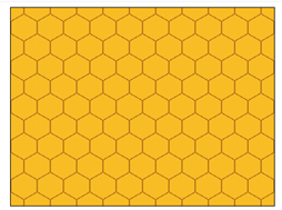
<div class="shape"></div>
<style>
.shape{
	margin: 50px auto;
	width: 400px;
	height: 300px;
	border: 1px solid;
	background:radial-gradient(circle farthest-side at 0% 50%, #fb1 23.5%,rgba(240,166,17,0) 0) 21px 30px,
		radial-gradient(circle farthest-side at 0% 50%, #B71 24%,rgba(240,166,17,0) 0) 19px 30px,
		linear-gradient(#fb1 14%,rgba(240,166,17,0) 0, rgba(240,166,17,0) 85%,#fb1 0) 0 0,
		linear-gradient(150deg,#fb1 24%,#B71 0,#B71 26%, rgba(240,166,17,0) 0,rgba(240,166,17,0) 74%, #B71 0,#B71 76%,#fb1 0) 0 0,
		linear-gradient(30deg,#fb1 24%,#B71 0,#B71 26%, rgba(240,166,17,0) 0,rgba(240,166,17,0) 74%, #B71 0,#B71 76%,#fb1 0) 0 0,
		linear-gradient(90deg,#B71 2%,#fb1 0,#fb1 98%,#B71 0%) 0 0 #fb1;
     background-size:40px 60px;
}
</style>
Application of radial gradient in animation
(1) Diffusion of dots.
<div class="shape"></div>
<style>
.shape{
     margin: 50px auto;
     width:400px;
     height: 400px;
     border: 1px solid;
     background: radial-gradient(circle, #f00, #f00 6px, transparent 7px);
     background-size: 200px 200px;
     animation: anim 8s linear infinite alternate;
}
@keyframes anim{
    0%   {  background-size:400px 400px; }
    25%  {  background-size:200px 200px; }
    50%  {  background-size:100px 100px;   }
    75%  {  background-size:50px 50px; }
    100% {  background-size:25px 25px; }
}
</style>
(2) Loading animation.
<div class="shape"></div>
<style>
.shape{
    margin: 0 auto;
    width: 300px;
    height:300px;
    position: relative;
    display: grid;
    overflow: hidden;
    background:#d8d8d8;
    border: 4px solid rgba(255, 0, 0, 0.9);
    border-radius: 10%;
}
.shape::before, .shape::after {
    padding: 100px;
    place-self: center;
    grid-column: 1;
    grid-row: 1;
    --stops: #fff 15px, transparent 16px;
    background: radial-gradient(circle at 16px, var(--stops)),
                radial-gradient(circle at 50% 16px, var(--stops)),
                radial-gradient(circle at calc(100% - 16px), var(--stops)),
                radial-gradient(circle at 50% calc(100% - 16px), var(--stops));
    animation: rotate 1s ease-in-out infinite;
    content: "";
}
.shape::before {
     animation-name: move;
}
@keyframes rotate {
      33.33% { transform: rotate(0deg); }
      66.67%, 100% { transform: rotate(90deg); }
}
 @keyframes move {
     33.33%, 66.67% { padding: 16px;}
}
</style>
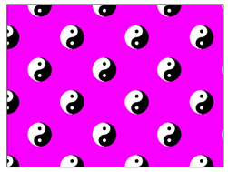
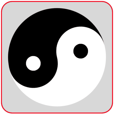
(3) Rotating Tai Chi diagram
<div class="container">
	<div class="shape"></div>
</div>
<style>
.container{
    margin: 0 auto;
    width: 450px;
    height:450px;
    display:flex;
    justify-content:center;
    align-items:center;
    background:#d8d8d8;
    border: 4px solid rgba(255, 0, 0, 0.9);
    border-radius: 10%;
}
.shape{
    position: relative;
    width: 400px;
    height: 400px;
    border-radius: 50%;
    background-image: linear-gradient(90deg,#fff 50%,#000 50%);
    animation:rotate 2s linear infinite;
}
.shape::before,.shape::after{
    content: '';
    width: 200px;
    height: 200px;
    border-radius: 50%;
    position: absolute;
    left: 25%;
}
.shape::before {
    background-image:radial-gradient(60px at center center ,#fff 50% ,#000 50%);
}
.shape::after {
    bottom: 0px;
    background-image:radial-gradient(60px at center center ,#000 50% ,#fff 50%);
}
@keyframes rotate {
    0%   { transform: rotate(0deg); }
    100% { transform:rotate(-360deg); }
}
</style>
Reprinted from https://www.cnblogs.com/cs-whut/p/13575125.html