catalogue
1.1 streaming layout (percentage layout)
1.2 home page case of JD mobile terminal
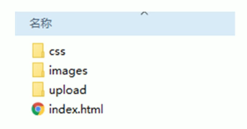
2. Build relevant folder structure
3. Set viewport labels and introduce initialization styles
4. Common initialization styles
6. Double sprite drawing method
1.1 streaming layout (percentage layout)
-
Streaming layout is percentage layout, also known as non fixed pixel layout
-
The width of the box is set as a percentage to scale according to the width of the screen, which is not limited by fixed pixels, and the content is filled on both sides
-
Streaming layout is a common layout used in mobile web development
-
Max width (max height)
-
Min width min height
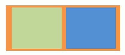
   <style>
      * {
        margin: 0;
        padding: 0;
      }
      section {
        width: 100%;
        max-width: 980px;
        min-width: 320px;
        margin: 0 auto;
      }
      section div {
        box-sizing: border-box;
        float: left;
        width: 50%;
        height: 400px;
      }
      div:nth-child(1) {
        background-color: yellow;
      }
      div:nth-child(2) {
        background-color: orange;
      }
    </style>
<body>
<section>
<div></div>
<div></div>
</section>
</body>1.2 home page case of JD mobile terminal
1. Technical selection
Scheme: we adopt the scheme of making mobile pages separately
Technology: flow layout is adopted
2. Build relevant folder structure
3. Set viewport labels and introduce initialization styles
    <meta name="viewport" content="width=device-width, initial-scale=1.0,user-scalable=no,maximum-scale=1.0,minimum-scale=1.0"/>
    <!-- introduce css Initialization file -->
    <link rel="stylesheet" href="css/normalize.css" />
    <!-- Introduction home page css file -->
    <link rel="stylesheet" href="css/index.css" />
4. Common initialization styles
body {
  width: 100%;
  min-width: 320px;
  max-width: 1080px;
  margin: 0 auto;
  background: #fff;
  font-size: 14px;
  font-family: -apple-system, Helvetica, sans-serif;
  line-height: 1.5;
  color: #666;
}
5. Problems encountered
1. Line height is set: the picture is not vertically centered?
Reason: the picture is aligned with the text baseline by default.
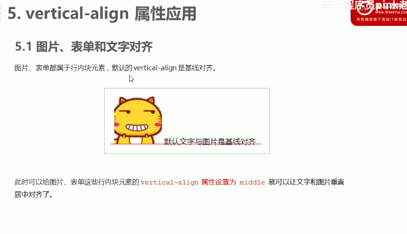
Solution: set vertical align: middle to center the picture and text. Alternatively, by locating top: 50%, translateY (- 50%) is also feasible, but text align is invalid. You can use margin to center the picture horizontally
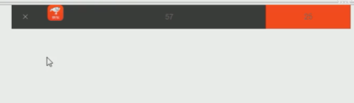
2. The search box can change automatically when the width changes
Solution: first fix the position of the boxes on both sides with positioning, and then specify 100% of the height and width of the search box. At this time, add left and right margin to the search box, and the value is the width of the two positioning boxes. In this way, when the page size changes, because it is a css3 box, the 100% width of the middle search box box changes, and the left and right boxes and margin values remain unchanged, so as to realize the automatic change of the search box
.search-wrap {
  position:relative;
  height: 44px;
}
.search-bth {
  position: absolute;
  top: 0;
  left: 0;
  width: 40px;
  height: 44px;
}
.search-login {
  position: absolute;
  right: 0;
  top: 0;
  width: 40px;
  height: 44px;
}
.search {
  height: 44px;
  margin: 0 40px;
}
<div class="search-wrap">
<div class="search-bth"></div>
<div class="search"></div>
<div class="search-login"></div>
</div>3. The picture is aligned with the baseline by default, and there will be a gap at the bottom
Solution: add vertical align: middle to center the picture and text, so that there will be no space for the text
6. Double sprite drawing method
-
Zoom the sprite image to half the original scale in ps (ctrl+alt+i open the image size setting)
-
Then measure the coordinates according to the reduced size, which is background position
-
Note that the background size in the code should also be written: half the width of the original sprite diagram
.sou {
  position: absolute;
  top: 8px;
  left: 50px;
  width: 18px;
  height: 15px;
  background: url(../images/jd-sprites.png) no-repeat -81px 0;
    /*The sprite is reduced to half*/
  background-size: 200px auto;
}
7. Picture format