Making Simple CSS Fence Layout
As we all know, Bootstrap has built-in a responsive, mobile device-preferred streaming grid system, which automatically changes the layout with the change of the display screen or viewport.
The author has used bootstrap framework in the past, which is the most impressive and frequently used fence layout. But it is obviously very unwise to introduce a framework just to use this fence layout, so a simple fence layout is made according to bootstrap framework.
Composition of the fence system: 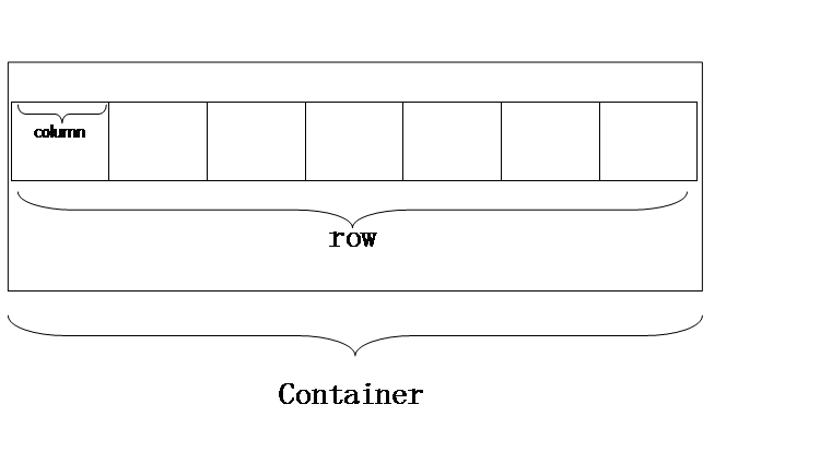
- Container container wrapping fence
- Row row
-
Column column
First, the fence system requires a total container so that column (column) can be set to width and height by percentage.
.container{
    width:100%;
    max-width:1366px;
    padding:0 15px;
}
A left-right padding is added to the container to prevent content from touching the edge of the browser.
Next is row.
row elements are used to prevent columns from overflowing to other rows. The next column will use floating layout, so float clearly in rows. Here, we add clear:both in pseudo-classes.
.row:before ,
.row:after {
    content:" ";
    display: table;
    clear:both;
}
.row {
    margin:0 -15px;
}
Add margin-left:-15px and margin-right:-15px to row (line) to offset padding in container, so that background, border and other attributes can be covered to the browser edge.
Finally, column
Let's first set the most basic style for columns.
[class*='col-'] {
    position: relative;
    float: left;
    min-height: 1px;
    padding:0 15px;
}
Here we divide a row into twelve columns, and by simple calculation we can get the width of each row:
.col-12 {
  width: 100%;
}
.col-11 {
  width: 91.66666667%;
}
.col-10 {
  width: 83.33333333%;
}
.col-9 {
  width: 75%;
}
.col-8 {
  width: 66.66666667%;
}
.col-7 {
  width: 58.33333333%;
}
.col-6 {
  width: 50%;
}
.col-5 {
  width: 41.66666667%;
}
.col-4 {
  width: 33.33333333%;
}
.col-3 {
  width: 25%;
}
.col-2 {
  width: 16.66666667%;
}
.col-1 {
  width: 8.33333333%;
}
Because the width unit of column is response type, we have left and right padding, so in order to prevent complex calculation, we set all elements in container: box-sizing: border-box;
.container*{
    box-sizing: border-box;
}
In this way, we can avoid adding and subtracting again and again, and avoid the problem of changing lines because of too large width.
Setting offsets for columns
.col-offset-12 {
  margin-left: 100%;
}
.col-offset-11 {
  margin-left: 91.66666667%;
}
.col-offset-10 {
  margin-left: 83.33333333%;
}
.col-offset-9 {
  margin-left: 75%;
}
.col-offset-8 {
  margin-left: 66.66666667%;
}
.col-offset-7 {
  margin-left: 58.33333333%;
}
.col-offset-6 {
  margin-left: 50%;
}
.col-offset-5 {
  margin-left: 41.66666667%;
}
.col-offset-4 {
  margin-left: 33.33333333%;
}
.col-offset-3 {
  margin-left: 25%;
}
.col-offset-2 {
  margin-left: 16.66666667%;
}
.col-offset-1 {
  margin-left: 8.33333333%;
}
In this way, a fence system is completed! You can write a simple sample for testing.
<!DOCTYPE html>
<html lang="en">
    <head>
        <meta charset="utf-8">
    </head>
    <body>
        <div class="container">
            <div class="row">
                <div class="col-12">45254</div>
            </div>
            <div class="row">
                <div class="col-6">1</div>
                <div class="col-4 col-offset-1">1</div>
            </div>
        </div>
    </body>
</html>
Finally, set up a responsive layout for the fence system
Responsive layout uses HTML5 media query to query screen width, and then to modify CSS.
Here, when our screen width is less than 960px, we use double column width, that is, two columns change into one column:
@media all and (max-width:960px){
    .col-12 {
  width: 100%;
}
.col-11 {
  width: 100%;
}
.col-10 {
  width: 100%;
}
.col-9 {
  width: 100%;
}
.col-8 {
  width: 100%;
}
.col-7 {
  width: 100%;
}
.col-6 {
  width: 100%;
}
.col-5 {
  width: 83.33333333%;
}
.col-4 {
  width: 66.66666667%;
}
.col-3 {
  width: 50%;
}
.col-2 {
  width: 33.33333333%;
}
.col-1 {
  width: 16.66666667%;
}
In this way, a basic fence system is completed, of course, you can also query according to the media, query screen width is less than 640, 320 and so on, these will not repeat the burden.