Project directory and file creation
First of all, we don't need to build the project environment. We still directly use the simplest way, that is, the introduction method, to create the project, which makes it convenient for us to test while writing. Create an empty directory named ColorPicker, create a JS file, color-picker.js, then create an index.html file and a style file, color-picker.css. Now you should see that your project directory is as follows:
ColorPicker
│  index.html
│  color-picker.js
│  color-picker.css
In your index.html, initialize the HTML document structure, and then introduce the color-picker.js file, as shown below:
<!DOCTYPE html>
<html lang="en">
  <head>
    <meta charset="UTF-8" />
    <meta http-equiv="X-UA-Compatible" content="IE=edge" />
    <meta name="viewport" content="width=device-width, initial-scale=1.0" />
    <title>color-picker</title>
    <link rel="stylesheet" href="./color-picker.css" />
  </head>
  <body></body>
  <script src="./color-picker.js"></script>
</html>
After making these preparations, let's move on to the next step.
Structure and layout
Module analysis
We analyze the modules we want to implement through the following figure, as shown in the figure below:
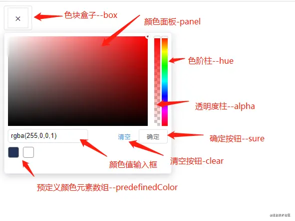
As shown in the figure above, we can split a color selector into multiple modules, so we roughly get a structure as follows:
-
Color block
-
Color panel
-
Hue column
-
Transparency column
-
Input box
-
Clear and OK button
-
Predefined color element list
In this way, we can clearly see which modules the whole color selector has. At present, we only need to consider developing basic module functions, and then start to expand and improve them on the basis of the follow-up. OK, let's move on to the next step and build the basic structure of the page.
Color block module
Through analysis, we should know that the color block is divided into two cases. The first is that when there is a color value, the color block should be a left and right arrow with the background color as the color value. As shown in the figure below:

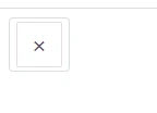
Without color value, our color block should be as shown in the figure below:
In this way, we have determined the structural elements of the color block, as follows:
<div class="ew-color-picker-box"> <!-- There are color values,We don't use any icons here css To implement one that looks like a drop-down arrow --> <div class="ew-color-picker-arrow"> <div class="ew-color-picker-arrow-left"> <div class="ew-color-picker-arrow-right"></div> <!-- No color value --> <div class="ew-color-picker-no">×</div> </div> </div> </div>
Here we must use a color value to determine which structure to use. We'll talk about it later. Let's first determine that the element structure of the color block should be as follows. Of course, the class name here can also be customized by yourself.
tips: I'm here to have my own characteristics, so I added ew prefix name. If you use your own custom class name, you need to pay attention to changing it when writing styles and manipulating DOM elements.
Also note & times; It is an HTML character entity. We only need to know that it will eventually be displayed as X. we won't talk about it in detail here. To learn more about html character entities, you can go to HTML character entities
see.
Next, let's finish the style writing of the color block. Let's finish the outermost box element first. You can see that the outermost layer will have a custom width and height, and then a border. There is nothing else. In this way, we know what kind of CSS code to write. Here we still use the style written by ourselves. Let's make a record:
-
The border color of the color block box is #dcdee2
-
The font color of the color block box is #5353
-
The color block box has 4px rounded corners
-
The color block box has an upper and lower inner spacing of 4px and a left and right inner spacing of 7px
-
The color block box has a font size of 14px
-
The color block box has a row height of 1.5. Note that there is no unit
Tips: 1.5x line height is a relative value, which is determined according to the font size set by the browser. For example, if the browser font size is 16px, then 1.5x line height is the line height of 16px * 1.5 = 24px
Seeing the above requirements, we should know which CSS attribute we want to implement, and have a clear understanding in our mind.
.ew-color-picker-box {
  /* The border color is #dcdee2  */
  border: 1px solid #dcdee2;
  /* The border has 4px rounded corners  */
  border-radius: 4px;
  /* 4px Upper and lower inner spacing of, 7px left and right inner spacing  */
  padding: 4px 7px;
}
We have finished writing the style of the outermost box element. Next, we start writing a style when there is no color value. In fact, it is similar to the style of the outermost color block box. The only thing to note is that we will set its width, height and row height through js later. Because it changes dynamically, but here we can fix a value first and then change it later.
.ew-color-picker-box > .ew-color-box-no {
  width: 40px;
  height: 40px;
  font-size: 20px;
  line-height: 40px;
  color: #5e535f;
  border: 1px solid #e2dfe2;
  border-radius: 2px;
}
The next step is to implement the style with color value. This is a little difficult. The difficulty lies in how to implement a down arrow like a drop-down box arrow. By analyzing the page structure elements, it is not difficult to see that in fact, the down arrow here is obviously pieced together by two elements, that is, one element is just a horizontal line rotated by 45deg. Similarly, the other element rotates in the opposite direction. And we can see that the two horizontal lines are vertically and horizontally centered. Here, we must soon think of the elastic box layout. We only need two attributes to make the elements vertically and horizontally centered. Just content: Center and align items: Center. Therefore, after such an analysis, our implementation here is not difficult.
2D coordinate system
3D coordinate system
As follows:
.ew-color-picker-box-arrow {
  display: flex;
  justify-content: center;
  align-items: center;
  width: 40px;
  height: 40px;
  margin: auto;
  z-index: 3;
}
.ew-color-picker-box-arrow-left {
  width: 12px;
  height: 1px;
  display: inline-block;
  background-color: #fff;
  position: relative;
  transform: rotate(45deg);
}
.ew-color-picker-box-arrow-right {
  width: 12px;
  height: 1px;
  display: inline-block;
  background-color: #fff;
  position: relative;
  transform: rotate(-45deg);
  right: 3px;
}
In this way, we have completed the page structure and style of the color block module. Let's continue.
Color panel
The color panel is also the most difficult part of the whole color selector. Now let's analyze the structure. First, we can see that it has a container element, which has a little shadow effect, and the background color is white. A knowledge point to know here is the box model, that is, the box sizing attribute, which has two attribute values: content box and border box. In fact, in the actual development, we use the border box most. Let's look at the document box sizing.
Through the document description, we know the meaning of this attribute. Then we need to pay attention to the box model of the color panel container element. Here, it is a standard box model, that is, we only include the width and height of the content separately. Therefore, we summarize as follows:
-
1px solid border #ebeeff
-
The box model is a standard box model
-
Shadow effect document
-
Inner margin of 7px
-
5px fillet
tips: let's leave a suspense here. Why use the standard box model.
At this point, our container element analysis is completed, and then we begin to write the structure and style.
<div class="ew-color-picker">
  <!-- Of course, the structure inside will be analyzed later -->
</div>

.ew-color-picker {
  min-width: 320px;
  box-sizing: content-box;
  border: 1px solid #ebeeff;
  box-shadow: 0 4px 15px rgba(0, 0, 0, 0.2);
  border-radius: 5px;
  z-index: 10;
  padding: 7px;
  text-align: left;
}
Now let's determine which elements are included in the container elements. The first is a color panel, which contains a container element. We can see that the color panel is very similar to the effect of the superposition of three background colors. There is no doubt. Boldly, yes, yes, it is the superposition of three background colors, so we need a container element, Then, the container element contains two panel elements. The background color of the container element plus two panel elements is superimposed. A white background and a black background can be superimposed to see the effect we want.
For example, let's take a look at an example:
<div class="panel">
  <div class="white-panel"></div>
  <div class="black-panel"></div>
</div>

.panel {
  width: 280px;
  height: 180px;
  position: relative;
  border: 1px solid #fff;
  background-color: rgb(255, 166, 0);
}
.panel > div.white-panel,
.panel > div.black-panel {
  position: absolute;
  left: 0;
  right: 0;
  top: 0;
  bottom: 0;
}
.white-panel {
  background: linear-gradient(90deg, #fff, rgba(255, 255, 255, 0));
}
.black-panel {
  background: linear-gradient(0deg, #000, transparent);
}
There may be another knowledge point involved here, that is, gradient color. I won't talk about it in detail here. You can view the documents you are interested in.
Therefore, our structure should be as follows:
<div class="ew-color-picker-content">
  <div class="ew-color-picker-panel">
    <div class="ew-color-picker-white-panel"></div>
    <div class="ew-color-picker-black-panel"></div>
  </div>
</div>
According to the previous example, we will be able to write this color panel soon, but we are missing one, that is, the drag element in the color panel area, or we can call it the cursor element.
.ew-color-picker-panel {
  width: 280px;
  height: 180px;
  position: relative;
  border: 1px solid #fff;
  background-color: rgb(255, 166, 0);
  cursor: pointer;
}
.ew-color-picker-panel > div.ew-color-picker-white-panel,
.ew-color-picker-panel > div.ew-color-picker-black-panel {
  position: absolute;
  left: 0;
  right: 0;
  top: 0;
  bottom: 0;
}
.ew-color-picker-white-panel {
  background: linear-gradient(90deg, #fff, rgba(255, 255, 255, 0));
}
.ew-color-picker-black-panel {
  background: linear-gradient(0deg, #000, transparent);
}
Well, now I can answer the question left before. Why use the standard box model instead of the IE standard box model. This is because here we will dynamically calculate the drag distance of cursor elements through js. If it is the IE standard box model, the size of border and spacing will be considered, which undoubtedly makes it more difficult for us to calculate the drag distance. Therefore, in order to simplify, we use the standard box model.
Now let's add this cursor element again, because it changes dynamically in the color panel. Usually, we want to move an element among the parent elements, so we obviously think that the child elements use absolute positioning, and the parent elements add a positioning other than static positioning. Usually, we use relative positioning, and here is no exception. That is, we add a relative positioning position: relative to. EW color picker panel; The reason for this.
<div class="ew-color-picker-content">
  <div class="ew-color-picker-panel">
    <!-- Some contents are omitted, and the cursor element is added -->
    <div class="ew-color-picker-panel-cursor"></div>
  </div>
</div>
It should be noted here that the width and height set by the cursor element will affect our subsequent calculations. Therefore, the width and height set here should be taken into account in subsequent calculations. This will be discussed in detail later. Now, let's write the style of the element.
.ew-color-picker-panel-cursor {
  width: 4px;
  height: 4px;
  border-radius: 50%;
  position: absolute;
  left: 100%;
  top: 0;
  transform: translate(-4px, -4px);
  box-shadow: 0 0 0 3px #fff, inset 0 0 2px 2px rgb(0 0 0 / 40%),
    /*Equivalent to rgba(0,0,0,0.4)*/ 0 0 2px 3px rgb(0 0 0 / 50%); /*Equivalent to rgba(0,0,0,0.5)*/
  cursor: default;
}
The cursor element looks like a small circle, so we don't give much width and height, only 4px. Since it is a circle, we all know that we can use border radius of 50%, that is, we can turn an element into a circle. Next is the shadow part, which realizes our small circle. Of course, we don't have to achieve this effect, but in order to restore the color selector itself and facilitate subsequent calculation, we still use the original style.
Color scale column
Next, let's look at the implementation of color scale column, that is, tone column. Seeing this figure, we should be able to clearly distinguish that the color scale column contains two parts. The first part is the cylindrical part, called bar, and the second part is the dragging slider part, called thumb. Then we add a container element to contain the color scale column and transparent column, so we can determine the structure of the color scale column as follows:
<!-- Container element -->
<div class="ew-color-slider ew-is-vertical">
  <div class="ew-color-slider-bar">
    <div class="ew-color-slider-thumb"></div>
  </div>
</div>
Then let's determine the implementation of the style. First, the whole color scale column is vertically arranged, so we should know that it has a fixed width, and then the height is equivalent to the rectangle of the color panel. Its background color is realized through a gradient color. In fact, it is a mixture of red, orange, yellow, green, blue and purple, which is similar to a rainbow. Each color has a different proportion. Secondly, we also need to know that the slider part needs to be dragged dynamically. Here, we can imagine that the color scale column can be arranged horizontally or vertically. At present, we first implement the vertical layout (add a class name EW is vertical to the container element in order to distinguish it). Therefore, the dynamic change part of the slider should be the top value. Now let's look at the style:
.ew-color-slider,
.ew-color-slider-bar {
  position: relative;
}
.ew-color-slider.ew-is-vertical {
  width: 28px;
  height: 100%;
  cursor: pointer;
  float: right;
}
.ew-color-slider.ew-is-vertical .ew-color-slider-bar {
  width: 12px;
  height: 100%;
  float: left;
  margin-left: 3px;
  background: linear-gradient(
    180deg,
    #f00 0,
    #ff0 17%,
    #0f0 33%,
    #0ff 50%,
    #00f 67%,
    #f0f 83%,
    #f00
  );
}
.ew-color-slider-thumb {
  background-color: #fff;
  border-radius: 4px;
  position: absolute;
  box-shadow: 0 0 2px rgba(0, 0, 0, 0.5);
  border: 1px solid #dcdee2;
  left: 0;
  top: 0;
  box-sizing: border-box;
  position: absolute;
}
So far, we have implemented the color scale column. Next, let's look at the implementation of the transparency column.
Transparency column
The implementation principle of the transparency column is very similar to that of the color scale column. Firstly, we can see that the transparency column will have a transparent background, which is obviously a picture. Secondly, it will also have a background color bar, depending on the color tone of the color scale column. Then, it also has a slider like the color scale column, as well as a vertical layout and a horizontal layout, Change the top value. So we get the structure as follows:
<div class="ew-alpha-slider-bar">
  <!-- Background map -->
  <div class="ew-alpha-slider-wrapper"></div>
  <!-- Background color -->
  <div class="ew-alpha-slider-bg"></div>
  <!-- Slider element -->
  <div class="ew-alpha-slider-thumb"></div>
</div>
Here, we need to note that the background color of the background color bar changes dynamically, which will be discussed later. We also realize the background color bar through linear gradient. Let's look at the style:
.ew-alpha-slider-bar {
  width: 12px;
  height: 100%;
  float: left;

  position: relative;
}
.ew-alpha-slider-wrapper,
.ew-alpha-slider-bg {
  position: absolute;
  left: 0;
  top: 0;
  bottom: 0;
  right: 0;
}
.ew-alpha-slider-bar.ew-is-vertical .ew-alpha-slider-bg {
  /* Write it here for a while  */
  background: linear-gradient(
    to top,
    rgba(255, 0, 0, 0) 0%,
    rgba(255, 0, 0) 100%
  );
}
.ew-alpha-slider-wrapper {
  background: url("data:image/png;base64,iVBORw0KGgoAAAANSUhEUgAAAAwAAAAMCAIAAADZF8uwAAAAGUlEQVQYV2M4gwH+YwCGIasIUwhT25BVBADtzYNYrHvv4gAAAABJRU5ErkJggg==");
}
.ew-alpha-slider-thumb {
  background-color: #fff;
  border-radius: 4px;
  position: absolute;
  box-shadow: 0 0 2px rgba(0, 0, 0, 0.5);
  border: 1px solid #dcdee2;
  left: 0;
  top: 0;
  box-sizing: border-box;
  position: absolute;
}
Well, so far, our transparency column has been implemented. Next, let's look at the implementation of the input box.
Input boxes and buttons
The input box is relatively simple. I think there is nothing to say. This input box can also be customized. Its structure is nothing more than the following:
<input class="ew-color-input" />
It is lined up with the empty and OK button elements, so we wrap them with a container element. The structure should be as follows:
<div class="ew-color-drop-container">
  <input class="ew-color-input" />
  <div class="ew-color-drop-btn-group">
    <button type="button" class="ew-color-drop-btn ew-color-clear">empty</button>
    <button type="button" class="ew-color-drop-btn ew-color-sure">determine</button>
  </div>
</div>
Then, there is nothing to analyze about styles. They are all basic styles. Let's continue to write code. As follows:
.ew-color-drop-container {
  margin-top: 6px;
  padding-top: 4px;
  min-height: 28px;
  border-top: 1px solid #cdcdcd;
  position: relative;
}
.ew-color-input {
  display: inline-block;
  padding: 8px 12px;
  border: 1px solid #e9ebee;
  border-radius: 4px;
  outline: none;
  width: 160px;
  height: 28px;
  line-height: 28px;
  border: 1px solid #dcdfe6;
  padding: 0 5px;
  -webkit-transition: border-color 0.2s cubic-bezier(0.175, 0.885, 0.32, 1.275);
  transition: border-color 0.2s cubic-bezier(0.175, 0.885, 0.32, 1.275);
  border-radius: 5px;
  background-color: #fff;
}
.ew-color-drop-btn-group {
  position: absolute;
  right: 0;
  top: 5px;
}
.ew-color-drop-btn {
  padding: 5px;
  font-size: 12px;
  border-radius: 3px;
  -webkit-transition: 0.1s;
  transition: 0.1s;
  font-weight: 500;
  margin: 0;
  white-space: nowrap;
  color: #606266;
  border: 1px solid #dcdfe6;
  letter-spacing: 1px;
  text-align: center;
  cursor: pointer;
}
.ew-color-clear {
  color: #4096ef;
  border-color: transparent;
  background-color: transparent;
  padding-left: 0;
  padding-right: 0;
}
.ew-color-clear:hover {
  color: #66b1ff;
}
.ew-color-sure {
  margin-left: 10px;
}
.ew-color-sure {
  border-color: #4096ef;
  color: #4096ef;
}
We have completed the input box and button. Next, let's look at the predefined color elements.
Predefined colors
Predefined color elements are also relatively simple to implement, that is, a container element and then contains multiple child elements. What may be a little more difficult is the style of child elements. We can divide them into four cases. The first is the default style and the second is the style that prohibits clicking. In addition, we also add a difference between color transparency, Then finally, select the style. Not to mention, we can write four sub elements to represent the styles of the four cases. As follows:
<div class="ew-pre-define-color-container">
  <div class="ew-pre-define-color" tabindex="0"></div>
  <div class="ew-pre-define-color ew-has-alpha" tabindex="1"></div>
  <div
    class="ew-pre-define-color ew-pre-define-color-disabled"
    tabindex="2"
  ></div>
  <div
    class="ew-pre-define-color ew-pre-define-color-active"
    tabindex="3"
  ></div>
</div>
Next, let's look at the implementation of the style:
.ew-pre-define-color-container {
  width: 280px;
  font-size: 12px;
  margin-top: 8px;
}
.ew-pre-define-color-container::after {
  content: "";
  display: table;
  height: 0;
  visibility: hidden;
  clear: both;
}
.ew-pre-define-color-container .ew-pre-define-color {
  margin: 0 0 8px 8px;
  width: 20px;
  height: 20px;
  border-radius: 4px;
  border: 1px solid #9b979b;
  cursor: pointer;
  float: left;
}
.ew-pre-define-color-container .ew-pre-define-color:hover {
  opacity: 0.8;
}
.ew-pre-define-color-active {
  box-shadow: 0 0 3px 2px #409eff;
}
.ew-pre-define-color:nth-child(10n + 1) {
  margin-left: 0;
}
.ew-pre-define-color.ew-has-alpha {
  background: url("data:image/png;base64,iVBORw0KGgoAAAANSUhEUgAAAAwAAAAMCAIAAADZF8uwAAAAGUlEQVQYV2M4gwH+YwCGIasIUwhT25BVBADtzYNYrHvv4gAAAABJRU5ErkJggg==");
}
.ew-pre-define-color.ew-pre-define-color-disabled {
  cursor: not-allowed;
}
This concludes the style and layout. The next step is our focus, that is, to realize the function of color selector.
JavaScript
Tool method
First, use an empty object to manage tool methods. As follows:
const util = Object.create(null);
Then there are the following methods:
const util = Object.create(null);
const _toString = Object.prototype.toString;
let addMethod = (instance, method, func) => {
  instance.prototype[method] = func;
  return instance;
};
["Number", "String", "Function", "Undefined", "Boolean"].forEach(
  (type) => (util["is" + type] = (value) => typeof value === type.toLowerCase())
);
util.addMethod = addMethod;
["Object", "Array", "RegExp"].forEach(
  (type) =>
    (util["isDeep" + type] = (value) =>
      _toString.call(value).slice(8, -1).toLowerCase() === type.toLowerCase())
);
util.isShallowObject = (value) =>
  typeof value === "object" && !util.isNull(value);
util["ewObjToArray"] = (value) =>
  util.isShallowObject(value) ? Array.prototype.slice.call(value) : value;
util.isNull = (value) => value === null;
util.ewAssign = function (target) {
  if (util.isNull(target)) return;
  const _ = Object(target);
  for (let j = 1, len = arguments.length; j < len; j += 1) {
    const source = arguments[j];
    if (source) {
      for (let key in source) {
        if (Object.prototype.hasOwnProperty.call(source, key)) {
          _[key] = source[key];
        }
      }
    }
  }
  return _;
};
util.addClass = (el, className) => el.classList.add(className);
util.removeClass = (el, className) => el.classList.remove(className);
util.hasClass = (el, className) => {
  let _hasClass = (value) =>
    new RegExp(" " + el.className + " ").test(" " + value + " ");
  if (util.isDeepArray(className)) {
    return className.some((name) => _hasClass(name));
  } else {
    return _hasClass(className);
  }
};
util["setCss"] = (el, prop, value) => el.style.setProperty(prop, value);
util.setSomeCss = (el, propValue = []) => {
  if (propValue.length) {
    propValue.forEach((p) => util.setCss(el, p.prop, p.value));
  }
};
util.isDom = (el) =>
  util.isShallowObject(HTMLElement)
    ? el instanceof HTMLElement
    : (el &&
        util.isShallowObject(el) &&
        el.nodeType === 1 &&
        util.isString(el.nodeName)) ||
      el instanceof HTMLCollection ||
      el instanceof NodeList;
util.ewError = (value) =>
  console.error("[ewColorPicker warn]\n" + new Error(value));
util.ewWarn = (value) => console.warn("[ewColorPicker warn]\n" + value);
util.deepCloneObjByJSON = (obj) => JSON.parse(JSON.stringify(obj));
util.deepCloneObjByRecursion = function f(obj) {
  if (!util.isShallowObject(obj)) return;
  let cloneObj = util.isDeepArray(obj) ? [] : {};
  for (let k in obj) {
    cloneObj[k] = util.isShallowObject(obj[k]) ? f(obj[k]) : obj[k];
  }
  return cloneObj;
};
util.getCss = (el, prop) => window.getComputedStyle(el, null)[prop];
util.$ = (ident) => {
  if (!ident) return null;
  return document[
    ident.indexOf("#") > -1 ? "querySelector" : "querySelectorAll"
  ](ident);
};
util["on"] = (element, type, handler, useCapture = false) => {
  if (element && type && handler) {
    element.addEventListener(type, handler, useCapture);
  }
};
util["off"] = (element, type, handler, useCapture = false) => {
  if (element && type && handler) {
    element.removeEventListener(type, handler, useCapture);
  }
};
util["getRect"] = (el) => el.getBoundingClientRect();
util["baseClickOutSide"] = (element, isUnbind = true, callback) => {
  const mouseHandler = (event) => {
    const rect = util.getRect(element);
    const target = event.target;
    if (!target) return;
    const targetRect = util.getRect(target);
    if (
      targetRect.x >= rect.x &&
      targetRect.y >= rect.y &&
      targetRect.width <= rect.width &&
      targetRect.height <= rect.height
    )
      return;
    if (util.isFunction(callback)) callback();
    if (isUnbind) {
      //  Delayed unbinding
      setTimeout(() => {
        util.off(document, util.eventType[0], mouseHandler);
      }, 0);
    }
  };
  util.on(document, util.eventType[0], mouseHandler);
};
util["clickOutSide"] = (context, config, callback) => {
  const mouseHandler = (event) => {
    const rect = util.getRect(context.$Dom.picker);
    let boxRect = null;
    if (config.hasBox) {
      boxRect = util.getRect(context.$Dom.box);
    }
    const target = event.target;
    if (!target) return;
    const targetRect = util.getRect(target);
    //  Use rect to judge whether the place the user clicks is within the color selector panel area
    if (config.hasBox) {
      if (
        targetRect.x >= rect.x &&
        targetRect.y >= rect.y &&
        targetRect.width <= rect.width
      )
        return;
      //  If you click on a box element
      if (
        targetRect.x >= boxRect.x &&
        targetRect.y >= boxRect.y &&
        targetRect.width <= boxRect.width &&
        targetRect.height <= boxRect.height
      )
        return;
      callback();
    } else {
      if (
        targetRect.x >= rect.x &&
        targetRect.y >= rect.y &&
        targetRect.width <= rect.width &&
        targetRect.height <= rect.height
      )
        return;
      callback();
    }
    setTimeout(() => {
      util.off(document, util.eventType[0], mouseHandler);
    }, 0);
  };
  util.on(document, util.eventType[0], mouseHandler);
};
util["createUUID"] = () =>
  (Math.random() * 10000000).toString(16).substr(0, 4) +
  "-" +
  new Date().getTime() +
  "-" +
  Math.random().toString().substr(2, 5);
util.removeAllSpace = (value) => value.replace(/\s+/g, "");
util.isJQDom = (dom) =>
  typeof window.jQuery !== "undefined" && dom instanceof jQuery;
//the event
util.eventType = navigator.userAgent.match(/(iPhone|iPod|Android|ios)/i)
  ? ["touchstart", "touchmove", "touchend"]
  : ["mousedown", "mousemove", "mouseup"];
Encapsulation of animation functions
const animation = {};
function TimerManager() {
  this.timers = [];
  this.args = [];
  this.isTimerRun = false;
}
TimerManager.makeTimerManage = function (element) {
  const elementTimerManage = element.TimerManage;
  if (!elementTimerManage || elementTimerManage.constructor !== TimerManager) {
    element.TimerManage = new TimerManager();
  }
};
const methods = [
  {
    method: "add",
    func: function (timer, args) {
      this.timers.push(timer);
      this.args.push(args);
      this.timerRun();
    },
  },
  {
    method: "timerRun",
    func: function () {
      if (!this.isTimerRun) {
        let timer = this.timers.shift(),
          args = this.args.shift();
        if (timer && args) {
          this.isTimerRun = true;
          timer(args[0], args[1]);
        }
      }
    },
  },
  {
    method: "next",
    func: function () {
      this.isTimerRun = false;
      this.timerRun();
    },
  },
];
methods.forEach((method) =>
  util.addMethod(TimerManager, method.method, method.func)
);
function runNext(element) {
  const elementTimerManage = element.TimerManage;
  if (elementTimerManage && elementTimerManage.constructor === TimerManager) {
    elementTimerManage.next();
  }
}
function registerMethods(type, element, time) {
  let transition = "";
  if (type.indexOf("slide") > -1) {
    transition = "height" + time + " ms";
    util.setCss(element, "overflow", "hidden");
    upAndDown();
  } else {
    transition = "opacity" + time + " ms";
    inAndOut();
  }
  util.setCss(element, "transition", transition);
  function upAndDown() {
    const isDown = type.toLowerCase().indexOf("down") > -1;
    if (isDown) util.setCss(element, "display", "block");
    const getPropValue = function (item, prop) {
      let v = util.getCss(item, prop);
      return util.removeAllSpace(v).length ? parseInt(v) : Number(v);
    };
    const elementChildHeight = [].reduce.call(
      element.children,
      (res, item) => {
        res +=
          item.offsetHeight +
          getPropValue(item, "margin-top") +
          getPropValue(item, "margin-bottom");
        return res;
      },
      0
    );
    let totalHeight = Math.max(element.offsetHeight, elementChildHeight + 10);
    let currentHeight = isDown ? 0 : totalHeight;
    let unit = totalHeight / (time / 10);
    if (isDown) util.setCss(element, "height", "0px");
    let timer = setInterval(() => {
      currentHeight = isDown ? currentHeight + unit : currentHeight - unit;
      util.setCss(element, "height", currentHeight + "px");
      if (currentHeight >= totalHeight || currentHeight <= 0) {
        clearInterval(timer);
        util.setCss(element, "height", totalHeight + "px");
        runNext(element);
      }
      if (!isDown && currentHeight <= 0) {
        util.setCss(element, "display", "none");
        util.setCss(element, "height", "0");
      }
    }, 10);
  }
  function inAndOut() {
    const isIn = type.toLowerCase().indexOf("in") > -1;
    let timer = null;
    let unit = (1 * 100) / (time / 10);
    let curAlpha = isIn ? 0 : 100;
    util.setSomeCss(element, [
      {
        prop: "display",
        value: isIn ? "none" : "block",
      },
      {
        prop: "opacity",
        value: isIn ? 0 : 1,
      },
    ]);
    let handleFade = function () {
      curAlpha = isIn ? curAlpha + unit : curAlpha - unit;
      if (element.style.display === "none" && isIn)
        util.setCss(element, "display", "block");
      util.setCss(element, "opacity", (curAlpha / 100).toFixed(2));
      if (curAlpha >= 100 || curAlpha <= 0) {
        if (timer) clearTimeout(timer);
        runNext(element);
        if (curAlpha <= 0) util.setCss(element, "display", "none");
        util.setCss(element, "opacity", curAlpha >= 100 ? 1 : 0);
      } else {
        timer = setTimeout(handleFade, 10);
      }
    };
    handleFade();
  }
}
["slideUp", "slideDown", "fadeIn", "fadeOut"].forEach((method) => {
  animation[method] = function (element) {
    TimerManager.makeTimerManage(element);
    element.TimerManage.add(function (element, time) {
      return registerMethods(method, element, time);
    }, arguments);
  };
});
Algorithms for some color operations
const colorRegExp = /^#([0-9a-fA-f]{3}|[0-9a-fA-f]{6})$/;
// RGB color
const colorRegRGB =
  /[rR][gG][Bb][Aa]?[(]([\s]*(2[0-4][0-9]|25[0-5]|[01]?[0-9][0-9]?),){2}[\s]*(2[0-4][0-9]|25[0-5]|[01]?[0-9][0-9]?),?[\s]*(0.\d{1,2}|1|0)?[)]{1}/g;
// RGBA color
const colorRegRGBA =
  /^[rR][gG][Bb][Aa][(]([\s]*(2[0-4][0-9]|25[0-5]|[01]?[0-9][0-9]?)[\s]*,){3}[\s]*(1|1.0|0|0?.[0-9]{1,2})[\s]*[)]{1}$/;
// hsl color
const colorRegHSL =
  /^[hH][Ss][Ll][(]([\s]*(2[0-9][0-9]|360|3[0-5][0-9]|[01]?[0-9][0-9]?)[\s]*,)([\s]*((100|[0-9][0-9]?)%|0)[\s]*,)([\s]*((100|[0-9][0-9]?)%|0)[\s]*)[)]$/;
// HSLA color
const colorRegHSLA =
  /^[hH][Ss][Ll][Aa][(]([\s]*(2[0-9][0-9]|360|3[0-5][0-9]|[01]?[0-9][0-9]?)[\s]*,)([\s]*((100|[0-9][0-9]?)%|0)[\s]*,){2}([\s]*(1|1.0|0|0?.[0-9]{1,2})[\s]*)[)]$/;
/**
 * hex to rgba
 * @param {*} hex
 * @param {*} alpha
 */
function colorHexToRgba(hex, alpha) {
  let a = alpha || 1,


    hColor = hex.toLowerCase(),
    hLen = hex.length,
    rgbaColor = [];
  if (hex && colorRegExp.test(hColor)) {
    //the hex length may be 4 or 7,contained the symbol of #
    if (hLen === 4) {
      let hSixColor = "#";
      for (let i = 1; i < hLen; i++) {
        let sColor = hColor.slice(i, i + 1);
        hSixColor += sColor.concat(sColor);
      }
      hColor = hSixColor;
    }
    for (let j = 1, len = hColor.length; j < len; j += 2) {
      rgbaColor.push(parseInt("0X" + hColor.slice(j, j + 2), 16));
    }
    return util.removeAllSpace("rgba(" + rgbaColor.join(",") + "," + a + ")");
  } else {
    return util.removeAllSpace(hColor);
  }
}
/**
 * rgba to hex
 * @param {*} rgba
 */
function colorRgbaToHex(rgba) {
  const hexObject = { 10: "A", 11: "B", 12: "C", 13: "D", 14: "E", 15: "F" },
    hexColor = function (value) {
      value = Math.min(Math.round(value), 255);
      const high = Math.floor(value / 16),
        low = value % 16;
      return "" + (hexObject[high] || high) + (hexObject[low] || low);
    };
  const value = "#";
  if (/rgba?/.test(rgba)) {
    let values = rgba
        .replace(/rgba?(/, "")
        .replace(/)/, "")
        .replace(/[\s+]/g, "")
        .split(","),
      color = "";
    values.map((value, index) => {
      if (index <= 2) {
        color += hexColor(value);
      }
    });
    return util.removeAllSpace(value + color);
  }
}
/**
 * hsva to rgba
 * @param {*} hsva
 * @param {*} alpha
 */
function colorHsvaToRgba(hsva, alpha) {
  let r,
    g,
    b,
    a = hsva.a; //rgba(r,g,b,a)
  let h = hsva.h,
    s = (hsva.s * 255) / 100,
    v = (hsva.v * 255) / 100; //hsv(h,s,v)
  if (s === 0) {
    r = g = b = v;
  } else {
    let t = v,
      p = ((255 - s) * v) / 255,
      q = ((t - p) * (h % 60)) / 60;
    if (h === 360) {
      r = t;
      g = b = 0;
    } else if (h < 60) {
      r = t;
      g = p + q;
      b = p;
    } else if (h < 120) {
      r = t - q;
      g = t;
      b = p;
    } else if (h < 180) {
      r = p;
      g = t;
      b = p + q;
    } else if (h < 240) {
      r = p;
      g = t - q;
      b = t;
    } else if (h < 300) {
      r = p + q;
      g = p;
      b = t;
    } else if (h < 360) {
      r = t;
      g = p;
      b = t - q;
    } else {
      r = g = b = 0;
    }
  }
  if (alpha >= 0 || alpha <= 1) a = alpha;
  return util.removeAllSpace(
    "rgba(" +
      Math.ceil(r) +
      "," +
      Math.ceil(g) +
      "," +
      Math.ceil(b) +
      "," +
      a +
      ")"
  );
}
/**
 * hsla to rgba
 * Conversion formula: https://zh.wikipedia.org/wiki/HSL%E5%92%8CHSV%E8%89%B2%E5%BD%A9%E7%A9%BA%E9%97%B4#%E4%BB%8EHSL%E5%88%B0RGB%E7%9A%84%E8%BD%AC%E6%8D%A2
 * @param {*} hsla
 */
function colorHslaToRgba(hsla) {
  let h = hsla.h,
    s = hsla.s / 100,
    l = hsla.l / 100,
    a = hsla.a;
  let r, g, b;
  if (s === 0) {
    r = g = b = l;
  } else {
    let compareRGB = (p, q, t) => {
      if (t > 1) t = t - 1;
      if (t < 0) t = t + 1;
      if (t < 1 / 6) return p + (q - p) * 6 * t;
      if (t < 1 / 2) return q;
      if (t < 2 / 3) return p + (q - p) * 6 * (2 / 3 - t);
      return p;
    };
    let q = l >= 0.5 ? l + s - l * s : l * (1 + s),
      p = 2 * l - q,
      k = h / 360;
    r = compareRGB(p, q, k + 1 / 3);
    g = compareRGB(p, q, k);
    b = compareRGB(p, q, k - 1 / 3);
  }
  return util.removeAllSpace(
    `rgba(${Math.ceil(r * 255)},${Math.ceil(g * 255)},${Math.ceil(
      b * 255
    )},${a})`
  );
}
/**
 * rgba to hsla
 * Conversion formula: https://zh.wikipedia.org/wiki/HSL%E5%92%8CHSV%E8%89%B2%E5%BD%A9%E7%A9%BA%E9%97%B4#%E4%BB%8EHSL%E5%88%B0RGB%E7%9A%84%E8%BD%AC%E6%8D%A2
 * @param {*} rgba
 */
function colorRgbaToHsla(rgba) {
  const rgbaArr = rgba
    .slice(rgba.indexOf("(") + 1, rgba.lastIndexOf(")"))
    .split(",");
  let a = rgbaArr.length < 4 ? 1 : Number(rgbaArr[3]);
  let r = parseInt(rgbaArr[0]) / 255,
    g = parseInt(rgbaArr[1]) / 255,
    b = parseInt(rgbaArr[2]) / 255;
  let max = Math.max(r, g, b),
    min = Math.min(r, g, b);
  let h,
    s,
    l = (max + min) / 2;

  if (max === min) {
    h = s = 0;
  } else {
    const d = max - min;
    s = l > 0.5 ? d / (2 - max - min) : d / (max + min);
    switch (max) {
      case r:
        h = (g - b) / d + (g >= b ? 0 : 6);
        break;
      case g:
        h = (b - r) / d + 2;
        break;
      case b:
        h = (r - g) / d + 4;
        break;
    }
  }
  return {
    colorStr: util.removeAllSpace(
      "hsla(" +
        Math.ceil(h * 60) +
        "," +
        Math.ceil(s * 100) +
        "%," +
        Math.ceil(l * 100) +
        "%," +
        a +
        ")"
    ),
    colorObj: {
      h,
      s,
      l,
      a,
    },
  };
}
/**
 * rgba to hsva
 * @param {*} rgba
 */
function colorRgbaToHsva(rgba) {
  const rgbaArr = rgba
    .slice(rgba.indexOf("(") + 1, rgba.lastIndexOf(")"))
    .split(",");
  let a = rgbaArr.length < 4 ? 1 : Number(rgbaArr[3]);
  let r = parseInt(rgbaArr[0]) / 255,
    g = parseInt(rgbaArr[1]) / 255,
    b = parseInt(rgbaArr[2]) / 255;
  let h, s, v;
  let min = Math.min(r, g, b);
  let max = (v = Math.max(r, g, b));
  let diff = max - min;
  if (max === 0) {
    s = 0;
  } else {
    s = 1 - min / max;
  }
  if (max === min) {
    h = 0;
  } else {
    switch (max) {
      case r:
        h = (g - b) / diff + (g < b ? 6 : 0);
        break;
      case g:
        h = 2.0 + (b - r) / diff;
        break;
      case b:
        h = 4.0 + (r - g) / diff;
        break;
    }
    h = h * 60;
  }

  s = s * 100;
  v = v * 100;
  return {
    h,
    s,
    v,
    a,
  };
}
/*
 * Method for converting any color value (even CSS color keyword) to RGBA color
 * This method is supported by IE9 + browser and implemented based on DOM features
 * @param {*} color
 */
function colorToRgba(color) {
  const div = document.createElement("div");
  util.setCss(div, "background-color", color);
  document.body.appendChild(div);
  const c = util.getCss(div, "background-color");
  document.body.removeChild(div);
  let isAlpha = c.match(/,/g) && c.match(/,/g).length > 2;
  let result = isAlpha
    ? c
    : c.slice(0, 2) + "ba" + c.slice(3, c.length - 1) + ", 1)";
  return util.removeAllSpace(result);
}
/**
 * Judge whether it is a qualified color value
 * @param {*} color
 */
function isValidColor(color) {
  // https://developer.mozilla.org/zh-CN/docs/Web/CSS/color_value#%E8%89%B2%E5%BD%A9%E5%85%B3%E9%94%AE%E5%AD%97
  let isTransparent = color === "transparent";
  return (
    colorRegExp.test(color) ||
    colorRegRGB.test(color) ||
    colorRegRGBA.test(color) ||
    colorRegHSL.test(color) ||
    colorRegHSLA.test(color) ||
    (colorToRgba(color) !== "rgba(0,0,0,0)" && !isTransparent) ||
    isTransparent
  );
}
/**
 *
 * @param {*} color
 * @returns
 */
function isAlphaColor(color) {
  return (
    colorRegRGB.test(color) ||
    colorRegRGBA.test(color) ||
    colorRegHSL.test(color) ||
    colorRegHSLA.test(color)
  );
}
We have completed these tools and methods, and then we will formally complete our main functional logic.
Definition of constructor
First of all, of course, we should complete our constructor. We regard a color selector as a construction instance. Therefore, we create a constructor.
function ewColorPicker(options){
   //Main logic
}
OK, next, let's complete the first step to verify the parameters passed in by the user. There are two cases. The first is that if the user passes in a DOM element string or a DOM element, we need to define a default configuration object. If the user passes in a custom object, we will not take the default object. Before verification, let's first think about the error conditions that may need to be handled, that is, if the parameters passed in by the user do not comply with the rules, do we need to return some error prompts to the user? Now let's define these error rules. As follows:
const NOT_DOM_ELEMENTS = ['html','head','meta','title','link','style','script','body'];
const ERROR_VARIABLE = {
    DOM_OBJECT_ERROR:'can not find the element by el property,make sure to pass a correct value!',
    DOM_ERROR:'can not find the element,make sure to pass a correct param!',
    CONFIG_SIZE_ERROR:'the value must be a string which is one of the normal,medium,small,mini,or must be an object and need to contain width or height property!',
    DOM_NOT_ERROR:'Do not pass these elements: ' + NOT_DOM_ELEMENTS.join(',') + ' as a param,pass the correct element such as div!',
    PREDEFINE_COLOR_ERROR:'"predefineColor" is a array that is need to contain color value!',
    CONSTRUCTOR_ERROR:'ewColorPicker is a constructor and should be called with the new keyword!',
    DEFAULT_COLOR_ERROR:'the "defaultColor" is not an invalid color,make sure to use the correct color!'
};
These verification errors are constants and cannot be modified, so we use uppercase letters to represent them. Next, we need to do a check in the constructor.
Definition and verification of configuration attributes
1. Verify whether it is instantiation
Judge new.target as follows:
if(util.isUndefined(new.target))return ewError(ERROR_VARIABLE.CONSTRUCTOR_ERROR);
2. Define a function startInit to judge the specific attributes in this function. As follows:
function startInit(context,options){
  let initOptions = initConfig(config);
    if(!initOptions)return;
    //  Cache configuration object properties
    context.config = initOptions.config;
    //Define private properties
    context._private = {
        boxSize: {
            b_width: null,
            b_height: null
        },
        pickerFlag: false,
        colorValue: "",
    };
    //  Actions taken before initialization
    context.beforeInit(initOptions.element,initOptions.config,initOptions.error);
}
Next, let's look at the initConfig function, as follows:
export function initConfig(config){
    //  Default configuration object properties
    const defaultConfig = { ...colorPickerConfig };
    let element,error,mergeConfig = null;
    //If the second parameter passes a string or DOM object, the default configuration is initialized
    if (util.isString(config) || util.isDom(config) || util.isJQDom(config)) {
        mergeConfig = defaultConfig;
        element = util.isJQDom(config) ? config.get(0) : config;
        error = ERROR_VARIABLE.DOM_ERROR;
    } //If it is an object, the user-defined configuration options are as follows:
    else if (util.isDeepObject(config) && (util.isString(config.el) || util.isDom(config.el) || util.isJQDom(config.el))) {
        mergeConfig = util.ewAssign(defaultConfig, config);
        element = util.isJQDom(config.el) ? config.el.get(0) : config.el;
        error = ERROR_VARIABLE.DOM_OBJECT_ERROR;
    } else {
        if(util.isDeepObject(config)){
            error = ERROR_VARIABLE.DOM_OBJECT_ERROR;
        }else{
            error = ERROR_VARIABLE.DOM_ERROR;
        }
    }
    return {
        element,
        config:mergeConfig,
        error
    }
}
Then let's look at the default configuration object properties:
export const emptyFun = function () { };
const baseDefaultConfig = {
    alpha: false,
    size: "normal",
    predefineColor: [],
    disabled: false,
    defaultColor: "",
    pickerAnimation: "height",
    pickerAnimationTime:200,
    sure: emptyFun,
    clear: emptyFun,
    togglePicker: emptyFun,
    changeColor: emptyFun,
    isClickOutside: true,
}
Next, let's look at the beforeInit function, as follows:
function beforeInit(element, config, errorText) {
    let ele = util.isDom(element) ? element : util.isString(element) ? util.$(element) : util.isJQDom(element) ? element.get(0) : null;
    if (!ele) return util.ewError(errorText);
    ele = ele.length ? ele[0] : ele;
    if (!ele.tagName) return util.ewError(errorText);
    if (!isNotDom(ele)) {
        if(!this._color_picker_uid){
            this._color_picker_uid = util.createUUID();
        }
        this.init(ele, config);
    }
}
Among them, isNotDom method is defined first:
const isNotDom = ele => {
    if (NOT_DOM_ELEMENTS.indexOf(ele.tagName.toLowerCase()) > -1) {
        util.ewError(ERROR_VARIABLE.DOM_NOT_ERROR);
        return true;
    }
    return false;
}
Finally, let's look at the init function, as follows:
function init(element, config) {
    let b_width, b_height;
    //Type of custom color selector
    if (util.isString(config.size)) {
        switch (config.size) {
            case 'normal':
                b_width = b_height = '40px';
                break;
            case 'medium':
                b_width = b_height = '36px';
                break;
            case 'small':
                b_width = b_height = '32px';
                break;
            case 'mini':
                b_width = b_height = '28px';
                break;
            default:
                b_width = b_height = '40px';
                break;
        }
    } else if (util.isDeepObject(config.size)) {
        b_width = config.size.width && (util.isNumber(config.size.width) || util.isString(config.size.width)) ? (parseInt(config.size.width) <= 25 ? 25 :  parseInt(config.size.width))+ 'px' : '40px';
        b_height = config.size.height && (util.isNumber(config.size.height) || util.isString(config.size.height)) ? (parseInt(config.size.height) <= 25 ? 25 : parseInt(config.size.height)) + 'px' : '40px';
    } else {
        return util.ewError(ERROR_VARIABLE.CONFIG_SIZE_ERROR);
    }
    this._private.boxSize.b_width = b_width;
    this._private.boxSize.b_height = b_height;
    //Render selector
    this.render(element, config);
}
In this way, our initialization is completed. Review what we did during initialization. I summarize as follows:
-
Some wrong constants are defined for prompt.
-
There are two ways to verify the parameters passed in by the user: the first is a string or DOM element, and the second is a user-defined object, in which the el attribute must be specified as a DOM element.
-
Defines the default configuration object and some private variables.
-
The size of the color block box is standardized once.
Next, we actually render a rendering function of a color selector, that is, the render function.
render function
The core idea of render function is very simple. In fact, it is to create a pile of elements and add them to the elements. However, we need to pay attention to some points, such as the predefined color array, the default color value, the size of the color block box, and the display and hiding of the alpha column. As follows:
ewColorPicker.prototype.render = function(element,config){
let predefineColorHTML = '',
alphaBar = '',
hueBar = '',
predefineHTML = '',
boxDisabledClassName = '',
boxBackground = '',
boxHTML = '',
clearHTML = '',
sureHTML = '',
inputHTML = '',
btnGroupHTML = '',
dropHTML = '',
openChangeColorModeHTML = '',
openChangeColorModeLabelHTML = '',
horizontalSliderHTML = '',
verticalSliderHTML = '';
const p_c = config.predefineColor;
if (!util.isDeepArray(p_c)) return util.ewError(ERROR_VARIABLE.PREDEFINE_COLOR_ERROR);
if (p_c.length) {
p_c.map((color,index) => {
let isValidColorString = util.isString(color) && isValidColor(color);
let isValidColorObj = util.isDeepObject(color) && color.hasOwnProperty('color') && isValidColor(color.color);
let renderColor = isValidColorString ? color : isValidColorObj ? color.color : '';
let renderDisabled = isValidColorObj ? setPredefineDisabled(color.disabled) : '';
predefineColorHTML += `
<div class="ew-pre-define-color${hasAlpha(renderColor)}${renderDisabled}" tabindex=${index}>
<div class="ew-pre-define-color-item" style="background-color:${renderColor};"></div>
</div>`;
})
};
//Open the box of the color selector
const colorBox = config.defaultColor ? `<div class="ew-color-picker-arrow" style="width:${this._private.boxSize.b_width};height:${this._private.boxSize.b_height};">
<div class="ew-color-picker-arrow-left"></div>
<div class="ew-color-picker-arrow-right"></div>
</div>` : `<div class="ew-color-picker-no" style="width:${this._private.boxSize.b_width};height:${this._private.boxSize.b_height};line-height:${this._private.boxSize.b_height};">×</div>`;
//transparency
if (config.alpha) {
alphaBar = `<div class="ew-alpha-slider-bar">
<div class="ew-alpha-slider-wrapper"></div>
<div class="ew-alpha-slider-bg"></div>
<div class="ew-alpha-slider-thumb"></div>
</div>`;
}
// hue
if (config.hue) {
hueBar = `<div class="ew-color-slider-bar"><div class="ew-color-slider-thumb"></div></div>`;
}
if (predefineColorHTML) {
predefineHTML = `<div class="ew-pre-define-color-container">${predefineColorHTML}</div>`;
}
if (config.disabled || config.boxDisabled) boxDisabledClassName = 'ew-color-picker-box-disabled';
if (config.defaultColor){
if(!isValidColor(config.defaultColor)){
return util.ewError(ERROR_VARIABLE.DEFAULT_COLOR_ERROR)
}else{
config.defaultColor = colorToRgba(config.defaultColor);
}
};
this._private.color = config.defaultColor;
if (!config.disabled && this._private.color) boxBackground = `background:${this._private.color}`;
// Box style
const boxStyle = `width:${this._private.boxSize.b_width};height:${this._private.boxSize.b_height};${boxBackground}`;
if (config.hasBox) {
boxHTML = `<div class="ew-color-picker-box ${boxDisabledClassName}" tabIndex="0" style="${boxStyle}">${colorBox}</div>`;
}
if (config.hasClear) {
clearHTML = `<button class="ew-color-clear ew-color-drop-btn">${ config.clearText }</button>`;
}
if (config.hasSure) {
sureHTML = `<button class="ew-color-sure ew-color-drop-btn">${ config.sureText }</button>`;
}
if (config.hasClear || config.hasSure) {
btnGroupHTML = `<div class="ew-color-drop-btn-group">${clearHTML}${sureHTML}</div>`;
}
if (config.hasColorInput) {
inputHTML = '<input type="text" class="ew-color-input">';
}
if (config.openChangeColorMode) {
if (!config.alpha || !config.hue) return util.ewError(ERROR_VARIABLE.COLOR_MODE_ERROR);
openChangeColorModeHTML = `<div class="ew-color-mode-container">
<div class="ew-color-mode-up"></div>
<div class="ew-color-mode-down"></div>
</div>`;
openChangeColorModeLabelHTML = `<label class="ew-color-mode-title">${this.colorMode[1]}</label>`;
}
if (config.hasColorInput || config.hasClear || config.hasSure) {
dropHTML = config.openChangeColorMode ? `<div class="ew-color-drop-container ew-has-mode-container">
${openChangeColorModeLabelHTML}${inputHTML}${openChangeColorModeHTML}
</div><div class="ew-color-drop-container">
${btnGroupHTML}
</div>` : `<div class="ew-color-drop-container">
${inputHTML}${btnGroupHTML}
</div>`;
}
this.isAlphaHorizontal = config.alphaDirection === 'horizontal';
this.isHueHorizontal = config.hueDirection === 'horizontal';
if(this.isAlphaHorizontal && this.isHueHorizontal){
horizontalSliderHTML = hueBar + alphaBar;
}else if(!this.isAlphaHorizontal && !this.isHueHorizontal){
verticalSliderHTML = alphaBar + hueBar;
}else{
if(this.isHueHorizontal){
horizontalSliderHTML = hueBar;
verticalSliderHTML = alphaBar;
} else{
horizontalSliderHTML = alphaBar;
verticalSliderHTML = hueBar;
}
}
if(horizontalSliderHTML){
horizontalSliderHTML = `<div class="ew-color-slider ew-is-horizontal">${ horizontalSliderHTML }</div>`
}
if(verticalSliderHTML){
verticalSliderHTML = `<div class="ew-color-slider ew-is-vertical">${ verticalSliderHTML }</div>`;
}
//Color selector
const html = `${boxHTML}
<div class="ew-color-picker">
<div class="ew-color-picker-content">
${ verticalSliderHTML }
<div class="ew-color-panel" style="background:red;">
<div class="ew-color-white-panel"></div>
<div class="ew-color-black-panel"></div>
<div class="ew-color-cursor"></div>
</div>
</div>
${ horizontalSliderHTML }
${dropHTML}
${predefineHTML}
</div>`;
element.setAttribute("color-picker-id",this._color_picker_uid);
element.innerHTML = `<div class="ew-color-picker-container">${ html }</div>`;
this.startMain(element, config);
}
startMain function
Next, let's see what logic we want to implement. First, we need to determine a color object with an initial value, represented by hsva. We create an initColor function, and the code is as follows:
function initColor(context, config) {
    if (config.defaultColor) {
        context.hsvaColor = colorRegRGBA.test(config.defaultColor) ? colorRgbaToHsva(config.defaultColor) : colorRgbaToHsva(colorToRgba(config.defaultColor));
    } else {
        context.hsvaColor = {
            h: 0,
            s: 100,
            v: 100,
            a: 1
        };
    }
}
This is the first logic we want to implement, that is, initialize the color value. This color value object will run through the whole color selector instance, and all logic changes will be expanded around it. Next, we store some DOM elements or some private object attributes and the configuration object passed in by the user, which can facilitate our subsequent operations.
Now let's analyze it again. We can roughly get the following main logic:
-
Initialize some DOM elements and color values for subsequent operations, as well as the left and top offsets of the panel
-
Predefined color logic
-
Initializes the animation logic of the color panel
-
Processing logic of color block box
-
Input box logic
-
Disable logic
-
Click outside the target area to close the logic of the color panel
-
Logic of clear button and OK button
-
Click logic of color panel and element drag logic of color panel
We will focus on these logic together. As follows:
    //  Initialization logic
    let scope = this;
    this.$Dom = Object.create(null);
    this.$Dom.rootElement = ele;
    this.$Dom.picker = getELByClass(ele, 'ew-color-picker');
    this.$Dom.pickerPanel = getELByClass(ele, 'ew-color-panel');
    this.$Dom.pickerCursor = getELByClass(ele, 'ew-color-cursor');
    this.$Dom.verticalSlider = getELByClass(ele, 'ew-is-vertical');
    //  Clear button logic
    this.$Dom.pickerClear = getELByClass(ele, 'ew-color-clear');
    this.$Dom.hueBar = getELByClass(ele, 'ew-color-slider-bar');
    this.$Dom.hueThumb = getELByClass(ele, 'ew-color-slider-thumb');
    this.$Dom.preDefineItem = getELByClass(ele, 'ew-pre-define-color', true);
    this.$Dom.box = getELByClass(ele, 'ew-color-picker-box');
    //  Input box logic
    this.$Dom.pickerInput = getELByClass(ele, 'ew-color-input');
    //  OK button logic
    this.$Dom.pickerSure = getELByClass(ele, 'ew-color-sure');
    initColor(this, config);
    //Initialize the left and top offsets of the panel
    const panelWidth = this.panelWidth = parseInt(util.getCss(this.$Dom.pickerPanel, 'width'));
    const panelHeight = this.panelHeight = parseInt(util.getCss(this.$Dom.pickerPanel, 'height'));
    const rect = util.getRect(ele);
    this.panelLeft = rect.left;
    this.panelTop = rect.top + rect.height;
Then we begin to initialize the predefined color logic:
    //  Predefined color logic
    if (this.$Dom.preDefineItem.length) {
        initPreDefineHandler(util.ewObjToArray(this.$Dom.preDefineItem), scope);
    }
    function initPreDefineHandler(items, context) {
        // get the siblings
        const siblings = el => Array.prototype.filter.call(el.parentElement.children, child => child !== el);
        items.map(item => {
            const clickHandler = event => {
                util.addClass(item, 'ew-pre-define-color-active');
                siblings(item).forEach(sibling => util.removeClass(sibling, 'ew-pre-define-color-active'))
                const bgColor = util.getCss(event.target, 'background-color');
                context.hsvaColor = colorRgbaToHsva(bgColor);
                setColorValue(context, context.panelWidth, context.panelHeight, true);
                changeElementColor(context);
            };
            const blurHandler = event => util.removeClass(event.target, 'ew-pre-define-color-active');
            [{ type: "click", handler: clickHandler }, { type: "blur", handler: blurHandler }].forEach(t => {
                if (!context.config.disabled && util.ewObjToArray(item.classList).indexOf('ew-pre-define-color-disabled') === -1) {
                    util.on(item, t.type, t.handler);
                }
            });
        })
    }
Then we begin to initialize the animation logic:
  initAnimation(scope);
  function initAnimation(context) {
      //Initial animation settings for color selector open
      const expression = getAnimationType(context);
      util.setCss(context.$Dom.picker, (expression ? 'display' : 'opacity'), (expression ? 'none' : 0))
      let pickerWidth = 0, sliderWidth = 0, sliderHeight = 0;
      let isVerticalAlpha = !context.isAlphaHorizontal;
      let isVerticalHue = !context.isHueHorizontal;
      let isHue = context.config.hue;
      let isAlpha = context.config.alpha;
      if (isAlpha && isHue && isVerticalAlpha && isVerticalHue) {
          pickerWidth = 320;
          sliderWidth = 28;
      } else if (isVerticalAlpha && isAlpha && (!isVerticalHue || !isHue) || (isVerticalHue && isHue && (!isVerticalAlpha || !isAlpha))) {
          pickerWidth = 300;
          sliderWidth = sliderHeight = 14;
      } else {
          pickerWidth = 280;
          sliderHeight = isAlpha && isHue && !isVerticalHue && !isVerticalAlpha ? 30 : 14;
      }
      util.setCss(context.$Dom.picker, 'min-width', pickerWidth + 'px');
      if (context.$Dom.horizontalSlider) {
          util.setCss(context.$Dom.horizontalSlider, 'height', sliderHeight + 'px');
      }
      if (context.$Dom.verticalSlider) {
          util.setCss(context.$Dom.verticalSlider, 'width', sliderWidth + 'px');
      }
  }
Next, let's implement some of our functional logic. First, we need to click the color block to open or close the color selector panel. As follows:
//  Color block
    if (!config.disabled){
      util.on(this.$Dom.box, 'click', () => handlePicker(ele, scope, (flag) => {
        if (flag && scope.config.isClickOutside) {
            initColor(this, config);
            setColorValue(scope, scope.panelWidth, scope.panelHeight, false);
            handleClickOutSide(scope, scope.config);
        }
      }));
    }
The logic here is not complicated, that is, judge whether to disable it, and then add a click event for the box element. The core function here is the handlePicker method. We can see that three parameters are passed in. The first parameter is the current root container element, the second parameter is the current execution context object, and the third parameter is a callback function, Used to do some details. The setColorValue method will not be described for the time being, but the initColor method has been mentioned earlier. We will introduce the handleClickOutSide method after talking about the handlePicker method. Now let's take a look at the handlePicker method.
export function handlePicker(el, scope,callback) {
    scope._private.pickerFlag = !scope._private.pickerFlag;
    openAndClose(scope);
    initColor(scope, scope.config);
    setColorValue(scope, scope.panelWidth, scope.panelHeight, false);
    if (util.isFunction(scope.config.togglePicker)){
        scope.config.togglePicker(el, scope._private.pickerFlag,scope);
    }
    if(util.isFunction(callback))callback(scope._private.pickerFlag);
}
You can see that the core operation of this method is to change the state of the color selector. The most important is the openAndClose method. Let's take a look,
export function openAndClose(scope) {
    const time = scope.config.pickerAnimationTime;
    scope._private.pickerFlag ? open(getAnimationType(scope), scope.$Dom.picker,time) : close(getAnimationType(scope), scope.$Dom.picker,time);
}
export function getAnimationType(scope) {
    return scope.config.pickerAnimation;
}
This method is to obtain the animation execution time, and then judge whether to turn on or off the color selector according to the pickerFlag. The core is the open and close methods, which both receive three parameters. The first is the type of animation, the second is the color selector panel element, and the third is the animation execution time. Let's take a look at:
1.open method
export function open(expression, picker,time = 200) {
    time = time > 10000 ? 10000 : time;
    let animation = '';
    switch(expression){
        case 'opacity':
            animation = 'fadeIn';
            break;
        default:
            animation = 'slideDown';
    }
    return ani[animation](picker, time);
}
2.close method
export function close(expression, picker,time = 200) {
    time = time > 10000 ? 10000 : time;
    let animation = '';
    switch(expression){
        case 'opacity':
            animation = 'fadeOut';
            break;
        default:
            animation = 'slideUp';
    }
    return ani[animation](picker, time);
}
As you can see, we limit the time inside the open and close methods, and then judge the animation type to decide which animation to call to turn on and off the color selector. So far, we haven't implemented one method, handleClickOutSide. Let's take a look at the implementation of this method:
export function handleClickOutSide(context, config) {
    util.clickOutSide(context, config, () => {
        if (context._private.pickerFlag) {
            context._private.pickerFlag = false;
            closePicker(getAnimationType(config.pickerAnimation), context.$Dom.picker,config.pickerAnimationTime);
        }
    });
}
It can be seen that we mainly do an operation on the color selector panel if it is open, that is, click the space outside the area that does not contain box elements, and we all have to close the color selector panel. How is it designed to judge that our mouse click is outside the area of the element? There are two ways to implement it. The first one is to judge whether the DOM element we click is a color selector element and its child element node, that is, we only need to judge whether the element we click is a color selector panel container element or its child element, and we can't close the color selector, And of course, the color selector panel should be in the open state. The other is to judge whether the coordinate range clicked by the mouse is within the coordinate region of the color selector panel through the calculation of coordinate values. Here we adopt the second implementation method. Let's have a look.
util["clickOutSide"] = (context, config, callback) => {
    const mouseHandler = (event) => {
        const rect = util.getRect(context.$Dom.picker);
        const boxRect = util.getRect(context.$Dom.box);
        const target = event.target;
        if (!target) return;
        const targetRect = util.getRect(target);
        //  Use rect to judge whether the place the user clicks is within the color selector panel area
        if (targetRect.x >= rect.x && targetRect.y >= rect.y && targetRect.width <= rect.width) return;
        //  If you click on a box element
        if (targetRect.x >= boxRect.x && targetRect.y >= boxRect.y && targetRect.width <= boxRect.width && targetRect.height <= boxRect.height) return;
        callback();
        setTimeout(() => {
            util.off(document, util.eventType[0], mouseHandler);
        }, 0);
    }
    util.on(document, util.eventType[0], mouseHandler);
}
It can be seen that we determine whether the clicked area belongs to the color selector panel area by comparing the size of x and y coordinates, so as to determine the closed state of the color selector. Of course, this is what we call by default. Of course, we also provide an option to determine whether the color selector panel can be closed by clicking on the space outside the element area. As follows:
if (config.isClickOutside) {
   handleClickOutSide(this, config);
}
The code is not complex and easy to understand. Next, let's look at the logical implementation of alpha transparency. As follows:
if (!config.disabled) {
    this.bindEvent(this.$Dom.alphaBarThumb, (scope, el, x, y) => changeAlpha(scope, y));
    util.on(this.$Dom.alphaBar, 'click', event => changeAlpha(scope, event.y));
}
As you can see, we first need to judge whether to disable it, and then we need two ways to add event logic to the transparency column. The first is the drag event triggered by dragging the slider element of the transparency column, and the second is the event of clicking the transparency column, which involves a changeAlpha event. Let's take a look:
export function changeAlpha(context, position) {
  let value = setAlphaHuePosition(context.$Dom.alphaBar,context.$Dom.alphaBarThumb,position);
  let currentValue = value.barPosition - value.barThumbPosition <= 0 ? 0 : value.barPosition - value.barThumbPosition;
  let alpha = context.isAlphaHorizontal ? 1 - currentValue / value.barPosition : currentValue / value.barPosition;
  context.hsvaColor.a = alpha >= 1 ? 1 : alpha.toFixed(2);
  changeElementColor(context, true);
}
This method involves two methods, setAlphaHuePosition and changeElementColor. Let's take a look at:
function setAlphaHuePosition(bar,thumb,position){
    const positionProp = 'y';
    const barProp = 'top';
    const barPosition = bar.offsetHeight,
          barRect = util.getRect(bar);
    const barThumbPosition = Math.max(0,Math.min(position - barRect[positionProp],barPosition));
        util.setCss(thumb,barProp,barThumbPosition +'px');
        return {
            barPosition,
            barThumbPosition
        }
}
It can be seen that our main logical operation here is to normalize the style processing, that is, we drag the slider to change the top offset in the vertical direction (we will consider adding the horizontal direction, that is, the left offset in the future), so we extract it separately for a common method. This top offset will have a comparison between the maximum value and the minimum value. Next, let's look at the implementation of the changeElementColor method:
 export function changeElementColor(scope, isAlpha) {
    const color = colorHsvaToRgba(scope.hsvaColor);
    let newColor = isAlpha || scope.config.alpha ? color : colorRgbaToHex(color);
    scope.$Dom.pickerInput.value = newColor;
    scope.prevInputValue = newColor;
    changeAlphaBar(scope);
    if (util.isFunction(scope.config.changeColor))scope.config.changeColor(newColor);
}
Obviously, the core purpose of this method is to deal with the change of color value. We have two parameters. The first parameter is the current context, and the second parameter is used to judge whether the transparency column is turned on. First, use the colorHsvaToRgba method to convert the current color value into rgba color, and then judge that if the transparency column is turned on, it does not need to be converted, otherwise it needs to be converted into hex color mode, and then we pass the new color value to the input element. The color value is cached. Note that if the color value is changed, the transparency may change. Therefore, you need to call the changeAlphaBar method again to change the function of the transparency column. Finally, we exposed a changeColor method interface for users to use.
We also mentioned a bindEvent method. Let's take a look at the implementation of this bindEvent method. As follows:
export function bindEvent(el, callback, bool) {
    const context = this;
    const callResult = event => {
        context.moveX = util.eventType[0].indexOf('touch') > -1 ? event.changedTouches[0].clientX : event.clientX;
        context.moveY = util.eventType[0].indexOf('touch') > -1 ? event.changedTouches[0].clientY : event.clientY;
        bool ? callback(context, context.moveX, context.moveY) : callback(context, el, context.moveX, context.moveY);
    }
    const handler = () => {
        const moveFn = e => { e.preventDefault(); callResult(e); }
        const upFn = () => {
            util.off(document, util.eventType[1], moveFn);
            util.off(document, util.eventType[2], upFn);
        }
        util.on(document, util.eventType[1], moveFn);
        util.on(document, util.eventType[2], upFn);
    }
    util.on(el, util.eventType[0], handler);
}
The core of this method is to listen for onmousedown, onMouseMove and onmouseup events on the PC side, listen for touchstart, touchmove and touchend events on the mobile side, and call back the current context, x coordinate and y coordinate.
Next, let's continue. Let's implement the logic of hue tone column, which is very similar to transparency column.
if (!config.disabled) {
    //Click event of hue
    util.on(this.$Dom.hueBar, 'click', event => changeHue(scope, event.y))
    //hue   Drag event of track
    this.bindEvent(this.$Dom.hueBarThumb, (scope, el, x, y) => changeHue(scope, y));
}
As you can see, we also judge whether to disable it, and then add a click event to the tone column and a drag event to the hue slider. Here, a changeHue method is implemented at the core. Let's have a look.
export function changeHue(context, position) {
    const { $Dom:{ hueBar,hueThumb,pickerPanel },_private:{hsvaColor}} = context;
    let value = setAlphaHuePosition(hueBar, hueThumb, position);
    const { barThumbPosition,barPosition } = value;
    context.hsvaColor.h = cloneColor(hsvaColor).h = parseInt(360 * barThumbPosition / barPosition);
    util.setCss(pickerPanel, 'background', colorRgbaToHex(colorHsvaToRgba(cloneColor(context.hsvaColor))));
    changeElementColor(context);
}
In this method, we first obtain a value. According to the previous color algorithm, we should know that the angle of color is limited to 0 ~ 360, and then we get the color, that is, the correlation value of h through 360 * barThumbPosition / barPosition. Then we need to modify the background style of the color panel. Then call the changeElementColor method (as mentioned earlier). We left a method called changeAlphaBar. Let's see what this method does.
export function changeAlphaBar(scope) {
    if (!scope.$Dom.alphaBarBg) return;
    let position = 'to top';
    util.setCss(scope.$Dom.alphaBarBg, 'background', 'linear-gradient('+ position +',' + colorHsvaToRgba(scope.hsvaColor,0) + ' 0%,' + colorHsvaToRgba(scope.hsvaColor,1) + ' 100%)');
}
As you can see, we actually made a change to the background color of the transparency column. Since our transparency column does not necessarily exist (because it is user-defined whether to display it), we need to make a judgment here.
Next, let's continue to implement the related logic functions of the color panel component. In fact, its logic, like transparency column and color column, is divided into drag and click. As follows:
//Color panel click event
util.on(this.$Dom.pickerPanel, 'click', event => onClickPanel(scope, event));
//Color panel drag element drag event
this.bindEvent(this.$Dom.pickerCursor, (scope, el, x, y) => {
    const left = Math.max(0, Math.min(x - scope._private.panelLeft, panelWidth));
    const top = Math.max(0, Math.min(y - scope._private.panelTop, panelHeight));
    changeCursorColor(scope, left + 4, top + 4, panelWidth, panelHeight);
});
Let's take a look at clicking logic first, and also click on the listening panel. Then we call the onClickPanel method. Let's look at the implementation of this method.
export function onClickPanel(scope, eve) {
    if (eve.target !== scope.$Dom.pickerCursor) {
        //Critical value processing
        const moveX = eve.layerX;
        const moveY = eve.layerY;
        const { _private:{ panelWidth,panelHeight }} = context;
        const left = moveX >= panelWidth - 1 ? panelWidth : moveX <= 0 ? 0 : moveX;
        const top = moveY >= panelHeight - 2 ? panelHeight : moveY <= 0 ? 0 : moveY;
        changeCursorColor(scope, left + 4, top + 4,panelWidth,panelHeight)
    }
}
As you can see, what we do is to obtain an x coordinate and y coordinate, and then set the left and top offsets of the drag cursor. There will be critical value processing here. Slightly reducing the width by 1 and the height by 2 is a layer of deviation treatment. Then call the changeCursorColor method again. Let's continue to look at the implementation of this method.
export function changeCursorColor(scope, left, top, panelWidth, panelHeight) {
    util.setSomeCss(scope.$Dom.pickerCursor, [{ prop: 'left', value: left + 'px' }, { prop: 'top', value: top + 'px' }])
    const s = parseInt(100 * (left - 4) / panelWidth);
    const v = parseInt(100 * (panelHeight - (top - 4)) / panelHeight);
    //You need to subtract its own width and height to judge
    scope.hsvaColor.s = s > 100 ? 100 : s < 0 ? 0 : s;
    scope.hsvaColor.v = v > 100 ? 100 : v < 0 ? 0 : v;
    changeElementColor(scope);
}
We can see that the operation of this method is to set the offset of the cursor element, and its offset represents s and v in the hsva color mode. Then we can call the changeElementColor method again to change the color value.
Let's continue to look at the event logic of the empty button, as shown below:
util.on(this.$Dom.pickerClear, 'click', () => onClearColor(scope));
That is to add the monitoring of click events, and then invoke the onClearColor method in the callback function of the event. Next, let's look at the onClearColor method. As follows:
export function onClearColor(scope) {
    scope._private.pickerFlag = false;
    closePicker(getAnimationType(scope.config.pickerAnimation),scope.$Dom.picker,scope.config.pickerAnimationTime);
    scope.config.defaultColor = scope._private.color = "";
    scope.config.clear(scope.config.defaultColor, scope);
}
You can see that our operation is simple, that is, reset the color selector open state, then call off the color picker method to close the color picker, then reset our color, and then callback a clear method interface to the user. Similarly, this is the logic of our OK button. As follows:
util.on(this.$Dom.pickerSure, 'click', () => onSureColor(scope));
That is to add the monitoring of click events, and then invoke the onSureColor method in the callback function of the event. Next, let's look at the onSureColor method. As follows:
export function onSureColor(scope) {
    const result = scope.config.alpha ? colorHsvaToRgba(scope._private.hsvaColor) : colorRgbaToHex(colorHsvaToRgba(scope._private.hsvaColor));
    scope._private.pickerFlag = false;
    closePicker(getAnimationType(scope.config.pickerAnimation),scope.$Dom.picker,scope.config.pickerAnimationTime);
    scope.config.defaultColor = scope._private.color = result;
    changeElementColor(scope);
    scope.config.sure(result, scope);
}
You can see that the logic of this operation is also relatively simple, similar to the logic of the empty button. We just need to set the color value, and then call back a sure method to the user. This method calls back two parameters. The first parameter is the currently selected color value, and the second parameter is the current context object. In addition, we need to call the changeElementColor method to change the color value.
Next, let's continue to implement the related logic functions of the input box, which is also our last logic. The first thing we need to make sure is that when the input box moves away from the focus, it means changing the color value. So we listen to its off focus event and then encapsulate an additional method. Of course, before that, we need to listen to the disable logic, as shown below:
//  Disable logic
if (config.disabled) {
    if (!util.hasClass(this.$Dom.pickerInput, 'ew-input-disabled')) {
        util.addClass(this.$Dom.pickerInput,'ew-input-disabled');
    }
    if (!util.hasClass(this.$Dom.picker, 'ew-color-picker-disabled')) {
        util.addClass(this.$Dom.picker,'ew-color-picker-disabled');
    }
    this.$Dom.pickerInput.disabled = true;
    return false;
}
As you can see, the above logic is to judge whether the user has passed in the disabled attribute, and then judge whether the input element still has our custom disabled class name EW input disabled. If not, add the class name. Similarly, we do the same logic for picker. Finally, we set the disabled attribute of the input element to true. Next, let's look at the implementation of the blur event:
util.on(this.$Dom.pickerInput, 'blur', event => onInputColor(scope, event.target.value));
This code is very simple, which is to add listening events. Next, let's look at the implementation of onInputColor method. As follows:
 export function onInputColor(scope, value) {
    if (!isValidColor(value)) return;
    //  The two are equal, indicating that the user has not changed the color
    if (util.removeAllSpace(scope.prevInputValue) === util.removeAllSpace(value))return;
    let color = scope.config.alpha ? colorRgbaToHsva(value) : colorRgbaToHsva(colorHexToRgba(value));
    scope.hsvaColor = color;
    setColorValue(scope, scope.panelWidth, scope.panelHeight,true);
}
The logic of this code is not complex. First, judge whether the value of the input box is a qualified color value or whether the current value is the same as the value we cached. If it is not a qualified color value or the same as the cached value, no operation will be performed. Then we judge whether we need to call the colorHexToRgba method to convert the color value into rgba color according to whether the transparency column is turned on, and then use the colorrbbatohsva method to convert the color value into the color of hsva. Then assign a value. Finally, call setColorValue method to assign value. Next, let's look at the implementation of the setColorValue method. As follows:
export function setColorValue(context, panelWidth, panelHeight,boxChange) {
    changeElementColor(context);
    context._private.prevInputValue = context.$Dom.pickerInput.value;
    let sliderBarHeight = 0;
    let l = parseInt(context.hsvaColor.s * panelWidth / 100),
        t = parseInt(panelHeight - context.hsvaColor.v * panelHeight / 100);
    [
        {
            el: context.$Dom.pickerCursor,
            prop: 'left',
            value: l + 4 + 'px'
        },
        {
            el: context.$Dom.pickerCursor,
            prop: 'top',
            value: t + 4 + 'px'
        },
        {
            el: context.$Dom.pickerPanel,
            prop: 'background',
            value: colorRgbaToHex(colorHsvaToRgba(cloneColor(context.hsvaColor)))
        }
    ].forEach(item => util.setCss(item.el, item.prop, item.value));
    getSliderBarPosition(context.$Dom.hueBar,(position,prop) => {
        util.setCss(context.$Dom.hueThumb, prop, parseInt(context.hsvaColor.h * position / 360) + 'px');
    });
    if (context.config.alpha) {
        getSliderBarPosition(context.$Dom.alphaBar,(position,prop) => {
            util.setCss(context.$Dom.alphaBarThumb, prop, position - context.hsvaColor.a * position + 'px');
        });
    }
}
export function getSliderBarPosition(bar,callback){
    let sliderPosition = bar.offsetHeight;
    let sliderProp = 'top';
    callback(sliderPosition,sliderProp);
}
The implementation of this method is a little complicated. In fact, we have used this method before, but we haven't explained it. Next, let's analyze what this method does one by one. Firstly, the changeElementColor method is called to assign values. Secondly, the color value of the current input box is cached. Then, the left and top offsets of the color panel cursor elements are calculated, and then they are set respectively. Then, the background color of the color panel is set. And setting the offset of the color column. If transparency columns exist, the offset of transparency columns should also be set.
So far, the basic functions of the color selector we want to implement have been completed. Next, let's make a summary of our documents. We start with the analysis of each color selector module. We analyze the corresponding structure and style one by one, and then refine to each function. The modules of each color selector are as follows:
-
Color block
-
Color panel
-
Hue column
-
Transparency column
-
Input box
-
Clear and OK button
-
Predefined color element list
Then, we compare each module to realize their functions one by one. What have we learned from these functions?
-
Closure. (that is, we access variables in other scopes in one scope. For example, the implementation of bindEvent method)
-
Timer. (such as the implementation of animation functions)
-
Color conversion algorithm.
-
Regular expressions.
-
Object oriented programming.
-
How to realize the logical function outside the click target area
Of course, there are many more. After careful taste, we should know that it is far more than that, but our document really ends here and should be expanded in the future. Let's see you later. Thank you for watching. I wish you a happy study.
If you think this article is not detailed enough, you can view the video course. Thank you for your support. Of course, you can also check the source code.
Turn from Implement a color selector from scratch (native JavaScript Implementation)