1. Label
Mainly use the function geom_text() adds labels at specific x and y coordinates label
geom_text() supports modifying most graphic attributes of all geometric objects because there are countless ways to adjust the presentation of text
family sets the font. Currently, there are only three general fonts: sans (default), serif and mono
Sans is sans serif font, which generally corresponds to boldface in Chinese characters
Serif is a serif font, which generally corresponds to the Song typeface in Chinese characters
mono is a constant width font
df <- data.frame(x = 1, y = 3:1,
	family = c("sans", "serif", "mono"))
ggplot(df, aes(x, y)) +
	geom_text(aes(label = family, family = family))

Using other fonts in the image will be more cumbersome, because the text drawing process of various graphics devices is different.
At present, there are five kinds of graphics devices (png(), pdf() and screen devices based on windows, mac and linux) which are popular, so each general font needs to be configured in five different ways
The following 2 packages can simplify the configuration process
showtext, by treating all fonts as polygons, the graphics device becomes an independent image
extrafont, which converts the font to the standard format common to all devices
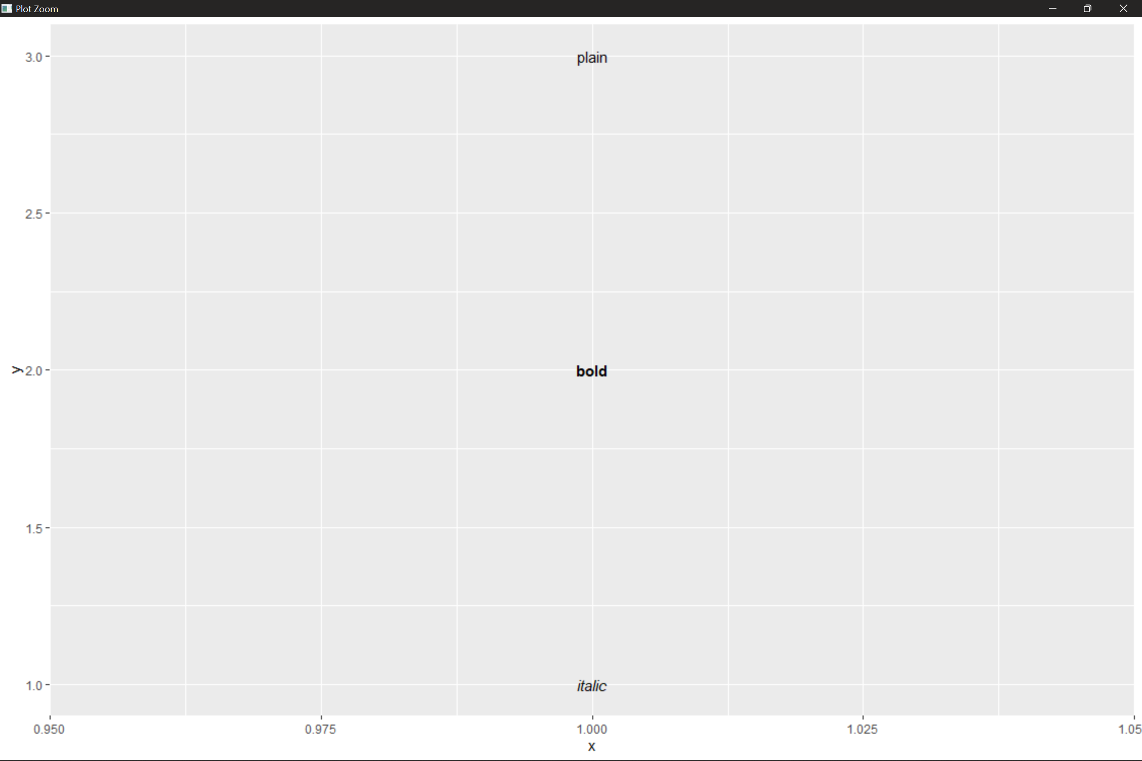
fontface sets the font style: default (plain), bold (BOLD), and italic (italic)
df <- data.frame(x = 1, y= 3:1,
	face = c("plain", "bold", "italic"))
ggplot(df, aes(x, y)) +
	geom_text(aes(label = face, fontface = face))
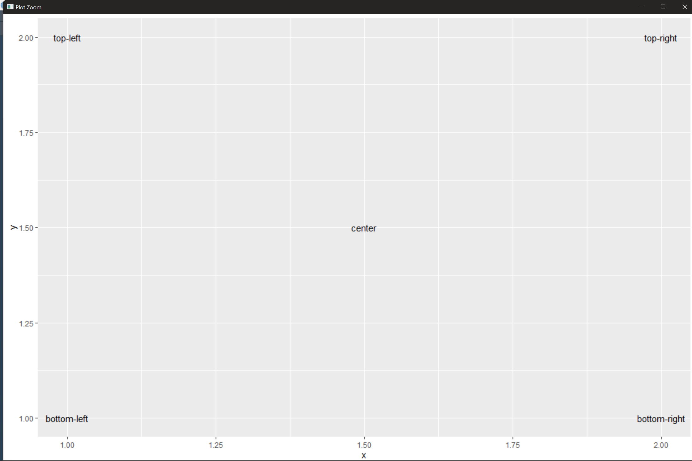
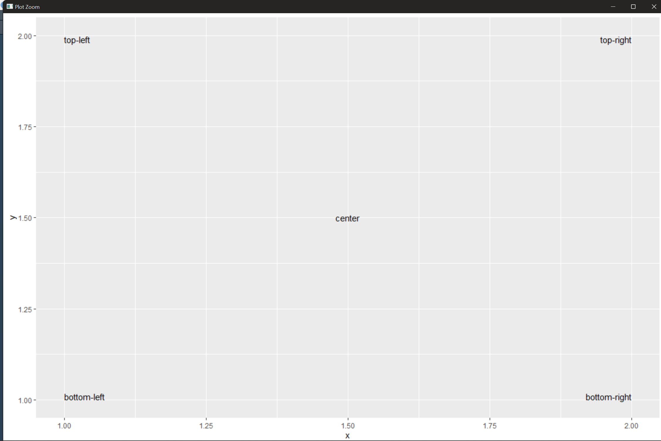
To change the alignment of text, you need to set the parameter hjust ("left" "center" "right" "inward" "outward")
And vjust ("boost" "middle" "top" "inward" "outward")
The default alignment is center. Among them, "forward" is more useful. It aligns the text to the center of the figure
df <- data.frame(x = c(1, 2, 1, 2, 1.5), y = c(1, 1, 2, 2, 1.5),
	text = c("bottom-left", "bottom-right", "top-left", "top-right", "center"))
ggplot(df, aes(x, y)) + geom_text(aes(label = text))
ggplot(df, aes(x, y)) + geom_text(aes(label = text), vjust = "inward", hjust = "inward")
Size adjusts the font size. Unlike most tools, the ggplot2 font is not in the common points (pts), but in millimeters (mm)
Angle defines the rotation angle of the text
Data can be mapped to these graphic attributes, but it needs to be used with caution, because it is difficult to intuitively feel the relationship between graphic attributes such as font size and font style and variables
geom_text() also has three parameters, but the difference is that these three parameters can only be set to a single value, so they apply to all labels
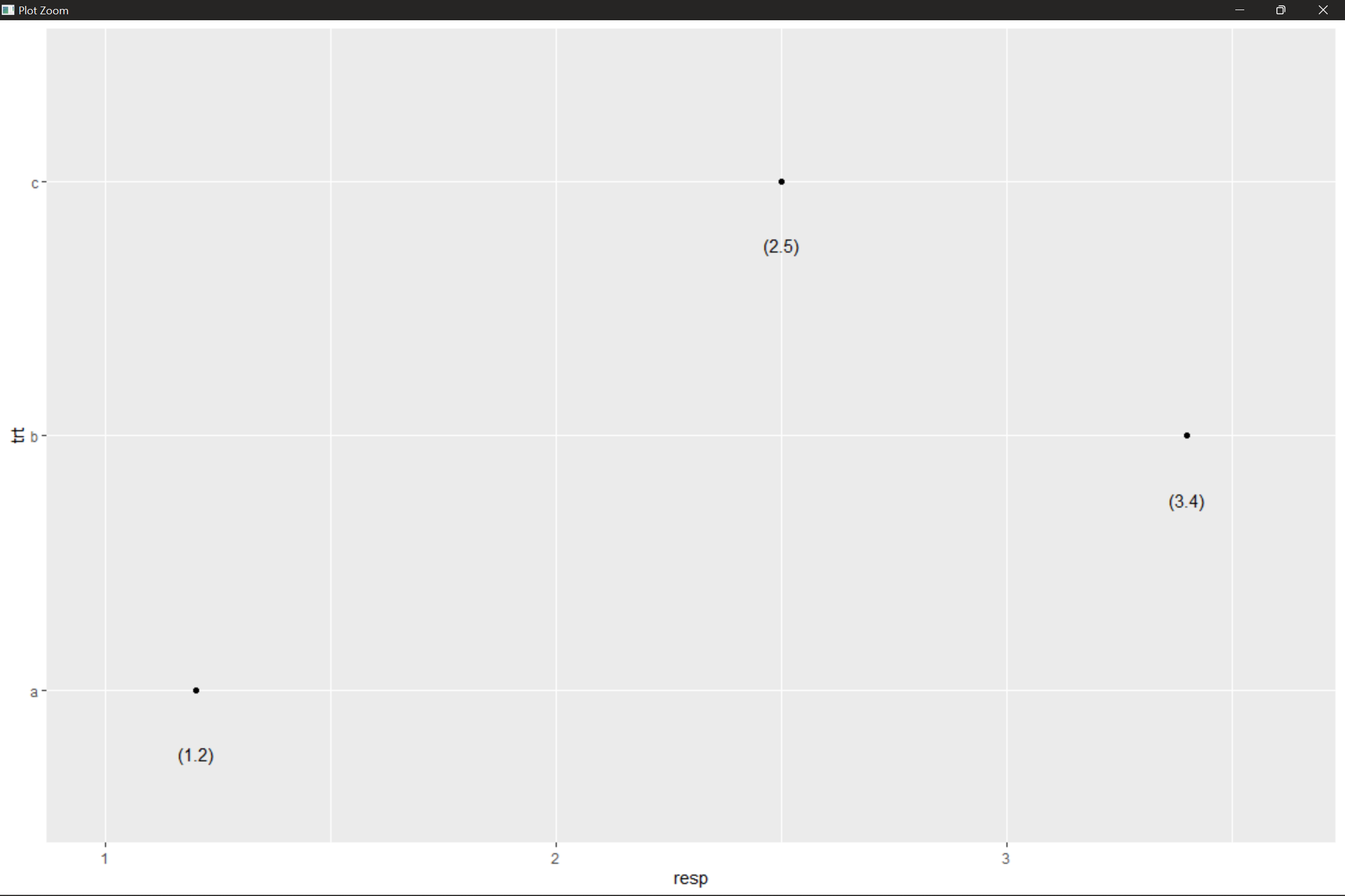
Generally, when we add labels to data points, we don't want the text to cover the points (or bars), so we usually draw the places where the text is slightly staggered from the data points. nudge_x and nudge_ The Y parameter sets the specific position of the text near the data point
df <- data.frame(trt = c("a", "b", "c"), resp = c(1.2, 3.4, 2.5))
ggplot(df, aes(resp, trt)) + geom_point() +
	geom_text(aes(label = paste0("(", resp, ")")), nudge_y = -0.25) + xlim(1, 3.6)
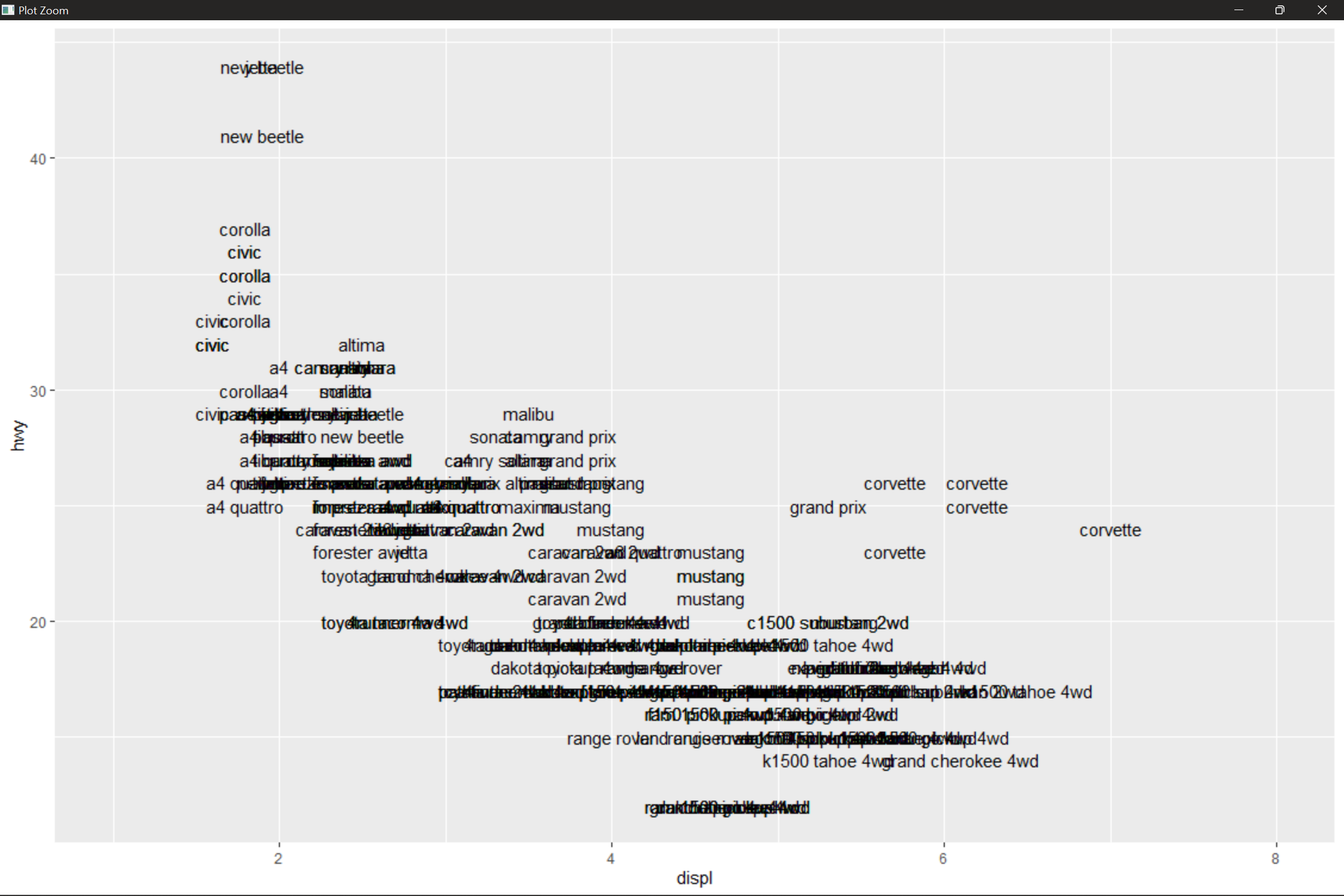
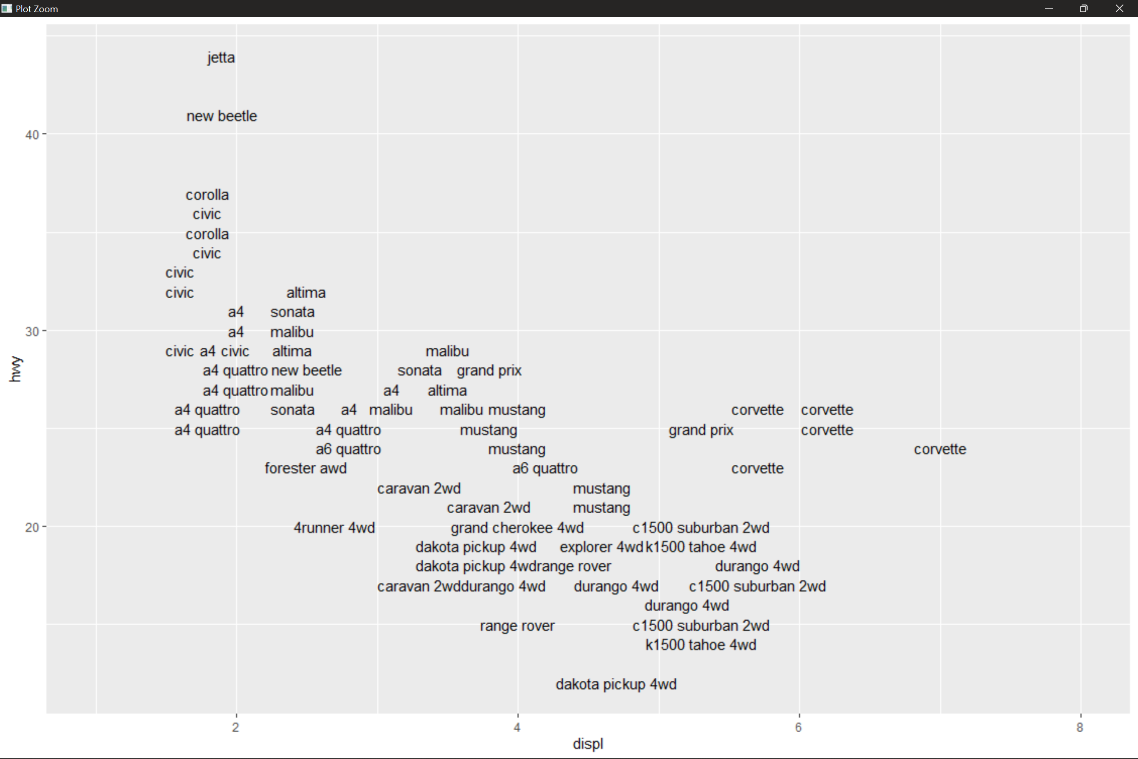
If check_overlap = TRUE, overlapping labels will be deleted automatically. The principle is very simple. Labels will be drawn in the image according to the order in the data frame; If a label overwrites an existing data point, it will be automatically ignored
ggplot(mpg, aes(displ, hwy)) +
	geom_text(aes(label = model)) + xlim(1, 8)
ggplot(mpg, aes(displ, hwy)) +
	geom_text(aes(label = model), check_overlap = TRUE) + xlim(1, 8)
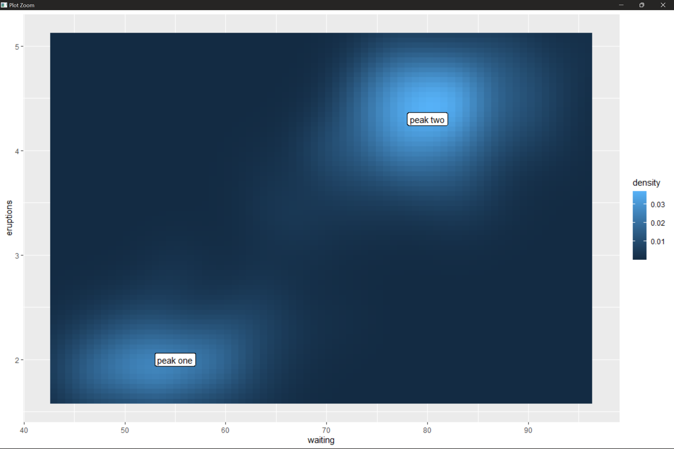
geom_label() is geom_ A derivative of text(), which draws a rectangular box outside the text to make the label appear clearer in a complex background
label <- data.frame(waiting = c(55, 80), eruptions = c(2, 4.3), label = c("peak one", "peak two"))
ggplot(faithfuld, aes(waiting, eruptions)) +
	geom_tile(aes(fill = density)) +
	geom_label(data = label, aes(label = label))
Adding labels can also cause some problems
The addition of text will not change the image interval. No matter how large the image is, the label is a fixed size (such as 3cm). Theoretically, the image interval should change with the change of image size, but this cannot be realized in ggplot2 at present. Therefore, it is necessary to set xlim() and ylim() parameters to adjust the image display interval according to the data distribution and image size
If you need to mark many data points, it is difficult to avoid the problem of masking drawing. check_overlap = TRUE can solve this problem to some extent, but it cannot determine which tags will be removed
Text labels can replace legends, and several related tools are provided in the directlabels package
ggplot(mpg, aes(displ, hwy, color = class)) + geom_point()

ggplot(mpg, aes(displ, hwy, color = class)) +
	geom_point(show.legend = FALSE) +
	directlabels::geom_dl(aes(label = class), method = "smart.grid")
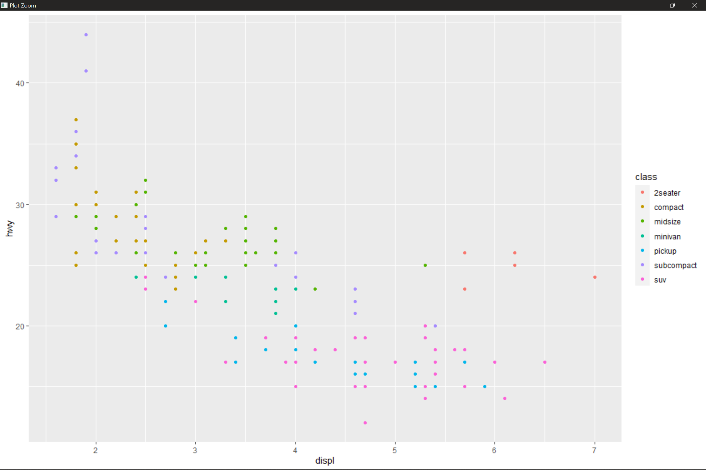
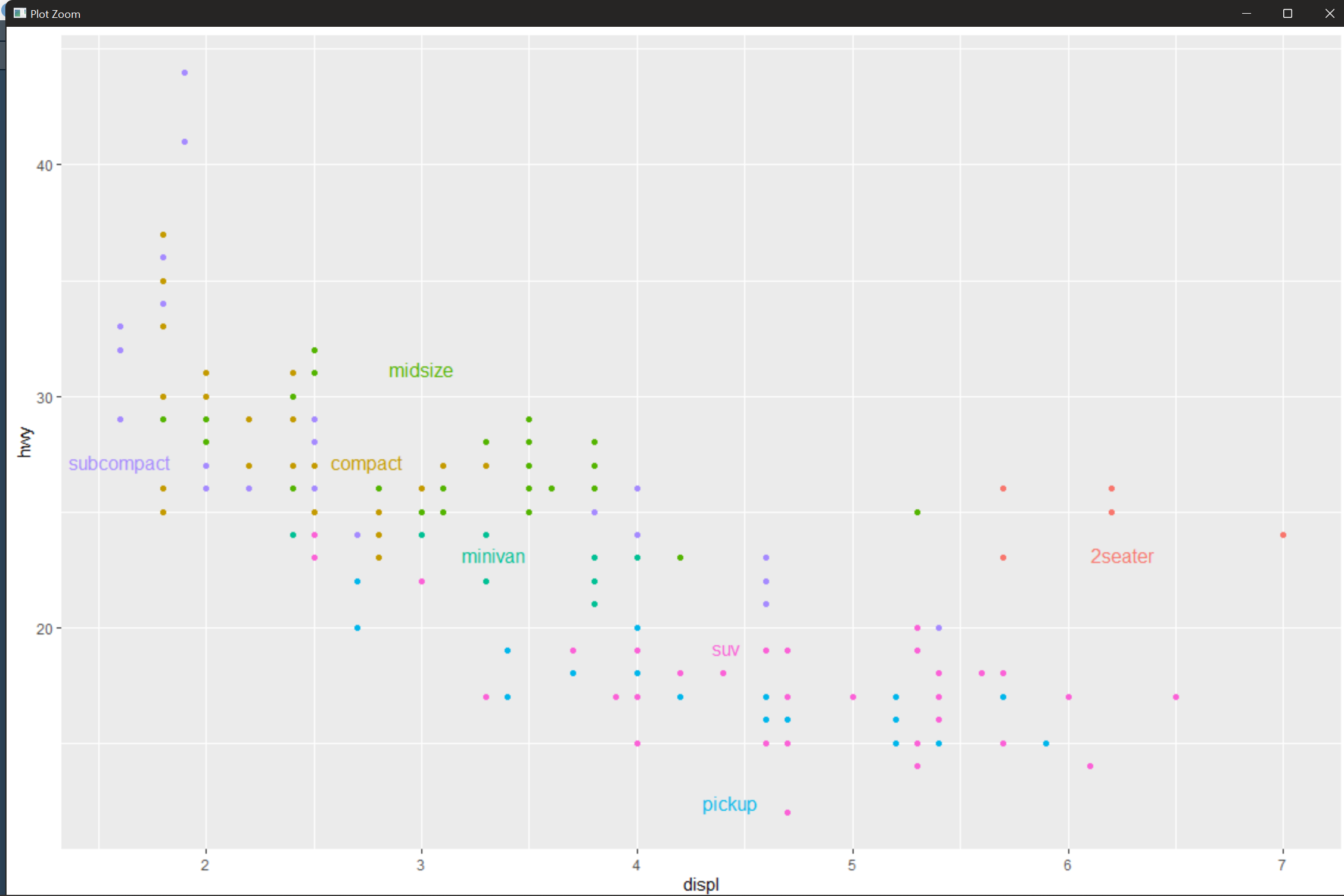
directlabels package provides a series of label positioning methods, such as smart.grid, which is suitable for the start of scatter diagram, and other methods to modify frequency multilateral graph and broken line graph