(7) Front end - initial knowledge of HTML and CSS - floating layout
1, CSS layout
1. Layout of web pages
It refers to how the browser arranges the elements in the web page
2. Standard stream (/ document stream / normal stream) typesetting mode
1) Browser default layout
At the bottom of the web page, it represents the position in a page. By default, the elements we create are in the standard flow (document flow / ordinary flow).
2) Characteristics of elements in standard flow
- Block element
- Exclusive row, arranged from top to bottom
- The default width is 100% of the element
- The height is extended by content by default
- Inline element
- It only occupies its own size, from left to right, from top to bottom
- The width and height are extended by default
3) Attention
-
CSS divides elements into three categories: block level elements / inline elements / inline block level elements
-
There are two typesetting methods in standard flow, one is vertical typesetting and the other is horizontal typesetting
- Block level elements: vertical layout
- Inline elements / inline block level elements: horizontal layout
-
If you want the block elements to be arranged horizontally in the page, you can make the block elements out of the standard flow and use float to float the elements out of the standard flow
- float : none; By default, elements are arranged in the standard flow by default
- float : left; The element immediately leaves the standard flow and floats to the left of the page
- float : right; Break away from the standard flow and float to the right of the page
-
Floating element out of document flow
-
When element A is set to float: left / right; After, the element A will immediately leave the standard flow, the element B below it will immediately move upward, and element A will cover element B.
-
After element A floats, it will float to the top left or right of the page as much as possible until it encounters the border of the parent element or other floating elements.
-
If the floating element A is A block element without floating, the floating element A will not exceed the block element.
-
Floating element A will not exceed its brother element B, up to one side.
-
2, Floating stream layout mode (floating layout)
Floating stream is a typesetting method that is "half separated from standard stream"
Floating stream has only one typesetting method, which is horizontal typesetting. It can only set the left alignment or right alignment of an element
Floating streams are not centered, and margin: 0 auto cannot be used;
1. Floating element
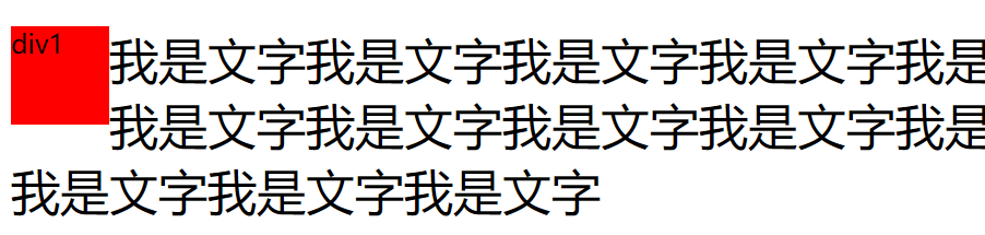
1) Word surround phenomenon
The floating element will not block the text in the non floating element. The non floating text will automatically give way to the floating element. This is the word circumference phenomenon of the floating element
  <style>
    .div1 {
      width: 60px;
      height: 60px;
      background-color: red;
      float: left;
    }
    p{
      font-size: 30px;
    }
  </style>
  <body>
  <div class="div1">div1</div>
  <p>I'm text I'm text I'm text I'm text I'm text I'm text I'm text I'm text I'm text I'm text I'm text I'm text I'm text I'm text I'm text I'm text I'm text I'm text I'm text I'm text I'm text I'm text I'm text I'm text I'm text</p>
</body>
2) Floating element characteristics
In a floating stream, both block level elements / inline elements / inline block level elements can be arranged horizontally, and the width and height can be set. Therefore, the elements of a floating stream are very similar to the inline block level elements of a standard stream.
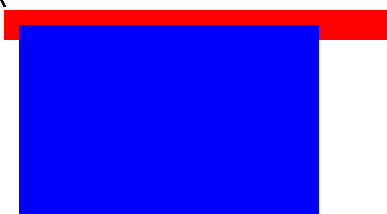
3) Height collapse
In the document flow, the height of the parent element is extended by the child element by default.
However, when the floating is set for the child element, the child element will be completely separated from the document flow, and the child element cannot support the height of the parent element, resulting in the collapse of the height of the parent element. All elements under the parent element will move upward, which will lead to page layout confusion.
Resolve height collapse:
Method 1: write the height of the parent element to death. However, at this time, the height of the parent element cannot adapt to the height of the child element, so it is not recommended.
Method 2: at the end of the highly collapsed parent element, add a blank div and set the value of the clear attribute to clear the float, that is, the height of the parent element can be expanded without side effects, but redundant structures will be added to the page.
clear value:
-
none: the default value. Floating elements are allowed
-
Left: floating elements are not allowed on the left
-
right: floating elements are not allowed on the left
-
both: floating elements are not allowed on the left and right sides
Method 3: pass the after pseudo class (recommended)
Add a blank block element to the end of the element to be cleared, and clear the floats on both sides. No extra div will be added to the page.
::after{
  /*Add a content*/
  content: "";
  /*Convert to a block element*/
  display: block;
  /*Clear the float on both sides*/
  clear: both;
}
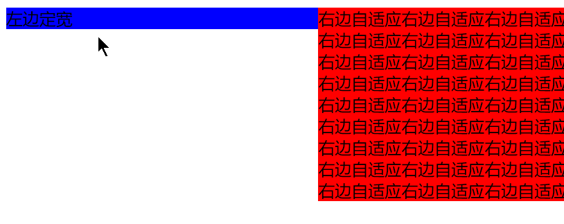
2. CSS two column layout
Two column layout: fixed width on the left and overflow: auto on the right; self-adaption
.left {
    float: left;
    width: 300px;
    background-color: pink;
}
.right {
    overflow: auto;
    background-color: red;
}

<div class="left">Left fixed width</div>
<div class="right">Right adaptive</div>
3. BFC block formatting context
A rendering area in a page has its own set of rendering rules, which determines how elements align their contents for layout, as well as the relationship and interaction with other elements.
That is, BFC is an independent layout environment, and the internal element layout of BFC does not affect each other
Layout rules of BFC
- The inner boxes are placed vertically one by one.
- The distance in the vertical direction of the Box is determined by margin. Margins of two adjacent boxes belonging to the same BFC will overlap.
- The left outer border of each box is next to the left border of the containing block, even for floating elements.
- The area of the BFC does not overlap the float box.
- BFC is an isolated independent container on the page. The child elements in the container will not affect the external elements, and vice versa.
- When calculating the height of BFC, floating sub elements also participate in the calculation.
Which elements generate BFC
-
Root element
-
float property is not none
-
position is absolute or fixed
-
display is inline block table cell table caption flex inline flex
-
overflow is not visible
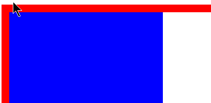
Role of BFC
Solve the problem that the floating element causes the parent element to collapse highly
When calculating the height of BFC, floating child elements also participate in the calculation, so BFC can be turned on for parent elements
<style>
    /* Parent element */
    .div1 {
      width: 1000px;
      border: 10px solid red;
      /* BFC-overflow Not visible */
      overflow: hidden;
    }
    /* Child element */
    .div2 {
      width: 200px;
      height: 400px;
      background-color: blue;
      float: left;
    }
</style>
<body>
  <div class="div1">
    <div class="div2"></div>
  </div>
</body>
BFC not turned on
Turn on BFC
Two column adaptive layout
Since the area of BFC will not overlap with the float box, you can set a fixed width for the fixed column and turn on BFC for the unfixed column.
<style>
    .left {
      float: left;
      width: 300px;
      background-color: blue;
    }
    .right {
      /* BFC-overflow Not visible */
      overflow: auto;
      background-color: red;
    }
  </style>
</head>
<body>
  <div class="left">Left fixed width</div>
  <div class="right">
    Right adaptive right adaptive right adaptive right adaptive right adaptive right adaptive right adaptive right adaptive right adaptive right adaptive right adaptive right adaptive right adaptive right adaptive right adaptive right adaptive right adaptive right adaptive right adaptive right adaptive right adaptive right adaptive right adaptive right adaptive right adaptive right adaptive right adaptive right adaptive right adaptive right adaptive right adaptive right adaptive right adaptive right adaptive right adaptive right adaptive right Edge adaptive right adaptive right adaptive right adaptive right adaptive right adaptive right adaptive right adaptive right adaptive right adaptive right adaptive right adaptive right adaptive right adaptive right adaptive right adaptive right adaptive right adaptive right adaptive right adaptive right adaptive
  </div>
BFC not turned on
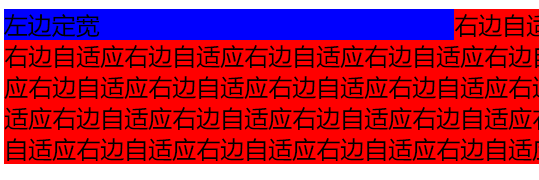
Turn on BFC
4. CSS three column layout
Three column layout: fixed width on both sides and adaptive in the middle
<style>
	*{
    margin: 0;
    padding: 0;
  }
  .left,.right {
    width: 200px;
    height: 200px;
    background-color: red;
  }
  .left {
    float: left;
  }
  .right {
    float: right;
  }
  .center {
    /* The middle module is free of left and right distance and set floating */
    margin: 0 200px;
    height: 300px;
    background-color: pink;
  }
</style>

<body>
  <div class="left">left</div>
  <div class="right">right</div>
  <div class="center">center</div>
</body>
float: right;
}
.center {
/*The middle module is free of left and right distance and set floating*/
margin: 0 200px;
height: 300px;
background-color: #f00;
}