In the development of fluent, we can reuse colors and descendants by defining themes, so as to make the design of the whole APP look more consistent
1. Use of theme theme
Theme is divided into global theme and local theme
Topics serve two purposes:
- After setting the theme, some widgets will automatically use the theme style (such as the color of AppBar)
- Some styles are managed uniformly in the theme and referenced directly elsewhere in the application
1.1 global Theme
The global Theme will affect the color and font style of the entire app.
It's very simple to use. You just need to pass ThemeData into the MaterialApp constructor
- If the Theme is not set, the shutter will use the preset style.
- Of course, we can customize it
import 'package:flutter/cupertino.dart';
import 'package:flutter/material.dart';
void main() {
runApp(MyApp());
}
class MyApp extends StatelessWidget {
@override
Widget build(BuildContext context) {
// TODO: implement build
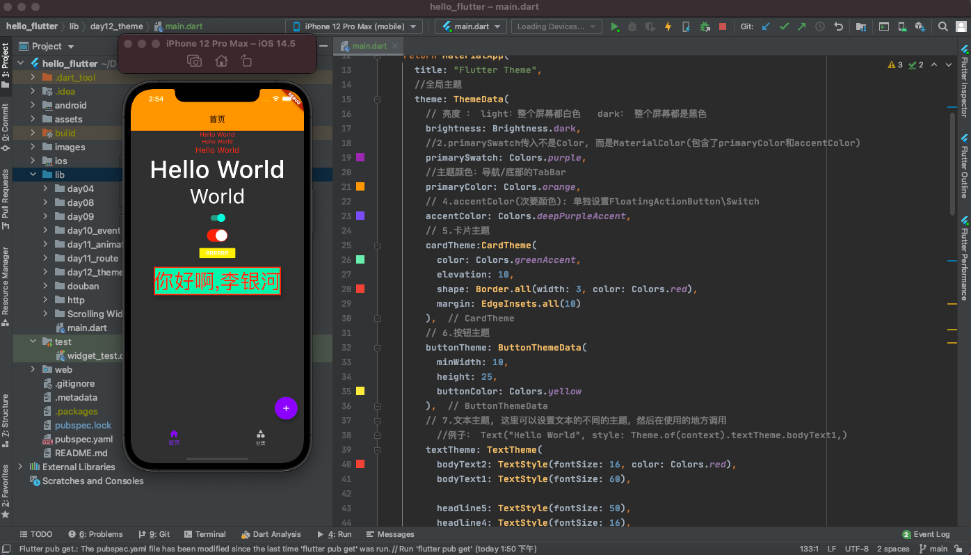
return MaterialApp(
title: "Flutter Theme",
//Global theme
theme: ThemeData(
// Brightness: light: the whole screen is white dark: the whole screen is black
brightness: Brightness.dark,
//2.primarySwatch does not pass in Color, but materialcolor (including primaryColor and accentColor)
primarySwatch: Colors.purple,
//Theme color: navigation / TabBar at the bottom
primaryColor: Colors.orange,
// 4. Accentcolor: set FloatingActionButton\Switch separately
accentColor: Colors.deepPurpleAccent,
// 5. Card theme
cardTheme:CardTheme(
color: Colors.greenAccent,
elevation: 10,
shape: Border.all(width: 3, color: Colors.red),
margin: EdgeInsets.all(10)
),
// 6. Button theme
buttonTheme: ButtonThemeData(
minWidth: 10,
height: 25,
buttonColor: Colors.yellow
),
// 7. Text theme. You can set different themes of text here, and then call them where they are used
//Example: Text("Hello World", style: Theme.of(context).textTheme.bodyText1,)
textTheme: TextTheme(
bodyText2: TextStyle(fontSize: 16, color: Colors.red),
bodyText1: TextStyle(fontSize: 60),
headline5: TextStyle(fontSize: 50),
headline4: TextStyle(fontSize: 16),
headline3: TextStyle(fontSize: 18),
headline2: TextStyle(fontSize: 20),
)
),
home: GYHomePage()
);
}
}
class GYHomePage extends StatelessWidget {
@override
Widget build(BuildContext context) {
// TODO: implement build
return Scaffold(
appBar: AppBar(title: Text("home page"),),
body: Center(
child: Column(
children: <Widget>[
Text("Hello World"),
Text("Hello World", style: TextStyle(fontSize: 14),),
Text("Hello World", style: TextStyle(fontSize: 20),),
Text("Hello World", style: Theme.of(context).textTheme.bodyText1,),
Text("World", style: Theme.of(context).textTheme.headline5,),
Switch(value: true, onChanged: (value) {},),
CupertinoSwitch(value: true, onChanged: (value) {}, activeColor: Colors.red,),
RaisedButton(child: Text("RRRRRR"), onPressed: () {},),
Card(child: Text("How do you do,Li Yinhe", style: TextStyle(fontSize: 50),),)
],
),
),
bottomNavigationBar: BottomNavigationBar(
items: [
BottomNavigationBarItem(
title: Text("home page"),
icon: Icon(Icons.home)
),
BottomNavigationBarItem(
title: Text("classification"),
icon: Icon(Icons.category)
)
],
),
floatingActionButton: FloatingActionButton(
child: Icon(Icons.add),
onPressed: () {
},
),
);
}
}
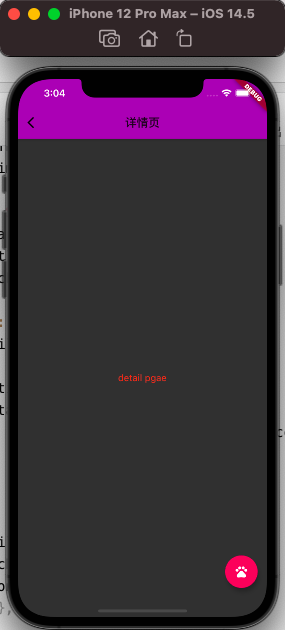
1.2 local Theme
If a specific Widget does not want to use the global Theme, but wants to define it by itself, what should it do?
- It's very simple. Just wrap Theme in the parent node of the widget
Create another new page with a new theme
- Outside the Scaffold of the new page, wrap a Theme, and set data to a new Theme data
class GYDetailPage extends StatelessWidget {
  @override
  Widget build(BuildContext context) {
    return Theme(
      data: ThemeData(
		//Here you can set your new theme
	)
      child: Scaffold(
        appBar: AppBar(
          title: Text("Detail page"),
          backgroundColor: Colors.purple,
        ),
        body: Center(
          child: Text("detail pgae"),
        ),
       ),
    );
  }
}

//Click event of floatingActionButton in the lower right corner
floatingActionButton: FloatingActionButton(
        child: Icon(Icons.add),
        onPressed: () {
          Navigator.of(context).push(MaterialPageRoute(
              builder: (ctx) {
                return GYDetailPage();
              }
          ));
        },
      ),
However, many times we don't want to use a new theme completely, but modify it based on the previous theme:
class GYDetailPage extends StatelessWidget {
  @override
  Widget build(BuildContext context) {
    return Theme(
    //Modify on the basis of the original topic
      data: Theme.of(context).copyWith(
          primaryColor: Colors.purple
      ),
      child: Scaffold(
        appBar: AppBar(
          title: Text("Detail page"),
          backgroundColor: Colors.purple,
        ),
        body: Center(
          child: Text("detail pgae"),
        ),
        //Modify on the basis of the original topic
        floatingActionButton: Theme(
          data: Theme.of(context).copyWith(
              colorScheme: Theme.of(context).colorScheme.copyWith(
                  secondary: Colors.pink
              )
          ),
          child: FloatingActionButton(
            child: Icon(Icons.pets),
            onPressed: () {
            },
          ),
        ),
      ),
    );
  }
}
2. Dark Theme adaptation
2.1 darkTheme
At present, many applications need to adapt to the dark mode. How to adapt to the dark mode in fluent?
In fact, there are two parameters in MaterialApp, Theme and darkTheme:
- According to the following wording, we have adapted the dark theme by default
class MyApp extends StatelessWidget {
  @override
  Widget build(BuildContext context) {
    // TODO: implement build
    return MaterialApp(
      title: "Flutter Theme",
      theme: ThemeData.light(),
      darkTheme: ThemeData.dark(),
      home: GYHomePage()
    );
  }
}
2.2 adaptation in development
In order to adapt to two themes (set more themes) during development, we can encapsulate an AppTheme
- Common styles are extracted into constants
- Encapsulate a bright theme
- Encapsulate a dark theme
class GYAppTheme {
  static const double smallFontSize = 16;
  static const double normalFontSize = 22;
  static const double largeFontSize = 24;

  //Text color in normal mode
  static final Color norTextColors = Colors.red;
  //Color in dark mode
  static final Color darkTextColors = Colors.green;


  static final ThemeData norTheme = ThemeData(
      primarySwatch: Colors.yellow,
      textTheme: TextTheme(
          bodyText2: TextStyle(fontSize: normalFontSize, color: norTextColors)
      )
  );

  static final ThemeData darkTheme = ThemeData(
      primarySwatch: Colors.grey,
      textTheme: TextTheme(
          bodyText2: TextStyle(fontSize: normalFontSize, color: darkTextColors)
      )
  );
}
Decide which theme to use in MaterialApp
class MyApp extends StatelessWidget {
  // This widget is the root of your application.
  @override
  Widget build(BuildContext context) {
    return MaterialApp(
      title: 'Flutter Demo',
      theme: GYAppTheme.lightTheme,
      darkTheme: GYAppTheme.darkTheme,
      home: HYHomePage(),
    );
  }
}