Element plus learning notes (I)
catalogue
Introduce element plus (main. JS)
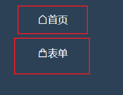
Underline removal of router link
Implement hover effect through CSS to control another element
Introduce element plus (main. JS)
import ElementPlus from 'element-plus'
import 'element-plus/dist/index.css'
import 'element-plus/theme-chalk/display.css'
app.use(ElementPlus)
Underline removal of router link
a {
  text-decoration: none;
}
.router-link-active {
  text-decoration: none;
}
Implement hover effect through CSS to control another element
<div class="course">
.course:hover {
  border-bottom: 1px solid pink;
}- Click style:. course:active
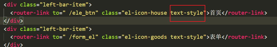
Item center setting
.text-style {
  font-size: 16px;
  color: #FFF;
  width: 200px;
  height: 50px;
  position: relative;
  left: 60px;
  top: 20px;
  margin: auto;
}
layout
- Layout | Element Plus
-
The components use Flex layout by default and do not need to be set manually type="flex".
Note that parent containers should be avoided inline Related styles will cause the component width to not be full.
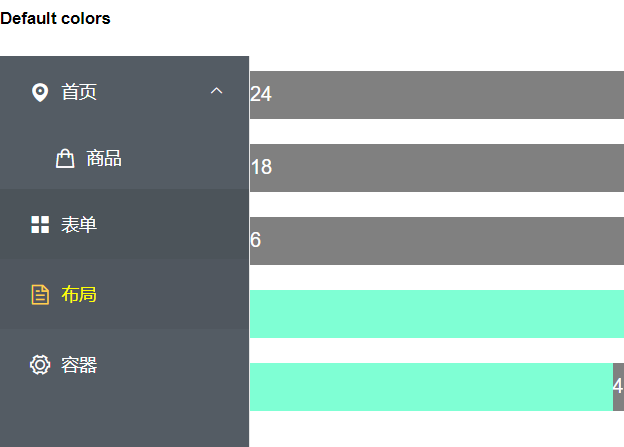
- Alignment
- By default, flex layout is used to flexibly align columns.
- Can pass justify Property to specify start, center, end, space between, and space around, where the values define the layout of child elements
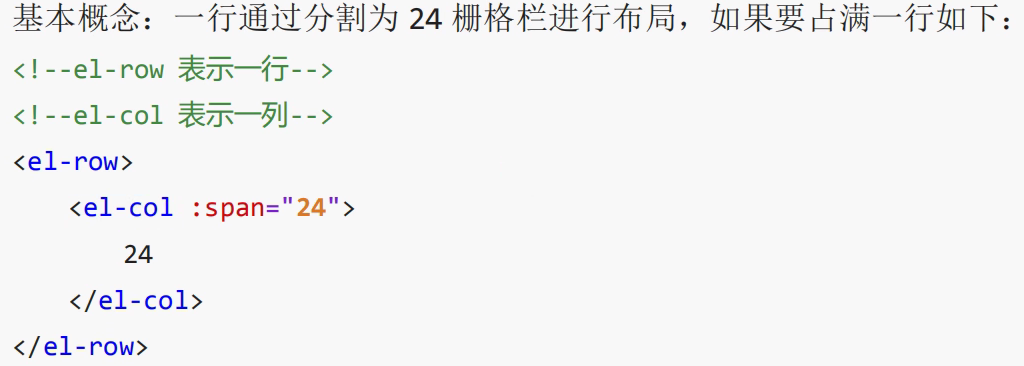
<el-row>
    <el-col :span="24">24</el-col>
</el-row>
<el-row>
    <el-col :span="18">18</el-col>
</el-row>
<el-row>
    <el-col :span="6">6</el-col>
    <el-col :span="6">6</el-col>
    <el-col :span="6">6</el-col>
    <el-col :span="6">6</el-col>
</el-row>
<el-row type="flex" justify="center">
    <el-col :span="4">4</el-col>
    <el-col :span="4">4</el-col>
    <el-col :span="4">4</el-col>
</el-row>
<el-row type="flex" justify="center">
    <el-col :span="4" :offset="1">4</el-col>
    <el-col :span="4" :offset="1">4</el-col>
    <el-col :span="4" :offset="1">4</el-col>
</el-row> 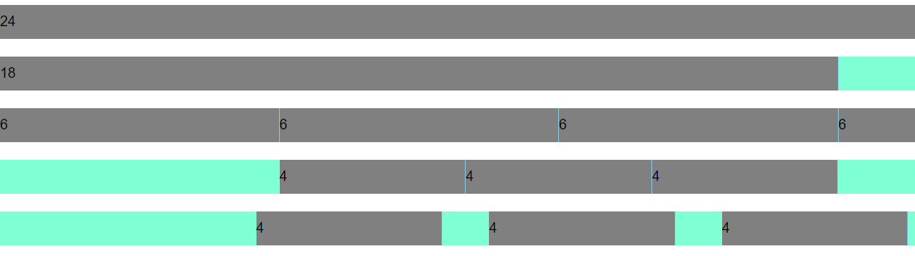
Container layout container
- Container layout container | Element Plus
- The container component used for layout is convenient to quickly build the basic structure of the page:
- < El container >: outer container. When the child element contains < El header > or < El footer >, all child elements will be arranged vertically up and down, otherwise they will be arranged horizontally left and right.
- < El header >: top bar container.
- < El aside >: sidebar container.
- < El main >: main area container.
- < El footer >: bottom bar container.
- The above components adopt flex layout. Please determine whether the target browser is compatible before use. In addition, the direct child element of < El container > must be one or more of the last four components. The parent element of the last four components must be a < El container >
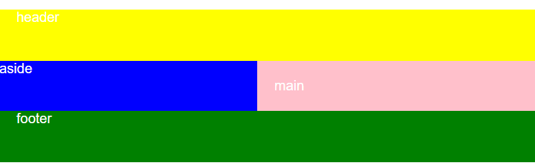
<!--  -->
<template>
    <div class="container_el">
        <h2>Container</h2>
        <el-container>
            <el-header>header</el-header>
            <el-container>
                <el-aside>aside</el-aside>
                <el-main>main</el-main>
            </el-container>
            <el-footer>footer</el-footer>

        </el-container>

    </div>
</template>

<script>
    export default {
        name: "Container",
    }
</script>
<style>
    .container_el {
        width: 100%;
        color: #fff;
    }

    .el-container {
        background-color: #eee;
    }

    .el-header {
        background-color: yellow;
    }

    .el-footer {
        background-color: green;
    }

    .el-aside {
        background-color: blue;
        max-width: 240;
        min-height: 300;
    }

    .el-main {
        background-color: pink;
    }
</style>
Basic specification
- typeface: Typography | Element Plus
- Add in html or body Tags
font-family: 'Helvetica Neue', Helvetica, 'PingFang SC', 'Hiragino Sans GB',
  'Microsoft YaHei', 'Microsoft YaHei ', Arial, sans-serif;
- Color: Color | Element Plus
- frame: Border | Element Plus
Icon icon
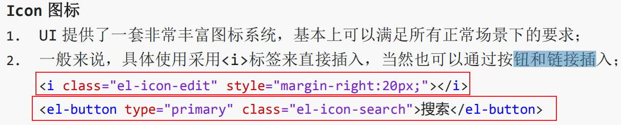
- reference resources: Element UI - Vue project integration element UI & Icon icon & custom Icon_ Kaven CSDN blog
- Element UI provides a set of commonly used icon collections. You can use it directly by setting the class name El icon iconname, which is also involved in the above code.
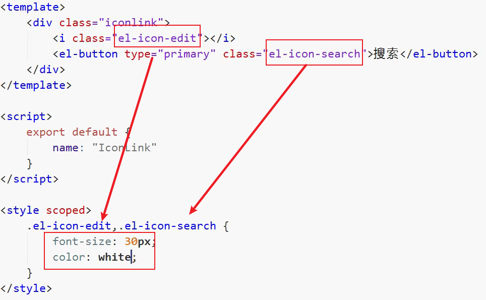
<i class="el-icon-platform-eleme"></i>
<i class="el-icon-delete-solid"></i>
<i class="el-icon-loading"></i>
<p class="el-icon-folder-add"></p>
<el-button type="primary" icon="el-icon-search">search</el-button>
- Change icon color:
<i class=" el-icon-s-custom" style="font-size: 16px; color: green"></i>
- Change font color, icon color
- Use icons as fonts
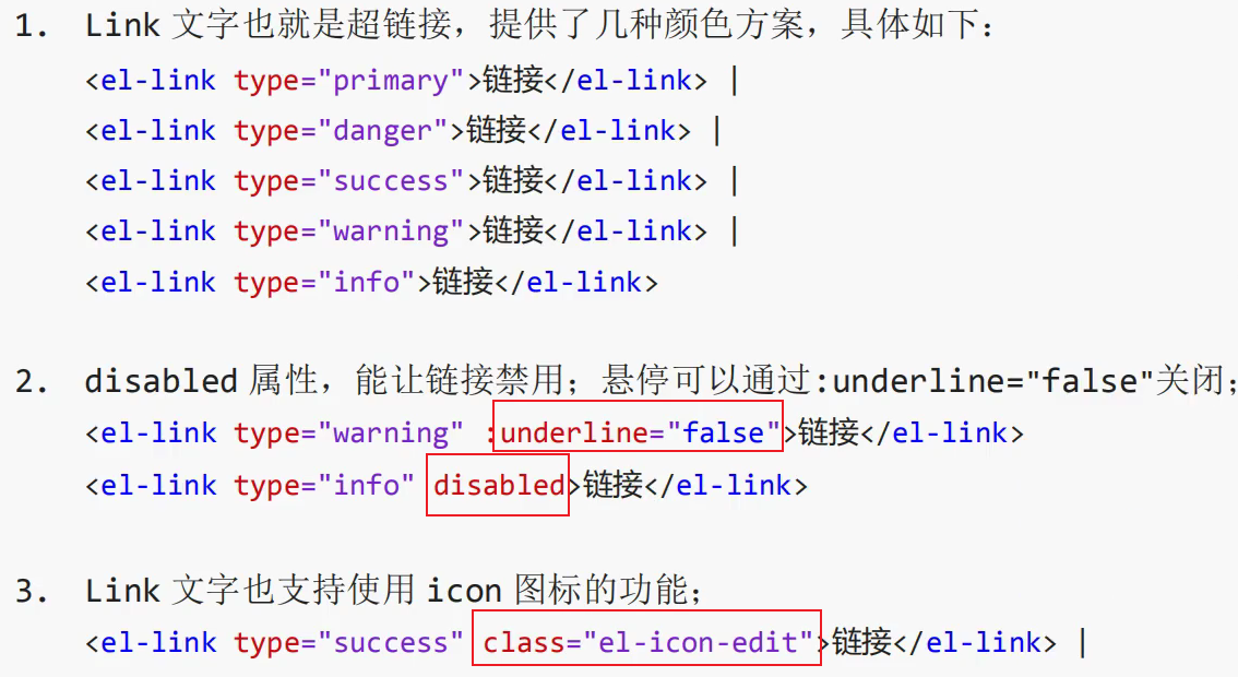
Link text link
Menu menu
<template>
  <div id="app">
    <div class="left-bar">
      <el-row class="tac">
        <el-col :span="12" class="el-menu-style">
          <h5 style="color: #000;">Default colors</h5>
          <!-- <el-menu active-text-color="#ffd04b" background-color="#545c64" class="el-menu-vertical-demo"
            default-active="2" text-color="#fff" @open="handleOpen" @close="handleClose"> -->
          <el-menu active-text-color="#ffd04b" background-color="#545c64" class="el-menu-vertical-demo"
            default-active="2" text-color="#fff" @open="handleOpen" @close="handleClose" style="height: 600px;">
            <el-sub-menu index=" 1">
              <template #title>
                <i class="el-icon-location"></i>
                <span>home page</span>
              </template>
              <el-menu-item>
                <i class="el-icon-goods"></i>
                <router-link to="/ele_btn">commodity</router-link>
              </el-menu-item>
            </el-sub-menu>

            <el-menu-item index="2">
              <i class="el-icon-menu"></i>
              <router-link to="/form_el">form </router-link>
            </el-menu-item>
            <el-menu-item index="3">
              <i class="el-icon-document"></i>
              <router-link to="/layout_el">layout</router-link>
            </el-menu-item>
            <el-menu-item index="4">
              <i class="el-icon-setting"></i>
              <router-link to="/container_el">container</router-link>
            </el-menu-item>
          </el-menu>
        </el-col>
      </el-row>
    </div>
    <router-view></router-view>
  </div>
</template>

<style>
  html,
  body {
    margin: 0;
    padding: 0;
    height: 100%;
    width: 100%;
    position: relative;
    font-family: 'Helvetica Neue', Helvetica, 'PingFang SC', 'Hiragino Sans GB',
      'Microsoft YaHei', 'Microsoft YaHei ', Arial, sans-serif;
  }

  #app {
    position: relative;
    width: 100%;
    height: 100%;
    display: flex;
    background-color: #fff;
    color: #fff;
  }

  a {
    text-decoration: none;
    color: #fff;
  }

  .router-link-active {
    text-decoration: none;
    color: yellow;
  }
</style>