Key points of data mapping 3 - spaghetti map
Broken line diagrams with too many lines usually become unreadable. This kind of diagram is generally called spaghetti diagram. Therefore, this kind of chart can hardly provide information about the data.
Drawing example
Let's take the evolution of female baby names in the United States from 1880 to 2015 as an example.
# Libraries
library(tidyverse)
library(hrbrthemes)
library(kableExtra)
library(babynames)
library(viridis)
library(DT)
library(plotly)
# Display data
data <- babynames
head(data)
nrow(data)
| year | sex | name | n | prop |
|---|---|---|---|---|
| <dbl> | <chr> | <chr> | <int> | <dbl> |
| 1880 | F | Mary | 7065 | 0.07238359 |
| 1880 | F | Anna | 2604 | 0.02667896 |
| 1880 | F | Emma | 2003 | 0.02052149 |
| 1880 | F | Elizabeth | 1939 | 0.01986579 |
| 1880 | F | Minnie | 1746 | 0.01788843 |
| 1880 | F | Margaret | 1578 | 0.01616720 |
1924665
# Pick data for some names
data = filter(data,name %in% c("Mary","Emma", "Ida", "Ashley", "Amanda", "Jessica", "Patricia", "Linda", "Deborah",   "Dorothy", "Betty", "Helen"))
head(data)
nrow(data)
| year | sex | name | n | prop |
|---|---|---|---|---|
| <dbl> | <chr> | <chr> | <int> | <dbl> |
| 1880 | F | Mary | 7065 | 0.07238359 |
| 1880 | F | Emma | 2003 | 0.02052149 |
| 1880 | F | Ida | 1472 | 0.01508119 |
| 1880 | F | Helen | 636 | 0.00651606 |
| 1880 | F | Amanda | 241 | 0.00246914 |
| 1880 | F | Betty | 117 | 0.00119871 |
2599
# As long as women's data
data= filter(data,sex=="F")
head(data)
nrow(data)
| year | sex | name | n | prop |
|---|---|---|---|---|
| <dbl> | <chr> | <chr> | <int> | <dbl> |
| 1880 | F | Mary | 7065 | 0.07238359 |
| 1880 | F | Emma | 2003 | 0.02052149 |
| 1880 | F | Ida | 1472 | 0.01508119 |
| 1880 | F | Helen | 636 | 0.00651606 |
| 1880 | F | Amanda | 241 | 0.00246914 |
| 1880 | F | Betty | 117 | 0.00119871 |
1593
# mapping
ggplot(data,aes(x=year, y=n, group=name, color=name)) +
geom_line() +
scale_color_viridis(discrete = TRUE) +
theme(
  plot.title = element_text(size=14)
) +
ggtitle("A spaghetti chart of baby names popularity")
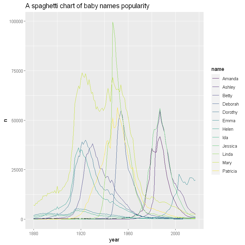
As can be seen from the figure, it is difficult to understand the evolution of the popularity of specific names according to one line. In addition, even if you try to follow a line to display the results, you need to associate it with a more difficult legend. Let's try to find some solutions to improve this graph.
Improvement method
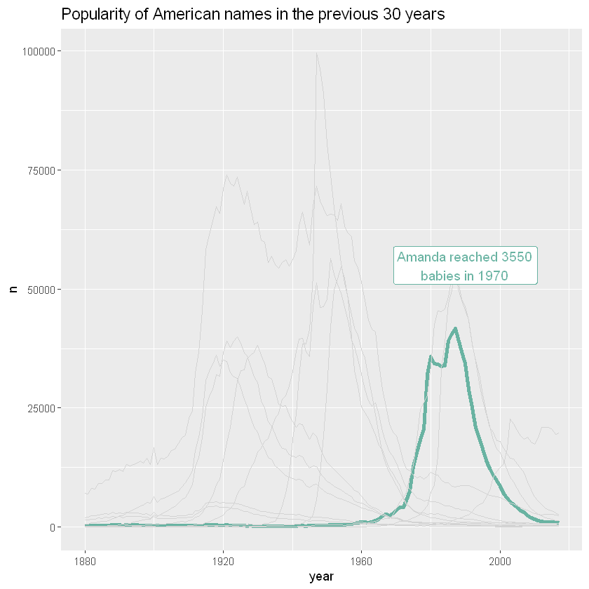
Targeting specific groups
Suppose you draw many groups, but the actual reason is to explain the characteristics of a particular group compared with other groups. Then a good solution is to highlight the group: make it look different and give it an appropriate comment. Here, Amanda's popularity evolution is obvious. Keeping other names is important because it allows you to compare Amanda with all other names
# Add data item
data =  mutate( data, highlight=ifelse(name=="Amanda", "Amanda", "Other"))
head(data)
| year | sex | name | n | prop | highlight |
|---|---|---|---|---|---|
| <dbl> | <chr> | <chr> | <int> | <dbl> | <chr> |
| 1880 | F | Mary | 7065 | 0.07238359 | Other |
| 1880 | F | Emma | 2003 | 0.02052149 | Other |
| 1880 | F | Ida | 1472 | 0.01508119 | Other |
| 1880 | F | Helen | 636 | 0.00651606 | Other |
| 1880 | F | Amanda | 241 | 0.00246914 | Amanda |
| 1880 | F | Betty | 117 | 0.00119871 | Other |
ggplot(data,aes(x=year, y=n, group=name, color=highlight, size=highlight)) +
geom_line() +
scale_color_manual(values = c("#69b3a2", "lightgrey")) +
scale_size_manual(values=c(1.5,0.2)) +
theme(legend.position="none") +
ggtitle("Popularity of American names in the previous 30 years") +
geom_label( x=1990, y=55000, label="Amanda reached 3550\nbabies in 1970", size=4, color="#69b3a2") +
theme(,
  plot.title = element_text(size=14)
)
Use subgraph
Area maps can be used to provide a more comprehensive overview of the dataset, especially when used in conjunction with subgraphs. The evolution of any name can be easily glimpsed in the following chart:
ggplot(data,aes(x=year, y=n, group=name, fill=name)) +
geom_area() +
scale_fill_viridis(discrete = TRUE) +
theme(legend.position="none") +
ggtitle("Popularity of American names in the previous 30 years") +
theme(
  panel.spacing = unit(0.1, "lines"),
  strip.text.x = element_text(size = 8),
  plot.title = element_text(size=14)
) +
# Map by name
facet_wrap(~name)
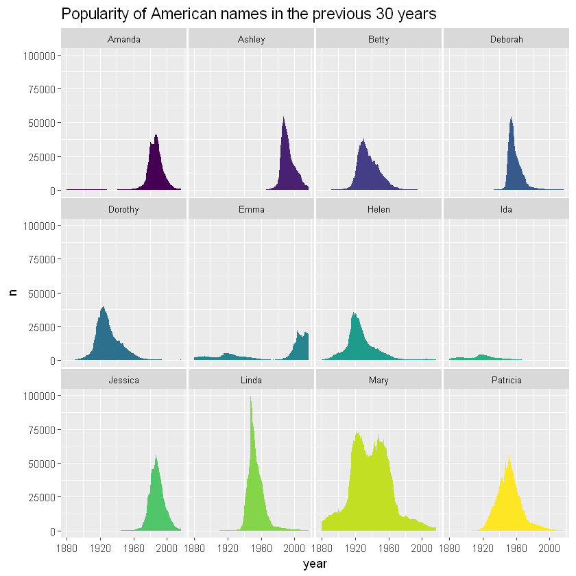
As can be seen from the picture, Linda is a very popular name in a very short time. On the other hand, Ida has never been very popular and has been less used for decades.
Combination method
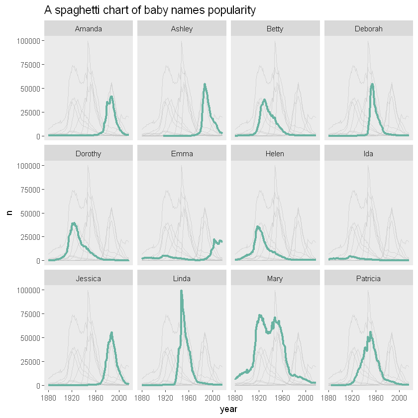
If you want to compare the evolution of each line with other lines, you can combine targeting specific groups and using subgraphs
# The duplicate column, name/name2, has different uses. One is used to display the data in the subgraph and the other is used to column
tmp <- data %>%
  mutate(name2=name)
head(tmp)
| year | sex | name | n | prop | highlight | name2 |
|---|---|---|---|---|---|---|
| <dbl> | <chr> | <chr> | <int> | <dbl> | <chr> | <chr> |
| 1880 | F | Mary | 7065 | 0.07238359 | Other | Mary |
| 1880 | F | Emma | 2003 | 0.02052149 | Other | Emma |
| 1880 | F | Ida | 1472 | 0.01508119 | Other | Ida |
| 1880 | F | Helen | 636 | 0.00651606 | Other | Helen |
| 1880 | F | Amanda | 241 | 0.00246914 | Amanda | Amanda |
| 1880 | F | Betty | 117 | 0.00119871 | Other | Betty |
tmp %>%
ggplot( aes(x=year, y=n)) +
# Display data with name2
geom_line( data=tmp %>% dplyr::select(-name), aes(group=name2), color="grey", size=0.5, alpha=0.5) +
geom_line( aes(color=name), color="#69b3a2", size=1.2 )+
scale_color_viridis(discrete = TRUE) +
theme(
  legend.position="none",
  plot.title = element_text(size=14),
  panel.grid = element_blank()
) +
ggtitle("A spaghetti chart of baby names popularity") +
# Partition with name
facet_wrap(~name)