CSS layout common elements
display
The display attribute specifies the type of box that the element should generate.
Each HTML element has its own default display attribute value.
You can change the default values of HTML inline elements and HTML inline elements through display. In my previous introduction to HTML documents, I explained the difference between the two.
display:inline;
This attribute value allows block level elements to be displayed as inline elements.
display:block;
This attribute value allows inline elements to be displayed as block level elements.
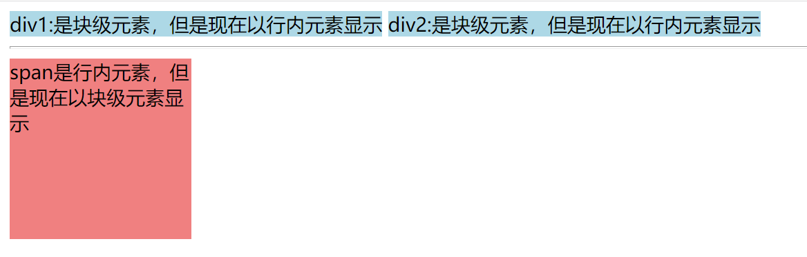
For example:
 <style>
     div {
         display: inline;
         background-color:lightblue;
     }
     span{
         display:block;
         background-color:lightcoral;
         width: 150px;
         height: 150px;
     }
 </style>

<body>
    <div>div1:Is a block level element, but is now displayed as an inline element</div>
    <div>div2:Is a block level element, but is now displayed as an inline element</div>
    <hr>
    <span>span Is an inline element, but is now displayed as a block level element</span>
</body>
Inline elements:
-
Width and height cannot be set
-
Up and down margin cannot be set
-
You can set the left and right margin
However, if the inline element is set as a block level element, the above can't.
display also has the following common attribute values
- none this element will not be displayed.
- flex this element will appear as an elastic box container.
- Grid this element is displayed as a grid container.
- Inline block this element will appear as an inline block element.
When using inline block, you should pay attention to
-
The vertical align attribute will affect the inline block element. You may set its value to top
-
You need to set the width of each column
-
If there are spaces between elements in HTML source code, there will be gaps between columns
flex and grid are more important, which will be written later, to be continued.
visibility
The visibility attribute specifies whether the element is visible.
It has the following attribute values
- Visible default. The element is visible.
- The hidden element is invisible.
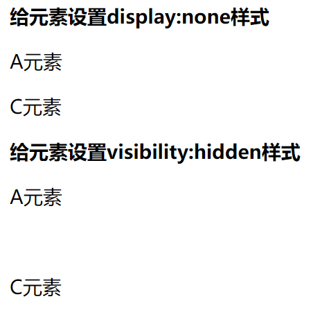
Both display:none and visibility:hidden can make elements invisible, but there are differences:
-
Display: the none element disappears and does not occupy space in the page
-
Visibility: the hidden element disappears and still occupies space in the page
    <div>
        <strong>Setting for elements display:none style</strong>
        <p>A element</p>
        <p style='display:none;'>B element</p>
        <p>C element</p>
    </div>

    <div>
        <strong>Setting for elements visibility:hidden style</strong>
        <p>A element</p>
        <p style='visibility:hidden;'>B element</p>
        <p>C element</p>
    </div>
float
Floating: the element breaks away from the original standard document flow and moves to the specified position in its parent element.
Attribute values are
- none defaults. The element does not float.
- The left element floats to the left.
- The right element floats to the right.
Common float layout
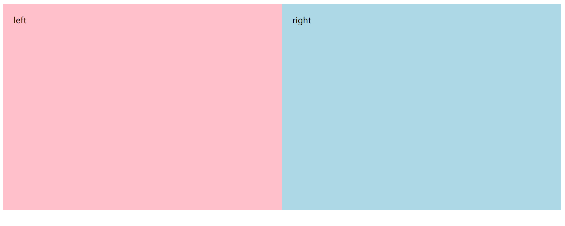
- Two column layout
<!DOCTYPE html>
<html>
<head>
    <meta charset="UTF-8">
    <title>Double column layout</title>
    <style type="text/css">
        .left {
            width: 50%;
            background-color: pink;
            height: 400px;
            float: left;
            box-sizing: border-box;
            padding: 20px;
        }
        .right {
            width: 50%;
            background-color: lightblue;
            height: 400px;
            padding: 20px;
            float: left;
            box-sizing: border-box;
        }
    </style>
</head>
<body>
    <div class="left">left</div>
    <div class="right">right</div>
</body>
</html>
- Three column layout
<!DOCTYPE html>
<html>

<head>
   <meta charset="UTF-8">
   <title>Double column layout</title>
   <style type="text/css">
       div {
           height: 300px;
       }

       .left {
           background-color: pink;
           width: 33.33%;
           float: left;
           padding: 20px;
           box-sizing: border-box;
       }
       .middle {
           background-color: cornsilk;
           width: 33.33%;
           float: left;
           padding: 20px;
           box-sizing: border-box;
       }
       .right {
           background-color: lightblue;
           width: 33.33%;
           float: right;
           padding: 20px;
           box-sizing: border-box;
       }
   </style>
</head>
<body>
   <div class="left">left</div>
   <div class="right">right</div>
   <div class="middle">middle</div>
</body>
</html>
Floating is a first come first served order.
Clear floating clear attribute
Floating elements leave the original document flow, which will affect the layout of other elements in the page. In order to eliminate this effect
You can use the clear attribute to eliminate floats.
- Left: clear the floating influence on the left
- Right: clear the floating influence on the right
- both: clear the floating influence on the left and right sides
Setting float will affect other adjacent elements;
Setting clear will only affect itself and will not affect other adjacent elements.
Position attribute
The position attribute specifies the location type of the element.
position:static
static is the default value of the position property.
- The location of the element caused by static positioning is determined by the browser independently, so the top, bottom, left and right attributes are invalid at this time.
position:relative
Relative positioning: the element is positioned (set coordinates) with its position in the normal flow as the starting point.
- It is used together with top, bottom, left and right attributes
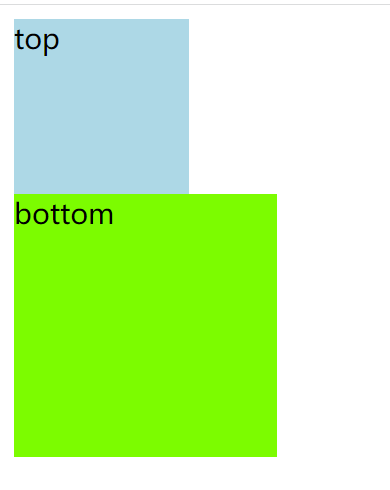
 <style type="text/css">
    .top{
        background-color: lightblue;
        width: 100px;
        height: 100px;
    }
    .bottom{
        background-color: lawngreen;
        width: 150px;
        height: 150px;
        /* position: relative;
        top: 20px;
        left: 30px; */
    }
    </style>
<body>
    <div class="top">top</div>
    <div class="bottom">bottom</div>
</body>
When adding positioning code to the code, the effect is
		position: relative;
        top: 20px;
        left: 30px;
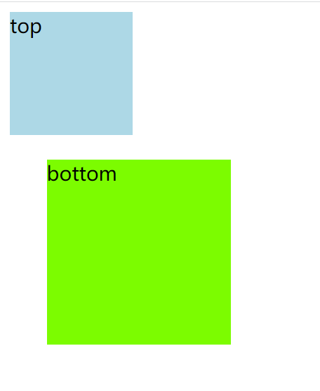
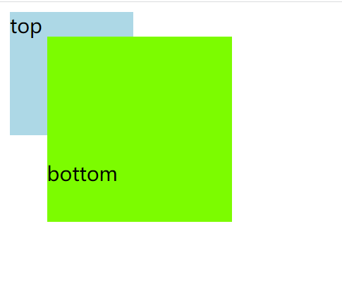
When adding float:left to the top element; When the top element is separated from the normal document flow, the bottom is positioned and offset with the normal document flow position.
    .top{
        background-color: lightblue;
        width: 100px;
        height: 100px;
        float: left;
    }
    .bottom{
        background-color: lawngreen;
        width: 150px;
        height: 150px;
        position: relative;
        top: 20px;
        left: 30px;
    }
position:absolute
absolute indicates that the positioning base point is the parent element, which is offset from the parent element (usually the parent element).
Important restrictions:
The positioning base point (usually the parent element) cannot be static positioning, otherwise the positioning base point will become the root element html of the whole web page
- It is used together with top, bottom, left and right attributes.
Modify the above code, remove the top floating attribute, and change the position attribute value of the bottom from relative to absolute.
    .top{
        background-color: lightblue;
        width: 100px;
        height: 100px;

    }
    .bottom{
        background-color: lawngreen;
        width: 150px;
        height: 150px;
        position: absolute;
        top: 20px;
        left: 30px;
    }
The effect is
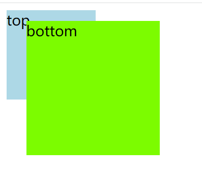
Elements located by absolute are ignored by normal page flow.
-
In normal page flow, the space occupied by this element is zero, and the surrounding elements are not affected.
-
The position of the absolutely positioned element is relative to the nearest parent element
-
Because the absolutely positioned boxes are independent of the document flow, they can cover other elements on the page and control their hierarchical order through z-index. The higher the value of z-index, the more it is displayed in the upper layer
- The default value of z-index attribute is 0;
position:fixed
fixed indicates that it is offset from the viewport (browser window), that is, the anchor point is the browser window.
This will cause the position of the element not to change with the page scrolling, as if it were fixed on the web page.
position:sticky
sticky is different from the previous four attribute values. It will produce dynamic effects.
- In some cases, it is relative positioning (the positioning base point is its default position), and in other cases, it automatically becomes fixed positioning (the positioning base point is the viewport).
- It must be used together with top, bottom, left and right attributes and cannot be omitted.
You can use this attribute to achieve the effect of letters in the phone book of the mobile phone.