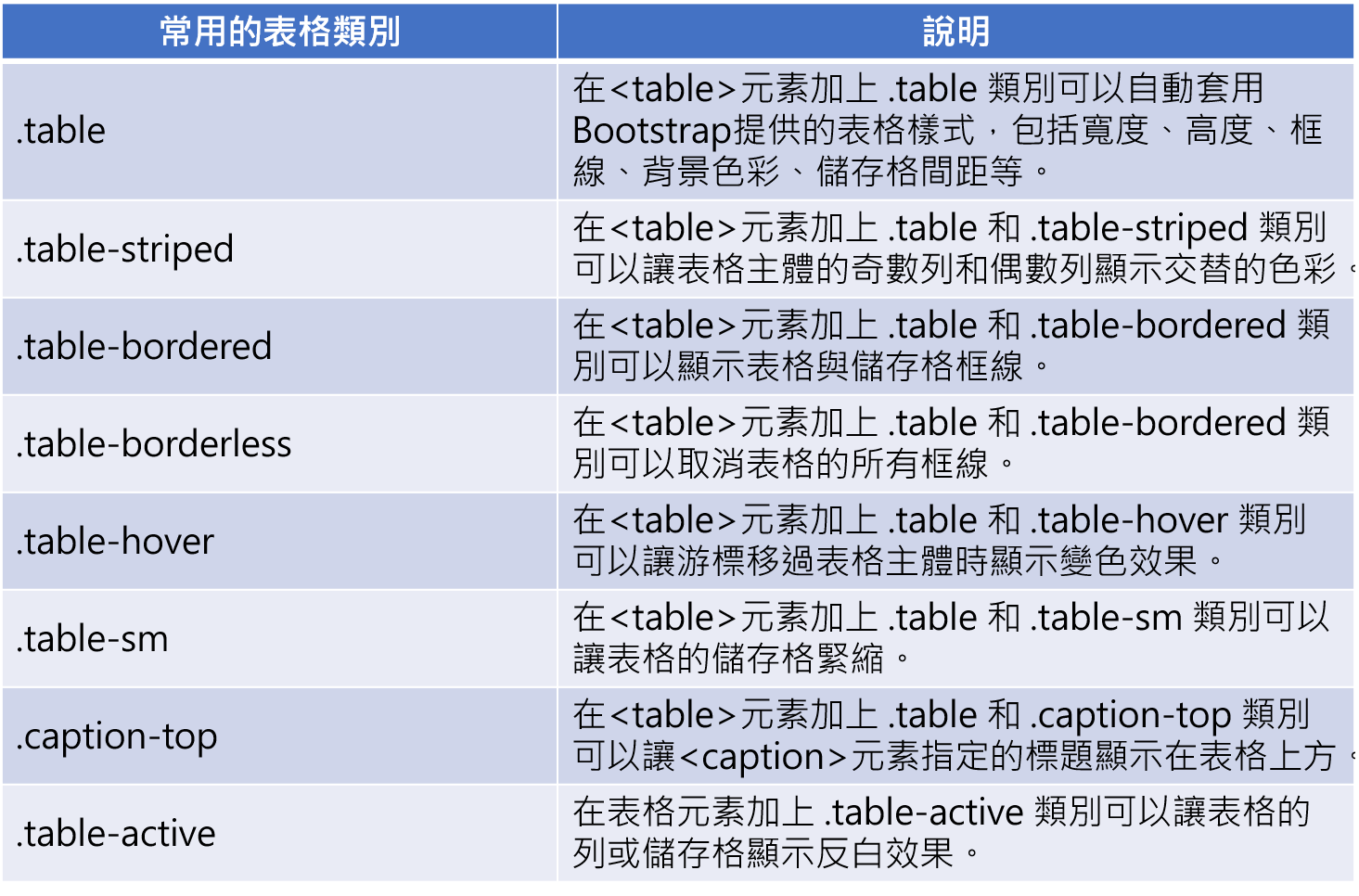
Table style and effect
Bootstrap provides the following categories to set table styles and effects:
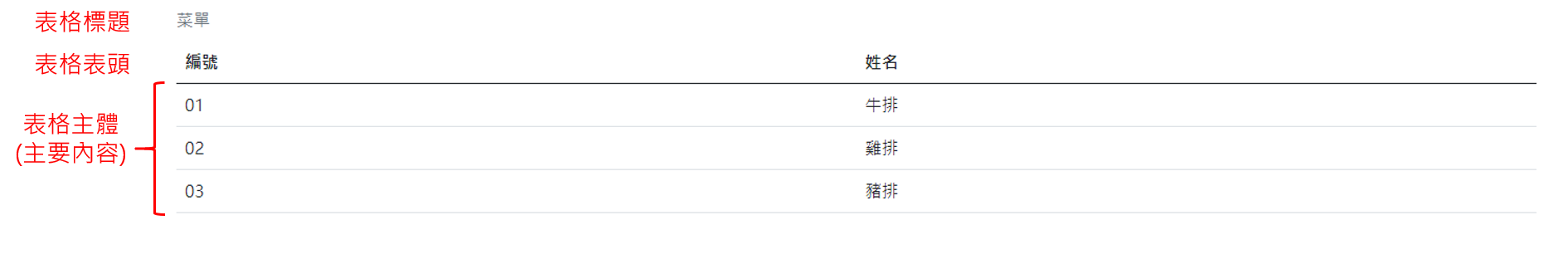
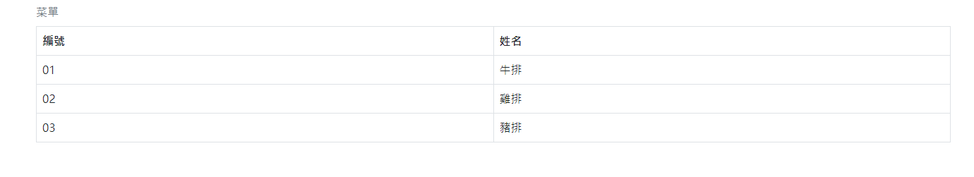
Example 1: table and title
Use the. Table category to automatically apply the table styles provided by Bootstrap, including width, height, border, background color, cell spacing, etc.
Use the. Caption top category to display the title above the table.
<!DOCTYPE html>
<html lang="en">
<head>
    <meta charset="UTF-8">
    <meta http-equiv="X-UA-Compatible" content="IE=edge">
    <meta name="viewport" content="width=device-width, initial-scale=1.0">
     <!-- Bootstrap CDN -->
    <!-- CSS only -->
    <link href="https://cdn.jsdelivr.net/npm/bootstrap@5.1.0/dist/css/bootstrap.min.css" rel="stylesheet" integrity="sha384-KyZXEAg3QhqLMpG8r+8fhAXLRk2vvoC2f3B09zVXn8CA5QIVfZOJ3BCsw2P0p/We" crossorigin="anonymous">
    <!-- JavaScript Bundle with Popper -->
    <script src="https://cdn.jsdelivr.net/npm/bootstrap@5.1.0/dist/js/bootstrap.bundle.min.js" integrity="sha384-U1DAWAznBHeqEIlVSCgzq+c9gqGAJn5c/t99JyeKa9xxaYpSvHU5awsuZVVFIhvj" crossorigin="anonymous"></script>
    <title>Table and table title</title>
</head>
<body>
    <div class="container">
        <table class="table caption-top">
        	<!-- Table title -->
            <caption>Menu</caption>
            <!-- Table title column -->
            <thead>
                <tr>
                    <th>Number</th>
                    <th>full name</th>
                </tr>
            </thead>
            <!-- Table body(primary coverage) -->
            <tbody>
                <tr>
                    <td>01</td>
                    <td>steak</td>
                </tr>
                <tr>
                    <td>02</td>
                    <td>Chicken chops</td>
                </tr>
                <tr>
                    <td>03</td>
                    <td>Pork chop</td>
                </tr>
            </tbody>
        </table>
    </div>
</body>
</html>
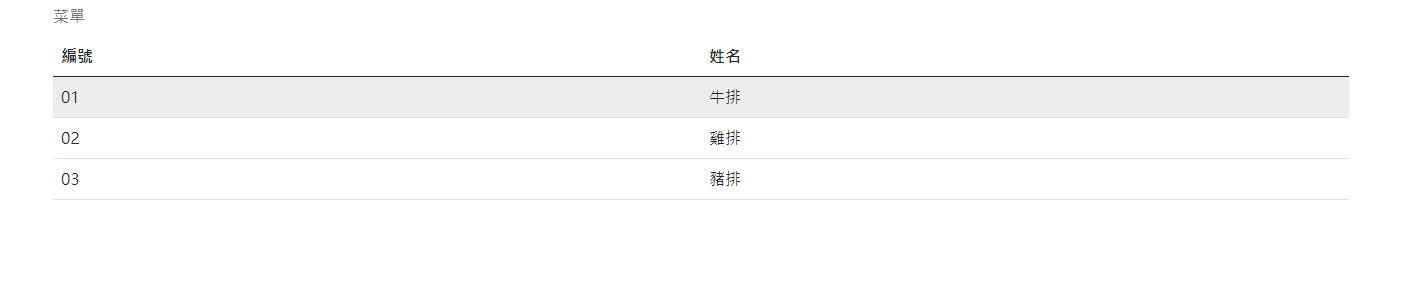
Example 2: alternating colors
You only need to add. table and. table striped categories to the < table > element.
<table class="table caption-top table-striped">
Example 3: display table and grid lines
You only need to add. table and. table bordered categories to the < table > element.
<table class="table caption-top table-bordered">
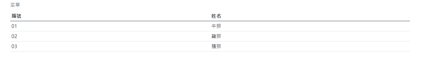
Example 4: cancel table and grid lines
You only need to add. table and. table borderless categories to the < table > element.
<table class="table caption-top table-borderless">

Example 5: the effect of color change is displayed when the cursor moves over the body of the table
You only need to add. table and. table hover categories to the < table > element.
<table class="table caption-top table-hover">
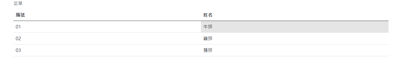
Example 6: the column or cell of the table displays the anti white effect
Add the. Table active category to the table element.
<td class="table-active">steak</td>
Example 7: cell compaction
You only need to add. table and. table SM categories to the < table > element.
<table class="table caption-top table-sm">
Vertical alignment of table contents
To set the vertical alignment of a table column or cell, you can add the following categories to the column or cell.
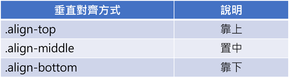
Example: vertical alignment of table contents
<!DOCTYPE html>
<html lang="en">
<head>
    <meta charset="UTF-8">
    <meta http-equiv="X-UA-Compatible" content="IE=edge">
    <meta name="viewport" content="width=device-width, initial-scale=1.0">
     <!-- Bootstrap CDN -->
    <!-- CSS only -->
    <link href="https://cdn.jsdelivr.net/npm/bootstrap@5.1.0/dist/css/bootstrap.min.css" rel="stylesheet" integrity="sha384-KyZXEAg3QhqLMpG8r+8fhAXLRk2vvoC2f3B09zVXn8CA5QIVfZOJ3BCsw2P0p/We" crossorigin="anonymous">
    <!-- JavaScript Bundle with Popper -->
    <script src="https://cdn.jsdelivr.net/npm/bootstrap@5.1.0/dist/js/bootstrap.bundle.min.js" integrity="sha384-U1DAWAznBHeqEIlVSCgzq+c9gqGAJn5c/t99JyeKa9xxaYpSvHU5awsuZVVFIhvj" crossorigin="anonymous"></script>
    <title>Vertical alignment of table contents</title>
</head>
<body>
    <div class="container">
        <table class="table table-sm">
            <tr>
                <td><img src="https://picsum.photos/200/200/?random=1"></td>
                <td class="align-top">Get up</td>
            </tr>
            <tr>
                <td><img src="https://picsum.photos/200/200/?random=2"></td>
                <td class="align-middle">Centering</td>
            </tr>
            <tr>
                <td><img src="https://picsum.photos/200/200/?random=3"></td>
                <td class="align-bottom">Get down</td>
            </tr>
        </table>
    </div>
</body>
</html>
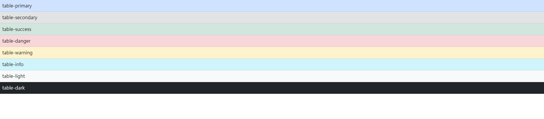
Specific meaning color category
You can set different colors for tables, columns and cells to represent different meanings.
Example: color category
<!DOCTYPE html>
<html lang="en">
<head>
    <meta charset="UTF-8">
    <meta http-equiv="X-UA-Compatible" content="IE=edge">
    <meta name="viewport" content="width=device-width, initial-scale=1.0">
     <!-- Bootstrap CDN -->
    <!-- CSS only -->
    <link href="https://cdn.jsdelivr.net/npm/bootstrap@5.1.0/dist/css/bootstrap.min.css" rel="stylesheet" integrity="sha384-KyZXEAg3QhqLMpG8r+8fhAXLRk2vvoC2f3B09zVXn8CA5QIVfZOJ3BCsw2P0p/We" crossorigin="anonymous">
    <!-- JavaScript Bundle with Popper -->
    <script src="https://cdn.jsdelivr.net/npm/bootstrap@5.1.0/dist/js/bootstrap.bundle.min.js" integrity="sha384-U1DAWAznBHeqEIlVSCgzq+c9gqGAJn5c/t99JyeKa9xxaYpSvHU5awsuZVVFIhvj" crossorigin="anonymous"></script>
    <title>Specific meaning color</title>
</head>
<body>
    <table class="table">
        <tr class="table-primary"><td>table-primary</td></tr>
        <tr class="table-secondary"><td>table-secondary</td></tr>
        <tr class="table-success"><td>table-success</td></tr>
        <tr class="table-danger"><td>table-danger</td></tr>
        <tr class="table-warning"><td>table-warning</td></tr>
        <tr class="table-info"><td>table-info</td></tr>
        <tr class="table-light"><td>table-light</td></tr>
        <tr class="table-dark"><td>table-dark</td></tr>
    </table>
</body>
</html>
Response form
The responsive table can be adjusted according to the width of the viewer. Just add the. Table responsive category to the container where the < Table > element is placed.
<!DOCTYPE html>
<html lang="en">
<head>
<meta charset="UTF-8">
<meta http-equiv="X-UA-Compatible" content="IE=edge">
<meta name="viewport" content="width=device-width, initial-scale=1.0">
<!-- Bootstrap CDN -->
<!-- CSS only -->
<link href="https://cdn.jsdelivr.net/npm/bootstrap@5.1.0/dist/css/bootstrap.min.css" rel="stylesheet" integrity="sha384-KyZXEAg3QhqLMpG8r+8fhAXLRk2vvoC2f3B09zVXn8CA5QIVfZOJ3BCsw2P0p/We" crossorigin="anonymous">
<!-- JavaScript Bundle with Popper -->
<script src="https://cdn.jsdelivr.net/npm/bootstrap@5.1.0/dist/js/bootstrap.bundle.min.js" integrity="sha384-U1DAWAznBHeqEIlVSCgzq+c9gqGAJn5c/t99JyeKa9xxaYpSvHU5awsuZVVFIhvj" crossorigin="anonymous"></script>
<title>Response form</title>
</head>
<body>
<!-- Add to the container .table-responsive category -->
<div class="container table-responsive">
<table class="table">
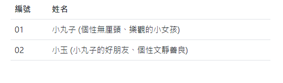
<tr>
<th>Number</th>
<th>full name</th>
</tr>
<tr>
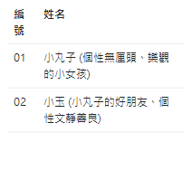
<td>01</td>
<td>Meatball (A little girl with unreasonable personality and optimism)</td>
</tr>
<tr>
<td>02</td>
<td>Xiaoyu (Xiaomaruzi's good friend has a quiet and kind personality)</td>
</tr>
</table>
</div>
</body>
</html>
When the width is large enough, the cell will automatically enlarge
When the width is not enough, the cell will automatically shrink