This article was created on October 8, 2021 at 2010
1. Official layui announcement
Today, I just came into contact with layui. It is still necessary for the developers in the background to know the basic front-end programming. Although there are not many front-end programs written in peacetime, they are also annoyed by the tedious front-end code. To avoid this situation, simplify the code, no layout, no positioning, no aesthetics, it is an ugly group anyway, but the back-end personnel care about it.So much, as long as it's not a specific requirement, I just want the reception to receive and feedback data.
However, considering that you may see a front-end framework in the future, in order to better interact with the front-end, you must understand it, otherwise when you write code, I can not even find the interface of the front-end page;
Recent messages from the official website:
Click to enter the official website
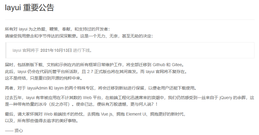
It feels very touching, although I'm also the first time I've learned this, but when I step into Java and hit hello word, I've heard layui, so programmers who have used layui before may feel even more touched.
Below I will make an article with some code examples to demonstrate layui, describing the corresponding methods and functions in the most popular language, but it should be noted that this article is only for back-end developers, understand it, not for professional front-end personnel, and friends who require too much framework knowledge, please know!
2. Why use layui framework, the benefits of layui framework
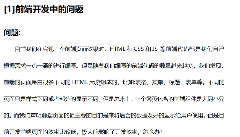
Our layui framework is the specific method and interface provided. What style and effect do we want? We just use it directly, such as our handwritten form or drop-down box, etc. instead of typing in one label and one label, so we only need to focus on the value passed and the value itself, some other complicationsOperations can be handed directly to the frame
The layui framework is very helpful for people on our backend. Here are the features of the layui framework and how to use it in more detail
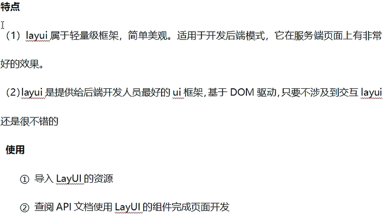
3. Use of layui framework
3.1. Importing Layui's Resources
This can be downloaded directly from his website, although it will be closed soon, everyone can go to his gitee to download it.
Click Jump
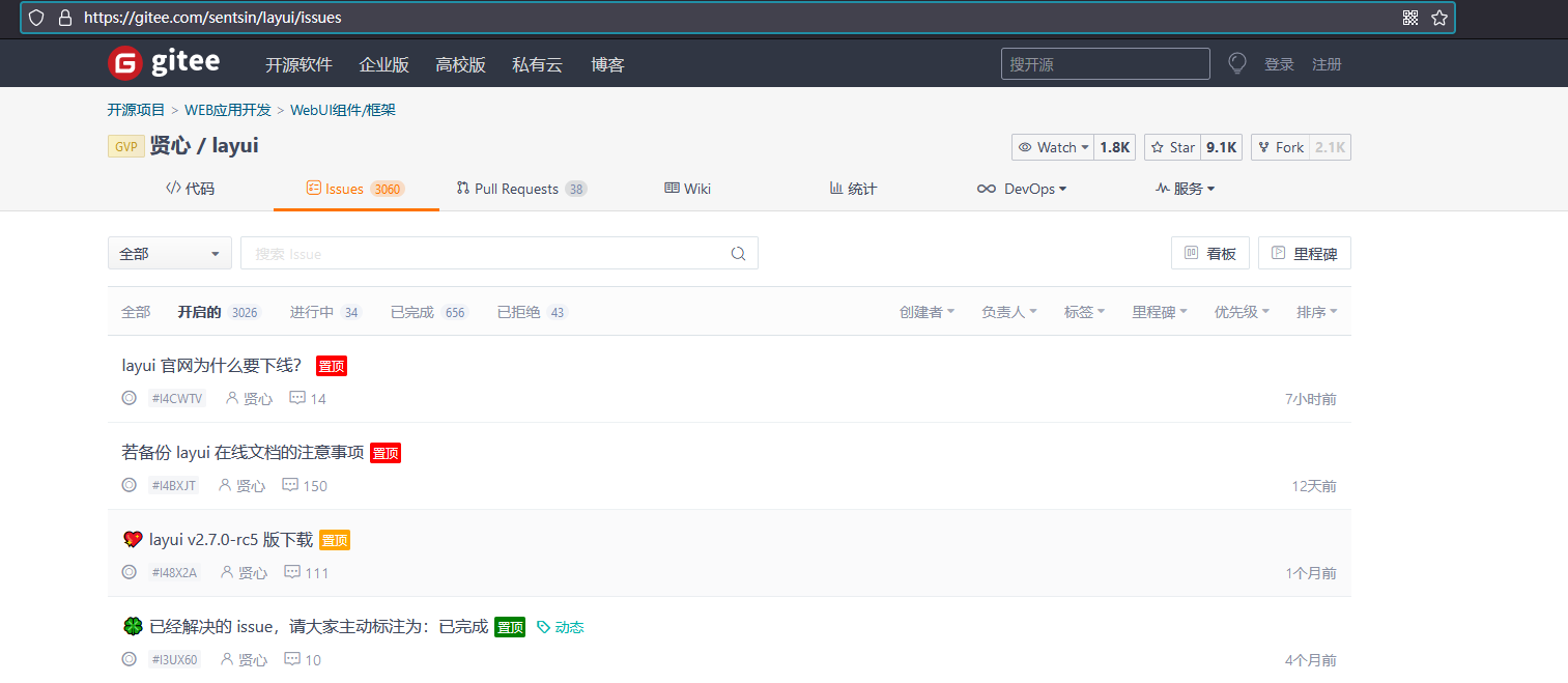
3.2. The introduction of resources in the project, under the webapp file in our project, simply copy the layui file of resources into it.

You don't need another jar package, and if you just use it, that's enough
3.3. Support for Technical Documentation
Laui's official technical documents are good by themselves. If you think the official documents are OK, you can actually go directly to see the code demonstration inside the official documents, copy and modify them directly. If the technology is good, you can look directly at the documents. There is no need to look at me. I just want to learn faster and easier for beginners!
Since recent official documents may be taken off the shelves, you can go to the previous gitee, where virtue should be seen, as well as inside the mirror.
4. Code beginners, key module examples, introduction of framework
Let's just follow the previous steps and introduce them directly into the code:
<!DOCTYPE html>
<html lang="en">
<head>
    <meta charset="UTF-8">
    <title>Title</title>

    <!--Introducing Core class file-->
    <link rel="stylesheet" href="./layui/css/layui.css">

    <!--Introducing Core js file-->
    <script type="text/javascript" src="./layui/layui.js"></script>
</head>
<body>

</body>
</html>
Once you've put the previous resources together, we can just import the class and js files directly into the code, both inside our layui files;
If we want to use something in the framework, we can just call it using class directly, and layui provides us with a variety of ways to call information, as shown below:
Here's an example of a button:
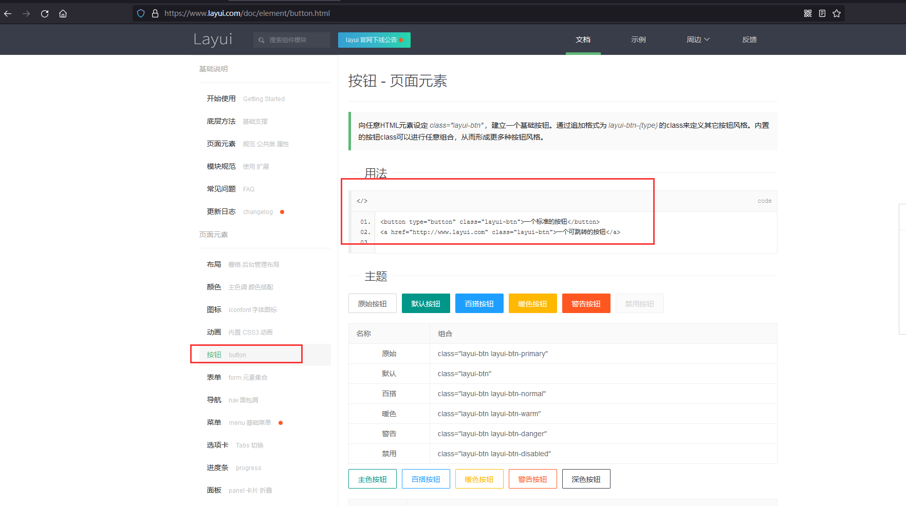
First we define a normal button in the code
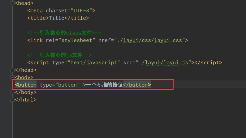 The results are as follows:
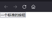
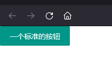
Obviously, this button is very common, the most basic button, so let's change the style of this button to make it look better. We can use class directly in the label to make the style written in the calling frame:
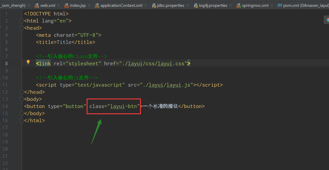 Effect:
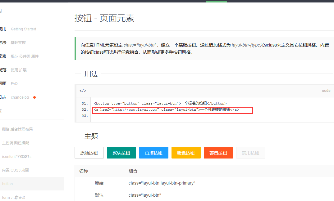
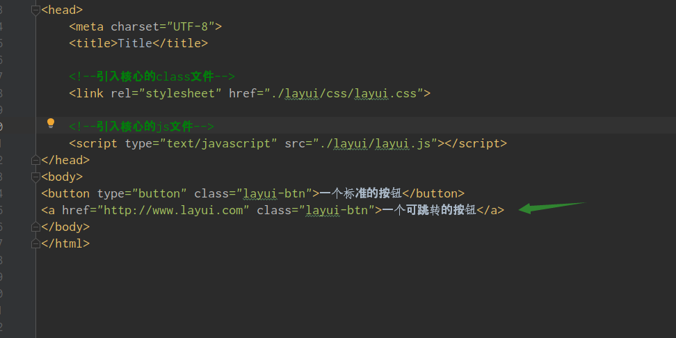
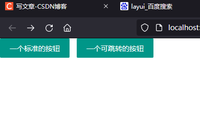
To jump a button, we can just use the label directly. The a label is a hyperlink label, but the class="layui-btn" in the frame changes to the button style:
Copy in Technical Documentation:
5. Introduction and use of layui framework module
In the button we just used, we can use the encapsulated method of the class call framework directly, but in the framework, there are some effects that require the introduction of modules to use.
For example, there are instructions in the Quick Start of Documentation:
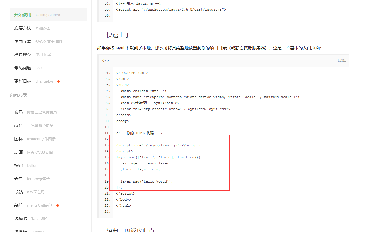 So what's the effect of these codes? Let's have a look:
<!DOCTYPE html>
<html lang="en">
<head>
    <meta charset="UTF-8">
    <title>Title</title>

    <!--Introducing Core class file-->
    <link rel="stylesheet" href="./layui/css/layui.css">

    <!--Introducing Core js file-->
    <script type="text/javascript" src="./layui/layui.js"></script>
</head>
<body>
<button type="button" class="layui-btn">A standard button</button>
<a href="http://Www.layui.com "class=" layui-btn ">a jumpable button</a>


<script>
    layui.use(['layer'], function(){
        var layer = layui.layer;
        layer.msg('Hello World');
    });
</script>

</body>
</html>
Running effect: A small pop-up window appears, which is considered a pop-up window
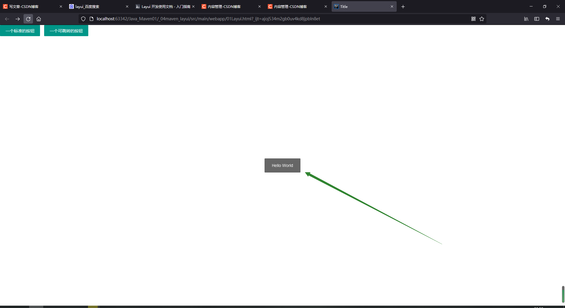 That's the effect of the new pop-up window. This pop-up window needs the support of the module, so we have to import the module. Let's have a look at the code that the module imports:

All but the descriptions are fixed formats;
If we want to use something else, like navigation: he needs modules:
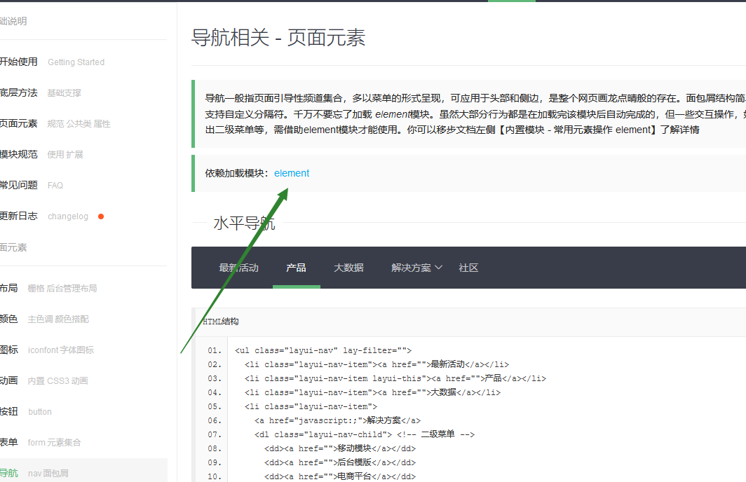
,
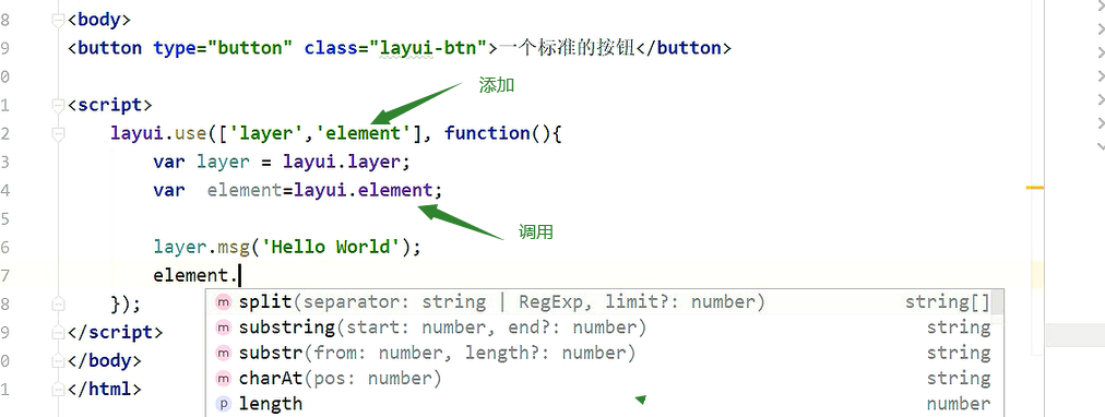
6. Raster system:
Raster Layout Using Frames
First look at the technical documentation:
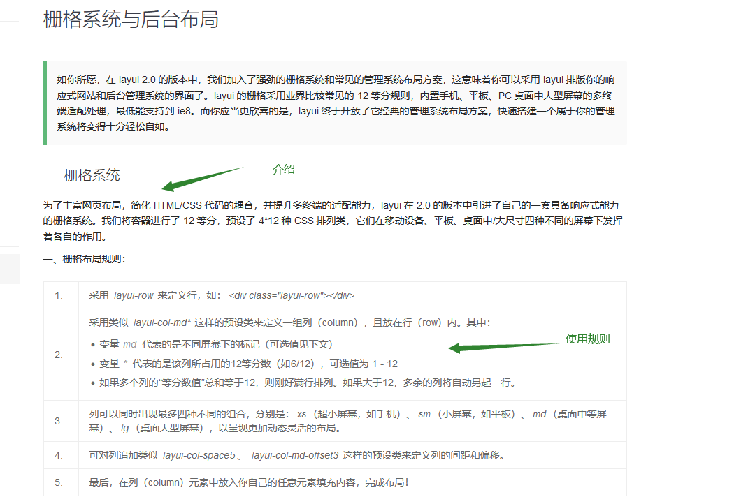
If you want to use the frame style of the frame system, it needs a container to receive, such as a biv tag

<!DOCTYPE html>
<html lang="en">
<head>
    <meta charset="UTF-8">
    <title>grid system</title>

    <!--Introducing Core class file-->
    <link rel="stylesheet" href="./layui/css/layui.css">

    <!--Introducing Core js file-->
    <script type="text/javascript" src="./layui/layui.js"></script>
</head>
<body>

    <div class="layui-container" style="background-color:red ">
        123
    </div>


</body>
</html>
The results are as follows:
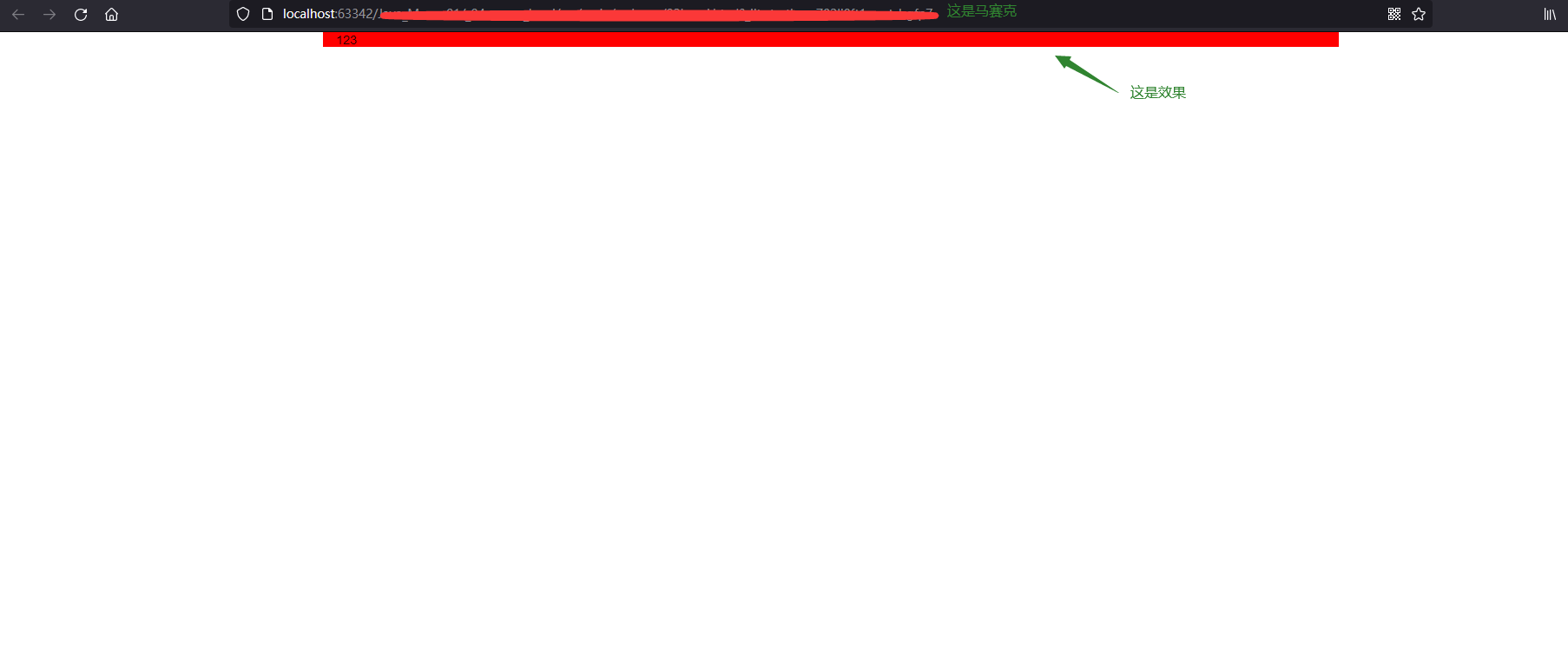
The reason for my screenshot is that it should be a centered effect.
In addition to this, there are no limitations to it: 100% tiling effect:
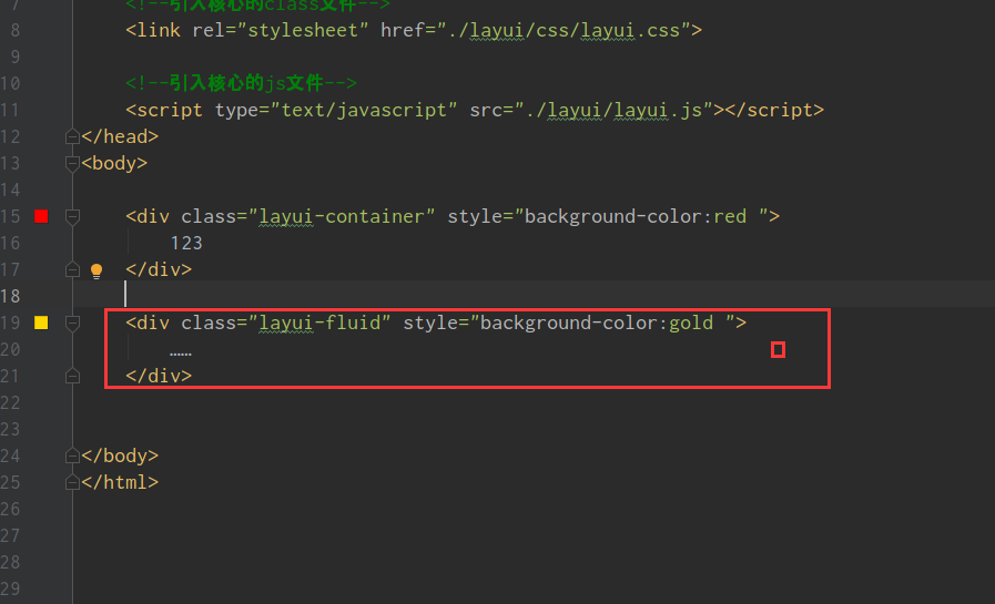

These are two simple layouts
Now we're going to raster
The frame is actually that the whole layout is divided into twelve parts, and we can set the layout according to different proportions
We're going to define a div to introduce the layout:
<!DOCTYPE html>
<html lang="en">
<head>
    <meta charset="UTF-8">
    <title>grid system</title>

    <!--Introducing Core class file-->
    <link rel="stylesheet" href="./layui/css/layui.css">

    <!--Introducing Core js file-->
    <script type="text/javascript" src="./layui/layui.js"></script>
</head>
<body>

    <div class="layui-container" style="background-color:red ">
        123
    </div>

    <div class="layui-fluid" style="background-color:gold ">
        ......
    </div>

    <br>
    <br>
    <br>

    <div class="layui-fluid" style="background-color:fuchsia ">

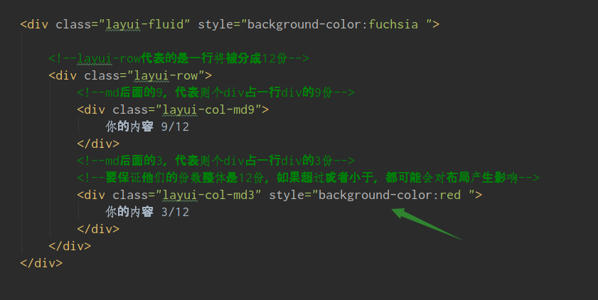
        <!--layui-row Represents a line that will be divided into 12 parts-->
        <div class="layui-row">
            <!--md The last 9 represent each other div Occupy one line div Nine copies-->
            <div class="layui-col-md9">
                Your Content 9/12
            </div>
            <!--md The latter three represent each other div Occupy one line div 3 copies-->
            <!--Make sure they have 12 copies as a whole, and if they are more or less, they may have an impact on the layout-->
            <div class="layui-col-md3">
                Your Content 3/12
            </div>
        </div>
    </div>


</body>
</html>
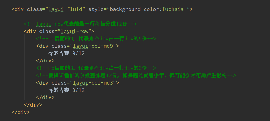 Just remember this format
Operation effect:
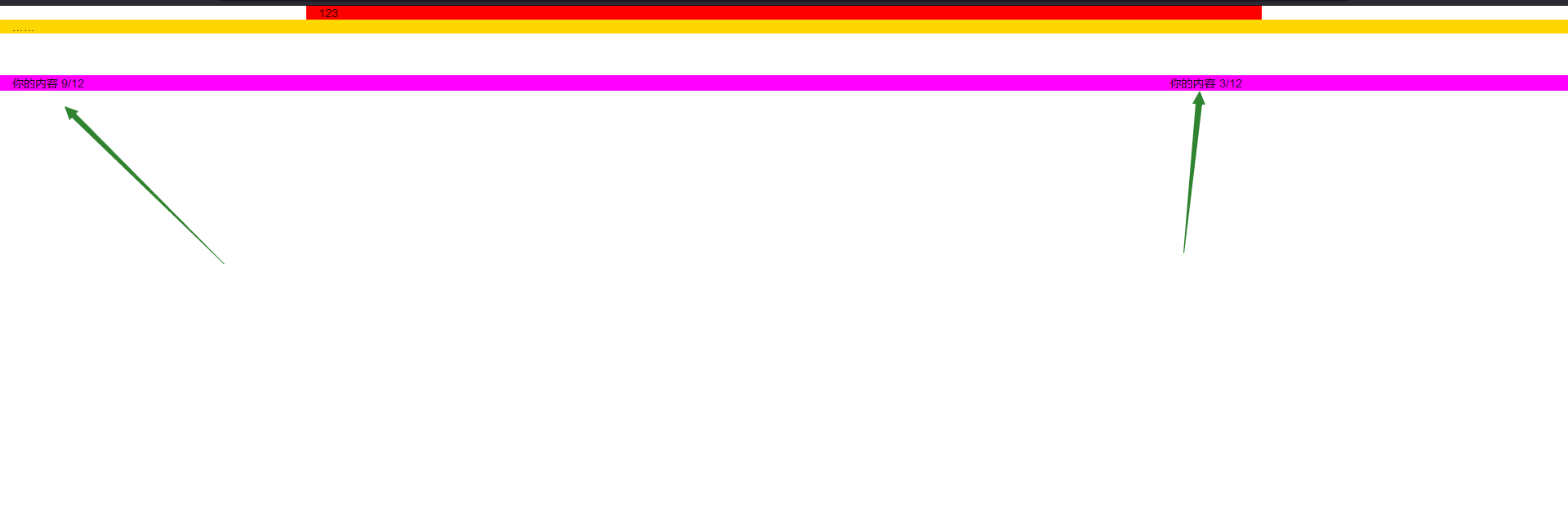
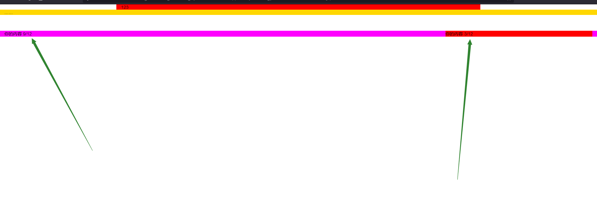
For a better view, we can add color to the back one:
6.1. Layout disorder caused by equipment problems
Now we can basically locate some effects in the div by this effect, but we also need to consider the situation under different devices, it is likely that the pc side will be normal, but when it comes to the mobile phone and the tablet, the layout will be confused due to the different screen and resolution.
So we can make adjustments in the technical documentation by
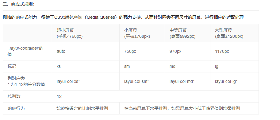
Look at the tag, that column has an md, which is what we wrote when we wrote the div reference layout, and we can change it for different devices.
But it's not too difficult for us to modify this all the time, so we can add a space directly in the class, directly after md9, and then write another one, but this is not the MD anymore, we can change other devices, so we can add more than one device

7. Management system interface layout
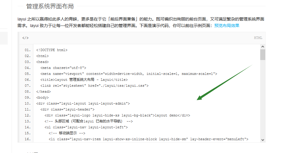
Our management system, in fact, is almost the same. It has a navigation bar on it, a catalog bar on the left, a theme on the right, and perhaps a tail bar at the bottom.
It is pointed out in the technical document that:
Code implementation:
<!DOCTYPE html>
<html lang="en">
<head>
    <meta charset="UTF-8">
    <title>grid system</title>

    <!--Introducing Core class file-->
    <link rel="stylesheet" href="./layui/css/layui.css">

    <!--Introducing Core js file-->
    <script type="text/javascript" src="./layui/layui.js"></script>
</head>
<body>

    <!--Introduce Layout-->
    <div class="layui-layout" >
        <!--head-->
        <div  class="layui-header">
            123
        </div>

        <!--subject-->
        <div class="layui-body">
            123
        </div>

        <!--tail-->
        <div class="layui-footer">
            123
        </div>
    </div>


</body>
</html>
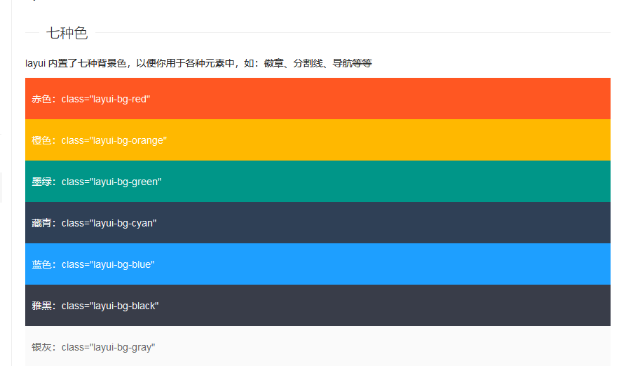
Now that the sample layout is ready, we want to add colors. Before we added colors according to the original div color label, we actually provided colors inside the frame:
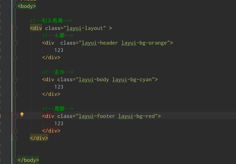
The color after adding the code is like this: to see the effect:

We found it unsatisfactory because we did not limit the height of the main part, but the height is still a div attribute. In the sub-framework, we can solve it by layui-layout-admin, which will automatically generate the management system layout:
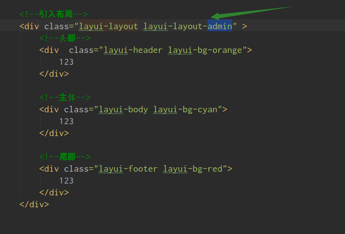
At this point our management system layout is ready:
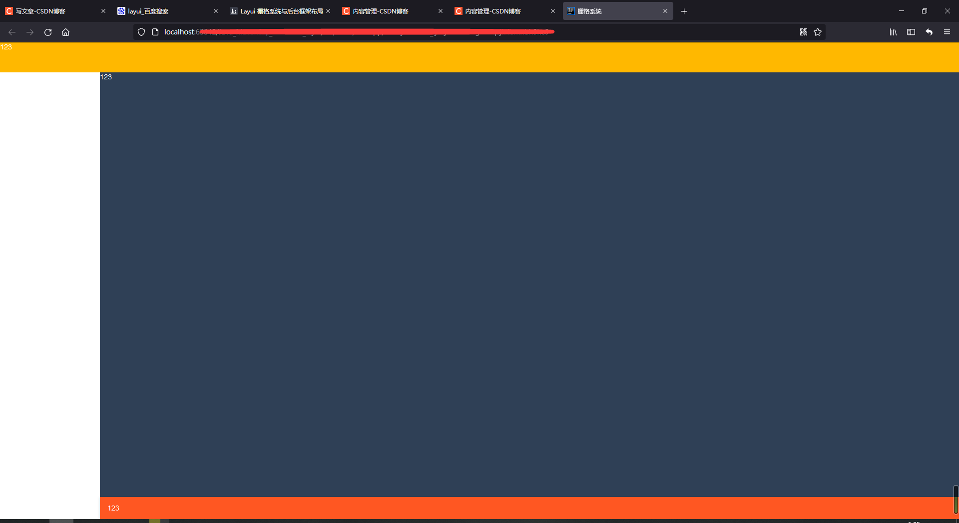
The empty part on the left is the menu, which we can ignore for the moment;
Say yes, it's 1:07 a.m. now, it's really late, I really don't want to write; write a little more, publish it tonight, and then add and change it later, oh, hard programming life
8. Button Component
The example we started with was the effect of a button generated by a framework
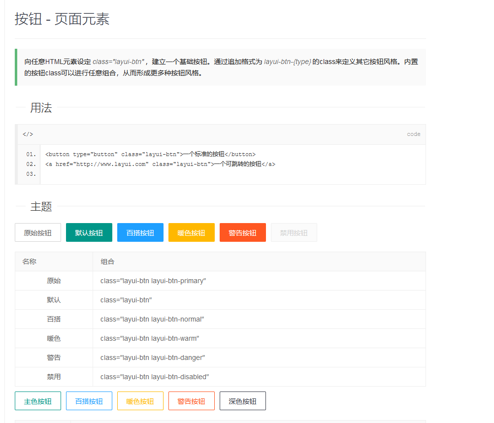
Code demonstration:
<!DOCTYPE html>
<html lang="en">
<head>
    <meta charset="UTF-8">
    <title>grid system</title>

    <!--Introducing Core class file-->
    <link rel="stylesheet" href="./layui/css/layui.css">

    <!--Introducing Core js file-->
    <script type="text/javascript" src="./layui/layui.js"></script>
</head>
<body>

    <!--Frame's normal button properties can be applied to any element-->
    <button type="button" class="layui-btn">A standard button</button>
    <a class="layui-btn">a Button for label</a>
    <span class="layui-btn">span Button for label</span>

</body>
</html>
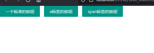
Our normal frame buttons, which work on other elements, can generate buttons
In addition to these, there are buttons in other formats, and we just need to add different class es to show them all.
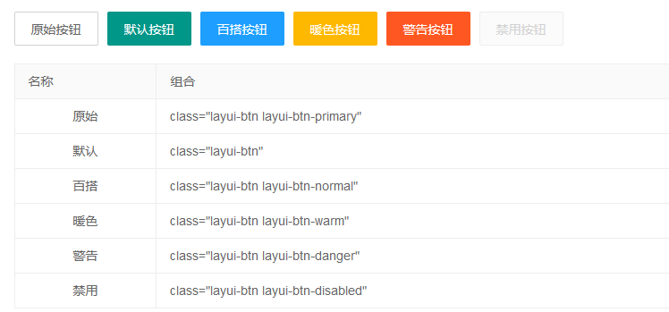
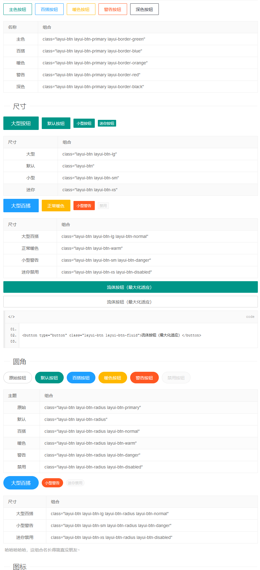
These buttons add the class of the response. Here's how to use icon buttons
8.1. Use of icon buttons
There are descriptions in our document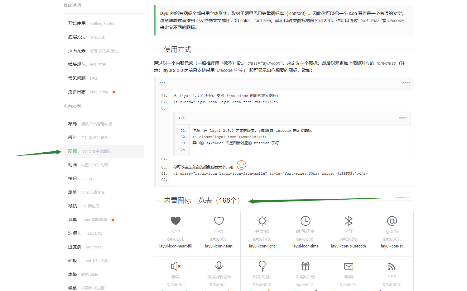
There are two main ways to combine icons and buttons:
class introduction:

Effect:

If you want to change it, just change the style at the back
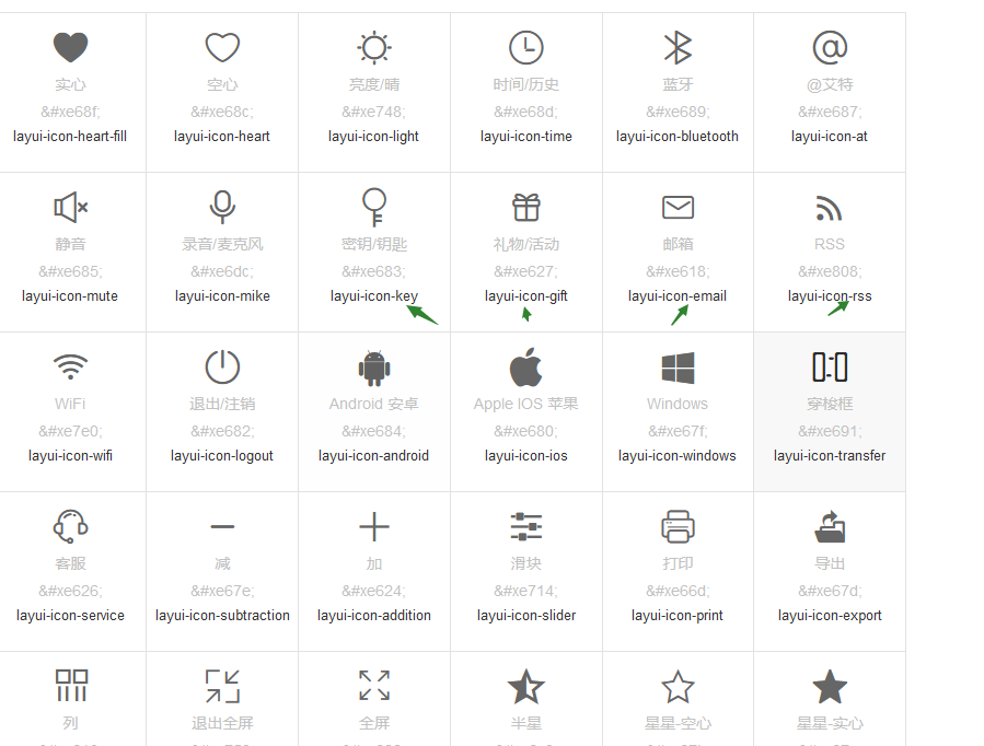 Below the icon is:
Another way is to use the paragraph above the style:
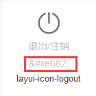
Use it as follows:

It's just an earlier version, the class one is recommended
Not finished yet.... Learning desperately