title: 2017-9-26 html model and centralization method
date: 2017-09-26 18:07:38
tags: [HTML5,CSS3]
grammar_cjkRuby: true
Welcome to my personal blog Personal Blog of Never Island
HTML model
Box model
The box model can be imagined as a packaged moon cake, div, content, padding between the moon cake and the box, margin between the two packaged moon cakes, and block-level elements all have the characteristics of the box model.
Block level elements
div, p, h1, form, ul are block-level elements in html. Setting display:block is to display elements as block-level elements.
The characteristics of block-level elements:
- Each block-level element starts with a new line, and subsequent elements start with a new line. (True hegemony, a single line of block-level elements)
- Element height, width, row height and top and bottom margins can be set.
- The width of an element is 100% of its parent container (the same as the width of the parent element), unless a width is set.
How to turn inline elements into block-level elements?
a{display:block;}inline
In html, span >, a, label, strong and em are typical inline elements. Of course, block elements can also be set to inline elements by code display:inline
The characteristics of inline elements:
It's on the same line as the other elements.
Element height, width and top and bottom margins are not set.
The width of an element is the width of the text or picture it contains and cannot be changed.
How do I transfer block-level elements to inline elements?
div{display:inline;}Inline Block Level Elements
inline-block is characterized by inline and block elements. img and input are inline block elements.
Characteristics of inline block-level elements:
- It's on the same line as the other elements.
- Element height, width, row height and top and bottom margins can be set.
How do I transfer another element to an inline block-level element?
div{display:inline-block;}The Border of Box Model
p{border:1px solid red;}
p {
    border-style:dotted;
    border-color:#ccc;
    border-width:1px;
}
Height and Width of Box Model
- IE box model
Total width of box model = margin+width
width=border+padding+content
- Standard Box Model
Total width of box model = margin+border+padding+width
width=content
- Solution
W3C finally solved this problem by adding box-sizing in CSS3. When we set box-sizing: border-box; border and padding are included in the width, so in order to avoid different performance of the same css under different browsers, it is better to add:
*, *:before, *:after {
  -moz-box-sizing: border-box;
  -webkit-box-sizing: border-box;
  box-sizing: border-box;
}
Layout model
Layout model, like box model, is the most basic and core concept of CSS. But the layout model is based on box model, which is different from what we often call CSS layout style or CSS layout template. If the layout model is this, then the CSS layout template is the end.
Flow Model
Flow model is the default layout mode of browsers, which has two characteristics
1. Block elements are laid out top-down
2. Inline elements are laid out from left to right
Float model
If we want two block elements to be displayed side by side now, we can use the floating model.
<!DOCTYPE html>
<html>
<head>
    <meta http-equiv="Content-Type" content="text/html; charset=utf-8">
    <title>Floating model</title>
    <style type="text/css">
        div{
            border: 2px red solid;
            width: 200px;
            height: 200px;
        }
        .div1, .div2 {
            float: left;
            margin-right: 10px;
        }
        .div3 {
            width:414px;
            /*414=2(div1 Border-left+200(width of div1)+2(border-right of div1)+10(margin-right of div1)+2(border-left of div 2)+200(width of div2)+2(border-right of div2)-4(border-left+border-right of div3)*/
            margin-top:2px;
        }
    </style>
</head>
<body>
    <div class="div1">Column 1</div>
    <div class="div2">Column 2</div>
    <p style="clear:both;margin:0px; height:1px;"></p>
    <div class="div3">Column 3</div>
</body>
</html>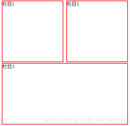
margin collapse boundary collapse or overlap
== Whether margin-top, which sets clear non-none elements, takes effect depends largely on whether the margin-top pushes the element over the height of all float elements.==
== The most effective way to solve the problem of clear: both after floating is to use margin to invalidate subsequent elements.==
Instead of mixing clear with other styles, reset a label to clear the float, such as the p label in the code above.
Layer Model
Layer layout model is like a very popular layer editing function in PhotoShop. Each layer can accurately locate the operation.
Layer model has three forms:
- Absolute positioning (position: absolute)
- Position: relative
-
Position: fixed
- Abslute: As in the table, if you move, you move.
- relative: It's just that the surface display moves, but it's still in the original position in the document stream, and other elements can't occupy it.
Middle skill
horizontally
In-line element level is in the middle
If the element is set as text, picture and other in-line elements, the horizontal centralization is achieved by setting text-align:center for the parent element.
.txtCenter{ text-align:center;}
<div class= "txtCenter">I want to display it horizontally in the parent container. </div>
Fixed Width Blocky Elements in the Middle Level
When set to block elements, text-align: center does not work. There are also two cases: fixed-width block elements and variable-width block elements. Fixed Width Block Element: Width of Block Element is a fixed value.
<body>
  <div>I'm a fixed width block element. Haha, I want to show it horizontally in the middle.</div>
</body>
<style>
div{
    border:1px solid red;/*In order to show the center effect, the div is clearly framed.*/

    width:200px;/*Fixed width*/
    margin:20px auto;/* margin-left With margin-right set to auto */
}
The indefinite wide block elements are in the middle of the level.
In practice, we will encounter the need to set "block elements with variable width" in the middle, such as paging navigation on Web pages, because the number of pages is uncertain, so we can not limit its flexibility by setting width.
- Add the table tag
- Setting the display: inline method: Similar to the first method, the display type is set to an in-line element, and the attribute setting of an indefinite width element is done.
- Setting position: relation and left:50%: Using relative positioning method, the element is shifted 50% to the left, that is to say, to achieve the goal of centering.
Add the table tag
<div>
 <table>
  <tbody>
    <tr><td>
    <ul>
        <li>I'm the first line of text.</li>
        <li>I'm the second line of text.</li>
        <li>I'm the third line of text.</li>
    </ul>
    </td></tr>
  </tbody>
 </table>
</div>
<style>
table{
    border:1px solid;
    margin:0 auto;
}
</style>
Set inline
<style>
        a {
            text-decoration:none;
        }
        .container {
            text-align:center;
        }
        ul {
            list-style:none;
            display:inline;
            margin:0px;
            padding:0px;
        }
        .container li {
            display:inline-block;
            width:30px;
            height:30px;
            border:1px solid red;
            line-height:30px;
        }
    </style>
<body>
    <div class="container">
        <ul>
            <li><a href="#">1</a></li>
            <li><a href="#">2</a></li>
            <li><a href="#">3</a></li>
        </ul>
    </div>
</body>
Use position: relation to center
<style>
        a {
            text-decoration: none;
        }
        .container li {
            text-align: center;
            display: inline-block;
            min-width: 30px;
            height: 30px;
            border: 1px solid red;
            line-height: 30px;
        }
        /*Step 1: Align the left line of the parent element, div, with the middle line of the browser. Be sure to set the left float*/
        .container {
            float:left;
            position: relative;
            left: 50%;
        }
        /*Step 2: Move ul to the left of the parent div by - 50%, which is to align the div's left-hand line with the middle line of ul.*/
        ul {
            list-style: none;
            margin: 0px;
            padding: 0px;
            position:relative;
            left:-50%;
        }
    </style>

<body>
    <div class="container">
        <ul>
            <li><a href="#">1</a></li>
            <li><a href="#">2</a></li>
            <li><a href="#">3</a></li>
            <li><a href="#">1</a></li>
            <li><a href="#">2</a></li>
            <li><a href="#">1</a></li>
            <li><a href="#">2</a></li>
            <li><a href="#">3</a></li>
            <li><a href="#">1</a></li>
            <li><a href="#">2</a></li>
            <li><a href="#">3</a></li>
            <li><a href="#">1</a></li>
            <li><a href="#">2</a></li>
            <li><a href="#">3</a></li>
        </ul>
    </div>
</body>
Vertical centering
One-way height in the middle
<div class="container">
    hi,imooc!
</div
<style>
.container{
    height:100px;
    line-height:100px;
    background:#999;
}
</style>
Multi-row height in the middle
- You can borrow table
- Set display:table-cell;
Borrowing table s to achieve high centrality
Use insert table (including tbody, tr, td) tags, and set vertical-align: middle.
The td tag defaults to vertical-align as middle by default, so we don't need to explicitly set it.
<style>
        .container {
            height: 500px;
            width: 500px;
            background: #999;
        }

            .container table {
                margin: 0 auto;
            }

                .container table td {
                    height: 500px;
                }
</style>
<body>
    <div class="container">
        <table>
            <tr>
                <td>
                    <img src="http://img.mukewang.com/54ffac56000169c001840181.jpg" title="" />
                </td>
            </tr>
        </table>
    </div>
</body>
Setting display:table-cell to achieve high centrality
 <style>
        .container {
            height: 500px;
            width:500px;
            background: #999;
            display: table-cell;/*IE8 Above and Chrome, Firefox*/
            vertical-align:middle;/*IE8 Above and Chrome, Firefox*/
            text-align:center;/*img It's an inline block element, with text-align in the middle.*/
        }
    </style>
</head>

<body>
    <div class="container">
        <img src="http://img.mukewang.com/54ffac56000169c001840181.jpg" title="" />
    </div>
</body>