Foreword: in the process of using flex in the project, if the two ends of space between are aligned, the last line will be difficult to align. This paper mainly lists the solutions for the common layout of multi row and multi column, which is convenient for everyone's daily development and use.
Without much to say, let's get to the point:
Scheme 1: label filling
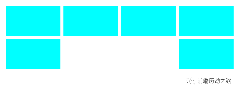
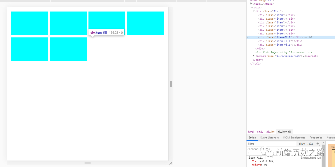
We all know that the reason for the misalignment is that there are not four sub items in the last line. The space between alignment will naturally empty the middle. In that case, why not fill the position directly and fill up 4 elements.
<!-- style -->
<style>
    .list{
        display: flex;
        justify-content: space-between;
        flex-wrap: wrap;
    }
    .item{
        /* flex: 0 0 24% This attribute is equivalent to flex:none;width:24% */
        flex: 0 0 24%;
        height: 100px;
        background-color: aqua;
        margin-bottom: 10px;
    }
    .item-fill{
        flex: 0 0 24%;
        height:0;
    }
    /* Eliminate extra margins on the last line */
    .list .item:nth-last-child(-n+4){
        margin-bottom: 0;
    }
</style>

<!-- html -->
<div class="list">
    <div class="item"></div>
    <div class="item"></div>
    <div class="item"></div>
    <div class="item"></div>
    <div class="item"></div>
    <div class="item"></div>

    <div class="item-fill"></div>
    <div class="item-fill"></div>
    <div class="item-fill"></div>
</div>
The effects are as follows:
What if the number of child elements is not 4? After careful observation, it is not difficult to find that the minimum value of the last line is 1, so we only need to fill in n-1. If there are only three, you can also use the pseudo element:: after to fill the last position.
Scheme 2: calculate the remaining space
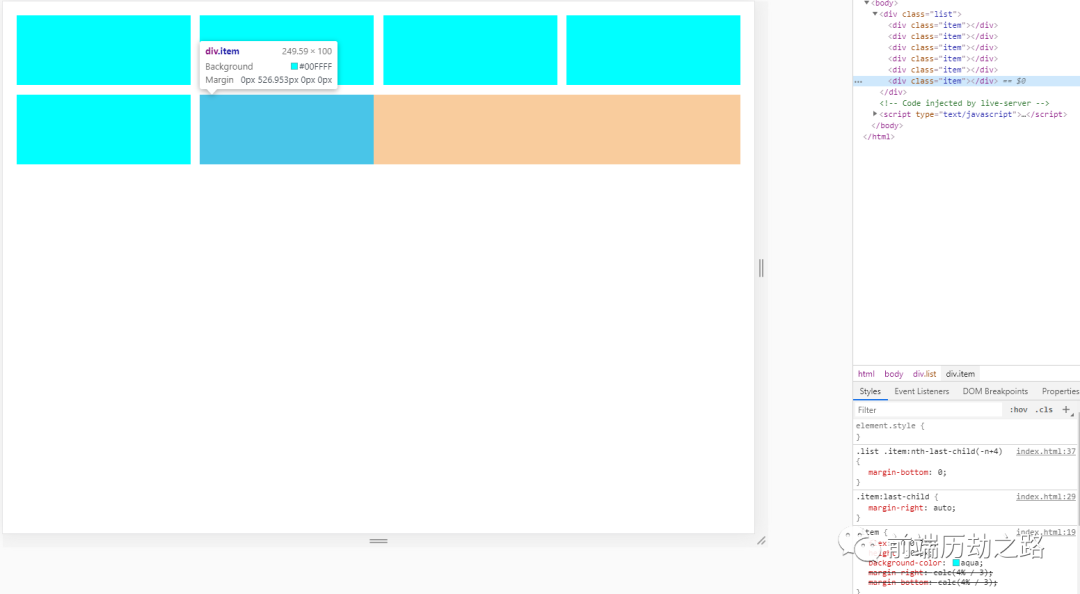
If we know the remaining space in the last row, we can control the margin or scaling of the last element to occupy the remaining space, so we can naturally align to the left. To do this, we must first determine the width and margin. The width is usually known. We only need to determine the margin to confirm the remaining space.
Following the above example, assuming that there are 4 elements in a row, each accounting for 24%, and 4 is 24% * 4 = 96%, then it can be determined that the total margin is 4%. Since there are 4 elements in a row and the right margin of the last one is redundant, it can be determined that the single margin is 4% / 3 = 1.333%. After calculation, you can start writing code:
<!-- css -->
<style>
    .list{
        display: flex;
        justify-content: space-between;
        flex-wrap: wrap;
    }
    .item{
        flex: 0 0 24%;
        height: 100px;
        background-color: aqua;
        /* Margins are too lazy to count, css function instead */
        margin-right: calc(4% / 3);
        margin-bottom: calc(4% / 3);
    }
    /* Remove excess margins at the end of each line */
    .item:nth-child(4n){
        margin-right: 0;
    }
    /* Fill the remaining space with the margin of the last element */
    .item:last-child{
        margin-right: auto;
    }
    /* You can also add a placeholder element to the list and automatically zoom to fill the remaining space */
    /* .list::after{
        content: '';
        flex: 1;
        height: 0;
    } */
    .list .item:nth-last-child(-n+4){
        margin-bottom: 0;
    }
</style>
<!-- html -->
<div class="list">
    <div class="item"></div>
    <div class="item"></div>
    <div class="item"></div>
    <div class="item"></div>
    <div class="item"></div>
    <div class="item"></div>
</div>
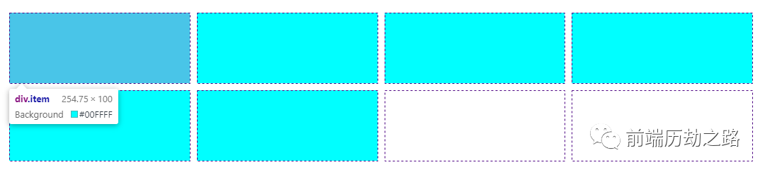
The effects are as follows:
Some partners may feel too lazy to remember, so the encapsulated sass mixin is directly given below, which can be used after replication:
/**
 * Multi column layout
 * $count Number of items
 * $itemWidth Item width, percentage, excluding percentage sign
 * $itemHeight Project height, random
 */
@mixin grid($count:4, $itemWidth:20, $itemHeight:auto) {
    $rest: 100 - $itemWidth * $count; // Remaining space
    $space: percentage($rest/($count - 1)/100); // Margin
    display: flex;
    flex-wrap: wrap;

    /*It is suggested to replace the * sign here with a specific layout container (div, view...) to speed up css parsing*/
    & > * {
        flex: 0 0 #{$itemWidth + '%'};
        height: $itemHeight;
        margin-right: $space;
        margin-bottom: $space;
        box-sizing: border-box;

        &:nth-child(#{$count}n) {
            margin-right: 0;
        }

        &:nth-last-child(-n + #{$count}) {
            margin-bottom: 0;
        }

        /*In order to be compatible with the layout of space between, fill up the remaining space*/
        &:last-child {
            margin-right: auto;
        }
    }
}

/*usage method*/
.list{
    /* 4 items in a row, each 20% width */
    @include grid(4,20)
}
The above is the flex version. If you need to be compatible with ie browser, you can replace it with float layout. Float is automatically aligned to the left, so you don't need to fill the last remaining space.
Scheme 3: grid layout
The grid layout is left aligned by default, even if space between is used.
<style>
    .list {
        display: grid;
        justify-content: space-between;
        grid-template-columns: 1fr 1fr 1fr 1fr; /*Set proportional column*/
        gap: 10px; /*Row spacing*/
    }
    .item{
        background-color: aqua;
        height: 100px;
    }
</style>

<!-- html -->
<div class="list">
    <div class="item"></div>
    <div class="item"></div>
    <div class="item"></div>
    <div class="item"></div>
    <div class="item"></div>
    <div class="item"></div>
</div>
The effects are as follows:
The above three schemes have their own advantages:
- The disadvantage of scheme 1 is that the implementation is not elegant enough and useless placeholder tags need to be added.
- Scheme 2 has no disadvantages, except that the writing method will be more complex, but as long as the mixin is encapsulated, it is simple enough to use in sass. Even if it needs to be compatible with ie, it only needs to be replaced with float.
- Scheme 3 has the worst compatibility and cannot be used normally in ie, but the usage is the simplest, and the layout is even more powerful than flex.
To sum up, scheme II is recommended for practical use.