1, What are dependent properties
A dependent property is a property that has no value and can obtain values from other data sources through binding. Dependent properties can support style setting, data binding, inheritance, animation and default values in WPF.
Setting all properties as dependent properties is not always the correct solution, depending on its application scenario. Sometimes, the typical method of using private fields to implement properties can meet the requirements. MSDN provides the following scenarios for applying dependent attributes:
1. You want to set properties in the style.
2. You want the attribute to support data binding.
3. You want to use dynamic resource references to set properties.
4. You want to automatically inherit the attribute value from the parent element in the element tree.
5. You want the attribute to be animated.
6. You want the attribute system to report when the attribute system, environment or user performs an operation or reads and uses a style to change the previous value of the attribute.
7. You want to use the established metadata conventions that are also used by the WPF process, such as whether the layout system is required to rewrite the visual object of the element when reporting the change of attribute value.
2, Characteristics of dependent attributes
1. Attribute change notification
Whenever the value of the dependent attribute changes, wpf will automatically trigger a series of actions according to the metadata of the attribute. These actions can re present the UI elements, update the current layout, refresh the data binding, etc. one of the most interesting features of this change notification is the attribute trigger, which can be used when the attribute value changes, Perform a series of custom actions without changing any other code. The following example demonstrates property change notification
Example: when the mouse moves over the Button button, the foreground color of the text changes to red and the default color changes to black when leaving. It is implemented in two ways: traditional and attribute dependent:
(1) . it is implemented in the traditional way. MouseEnter and MouseLeave events are defined on the Button button to handle the mouse moving to and from the Button respectively. XAML interface code:
1 <Window x:Class="WpfDemo.MainWindow"
2         xmlns="http://schemas.microsoft.com/winfx/2006/xaml/presentation"
3         xmlns:x="http://schemas.microsoft.com/winfx/2006/xaml"
4         Title="Grid panel" Height="237" Width="525" WindowStartupLocation="CenterScreen">
5     <Grid >
6         <Button Height="30" Width="200" MouseEnter="Button_MouseEnter" MouseLeave="Button_MouseLeave" >Move the mouse over it and the foreground color turns red</Button>
7     </Grid>
8 </Window>
C# background code implementation:
 1 using System;
 2 using System.Collections.Generic;
 3 using System.Linq;
 4 using System.Text;
 5 using System.Threading.Tasks;
 6 using System.Windows;
 7 using System.Windows.Controls;
 8 using System.Windows.Data;
 9 using System.Windows.Documents;
10 using System.Windows.Input;
11 using System.Windows.Media;
12 using System.Windows.Media.Imaging;
13 using System.Windows.Navigation;
14 using System.Windows.Shapes;
15
16 namespace WpfDemo
17 {
18     /// <summary>
19     ///Interaction logic of MainWindow.xaml
20     /// </summary>
21     public partial class MainWindow : Window
22     {
23         public MainWindow()
24         {
25             InitializeComponent();
26         }
27
28         /// <summary>
29         ///Move the mouse over the button
30         /// </summary>
31         /// <param name="sender"></param>
32         /// <param name="e"></param>
33         private void Button_MouseEnter(object sender, MouseEventArgs e)
34         {
35             Button btn = sender as Button;
36             if (btn != null)
37             {
38                 btn.Foreground = Brushes.Red;
39             }
40         }
41
42         /// <summary>
43         ///Mouse away button
44         /// </summary>
45         /// <param name="sender"></param>
46         /// <param name="e"></param>
47         private void Button_MouseLeave(object sender, MouseEventArgs e)
48         {
49             Button btn = sender as Button;
50             if (btn != null)
51             {
52                 btn.Foreground = Brushes.Black;
53             }
54         }
55     }
56 }
(2) Implemented using dependent attributes, XAML interface code:
 1 <Window x:Class="WpfDemo.MainWindow"
 2         xmlns="http://schemas.microsoft.com/winfx/2006/xaml/presentation"
 3         xmlns:x="http://schemas.microsoft.com/winfx/2006/xaml"
 4         Title="Grid panel" Height="237" Width="525" WindowStartupLocation="CenterScreen">
 5     <Grid >
 6         <Button Height="30" Width="200">Move the mouse over it and the foreground color turns red
 7             <Button.Style>
 8                 <Style TargetType="Button">
 9                     <Style.Triggers>
10                         <Trigger Property="IsMouseOver" Value="true">
11                             <Setter Property="Foreground" Value="Red"></Setter>
12                         </Trigger>
13                     </Style.Triggers>
14                 </Style>
15             </Button.Style>
16         </Button>
17     </Grid>
18 </Window>
The foreground color of the Button can be changed by using the above two methods. The effects are as follows:
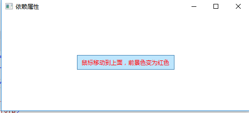
When judging that the value of attribute IsMouseOver is false, the value of foregroup is automatically changed to the previous value. Therefore, it is not necessary to write that when the value of IsMouseOver is false, the value of foregroup is changed to Black.
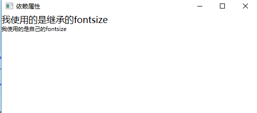
2. Attribute value inheritance
Attribute values are passed from top to bottom along the element tree.
 1 <Window x:Class="WpfDemo.MainWindow"
 2         xmlns="http://schemas.microsoft.com/winfx/2006/xaml/presentation"
 3         xmlns:x="http://schemas.microsoft.com/winfx/2006/xaml"
 4         Title="Dependent properties" Height="237" Width="525" FontSize="18" WindowStartupLocation="CenterScreen">
 5     <Grid >
 6         <StackPanel>
 7             <TextBlock>I use inherited fontsize</TextBlock>
 8             <TextBlock FontSize="11">I use my own fontsize</TextBlock>
 9         </StackPanel>
10     </Grid>
11 </Window>
Interface operation effect:
3. Save memory space
The memory usage of dependency attributes and CLR attributes are quite different. Each CLR attribute contains a non static field. Therefore, when we instantiate a type, we will create all CLR attributes owned by the type, that is, the internal space occupied by an object is determined when we call the new operation for instantiation wpf allows objects to be created without space for storing data, and only retains the ability to obtain the default value when data is needed, that is, the ability to use other object data or allocate space in real time.
3, How to customize dependency properties
1. Declare dependent property variables. The declaration of dependent properties exposes a static variable through public static. The type of variable must be DependencyProperty
2. Register in the properties system. Use the DependencyProperty.Register method to register dependent properties, or use the DependencyProperty.RegisterReadOnly method to register dependent properties
3. Wrap dependent properties with. NET properties
When implementing a property on a class, as long as the class derives from DependencyObject, you can choose to use the DependencyProperty identifier to identify the property and set it as a dependent property. The syntax is as follows:
 1 public static DependencyProperty TextProperty;
 2        TextProperty =
 3        DependencyProperty.Register("Text", //Attribute name
 4        typeof(string), //Attribute type
 5        typeof(TestDependencyPropertyWindow), //The owner of the property, that is, the class to which the property is registered
 6        new PropertyMetadata("")); //Property defaults
 7
 8 public string Text
 9 {
10    get { return (string)GetValue(TextProperty); }
11    set { SetValue(TextProperty, value); }
12 }
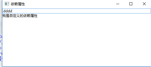
Example: customize a dependency attribute. The interface includes a TextBox and TextBlock. The foreground color of the font on the TextBlock changes with the color entered in the TextBox. If the value entered in the TextBox can be converted into color, the foreground color of the TextBlock font will display the entered color value. If it cannot be converted, the default foreground color will be displayed.
1. Add a WPF version user control named "MyDependencyProperty" in the current project, and customize a dependency property in the MyDependencyProperty.xaml.cs file:
 1 using System;
 2 using System.Collections.Generic;
 3 using System.Linq;
 4 using System.Text;
 5 using System.Threading.Tasks;
 6 using System.Windows;
 7 using System.Windows.Controls;
 8 using System.Windows.Data;
 9 using System.Windows.Documents;
10 using System.Windows.Input;
11 using System.Windows.Media;
12 using System.Windows.Media.Imaging;
13 using System.Windows.Navigation;
14 using System.Windows.Shapes;
15
16 namespace WpfDemo
17 {
18     /// <summary>
19     ///Interaction logic of MyDependencyProperty.xaml
20     /// </summary>
21     public partial class MyDependencyProperty : UserControl
22     {
23         public MyDependencyProperty()
24         {
25             InitializeComponent();
26         }
27
28         //1. Declare dependent property variables
29         public static readonly DependencyProperty MyColorProperty;
30
31         //2. Register in the properties system
32         static MyDependencyProperty()
33         {
34             MyColorProperty = DependencyProperty.Register("MyColor", typeof(string), typeof(MyDependencyProperty),
35                 new PropertyMetadata("Red", (s, e) =>
36                 {
37                     var mdp = s as MyDependencyProperty;
38                     if (mdp != null)
39                     {
40                         try
41                         {
42                             var color = (Color)ColorConverter.ConvertFromString(e.NewValue.ToString());
43                             mdp.Foreground = new SolidColorBrush(color);
44                         }
45                         catch
46                         {
47                             mdp.Foreground = new SolidColorBrush(Colors.Black);
48                         }
49                     }
50
51                 }));
52         }
53
54         //3. Wrap dependent attributes with. NET attributes: the attribute name must be consistent with the name at the time of registration,
55         //That is, the attribute name MyColor corresponds to the MyColor at the time of registration
56         public string MyColor
57         {
58             get
59             {
60                 return (string)GetValue(MyColorProperty);
61             }
62             set
63             {
64                 SetValue(MyColorProperty, value);
65             }
66         }
67     }
68 }
Shortcut to quickly define dependent properties:
Enter propdp and press Tab twice to automatically generate the syntax for defining dependent attributes. It is the same as entering cw and pressing Tab twice to automatically generate Console.Write().
1 public int MyProperty
2         {
3             get { return (int)GetValue(MyPropertyProperty); }
4             set { SetValue(MyPropertyProperty, value); }
5         }
6
7         // Using a DependencyProperty as the backing store for MyProperty.  This enables animation, styling, binding, etc...
8         public static readonly DependencyProperty MyPropertyProperty =
9             DependencyProperty.Register("MyProperty", typeof(int), typeof(ownerclass), new PropertyMetadata(0));
2. Add a TextBlock in MyDependencyProperty.xaml
 1 <UserControl x:Class="WpfDemo.MyDependencyProperty"
 2              xmlns="http://schemas.microsoft.com/winfx/2006/xaml/presentation"
 3              xmlns:x="http://schemas.microsoft.com/winfx/2006/xaml"
 4              xmlns:mc="http://schemas.openxmlformats.org/markup-compatibility/2006"
 5              xmlns:d="http://schemas.microsoft.com/expression/blend/2008"
 6              mc:Ignorable="d"
 7              d:DesignHeight="300" d:DesignWidth="300">
 8     <Grid>
 9         <TextBlock>I am a custom dependency attribute</TextBlock>
10     </Grid>
11 </UserControl>
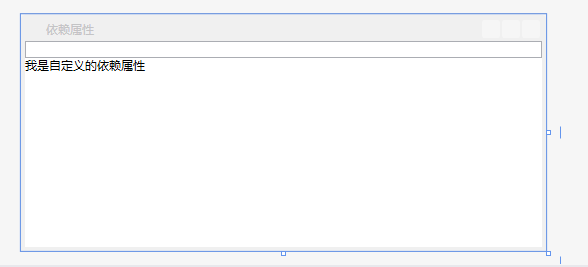
3. Reference the newly created user control in MainWindow.xaml, add a TextBox to input the color value, and bind the custom dependent attribute MyColor to the TextBox
 1 <Window x:Class="WpfDemo.MainWindow"
 2         xmlns="http://schemas.microsoft.com/winfx/2006/xaml/presentation"
 3         xmlns:x="http://schemas.microsoft.com/winfx/2006/xaml"
 4         xmlns:p="clr-namespace:WpfDemo"
 5         Title="Dependent properties" Height="237" Width="525" WindowStartupLocation="CenterScreen">
 6     <Grid >
 7         <StackPanel>
 8             <TextBox Name="tbColor"></TextBox>
 9             <p:MyDependencyProperty MyColor="{Binding Path=Text,ElementName=tbColor}" ></p:MyDependencyProperty>
10         </StackPanel>
11     </Grid>
12 </Window>
Effects displayed in the design interface:
4. Program running effect:
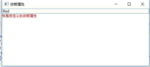
Enter the correct color value in the TextBox, and the foreground color will be displayed as the currently entered color:
Enter the wrong color value in the TextBox, and the foreground color will be displayed as the default color: