This section focuses on the Content control's Content property.
Project Source
Content properties can be set directly in the control
<Button x:Name="button" Content="Button" Height="49"/>
You can also use pictures.
<Button>
    <Image Source="/edbcb5485f9ac954.jpg" Width="100" Height="30">
    </Image>
</Button>
Set the display position of Content in the control by setting the HorizontalContentAlignment="Left" property
Note the distinction between HorizontalAlignment="Left", which sets the display position of the control in the container.
XAML Shortcut
<Label Height="28" Margin="5" Target="{Binding ElementName=textBox1}">
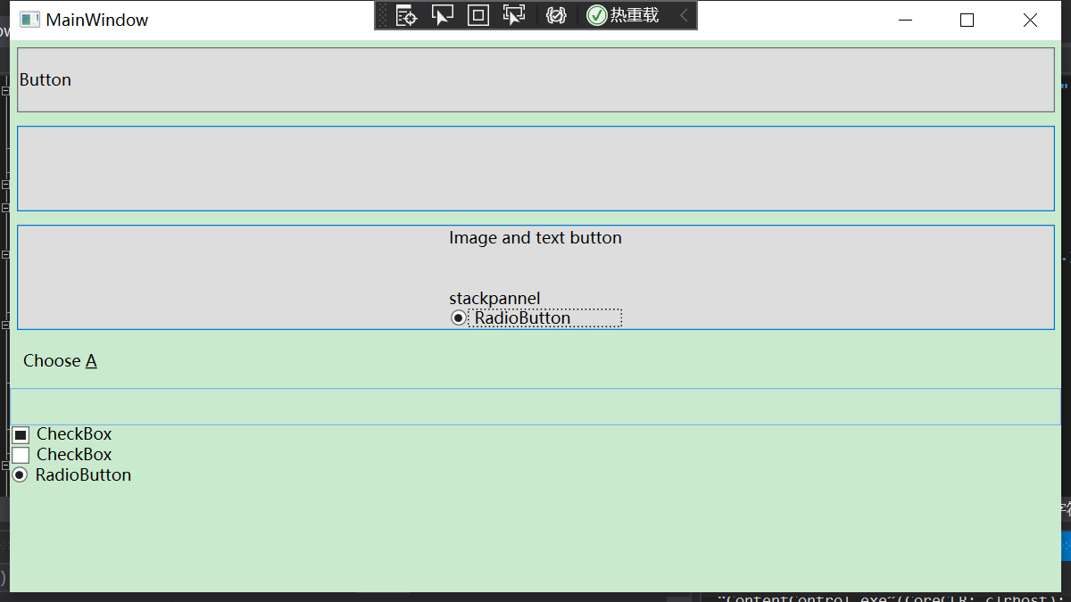
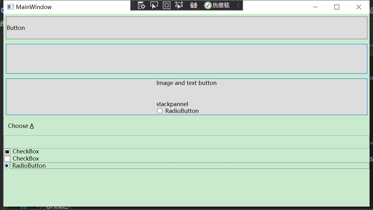
Choose _A
</Label>
<TextBox Name="textBox1" Height="28">
</TextBox>
After pressing the alt key, A appears underlined. By pressing the defined shortcut key A, you can transfer the typing cursor to the TextBox input.
Generally speaking, shortcut keys are hidden and will only be displayed when the user presses the alt key. When the user presses the shortcut key again, it will be moved to the element bound to it.
IsCancel property of button control
Add the attribute IsCancel="True" to the button in the xaml file, and when loading the window, if you press the button, the form will close, or if you press the ESC key, it will close.
ISDefault property of button control
Add the attribute IsDefault="True" to the button in the xaml file, and the button will have a blue shadow when loading the window. Pressing Enter will have the same effect as clicking the button with the mouse.
CheckBox Multiple Checkboxes and RadioBox Radio Buttons
Multiple CheckBox es can be selected under the same StackPannel, but only one RadioBox can be selected. If the buttons are in the same container.
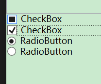
Both contain an IsThreeState property that allows you to select an unknown state when IsThreeState="True". Contains an IsChecked property that initializes the selection command. For example, IsChecked="{x:Null}" indicates that the selection is unknown.
RadioButton can also be multi-selected if not in the same container:
If you want to achieve radio effects without the same container, you need to add the same grouped attribute GroupName="radio" in two RadioButton tags:
In this way, you can only choose one of the two Radio elements, which are mutually exclusive.
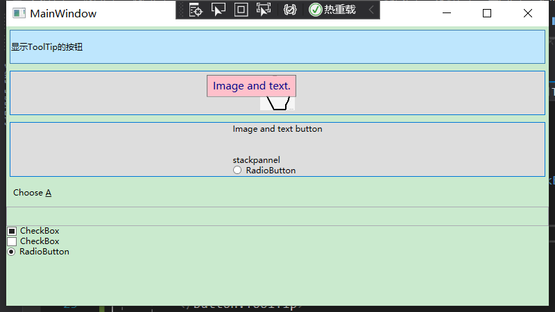
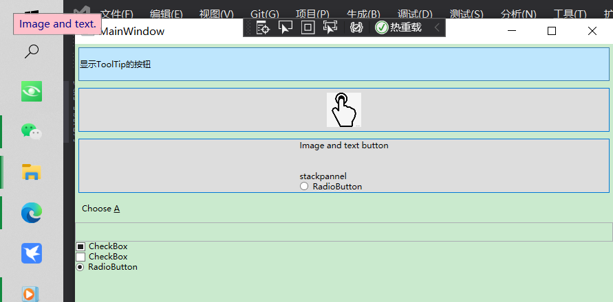
ToolTip ToolTip
All spaces that can be displayed on the wpf form contain the ToolTip property, which prompts you when you hover over the control.
<Button x:Name="button" Content="Button" Height="49" Margin="5" HorizontalContentAlignment="Left" ToolTip="Click button action"/>
Built-in properties are used for simple hints.
If we want more complex hints, we need to write ToolTip as an element property.
For example, the following
<Button x:Name="button" Height="49" Margin="5" HorizontalContentAlignment="Left">
 <Button.Content>
     display ToolTip Button for
 </Button.Content>
 <Button.ToolTip>
     <StackPanel>
         <TextBlock>
             Image and text.
         </TextBlock>
         <Image Source="Picture Path">
         </Image>
     </StackPanel>
 </Button.ToolTip>
</Button>
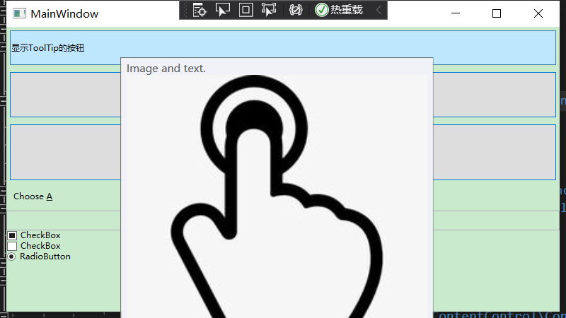
This allows ToolTip to display both text and picture prompts when the mouse hovers over the button.
You can define the background color Background, foreground color Foreground, and location Placement of the pop-up ToolTip prompt box, and set values for the following properties in ToolTip:
Where Plcement indicates that the position of the prompt box is referenced to the location of the mouse, HorizontalOffset is the horizontal offset, and VerticalOffset is the vertical offset.
<Button x:Name="button" Height="49" Margin="5" HorizontalContentAlignment="Left">
  <Button.Content>
      display ToolTip Button for
  </Button.Content>
  <Button.ToolTip>
      <ToolTip Background="Pink" Foreground="DarkBlue" Placement="Mouse" HorizontalOffset="15" VerticalOffset="15">
          <StackPanel>
              <TextBlock>
              Image and text.
              </TextBlock>
          </StackPanel>
      </ToolTip>
  </Button.ToolTip>
</Button>
The offset position reference point can also choose an absolute position, which is displayed somewhere on the screen:
Modify Placement="Absolute".
Project Source