Special effects overview
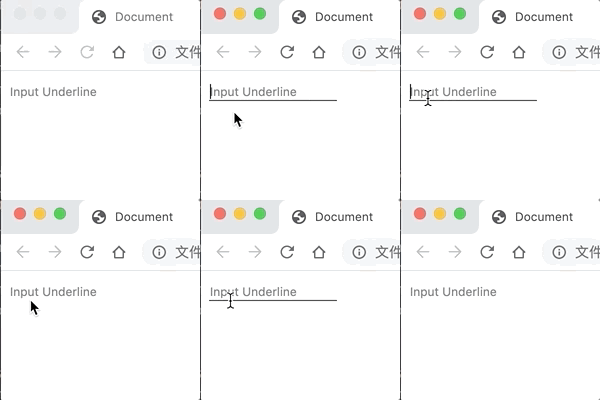
Dash Dynamic:

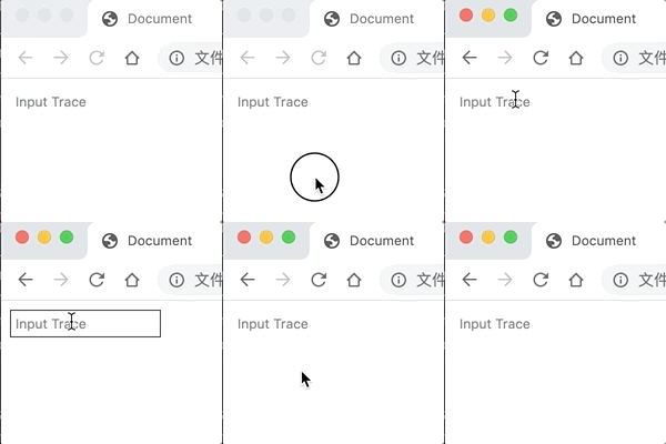
Dynamic Border:

Stroke Dynamics
Design sketch

Principles and Codes
: before and: after pseudo elements specify the content before and after the content of an element document tree.Because the input tag is not a container for insertible content.So underlining here cannot be done with pseudo elements.Additional dom nodes are required.
<div>
  <input type="text" />
  <span></span>
</div>
web front-end development learn Q-q-u-n:784783012, share development tools, zero basics, advanced video tutorials, hope novices take less detours
The parent div wrapped outside should be set to inline-block, otherwise the width will be full.
div {
  position: relative;
  display: inline-block;
}
input tags need to disable default styles:
input {
  outline: none;
  border: none;
  background: #fafafa;
}
The space tag implements the "left in, right out" dynamic, requiring a change in the transform-origin direction.To avoid reflux redrawing, use scaleX to achieve a visual effect with varying widths.
input ~ span {
  position: absolute;
  left: 0;
  right: 0;
  bottom: 0;
  height: 1px;
  background-color: #262626;
  transform: scaleX(0);
  transform-origin: right center;
  transition: transform 0.3s ease-in-out;
}

input:focus ~ span {
  transform: scaleX(1);
  transform-origin: left center;
}
Dynamic Border
Design sketch

Principles and Codes
As the dynamic graph shows, there are four borders.So in addition to the input element, you need to prepare four other dom's.To facilitate positioning, nest a parent element.
<div>
  <input type="text">
  <span class="bottom"></span>
  <span class="right"></span>
  <span class="top"></span>
  <span>
</div>
web front-end development learn Q-q-u-n:784783012, share development tools, zero basics, advanced video tutorials, hope novices take less detours
Similar to underline dynamics, input and div are essentially the same style.To look good, change the padding property.
div {
  position: relative;
  display: inline-block;
  padding: 3px;
}

input {
  outline: none;
  border: none;
  background: #fafafa;
  padding: 3px;
}
For the other four space elements, their position properties, animation properties, and colors are the same:
.bottom,
.top,
.left,
.right {
  position: absolute;
  background-color: #262626;
  transition: transform 0.1s ease-in-out;
}
For.bottom and.top, they change horizontally; for.left and.right, they change vertically.
.bottom,
.top {
  left: 0;
  right: 0;
  height: 1px;
  transform: scaleX(0);
}

.left,
.right {
  top: 0;
  bottom: 0;
  width: 1px;
  transform: scaleY(0);
}
Here are the special effects of processing delays.In a dynamic picture, the animation changes in order of bottom, right, top and left.The transition-delay property is used to achieve animation delay.
.bottom {
  bottom: 0;
  transform-origin: right center;
}
input:focus ~ .bottom {
  transform: scaleX(1);
  transform-origin: left center;
}

.top {
  top: 0;
  transform-origin: left center;
  transition-delay: 0.2s;
}
input:focus ~ .top {
  transform: scaleX(1);
  transform-origin: right center;
}

.right {
  transform-origin: top center;
  right: 0;
  transition-delay: 0.1s;
}
input:focus ~ .right {
  transform: scaleY(1);
  transform-origin: bottom center;
}

.left {
  left: 0;
  transform-origin: bottom center;
  transition-delay: 0.3s;
}
input:focus ~ .left {
  transform: scaleY(1);
  transform-origin: top center;
}
web Front End Development Learning Q-q-u-n:  784783012 ,Share development tools, zero basics, advanced video tutorials, hope novices take less detours