Because the previously written interface was changed, the following was updated
One: Data preparation phase
All sources of this data are available from both locations
1. Epidemic Interface of Tencent Provinces and Cities
2. Tencent Epidemic History Daily Data Interface and Foreign Epidemic Data Interface
Two: Tools and Environment
IDE: Pycharm
Third-party modules
1.json Main Functions: Processing Interface Data
2.requests main function: Get interface data
3.pandas main function: save data as csv
4.datetime main features: file save time
5.pyecahrts main functions: data visualization map making version 1.7.0
6.flask main features: web presentation
Environment Python 3.7
Browser: Chrome Browser
Three Mapping
Getting Data Method
The return is that the data needs to be converted into json.loads by converting the JSON object into a python object
    def getdata(self):
        r = requests.get(self.url).json()


        data = json.loads(r['data'])
        return data
1. Multinational cumulative diagnostic trend line chart
lines =(
        Line()

        .add_xaxis([x.strftime('%Y-%m-%d') for x in list(pd.date_range(start='2020-02-25', end=datetime.date.today()))])
        .add_yaxis('Iran',y_axis=list(df_yilang['confirm'])[6:])
        .add_yaxis('Canada',list(df_jianada['confirm'])[28:])
        .add_yaxis('Germany',list(df_deguo['confirm'])[28:])
        .add_yaxis('Italy',list(df_yidali['confirm'])[25:])
        .add_yaxis('Native Japan',list(df_ribenbentu['confirm'])[28:])
        .add_yaxis('France',list(df_faguo['confirm'])[28:])
        .add_yaxis('U.S.A',list(df_meiguo['confirm'])[28:])
        .add_yaxis('Britain',list(df_yingguo['confirm'])[25:])
        .add_yaxis('Spain',list(df_xibanya['confirm'])[24:])
        .add_yaxis('The Republic of Korea',list(df_hanguo['confirm'])[28:])
        .set_global_opts(
            title_opts = opts.TitleOpts(title='Multinational cumulative diagnostic trends'),
            datazoom_opts= opts.DataZoomOpts(
                is_show=True,#display
                is_realtime=True,#Whether to update the view of the series in real time while dragging.If set to false, update only at the end of the drag.
                range_end= 60, # Percentage of end of data window range.
            ),
            tooltip_opts= opts.TooltipOpts(
                is_show=True,
                trigger='axis', #Axis triggering, mainly for column and line charts
                trigger_on='mousemove|click', #Triggered when the mouse moves and clicks simultaneously.
            ),
            # toolbox_opts=opts.ToolboxOpts(
            #     is_show=True,  # Whether to display prompt box components, including prompt box floats and axisPointer.
            # )
        )
        .render('./templates/Multinational cumulative diagnostic trend line chart.html')
    )
Note here that the data on the x-axis must be of str type or the graph that will be drawn will be problematic, hands-on.Whooping
.add_xaxis([x.strftime('%Y-%m-%d') for x in list(pd.date_range(start='2020-02-25', end=datetime.date.today()))])
This line of code is a list derivation that generates an ordered sequence of time periods using the data_range inside the pandas
Design sketch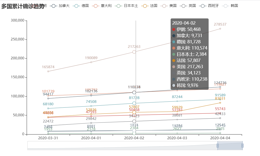
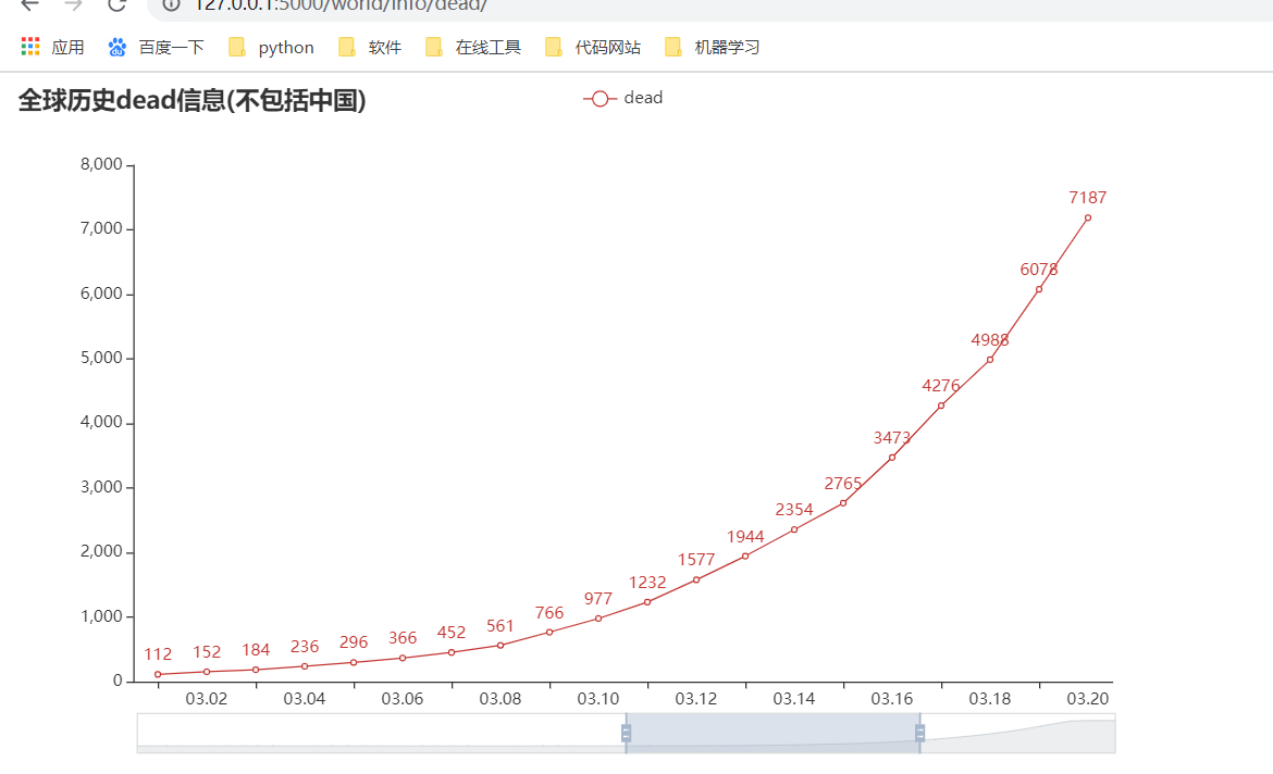
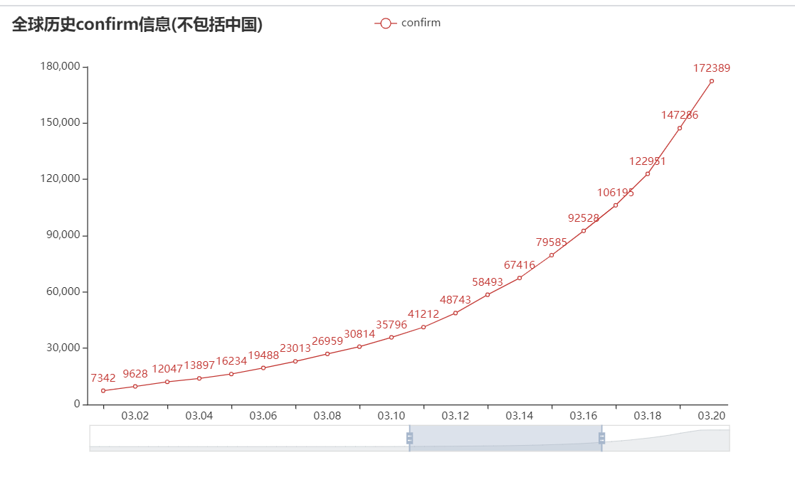
2. Line chart of daily information for global history
Parameters can be chosen by yourself
"""
        name conrirm Number of confirmed cases
        heal Cure
        dead	death
        addcnfirm	Increase the number of diagnoses
        """
    def globalDailyHistory(self, name):
        data = self.getdata()
        print(name)
        newAddConfirmList = []
        for i in data['globalDailyHistory'][:-1]:
            item = {
                'date': i['date'],
                name: i['all'][name]
            }
            newAddConfirmList.append(item)
        df = pd.DataFrame(newAddConfirmList)
        print(df)
        line = (
            Line()
                .add_xaxis(list(df['date']))
                .add_yaxis(series_name=name, y_axis=list(df[name]))
                .set_global_opts(
                title_opts=opts.TitleOpts(title='Global History%s information(Excluding China)'%name),
                datazoom_opts=opts.DataZoomOpts(
                    is_show=True,  #
                    is_realtime=True,  # Whether to update the view of the series in real time while dragging.If set to false, update only at the end of the drag.
                    range_end=80,  # Percentage of end of data window range.
                    range_start=50
                ),
                tooltip_opts=opts.TooltipOpts(
                    is_show=True,
                    trigger='axis',  # Axis triggering, mainly for column and line charts
                    trigger_on='mousemove|click',  # Triggered when the mouse moves and clicks simultaneously.
                ),
            )
                .render('./templates/Global History{}information.html'.format(name))
        )
Map of the number of confirmed cases in China
data = self.getdata()
        province_list = []
        for i in data['importStatis']['TopList']:
            item = {
                'province':i['province'],
                'importedCase':i['importedCase']
            }
            province_list.append(item)
        df = pd.DataFrame(province_list)
        print(df)
        map = (
            Map(init_opts=opts.InitOpts(width="1500px", height="1500px", theme=ThemeType.DARK)) #Map specification init_opts=opts.InitOpts(width='1000', height='1000')
            .add(
                'China',
                [list(z) for z in zip(list(df["province"]), list(df['importedCase']))],
                'china',
                is_map_symbol_show=False,
            )
            .set_global_opts(
                title_opts= opts.TitleOpts('Total number of confirmed cases in provinces of China'),
                visualmap_opts=opts.VisualMapOpts(
                    max_=200, #Display color
                    is_piecewise=True,  # Is color segmented (False is gradient, True is segmented)

                ),
                tooltip_opts=opts.TooltipOpts(
                    is_show=True,  # display
                    trigger_on='mousemove|click',  # Mouse clicks or moves to a specific value

                ),

            )
            .render('./templates/Total number of confirmed cases in provinces of China.html')
        )
Nothing to say is to extract the data and process it, map it, and label the parameters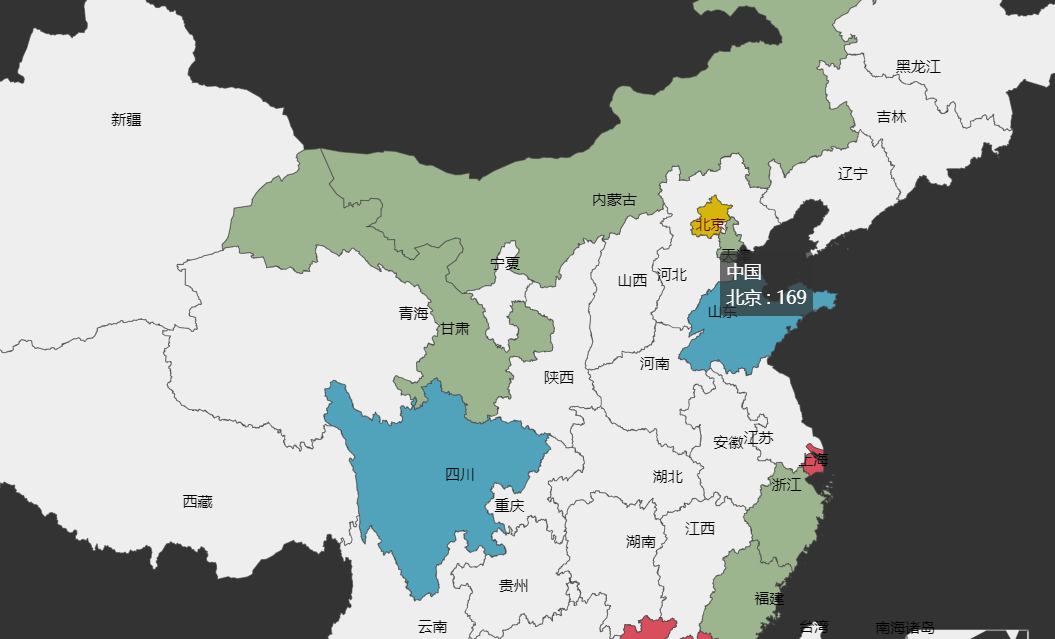
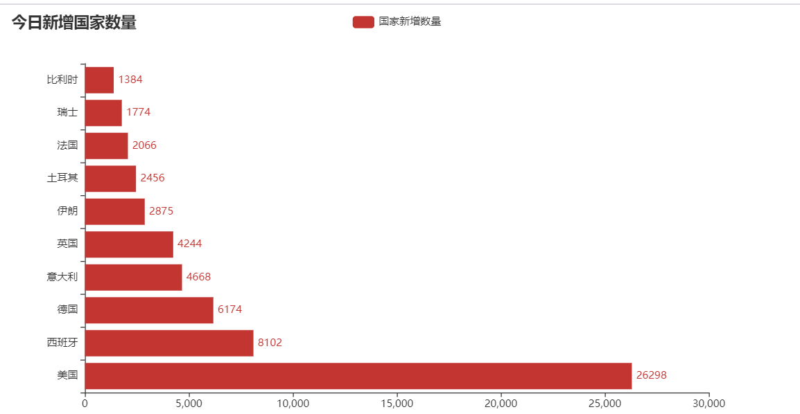
4 Add 10 Bars before National Confirmation today (X-Y axis interchange)
Parameter. reversal_axis() #flip xy axis
data = self.getdata()

        countryList = []
        for i in data['countryAddConfirmRankList']:
            item = {
                'nation':i['nation'],
                'addConfirm':i['addConfirm']
            }
            countryList.append(item)
        df = pd.DataFrame(countryList)

        #Bar flips xy axis
        bar = (
            Bar()
            .add_xaxis(list(df['nation']))
            .add_yaxis('New National Quantity',list(df['addConfirm']))
            .reversal_axis() #Flip xy axis
            .set_series_opts(label_opts=opts.LabelOpts(position="right"))
            .set_global_opts(title_opts=opts.TitleOpts(title="Number of new countries added today"))
            .render("./templates/Number of Countries Added Today.html")
        )
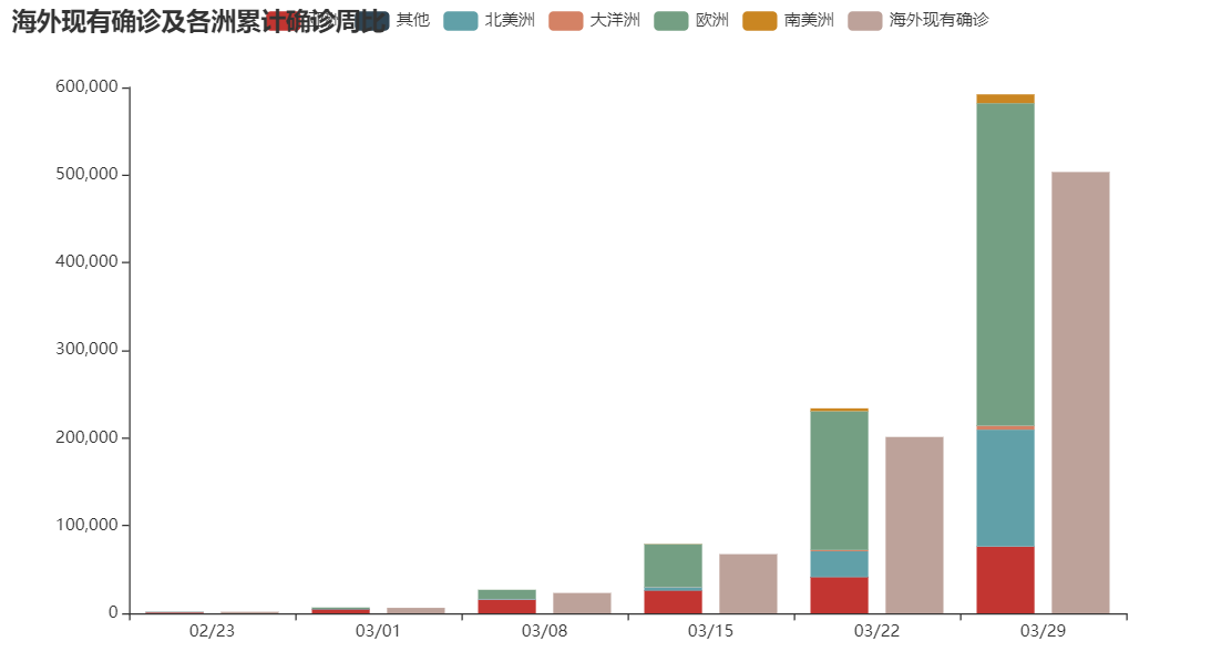
bar(stack) charts of five continents
Notice that
A stack is a stack1 stacked together, stack2 equals two
Well, that's it
statisList = []
        for i in data['continentStatis'][1:]:
            item = {
                'date':i['date'],
                'Asia':i['statis']['Asia'] ,
                'Other':i['statis']['Other'],
                'North America':i['statis']['North America'],
                'Oceania':i['statis']['Oceania'],
                'Europe':i['statis']['Europe'],
                'Africa':i['statis']['Africa'] if i['statis'].get('Africa') else 0,
                'South America':i['statis']['South America'] if i['statis'].get('South America') else 0,
            }
            statisList.append(item)
        df = pd.DataFrame(statisList)

        bar_stack = (
            Bar()
            .add_xaxis(list(df['date']))
            .add_yaxis('Asia',list(df['Asia']),stack='stack1')
            .add_yaxis('Other',list(df['Other']),stack='stack1')
            .add_yaxis('North America',list(df['North America']),stack='stack1')
            .add_yaxis('Oceania',list(df['Oceania']),stack='stack1')
            .add_yaxis('Europe',list(df['Europe']),stack='stack1')
            .add_yaxis('South America',list(df['South America']),stack='stack1')
            .add_yaxis('Existing diagnoses overseas',[1718,6210,23190,67493,201196,503530])
            .set_series_opts(label_opts=opts.LabelOpts(is_show=False))
            .set_global_opts(title_opts=opts.TitleOpts(title="Current diagnoses overseas and cumulative diagnostic week ratios across continents"),
                             tooltip_opts=opts.TooltipOpts(
                                 is_show=True,
                                 trigger='axis',  # Axis triggering, mainly for column and line charts
                                 trigger_on='mousemove|click',  # Triggered when the mouse moves and clicks simultaneously.
                             ))
            .render("./templates/Continents Column.html")
        )
Well, when we get to today's pin chart, nothing really happens.It's his long emmm detail (under my skin)
No verbose, direct topic
6 World map and table format display
Data preparation
Some things can be added on their own to see what they need.
 item = {
            'In Country':i['name'],  # Country
            'National English':item_contry[i['name']] if i['name'] in item_contry else i['name'], # Show original name if there is no country UK
            # 'Continent':i['continent'], # Continent
            # 'date':i['date'], # date
            # 'Whether to update':i['isUpdated'], # Whether to update
            'New Diagnosis':i['confirmAdd'], # New Diagnosis
            # 'confirm':i['confirmAddCut'], #confirm
            'Total diagnosis':i['confirm'], # Total diagnosis
            'Suspect':i['suspect'], # Suspect
            'death':i['dead'], # death
            'Cure':i['heal'], # Cure
            'Existing diagnosis':i['confirm'], # Existing diagnosis
            # 'Confirm':i['confirmCompare'], # Confirm
            # 'New Verification':i['nowConfirmCompare'], # New Verification
            # 'Cure confirmation':i['healCompare'], #Cure confirmation
            # 'Death confirmation':i['deadCompare'], # Death confirmation
        }
        countryList.append(item)
    countryList.append(getchinadata())
    df = pd.DataFrame(countryList)
'National English':item_contry[i['name']] if i['name'] in item_contry else i['name'], # Show original name if there is no country UK
I have defined a Chinese-English dictionary, but because there is nothing like the Diamond Princess, I need to add an if statement.
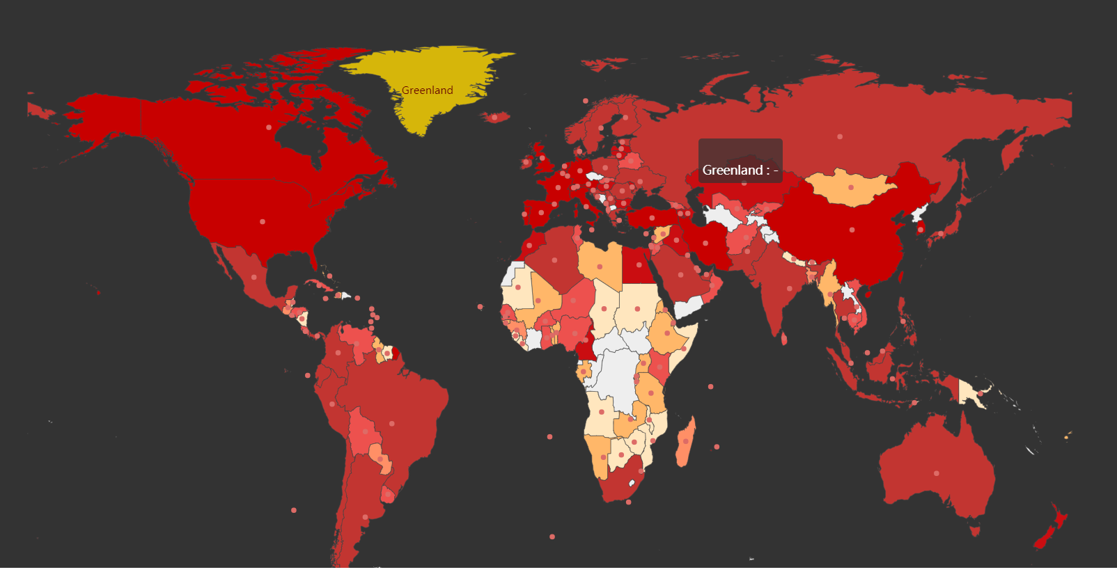
6 World Maps
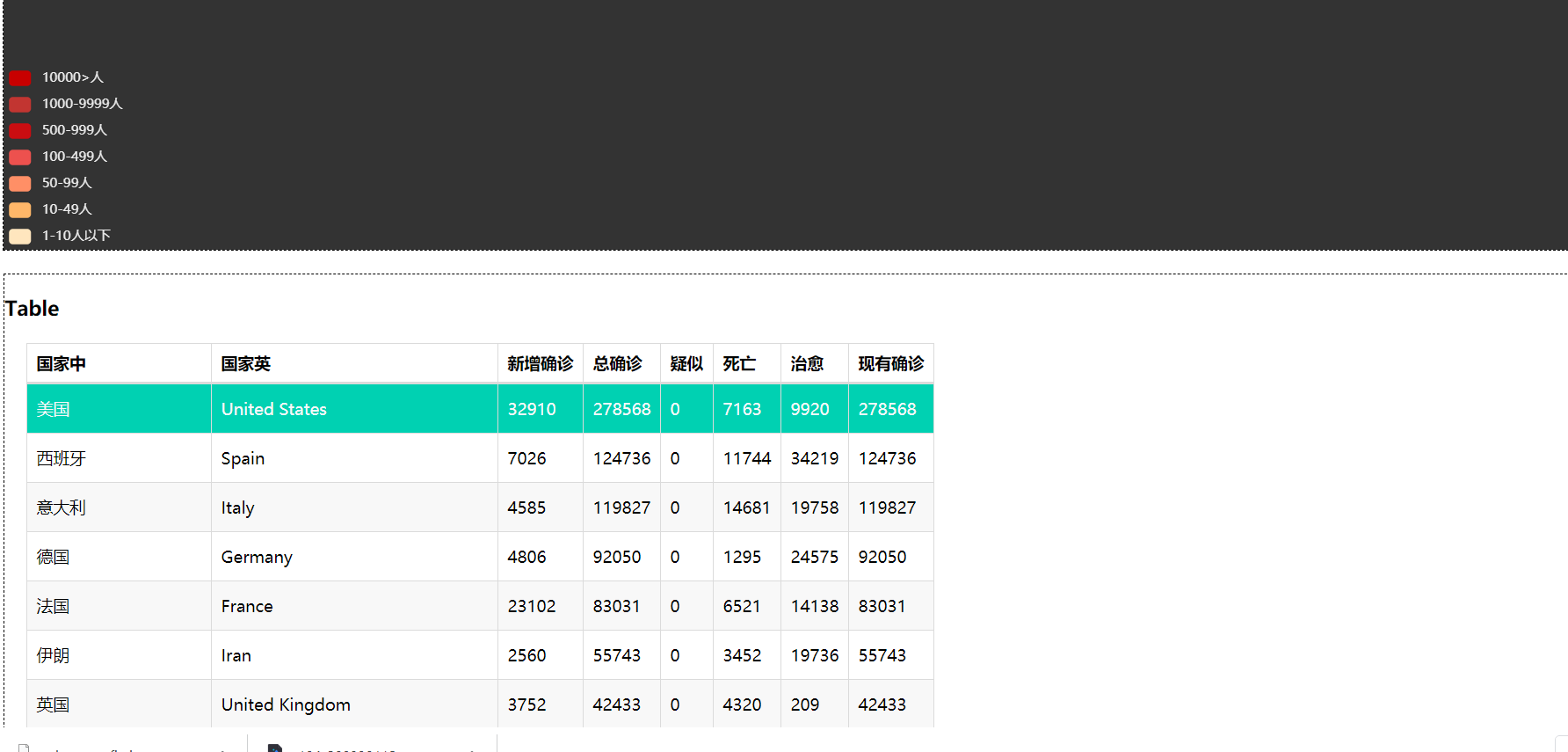
Inside pieces is a custom display color. I'm tired of changing it.You must be better than me.
map =(
        Map(init_opts=opts.InitOpts(width="1500px", height="1500px", theme=ThemeType.DARK))
            .add("Country", [list(z) for z in zip(list(df['National English']),list(df['Total diagnosis']))], "world")
            .set_series_opts(label_opts=opts.LabelOpts(is_show=False))
        .set_global_opts(
            title_opts=opts.TitleOpts(title='World Epidemic Confirmation Map'), # Title
            visualmap_opts=opts.VisualMapOpts(
                max_=500000,
                is_piecewise=True,  # Is color segmented (False is gradient, True is segmented)
                pieces=[

                    {"min": 1, "max": 10, "label": "1-10 Below", "color": "#FFE6BE"},
                    {"min": 10, "max": 49, "label": "10-49 people", "color": "#FFB769"},
                    {"min": 50, "max": 99, "label": "50-99 people", "color": "#FF8F66"},
                    {"min": 100, "max": 499, "label": "100-499 people", "color": "#ED514E"},
                    {"min": 500, "max": 999, "label": "500-999 people", "color": "#CA0D11"},
                    {"min": 1000, "max": 9999, "label": "1000-9999 people", "color": "#C23531"},
                    {"min": 10000, "max": '', "label": "10000>people", "color": "#C80000"},
                ]
            ),#Differentiate by color
            tooltip_opts=opts.TooltipOpts( is_show=True,  # display
                    trigger_on='mousemove|click',)  # Mouse clicks or moves to a specific value)

        )
        # .render('./html file/country data (%s). html'% (datetime.date.today())
    )
Table display
 headers = df.columns.to_list()
    rows = list(df.values)
    # print(rows)
    table = (
        Table()
        .add(headers,rows)
        .set_global_opts(title_opts=opts.ComponentTitleOpts(title="Table"))
    )
Did you find that no render generated the html file?Actually, I did it intentionally.
pyecharts can be drawn inside for combination icon drawing
page = Page(layout=Page.DraggablePageLayout)
    page.add(
        map,
        table,
    )
    page.render('./templates/Country data(%s).html'%(datetime.date.today()))
That's how we get together.
Fourth: Summary
pyecharts is a good visualization Library Chinese website for pyecharts
There is also demo
Five: falsk Show
Flask is a web micro-framework implemented by python that allows us to quickly implement a website or web service using Python.
The simple thing we do is call the function we wrote before and render the template to show html locally
# World Maps and Tables
@app.route('/')
def map_world():
    url = 'https://api.inews.qq.com/newsqa/v1/automation/foreign/country/ranklist'
    world_map(url)
    return render_template('Country data(%s).html'%(datetime.date.today()))

@app.route('/index')
def index():
    return redirect(map_world)

#Multinational cumulative diagnostic trend line chart
@app.route('/manycounrtry')
def manyCountry():
    main()
    return render_template('Multinational cumulative diagnostic trend line chart.html')

wn = World_ncov()

##Continents Column
@app.route('/world/statis')
def worldStatis():
    wn.continentStatis()
    return render_template('Continents Column.html')


#New countryAddConfirmRankList countries added today
@app.route('/counrtryadd')
def worldCountryAdd():
    wn.countryAddConfirmRankList()
    return render_template('Number of Countries Added Today.html')

#Total number of confirmed cases in provinces of China
@app.route('/china')
def chinaMap():
    wn.china_map()
    return render_template('Total number of confirmed cases in provinces of China.html')


"""
//Global except for China
//If the total number of confirmed cases is to be achieved, name ='confirm'
//Global Daily Death Line Name ='dead'
//Global daily cure line name ='heal'
//Global daily cure line name ='newAddConfirm'

"""
#http://127.0.0.1:5000/world/info/heal/
#This format
@app.route('/world/info/<name>/')
def worldInfo(name):
    print(name)
    wn.globalDailyHistory(name=name)
    return render_template('Global History%s information.html'%name)

if __name__ == '__main__':
    app.run()
lima
Almost. That's the first time.Not written.Write next time.Write a python crawl in a few days
Extraction Code: sj8y