Referring to Gao Nan's posts, they are purely for learning. The links are as follows: https://www.zhihu.com/question/33783546/answer/775946401
Here, the visualization of data is realized mainly through folium. This is a niche library, but there are some functions to be used, still need to understand. I have to admire Python's advantages. Visualization also has a very important library, pyecharts, which will learn to use in the future. The links on Github are as follows:
https://github.com/pyecharts/pyecharts/
Here is a review of this process.
Import library, see version, import is normal:
import pandas as pd
import numpy as np
import folium
folium.__version__
#Creating a World Map
world_map=folium.Map()
world_map
The following figure is shown: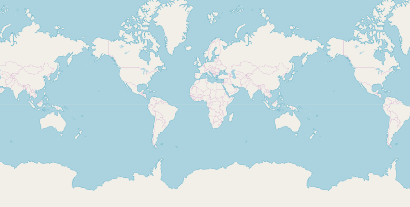
The map is loaded by latitude and longitude. Here is the map of Shenzhen.
#Geographical location is determined and positioned by latitude and longitude. This site is located in San Francisco, so San Francisco shall prevail.
latitude=37.77
longitude=-122.42
#Display the location, zoom_start parameter for zoom-in small control, tiles for control style, OpenStreetMap,Stamen Terrain,Stamen Toner, etc.
San_map=folium.Map(location=[latitude,longitude],zoom_start=12)
San_map
#Test the map of Shenzhen and see the effect.
SZ_Latitude=22.54
SZ_Longitude=114.0654
#SZ_loc=[SZ_Latitude,SZ_Longitude]
SZ_Map=folium.Map(location=[SZ_Latitude,SZ_Longitude],zoom_start=12)
SZ_Map
The results are as follows: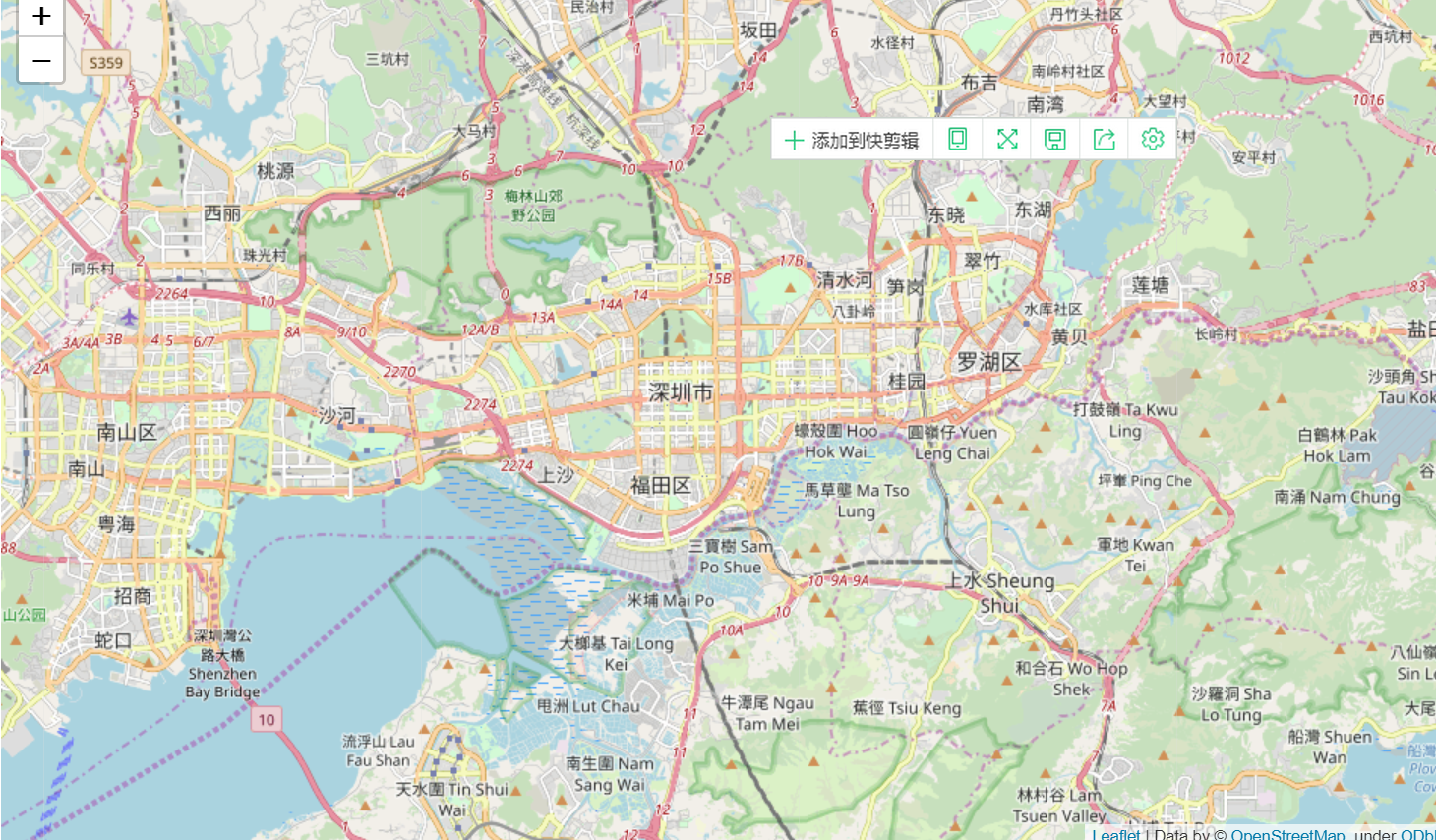
Read and display the data:
#Read data
San_data=pd.read_excel('D:/Police_ncidents2016.xlsx')
San_data.head(1)
Result:
After knowing the corresponding attribute data, we call folium's function to make visual adjustment, as follows:
#The first 211 data can now be displayed.
limit=211
San_data=San_data.iloc[0:limit,:]#With iloc, the first 211 items of data can be retrieved, and San_data has been updated.

#Accident area, DataFrame type
incidents=folium.map.FeatureGroup()

#Place 211 events in the area array for display
for lat,lng, in zip(San_data.Y,San_data.X):
    incidents.add_child
    (
    folium.CircleMarker(
      [lat,lng],
      radius=10,
      color='yellow',
        fill=True,
        fill_color='red',
        fill_opacity=0.4
    )
    )
 #Display the accident on the map
San_map.add_child(incidents)
The result is as follows: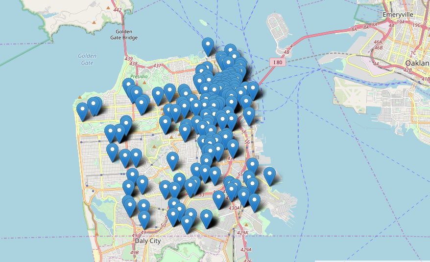
The library corresponds to the function of the map. The overall idea: Create an event cluster MarkerCluster(), mark it on the map by adding_to (map), and then put each individual event object Marker in the Cluster by for cycle.
#Take a look at the relevant information and implement it with pluggins
from folium import plugins
map=folium.Map(location=[latitude,longitude],zoom_start=12)

incidents=plugins.MarkerCluster().add_to(map)  #Marking Cluster Objects for Data Events
type(incidents)

#Put data into the cluster object above
for lat,lng,label, in zip(San_data.Y,San_data.X,San_data.Category):
    folium.Marker(
    location=[lat,lng],
    icon=None,
    popup=label,
    ).add_to(incidents)

map
The scaled image is clustered according to the size of the corresponding region of the map, and automatically adjusted by Category.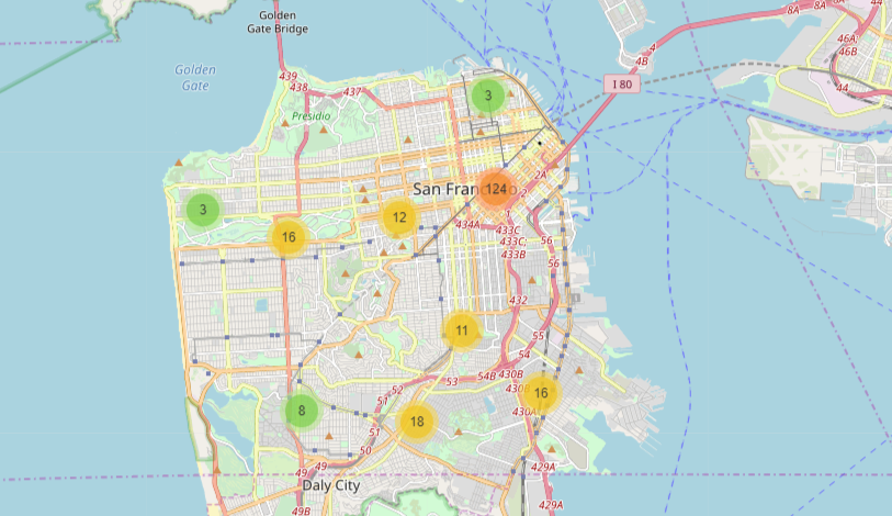
Statistical data:
showdata=pd.DataFrame(San_data['PdDistrict'].value_counts())
showdata.reset_index(inplace=True)
showdata.rename(columns={'index':'Neighborhood','PdDistrict':'count'},inplace=True)
showdata
Editing the visualization using the boundary data on the Internet is as follows:
#Visualize the boundaries of San City with data from the Internet.
import json
import requests
url = 'https://An Attempt to Read Boundary Files by URL in cocl.us/sanfran_geojson'
san_geo = f'{url}'
g_map=folium.Map(location=[37.77,-122.4],zoom_start=12) #The boundary file is passed in as the first parameter of GeoJson, and GeoJson also has the style_function parameter. It is given by an anonymous function.

folium.GeoJson(san_geo,style_function=
               lambda feature:{'fillColor':'#ffff00','color':'black','weight':2,'dashArray':'5,5'}).add_to(g_map)
The following picture is the result of regional demarcation.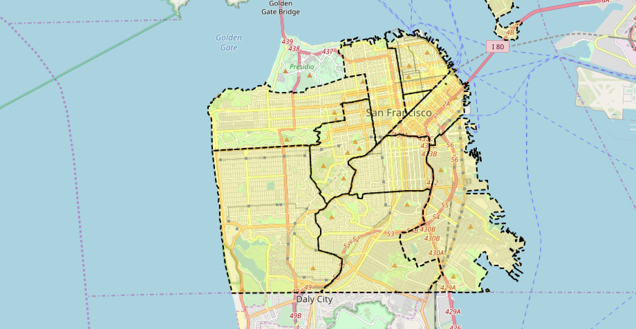
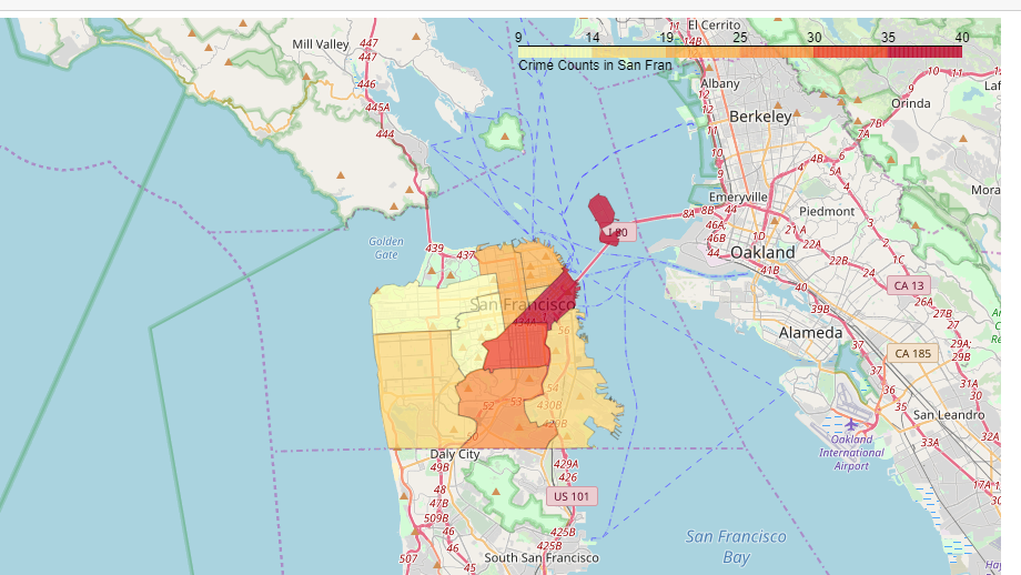
We hope to show the crime degree intuitively through the depth of the color. This kind of operation is also common in EXCEL (Gradient). Pay attention to the color parameters. Others can be carefully studied by looking at the source code:
#Define how much, how much, and how much, by color, similar to excel
m_color=folium.Map(location=[37.77,-122.74],zoom_start=10)
folium.Choropleth(geo_data=san_geo,
                 data=showdata,
                 columns=['Neighborhood','count'],
                 key_on='feature.properties.DISTRICT',
                 fill_color='YlOrRd',     #Notice the parameters here, lowercase L and number 0.
                  fill_opacity=0.7,
                  line_opacity=0.2,
                  highlight=True,
                  legend_name='Crime Counts in San Fran').add_to(m_color)
m_color
The following is the result. The crime area is clear at a glance. Is it very commendable? The code is relatively simple and portable. Keep it. If there are latitude and longitude data involved in the future, use it flexibly.