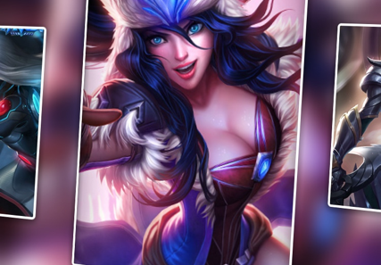
Having a weekend off is a happy thing for programmers. After a week's hard work, I can finally relax and relax. As a LOL enthusiast, the happiest thing on the weekend is, of course, to have a few small partners together in the dark. It's also a great weekend pleasure to be super-spiritual and kneeling together. In recent days, the hero League has been conducting activities, and draws an Anne to limit the skin, which makes me happy, so I immediately landed in the palm League client to check the skin. After entering the Skin Browsing Interface, I feel that this Skin Browsing effect is really good, as follows:

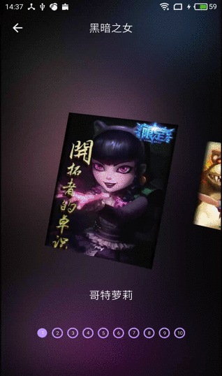
As a programmer, of course, the first thing to think about is how it works. How can I achieve similar results? So it took half a day to do a similar effect. So this article will share how to achieve this effect. The final results are as follows:
Thoughts and Analysis
Before we start coding, let's analyze the interface elements and what technology we use to implement the various parts.
1. First of all, the sliding of the whole interface, which we can see at a glance, is implemented with ViewPager.
2. ViewPager has zoom-in and zoom-out animation when sliding. It's easy to do with ViewPager.Transfoemer.
3. ViewPager displays multiple pages (parts of the front and back pages).
4. The shape of the interface picture, the isosceles trapezoid with 90 degrees rotation. This can only be achieved with a custom View.
5. The background of the whole interface is the Gauss blurred image of the current picture.
code implementation
The components of the interface are analyzed above. Now let's look at the implementation.
1. ViewPager shows multiple pages
This problem, which we discussed in our previous article, will not be repeated here. It is to use the clipChildren attribute of ViewGroup, which has a value of false. That is to add the following line of code to the node in the whole layout:
android:clipChildren="false"
Then, the ViewPager needs to set the left and right margins, which is where the front and back pages are displayed.
<android.support.v4.view.ViewPager
           android:id="@+id/my_viewpager"
           android:layout_width="wrap_content"
           android:layout_height="300dp"
           android:clipChildren="false"
           android:layout_marginLeft="50dp"
           android:layout_marginRight="50dp"
           android:layout_centerInParent="true"
           />
As can be seen from the effect diagram above, there is a gap between the current page and the front and back pages. We only need to add margin attributes around the Item layout:
 android:layout_marginLeft="30dp"
 android:layout_marginRight="30dp"
Okay, so the ViewPager can display multiple pages, and there is a certain distance between the current page and the front and back pages.
2. Animation when ViewPager switches
Custom animation for ViewPager switching uses ViewPager.PageTransformer, which was also mentioned in the previous article, but I haven't seen it before. I'm not going to go into details here. I'm going to code it directly.
public class CustomViewPagerTransformer implements ViewPager.PageTransformer {
    private int maxTranslateOffsetX;
    private ViewPager viewPager;
    private static final float MIN_SCALE = 0.75f;


    public CustomViewPagerTransformer(Context context) {
        this.maxTranslateOffsetX = dp2px(context, 160);
    }

    public void transformPage(View view, float position) {
        // The possible value of position is, in fact, as can be seen from the annotations of the official examples:
        //[-Infinity, -1] No longer visible
        // (1,+Infinity] is no longer visible
        // [-1,1]
        // From the point of writing Page Transformer, the focus area of View animation is [-1,1]
        if (viewPager == null) {
            viewPager = (ViewPager) view.getParent();
        }
        int leftInScreen = view.getLeft() - viewPager.getScrollX();
        int centerXInViewPager = leftInScreen + view.getMeasuredWidth() / 2;
        int offsetX = centerXInViewPager - viewPager.getMeasuredWidth() / 2;
        float offsetRate = (float) offsetX * 0.38f / viewPager.getMeasuredWidth();
        float scaleFactor = 1 - Math.abs(offsetRate);
        if (scaleFactor > 0) {
            view.setScaleX(scaleFactor);
            view.setScaleY(scaleFactor);
            view.setTranslationX(-maxTranslateOffsetX * offsetRate);
        }
    }

    /**
     * dp And Pixel Conversion
     */
    private int dp2px(Context context, float dipValue) {
        float m = context.getResources().getDisplayMetrics().density;
        return (int) (dipValue * m + 0.5f);
    }
}
3. Custom Polygon ImageView
The polygon ImageView, which we implement in a custom way, inherits the ImageView, and then overrides the onDraw() method. There are two ways to implement this irregular polygon View. First, using PorterDuffXfermode, this method requires you to give a mask image. In onDraw method, first draw the mask image, then set Paint's setXfermode to PorterDuff.Mode.SRC_IN, and then draw the picture to be displayed, so that the displayed image can be cut into the shape of the mask. Secondly, using clipPath() method of canvas, we use Path to draw polygons, then clipPath() cuts the canvas into drawn shape, and then draws the pictures to be displayed.
For more usage of PorterDuffXfermode, you can go to google if you are interested. There are many related articles on the internet. Here I use a combination of the two methods. First I use clipPath to get a bitmap that needs shape, and then I use PorterDuffXfermode. The custom View code is as follows:
public class PolygonView extends AppCompatImageView {
    private int mWidth = 0;
    private int mHeight = 0;

    private Paint mPaint;
    private Paint mBorderPaint;

    private PorterDuffXfermode mXfermode;
    private Bitmap mBitmap;
    private int mBorderWidth;
    private Bitmap mMaskBitmap;
    public PolygonView(Context context) {
        super(context);
        init();
    }

    public PolygonView(Context context, @Nullable AttributeSet attrs) {
        super(context, attrs);
        init();
    }

    public PolygonView(Context context, @Nullable AttributeSet attrs, int defStyleAttr) {
        super(context, attrs, defStyleAttr);
        init();
    }

    private void init(){
        mBorderWidth = DisplayUtils.dpToPx(4);
        setLayerType(View.LAYER_TYPE_SOFTWARE, null);// Close Hardware Acceleration
        mPaint = new Paint();
        mPaint.setAntiAlias(true);
        mPaint.setColor(Color.RED);
        mPaint.setDither(true);

        mBorderPaint = new Paint();
        mBorderPaint.setColor(Color.WHITE);
        mBorderPaint.setStyle(Paint.Style.FILL_AND_STROKE);
        mBorderPaint.setAntiAlias(true);//Anti-Aliasing
        mBorderPaint.setDither(true);//debounce

        mXfermode = new PorterDuffXfermode(PorterDuff.Mode.SRC_IN);

    }


    @Override
    protected void onMeasure(int widthMeasureSpec, int heightMeasureSpec) {
        super.onMeasure(widthMeasureSpec, heightMeasureSpec);
        mWidth = getMeasuredWidth();
        mHeight = getMeasuredHeight();

        mMaskBitmap = getMaskBitmap();

    }

    @Override
    public void setImageResource(@DrawableRes int resId) {
        super.setImageResource(resId);
        mBitmap = BitmapFactory.decodeResource(getResources(),resId);
        invalidate();
    }

    @Override
    protected void onDraw(Canvas canvas) {

        canvas.save();

        canvas.drawBitmap(mMaskBitmap,0,0,mBorderPaint);
        mPaint.setXfermode(mXfermode);

        Bitmap bitmap = getCenterCropBitmap(mBitmap,mWidth,mHeight);
        canvas.drawBitmap(bitmap,0,0,mPaint);
        mPaint.setXfermode(null);
        canvas.restore();


    }

    private Bitmap getMaskBitmap(){
        Bitmap bm = Bitmap.createBitmap(mWidth, mHeight, Bitmap.Config.ARGB_8888);
        Canvas c = new Canvas(bm);

        Point point1 = new Point(0,30);
        Point point2 = new Point(mWidth,0);
        Point point3 = new Point(mWidth,mHeight);
        Point point4 = new Point(0,mHeight - 30);

        Path path = new Path();
        path.moveTo(point1.x,point1.y);
        path.lineTo(point2.x,point2.y);
        path.lineTo(point3.x,point3.y);
        path.lineTo(point4.x,point4.y);
        path.close();

        c.drawPath(path,mBorderPaint);

        return bm;
    }

    /**
     * Equivalent clipping of the original map
     */
    private Bitmap scaleImage(Bitmap bitmap){

        if(bitmap!=null){

            int widht=bitmap.getWidth();
            int height=bitmap.getHeight();

            int new_width=0;
            int new_height=0;

            if(widht!=height){
                if(widht>height){
                    new_height=mHeight;
                    new_width=widht*new_height/height;
                }else{
                    new_width=mWidth;
                    new_height=height*new_width/widht;
                }
            }else{
                new_width=mWidth;
                new_height=mHeight;
            }
            return Bitmap.createScaledBitmap(bitmap, new_width, new_height, true);
        }
        return null;
    }

    private Bitmap getCenterCropBitmap(Bitmap src, float rectWidth, float rectHeight) {

        float srcRatio = ((float) src.getWidth()) / src.getHeight();
        float rectRadio = rectWidth / rectHeight;
        if (srcRatio < rectRadio) {
            return Bitmap.createScaledBitmap(src, (int)rectWidth, (int)((rectWidth / src.getWidth()) * src.getHeight()), false);
        } else {
            return Bitmap.createScaledBitmap(src, (int)((rectHeight / src.getHeight()) * src.getWidth()), (int)rectHeight, false);
        }
    }

}
Suggestion: When using clipPath method here, there will be a lot of sawtooth, even if Paint set anti-sawtooth is useless, so it is recommended to use PorterDuffXfermode method. To achieve similar results, it is best to find a designer to ask for a mask shape map. Implemented in PorterDuffXfermode, it is simple and effective.
Through the above three steps, in fact, the effect of the entire interface has almost come out, and finally we need to do is the Gauss blurred background image.
4. Gauss blurring of background image
Background Gaussian blurring is very simple. I have written about the comparison of several Gaussian blurring methods before.( Gauss Blur Solution for Android Pictures Finally, a convenient library is encapsulated( https://github.com/pinguo-zhouwei/EasyBlur Just a few lines of code. In view Pager's onPage Select method, we get the displayed pictures and process them with Gauss blur.
      @Override
        public void onPageSelected(int position) {
            Bitmap source = BitmapFactory.decodeResource(getResources(),VPAdapter.RES[position]);
            Bitmap bitmap = EasyBlur.with(getApplicationContext())
                    .bitmap(source)
                    .radius(20)
                    .blur();
            mImageBg.setImageBitmap(bitmap);

            mDesc.setText(mVPAdapter.getPageTitle(position));
        }
Finally, the complete layout file and Activity code are given.
1. The activity layout file:
<?xml version="1.0" encoding="utf-8"?>
<RelativeLayout xmlns:android="http://schemas.android.com/apk/res/android"
                xmlns:app="http://schemas.android.com/apk/res-auto"
                android:orientation="vertical"
                android:clipChildren="false"
                android:layout_width="match_parent"
                android:layout_height="match_parent">
       <!-- Gauss Fuzzy Background-->
       <ImageView
           android:id="@+id/activity_bg"
           android:layout_width="match_parent"
           android:layout_height="match_parent"
           android:scaleType="centerCrop"
          />

       <!-- Toolbar-->
       <RelativeLayout
           android:id="@+id/toolbar"
           android:layout_width="match_parent"
           android:layout_height="50dp">
              <ImageView
                  android:layout_width="wrap_content"
                  android:layout_height="wrap_content"
                  android:src="@drawable/navigation_back_white"
                  android:layout_centerVertical="true"
                  android:layout_marginLeft="15dp"
                  />
              <TextView
                  android:id="@+id/title_name"
                  android:layout_width="wrap_content"
                  android:layout_height="wrap_content"
                  android:layout_centerInParent="true"
                  android:textSize="18sp"
                  android:textColor="@android:color/white"
                  />
       </RelativeLayout>

       <android.support.v4.view.ViewPager
           android:id="@+id/my_viewpager"
           android:layout_width="wrap_content"
           android:layout_height="300dp"
           android:clipChildren="false"
           android:layout_marginLeft="50dp"
           android:layout_marginRight="50dp"
           android:layout_centerInParent="true"
           />
       <com.zhouwei.indicatorview.CircleIndicatorView
           android:id="@+id/indicatorView"
           android:layout_width="wrap_content"
           android:layout_height="wrap_content"
           android:layout_alignParentBottom="true"
           android:layout_marginBottom="60dp"
           android:layout_centerHorizontal="true"
           app:indicatorSelectColor="#C79EFE"
           app:indicatorSpace="5dp"
           app:indicatorRadius="8dp"
           app:enableIndicatorSwitch="false"
           app:indicatorTextColor="@android:color/white"
           app:fill_mode="number"
           app:indicatorColor="#C79EFE"
           />
       <TextView
           android:id="@+id/skin_desc"
           android:layout_width="wrap_content"
           android:layout_height="wrap_content"
           android:layout_centerHorizontal="true"
           android:layout_below="@+id/my_viewpager"
           android:layout_marginTop="20dp"
           android:textColor="@android:color/white"
           android:textSize="18sp"
           />
</RelativeLayout>
2. Activity code:
public class ViewPagerActivity extends AppCompatActivity {
    private ViewPager mViewPager;
    private VPAdapter mVPAdapter;
    private ImageView mImageBg;
    private CircleIndicatorView mCircleIndicatorView;
    private TextView mTitle,mDesc;
    @Override
    protected void onCreate(@Nullable Bundle savedInstanceState) {
        super.onCreate(savedInstanceState);
        setContentView(R.layout.viewpager_transform_layout);
        View view = findViewById(R.id.toolbar);
        StatusBarUtils.setTranslucentImageHeader(this, 0,view);
        initView();
    }

    private void initView() {
        mViewPager = (ViewPager) findViewById(R.id.my_viewpager);
        mImageBg = (ImageView) findViewById(R.id.activity_bg);
        mCircleIndicatorView = (CircleIndicatorView) findViewById(R.id.indicatorView);
        mTitle = (TextView) findViewById(R.id.title_name);
        mDesc = (TextView) findViewById(R.id.skin_desc);

        mTitle.setText("Dark Daughter");
        mViewPager.setPageTransformer(false,new CustomViewPagerTransformer(this));
        // Adding listeners
        mViewPager.addOnPageChangeListener(onPageChangeListener);
        mVPAdapter = new VPAdapter(getSupportFragmentManager());
        mViewPager.setAdapter(mVPAdapter);
        mViewPager.setOffscreenPageLimit(3);
        //  Connection between Indicator and ViewPager
        mCircleIndicatorView.setUpWithViewPager(mViewPager);
        // Enter the second page of the exhibition for the first time
        mViewPager.setCurrentItem(1);


    }

    @Override
    public boolean onTouchEvent(MotionEvent event) {
        return mViewPager.onTouchEvent(event);
    }

    private ViewPager.OnPageChangeListener onPageChangeListener = new ViewPager.OnPageChangeListener() {
        @Override
        public void onPageScrolled(int position, float positionOffset, int positionOffsetPixels) {

        }

        @Override
        public void onPageSelected(int position) {
            Bitmap source = BitmapFactory.decodeResource(getResources(),VPAdapter.RES[position]);
            Bitmap bitmap = EasyBlur.with(getApplicationContext())
                    .bitmap(source)
                    .radius(20)
                    .blur();
            mImageBg.setImageBitmap(bitmap);

            mDesc.setText(mVPAdapter.getPageTitle(position));
        }

        @Override
        public void onPageScrollStateChanged(int state) {

        }
    };
}
Each page of the ViewPager is shown in Fragment, the Fragment code is as follows:
public class ItemFragment extends Fragment {
    private PolygonView mPolygonView;
    public static ItemFragment newInstance(int resId){
        ItemFragment itemFragment = new ItemFragment();
        Bundle bundle = new Bundle();
        bundle.putInt("resId",resId);
        itemFragment.setArguments(bundle);
        return itemFragment;
    }
    @Nullable
    @Override
    public View onCreateView(LayoutInflater inflater, @Nullable ViewGroup container, @Nullable Bundle savedInstanceState) {
        View view = inflater.inflate(R.layout.view_pager_muti_layout,null);
        mPolygonView = (PolygonView) view.findViewById(R.id.item_image);
        // Make an attribute animation
        ObjectAnimator animator = ObjectAnimator.ofFloat(mPolygonView,"rotation",0f,10f);
        animator.setDuration(10);
        animator.start();
        return view;
    }

    @Override
    public void onViewCreated(View view, @Nullable Bundle savedInstanceState) {
        super.onViewCreated(view, savedInstanceState);
        int resId = getArguments().getInt("resId");
        mPolygonView.setImageResource(resId);// Setting Pictures
    }
}
Explanation: PolygonView is a rotating animation in Fragment because PolygonView is a vertical isosceles trapezoid, but look at the effect map, actually not, there is a small rotation. If you put this rotation in PolygonView, you will find that every time the ViewPager switch, there is a rotating animation, the effect is not good, so the animation will be put. Ad locum. There should be other more elegant ways, if you are interested, you can try them.
Last
This article is the third and final article in the ViewPager series. These three articles summarize some common methods of ViewPager, such as Banner, switching animation, and so on. It also describes how to encapsulate a more extensible and general ViewPager. This is also a summary and precipitation of these knowledge points that I have used before. If you like, you can pay attention to my brief book and Nuggets account, and update Android-related high-quality articles from time to time. If you have any questions, you are welcome to point out the exchange. Demo please visit: https://github.com/pinguo-zhouwei/AndroidTrainingSimples
ViewPager series:
The ViewPager Series Creates a Universal ViewPager
BannerView: An Advertising Banner View for the Imitation of Meizu Apps in ViewPager Series
If you like my article, please pay attention to my Wechat Public Number: Android Technology Grocery Store, get valuable Android dry articles for the first time. Explore Android development technology together and grow together.