1. Preface
Every application with ideal UWP will make the idea of title block, especially when Microsoft provides Extend Acrylic to the title block After this function, most of Windows 10's native applications are not obedient, occupying one mu and three Fen of the title bar. This blog will show you how to customize the title block in UWP.
2. Example code
There are many restrictions on UWP, and almost all the content of title block customization is concentrated in This document Inside. But it's not easy to just refer to this article. I refer to Microsoft's open source calculator application TitleBar A sample application is written, which can be Here Check its source code. I also applied TitleBar to my OnePomodoro In the app.
3. Simple color customization
If you want to simply customize the color of the title block, you can use the ApplicationViewTitleBar , ApplicationViewTitleBar represents the title block of an application. It provides some color attributes to control the color of the title block. The example code is as follows:
// using Windows.UI.ViewManagement;

var titleBar = ApplicationView.GetForCurrentView().TitleBar;

// Set active window colors
titleBar.ForegroundColor = Windows.UI.Colors.White;
titleBar.BackgroundColor = Windows.UI.Colors.Green;
titleBar.ButtonForegroundColor = Windows.UI.Colors.White;
titleBar.ButtonBackgroundColor = Windows.UI.Colors.SeaGreen;
titleBar.ButtonHoverForegroundColor = Windows.UI.Colors.White;
titleBar.ButtonHoverBackgroundColor = Windows.UI.Colors.DarkSeaGreen;
titleBar.ButtonPressedForegroundColor = Windows.UI.Colors.Gray;
titleBar.ButtonPressedBackgroundColor = Windows.UI.Colors.LightGreen;

// Set inactive window colors
titleBar.InactiveForegroundColor = Windows.UI.Colors.Gray;
titleBar.InactiveBackgroundColor = Windows.UI.Colors.SeaGreen;
titleBar.ButtonInactiveForegroundColor = Windows.UI.Colors.Gray;
titleBar.ButtonInactiveBackgroundColor = Windows.UI.Colors.SeaGreen;
There are several points to note:
- Background definitions for hover and press states are not valid for close buttons
- Foregroup cannot set transparency
4. Extend content to title block
To hide the default title block and extend your content into the title block area, change the CoreApplicationViewTitleBar.ExtendViewIntoTitleBar Property is set to true. CoreApplicationViewTitleBar Allows the app to define a custom title block to display in the app window. The sample code is as follows:
// using Windows.ApplicationModel.Core;

// Hide default title bar.
var coreTitleBar = CoreApplication.GetCurrentView().TitleBar;
coreTitleBar.ExtendViewIntoTitleBar = true;
5. Customize the color of the title button when extending content to the title block
Extending the content to the title bar complicates the color of the title button. Because the color of the applied content may conflict with the color of the button. In this case, there are several schemes, the simplest of which is to write as a non conflicting color, but switching themes may cause problems with these colors. Subscription in calculator application UISettings The colorvalues changed event dynamically changes the color of the title bar according to the value of ThemeResources, and further considers the use of high contrast topics, so the user has subscribed to the AccessibilitySettings Highcontractchanged event for:
if (_accessibilitySettings.HighContrast)
{
    // Reset to use default colors.
    applicationTitleBar.ButtonBackgroundColor = null;
    applicationTitleBar.ButtonForegroundColor = null;
    applicationTitleBar.ButtonInactiveBackgroundColor = null;
    applicationTitleBar.ButtonInactiveForegroundColor = null;
    applicationTitleBar.ButtonHoverBackgroundColor = null;
    applicationTitleBar.ButtonHoverForegroundColor = null;
    applicationTitleBar.ButtonPressedBackgroundColor = null;
    applicationTitleBar.ButtonPressedForegroundColor = null;
}
else
{
    Color bgColor = Colors.Transparent;
    Color fgColor = ((SolidColorBrush)Application.Current.Resources["SystemControlPageTextBaseHighBrush"]).Color;
    Color inactivefgColor = ((SolidColorBrush)Application.Current.Resources["SystemControlForegroundChromeDisabledLowBrush"]).Color;
    Color hoverbgColor = ((SolidColorBrush)Application.Current.Resources["SystemControlBackgroundListLowBrush"]).Color;
    Color hoverfgColor = ((SolidColorBrush)Application.Current.Resources["SystemControlForegroundBaseHighBrush"]).Color;
    Color pressedbgColor = ((SolidColorBrush)Application.Current.Resources["SystemControlBackgroundListMediumBrush"]).Color;
    Color pressedfgColor = ((SolidColorBrush)Application.Current.Resources["SystemControlForegroundBaseHighBrush"]).Color;

    applicationTitleBar.ButtonBackgroundColor = bgColor;
    applicationTitleBar.ButtonForegroundColor = fgColor;
    applicationTitleBar.ButtonInactiveBackgroundColor = bgColor;
    applicationTitleBar.ButtonInactiveForegroundColor = inactivefgColor;
    applicationTitleBar.ButtonHoverBackgroundColor = hoverbgColor;
    applicationTitleBar.ButtonHoverForegroundColor = hoverfgColor;
    applicationTitleBar.ButtonPressedBackgroundColor = pressedbgColor;
    applicationTitleBar.ButtonPressedForegroundColor = pressedfgColor;
}
In this code, when using the high contrast theme, restore the button color of the title bar to the default value. Otherwise, set it to the corresponding color in ThemeResource. The operation effect is as follows:
But now, UWP applications often skip between Dark and Light themes repeatedly, while Application.Current.Resources can only get the ThemeResource value when the program is loaded, so this code is invalid after the theme switch in the application. I don't know how to get the latest theme resource in the code for the moment. To solve this problem, TitleBar has to get the current theme resource in XAML. The code is as follows:
<UserControl.Resources>
    <SolidColorBrush x:Key="ButtonForegroundColor"
                     Color="{ThemeResource SystemBaseHighColor}" />
    <SolidColorBrush x:Key="ButtonInactiveForegroundBrush"
                     Color="{ThemeResource SystemChromeDisabledLowColor}" />
    <SolidColorBrush x:Key="ButtonHoverBackgroundBrush"
                     Color="{ThemeResource SystemListLowColor}" />
    <SolidColorBrush x:Key="ButtonHoverForegroundBrush"
                     Color="{ThemeResource SystemBaseHighColor}" />
    <SolidColorBrush x:Key="ButtonPressedBackgroundBrush"
                     Color="{ThemeResource SystemListMediumColor}" />
    <SolidColorBrush x:Key="ButtonPressedForegroundBrush"
                     Color="{ThemeResource SystemBaseHighColor}" />
</UserControl.Resources>
Color fgColor = ((SolidColorBrush)Resources["ButtonForegroundColor"]).Color; Color inactivefgColor = ((SolidColorBrush)Resources["ButtonInactiveForegroundBrush"]).Color; Color hoverbgColor = ((SolidColorBrush)Resources["ButtonHoverBackgroundBrush"]).Color; Color hoverfgColor = ((SolidColorBrush)Resources["ButtonHoverForegroundBrush"]).Color; Color pressedbgColor = ((SolidColorBrush)Resources["ButtonPressedBackgroundBrush"]).Color; Color pressedfgColor = ((SolidColorBrush)Resources["ButtonPressedForegroundBrush"]).Color;
6. Draggable area
The content has been extended to the title bar. It is sure that you want to place the UI elements you need on the title bar. By default, the scope of the title bar is reserved for Windows forms such as drag and click. The user-defined UI content in this scope can't get mouse click. In order to let the user-defined UI content get the mouse, you can use the Window.SetTitleBar Method to specify that an element can be used for dragging and clicking the form.
<Grid x:Name="LayoutRoot"
      Height="32"
      HorizontalAlignment="Stretch">
    <Grid x:Name="BackgroundElement"
          Height="32"
          Background="Transparent" />
    <StackPanel Orientation="Horizontal">
        <StackPanel x:Name="ItemsPanel" Orientation="Horizontal">
        </StackPanel>

        <TextBlock x:Name="AppName"
                   x:Uid="AppName"
                   Text="ExtendViewIntoTitleBarDemo"
        </StackPanel>
</Grid>
Window.Current.SetTitleBar(BackgroundElement);
The code above specifies that the BackgroundElement element in the TitlaBar is a draggable area, while the StackPanel below is used to place interactive content, such as a title or back button. This StackPanel must have a higher Z order than BackgroundElement to receive user mouse input.
7. System reserved area of title
On the right side of the title bar is a 188 pixel system reserved area for system Title buttons (back, minimize, maximize, close). In fact, these buttons also occupy 141 pixels of controls, and a small space is the default draggable area, which ensures that no matter how you set it, there is always a user draggable area.
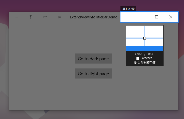
The 188 pixels mentioned above are 100% zoomed. You can see from the screenshot above that they may not be the same in fact, usually when the form is loaded or subscribed CoreApplicationViewTitleBar.LayoutMetricsChanged Event, and then obtain the specific value through CoreApplicationViewTitleBar.
_coreTitleBar.LayoutMetricsChanged += OnLayoutMetricsChanged;

private void OnLayoutMetricsChanged(CoreApplicationViewTitleBar sender, object args)
{
    LayoutRoot.Height = _coreTitleBar.Height;
    SetTitleBarPadding();
}

private void SetTitleBarPadding()
{
    double leftAddition = 0;
    double rightAddition = 0;

    if (FlowDirection == FlowDirection.LeftToRight)
    {
        leftAddition = _coreTitleBar.SystemOverlayLeftInset;
        rightAddition = _coreTitleBar.SystemOverlayRightInset;
    }
    else
    {
        leftAddition = _coreTitleBar.SystemOverlayRightInset;
        rightAddition = _coreTitleBar.SystemOverlayLeftInset;
    }

    LayoutRoot.Padding = new Thickness(leftAddition, 0, rightAddition, 0);
}
8. Contents of interactive areas
The StackPanel above is an interactive area. The details are as follows:
<StackPanel Orientation="Horizontal">
    <StackPanel x:Name="ItemsPanel" Orientation="Horizontal">
        <StackPanel.Resources>
            <Style TargetType="Button"
                   BasedOn="{StaticResource NavigationBackButtonNormalStyle}">
                <Setter Property="Foreground"
                        Value="{StaticResource TitleBarForeground}" />
                <Setter Property="FontSize"
                        Value="10" />
                <Setter Property="Width"
                        Value="46" />
                <Setter Property="Height"
                        Value="32" />
                <Setter Property="IsTabStop"
                        Value="False" />
            </Style>
        </StackPanel.Resources>

    </StackPanel>

    <TextBlock x:Name="AppName"
               x:Uid="AppName"
               Text="ExtendViewIntoTitleBarDemo"
               Margin="12,0,12,0"
               HorizontalAlignment="Left"
               VerticalAlignment="Center"
               Foreground="{ThemeResource SystemControlPageTextBaseHighBrush}"
               FontSize="12"
               IsHitTestVisible="False"
               TextAlignment="Left"
               TextTrimming="CharacterEllipsis" />
</StackPanel>
AppName is used to display the title bar, and ItemsPanel is used to place other Buttons. The Buttons attribute is defined in TitleBar. When calling TitleBar, you can specify Buttons through the Buttons attribute (I wrote this code at 2:00 a.m. perfunctorily, but I didn't want to change it after I wrote it).
public ObservableCollection<Button> Buttons { get; } = new ObservableCollection<Button>();

private void OnButtonsCollectionChanged(object sender, System.Collections.Specialized.NotifyCollectionChangedEventArgs e)
{
    ItemsPanel.Children.Clear();
    foreach (var button in Buttons)
    {
        ItemsPanel.Children.Add(button);
    }
}
<local:TitleBar>
<local:TitleBar.Buttons>
<Button x:Name="OptionsButton"
Content=""
ToolTipService.ToolTip="Options" />
<Button Content=""
ToolTipService.ToolTip="Options" />
<Button Content=""
ToolTipService.ToolTip="Options" />
<Button Content=""
ToolTipService.ToolTip="Options" />
</local:TitleBar.Buttons>
</local:TitleBar>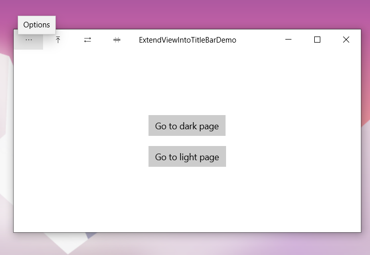
The style of the button comes from NavigationBackButtonNormalStyle and is slightly modified, roughly the same as the standard title bar button.
9. Inactive title block color
When the form is inactive, the button and title should be grayed out. You can subscribe to the Activated Event, changing color when inactive:
Window.Current.Activated += OnWindowActivated;

private void OnWindowActivated(Object sender, WindowActivatedEventArgs e)
{
    VisualStateManager.GoToState(
        this, e.WindowActivationState == CoreWindowActivationState.Deactivated ? WindowNotFocused.Name : WindowFocused.Name, false);
}
<UserControl.Resources>
<SolidColorBrush x:Key="TitleBarForeground"
x:Name="TitleBarForeground"
Color="{ThemeResource SystemBaseHighColor}" />
</UserControl.Resources>
<Grid x:Name="LayoutRoot"
Height="32"
HorizontalAlignment="Stretch">
<VisualStateManager.VisualStateGroups>
<VisualStateGroup x:Name="WindowFocusStates">
<VisualState x:Name="WindowFocused" />
<VisualState x:Name="WindowNotFocused">
<VisualState.Setters>
<Setter Target="AppName.Foreground"
Value="{ThemeResource SystemControlForegroundChromeDisabledLowBrush}" />
<Setter Target="TitleBarForeground.Color"
Value="{ThemeResource SystemChromeDisabledLowColor}" />
</VisualState.Setters>
</VisualState>
</VisualStateGroup>
</VisualStateManager.VisualStateGroups>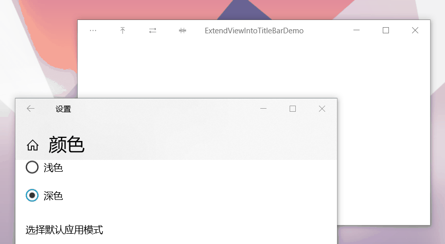
10. Full screen and tablet mode
When the app is running in full screen or tablet mode, the title bar and title controls are hidden. However, the user can call the title bar to display it as an overlay at the top of the application's UI. You can handle the CoreApplicationViewTitleBar.IsVisibleChanged Events, and show or hide your custom title block content as needed.
LayoutRoot.Visibility = _coreTitleBar.IsVisible ? Visibility.Visible : Visibility.Collapsed;
It's hard to take screenshots. If you want to see the effect, you can try mine Application of tomato clock.
11. Conclusion
In this way, the annoying custom title block is finished. Fortunately, Microsoft has opened its calculator to the public and just has the code I need, so I copied it. Some of them are not handled well. Please correct them if they are wrong.
12. References
calculator_TitleBar.xaml.cpp at master
ApplicationViewTitleBar Class (Windows.UI.ViewManagement) - Windows UWP applications Microsoft Docs
13. Source code
DinoChan_ExtendViewIntoTitleBarDemo How to handle titlebar when ExtendViewIntoTitleBar