1. Why do you need to design a status button
OnePomodoro There's a button in the app to control the start/stop of the timer. It should have been a button with two states: Started and Stopped. But I've done too many things like StateButton and ProgressButton on WPF and UWP before and I'm tired of this control, so I'm just using two buttons in OnePomodoro app to do this.:
<Button Content=""
Visibility="{x:Bind ViewModel.IsTimerInProgress,Converter={StaticResource NegationBoolToVisibilityConverter}}"
Command="{Binding StartTimerCommand}" />
<Button Content=""
Visibility="{x:Bind ViewModel.IsTimerInProgress,Converter={StaticResource BoolToVisibilityConverter}}"
Command="{Binding StopTimerCommand}" />
A lot of playboys get tired of finding a good family to get married.However, the two buttons are actually very difficult to use and have a bad feel, especially when the state changes there will be a tearing feeling, the more uncomfortable it is to use, and finally take the time to make a state button PomodoroStateButton.The goal of this button is to be low-key and dazzling, matching multiple themes of OnePomodoro.During this period, I tried a lot of techniques, and at the end, I made this result:
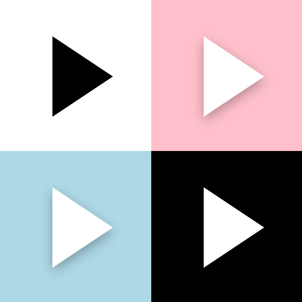
It looks just plain.

The implementation details are described below.
2. Button status
When I make a custom control, I will write the code part first, then the XAML part. The function and appearance will be decoupled and not messy.
PomodoroStateButton inherits from Button and, in addition to Button's own CommonStates, PomodoroStateButton contains the following two groups of VisualState s:
- ProgressStates: Idle is timing the tomato clock and Busy is the status of the tomato clock stopping.
- PromodoroStates: Inwork is working and Break is resting.
Although it is a self-free control, the basic rules are to be followed. TemplateVisualState corresponding to VisualState cannot be saved:
[TemplateVisualState(GroupName = ProgressStatesName, Name = IdleStateName)]
[TemplateVisualState(GroupName = ProgressStatesName, Name = BusyStateName)]
[TemplateVisualState(GroupName = PromodoroStatesName, Name = InworkStateName)]
[TemplateVisualState(GroupName = PromodoroStatesName, Name = BreakStateName)]

public class PomodoroStateButton : Button
{
    private const string ProgressStatesName = "ProgressStates";
    private const string IdleStateName = "Idle";
    private const string BusyStateName = "Busy";

    private const string PromodoroStatesName = "PromodoroStates";
    private const string InworkStateName = "Inwork";
    private const string BreakStateName = "Break";

    protected virtual void UpdateVisualStates(bool useTransitions)
    {
        VisualStateManager.GoToState(this, IsInPomodoro ? InworkStateName : BreakStateName, useTransitions);
        VisualStateManager.GoToState(this, IsTimerInProgress ? BusyStateName : IdleStateName, useTransitions);
    }
With these buttons, the tomato clock is almost ready.
3. ICommand
Both Start and Top Commands need to be supported.To achieve ICommand support, the following steps are performed in the control:
- Define Command and CommandParameter properties.
- Monitor Command's CanExecuteChanged event.
In the event handler for CanExecuteChanged and the ProertyChangedCallback for CommandParameter, set the IsEnabled property of the control based on the results of Command.CanExecute(CommandParameter).
Execute Command in an event (Click or ValueChanged).
This article details: Understanding templated controls (7): Support for Command
This button is easier to implement because it does not require CommandParameter or monitor CanExecuteChanged events as required:
public ICommand StartCommand
{
    get => (ICommand)GetValue(StartCommandProperty);
    set => SetValue(StartCommandProperty, value);
}

public ICommand StopCommand
{
    get => (ICommand)GetValue(StopCommandProperty);
    set => SetValue(StopCommandProperty, value);
}

private void OnClick(object sender, RoutedEventArgs e)
{
    if (IsTimerInProgress)
    {
        if (StopCommand != null && StopCommand.CanExecute(this))
            StopCommand.Execute(this);
    }
    else
    {
        if (StartCommand != null && StartCommand.CanExecute(this))
            StartCommand.Execute(this);
    }
}
4. Deformation
Write the code section before you start the XAML section.
The core of PomodoroStateButton's ControlTempalte is a Polygon. The button icon needs to change its shape between the start and stop of the timer. It is a triangle and needs to be squared by the user.This part of the manipulation is done in ProgressStates.It would be boring to simply hide/show or change Points, here I use the ProgressToPointCollectionBridge described earlier, as you can see Animate with Shape (2) Use and extend PointAnimation This article.To make the distortion smoother, I made the triangle circle first and then square, adding a rotation animation:
<VisualTransition From="Idle" To="Busy">
    <Storyboard >
        <DoubleAnimation Storyboard.TargetName="ProgressToPointCollectionBridge" Storyboard.TargetProperty="Progress" To="1" EnableDependentAnimation="True" Duration="0:0:0.3">
            <DoubleAnimation.EasingFunction>
                <CubicEase EasingMode="EaseOut"/>
            </DoubleAnimation.EasingFunction>
        </DoubleAnimation>
        <DoubleAnimation Storyboard.TargetName="ShapeCompositeTransform" Storyboard.TargetProperty="Rotation" To="180" EnableDependentAnimation="True" Duration="0:0:0.3">
            <DoubleAnimation.EasingFunction>
                <CubicEase EasingMode="EaseOut"/>
            </DoubleAnimation.EasingFunction>
        </DoubleAnimation>

    </Storyboard>
</VisualTransition>

<Border.Resources>
    <controls:ProgressToPointCollectionBridge x:Name="ProgressToPointCollectionBridge"
                   Progress="0">
        <PointCollection>The point of a triangle</PointCollection>
        <PointCollection>Circular Point</PointCollection>
        <PointCollection>Square Points</PointCollection>
    </controls:ProgressToPointCollectionBridge>
</Border.Resources>

<Polygon Points="{Binding Source={StaticResource ProgressToPointCollectionBridge},Path=Points}"/>
By the way, mention other deformation schemes.
HandyControl GeometryAnimation is available to use deformational animations like other linear animations:
<hc:GeometryAnimationUsingKeyFrames Storyboard.TargetProperty="Data" Storyboard.TargetName="PathDemo">
    <hc:DiscreteGeometryKeyFrame KeyTime="0:0:0.7" Value="{StaticResource FaceBookGeometry}"/>
    <hc:EasingGeometryKeyFrame KeyTime="0:0:1.2" Value="{StaticResource TwitterGeometry}">
        <hc:EasingGeometryKeyFrame.EasingFunction>
            <QuarticEase EasingMode="EaseInOut"/>
        </hc:EasingGeometryKeyFrame.EasingFunction>
    </hc:EasingGeometryKeyFrame>
</hc:GeometryAnimationUsingKeyFrames>
Can also be used MorphSVG Or similar SVG deformations library:
5. Pass AlphaMask
I am here Use GetAlphaMask to make shadows This article shows how to use the GetAlphaMask function to get the AlphaMask of an element. In PomodoroStateButton, I also use this function to get the AlphaMask of a Polygon in the ControlTemplate (that is, the deformed part above), and use this AlphaMask to create shadows, process animations of MouseEnter/MouseLeave, state transformations of Pressed, and Inwork/Break state switches.Animation.It's really worn out, and I'm also tired of dealing with this animation on one element, so I don't use a ContentControl scheme like DropShadowPanel, because it's only ContentControl that owns Polygon's AlphaMask.Instead, multiple ButtonDecorator controls were created to associate Polygons with RelativeElement="{Binding ElementName=Shape}", and then get Polygon's AlphaMask from the GetAlphaMask function, so that each person can have a copy of Polygon's AlphaMask and animate it individually, thus avoiding the complexity of the animation.XML looks like this:
<controls:ButtonDecorator  x:Name="Shadow"
                           RelativeElement="{Binding ElementName=Shape}"
                           Style="{StaticResource Shadow}"/>
<controls:ButtonDecorator RelativeElement="{Binding ElementName=Shape}"
                          x:Name="Outline"
                          Style="{StaticResource Outline}"/>
<controls:ButtonDecorator RelativeElement="{Binding ElementName=Shape}"
                          Style="{StaticResource Glow}"
                          IsInPomodoro="{TemplateBinding IsInPomodoro}"/>
<Polygon Points="{Binding Source={StaticResource ProgressToPointCollectionBridge},Path=Points}"
         StrokeThickness="4"
         Stretch="None"
         StrokeEndLineCap="Round"
         x:Name="Shape"/>
6. Pass ButtonState
<VisualState x:Name="Pressed">
    <VisualState.Setters>
        <Setter Target="RootGrid.(RevealBrush.State)" Value="Pressed" />
        <Setter Target="RootGrid.Background" Value="{ThemeResource ButtonRevealBackgroundPressed}" />
        <Setter Target="ContentPresenter.BorderBrush" Value="{ThemeResource ButtonRevealBorderBrushPressed}" />
        <Setter Target="ContentPresenter.Foreground" Value="{ThemeResource ButtonForegroundPressed}" />
    </VisualState.Setters>

    <Storyboard>
        <PointerDownThemeAnimation Storyboard.TargetName="RootGrid" />
    </Storyboard>
</VisualState>
Above is part of ButtonRevealStyle's XAML, which has a complicated look with ButtonRevealStyle-style buttons, but its Style is concise because it passes state to RevealBrush to handle animations (and PointerDownThemeAnimation, for example), which breaks down complex XAML.I also added the State property for ButtonDecorator, which is a property of the ButtonState enumeration type:
public enum ButtonState
{
    //
    // Summary:
    //     The element is in its default state.
    Normal = 0,
    //
    // Summary:
    //     The pointer is on the element.
    PointerOver = 1,
    //
    // Summary:
    //     The element has been pressed.
    Pressed = 2
}
PomodoroStateButton makes Outward and Inward animations of outlines as it transitions between CommonStates'states. Shadows also change color, but because complex XAML is separated by passing ButtonState, the XAML of CommonStates is written simply:
<VisualState x:Name="Normal" >
    <VisualState.Setters>
        <Setter Target="Outline.State" Value="Normal"/>
        <Setter Target="Shadow.State" Value="Normal"/>
    </VisualState.Setters>
</VisualState>
<VisualState x:Name="PointerOver">
    <VisualState.Setters>
        <Setter Target="Outline.State" Value="PointerOver"/>
        <Setter Target="Shadow.State" Value="PointerOver"/>
    </VisualState.Setters>
</VisualState>
<VisualState x:Name="Pressed">
    <VisualState.Setters>
        <Setter Target="Outline.State" Value="Pressed"/>
        <Setter Target="Shadow.State" Value="Pressed"/>
        <Setter Target="Shape.Opacity" Value="0.7"/>
    </VisualState.Setters>
</VisualState>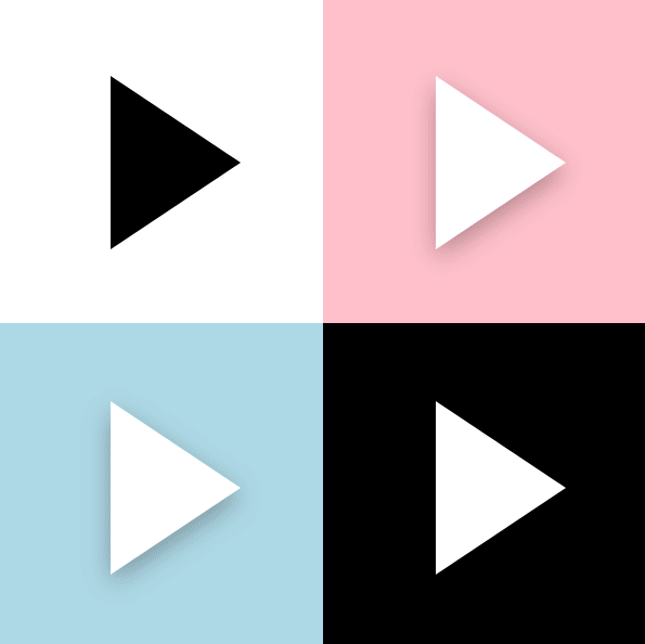
7. Circle animation
When PomodoroStateButton switches between Inwork and Break, it allows the blue and red shadows on the left and right to make a half-circle motion to swap locations, which is fine, but when it's too idle, it's time to focus.
before Articles on Progre***ing What I said about circular motion is simply putting elements in a big container and rotating the whole container.
<Page.Resources>
    <Storyboard RepeatBehavior="Forever" x:Key="Sb" >
        <DoubleAnimation Storyboard.TargetName="E1R" BeginTime="0" Storyboard.TargetProperty="Angle" Duration="0:0:4" To="360"/>
    </Storyboard>
</Page.Resources>
<Grid Background="White">
    <Canvas RenderTransformOrigin=".5,.5" Height="100" Width="100">
        <Canvas.RenderTransform>
            <RotateTransform x:Name="E1R" />
        </Canvas.RenderTransform>
        <Rectangle  Width="20"  Height="20"  Fill="MediumPurple"  />
    </Canvas>
</Grid>
However, if this happens, the elements inside will also rotate. One solution is that the elements inside will rotate in the opposite direction at the same speed to counteract the outer rotation.But at that time I was too free to use another method, translation:
<Page.Resources>
    <Storyboard RepeatBehavior="Forever" x:Key="Sb" >
        <DoubleAnimationUsingKeyFrames Storyboard.TargetName="Translate1" Storyboard.TargetProperty="X" EnableDependentAnimation="True">
            <EasingDoubleKeyFrame KeyTime="0:0:4" Value="120">
                <EasingDoubleKeyFrame.EasingFunction>
                    <QuadraticEase EasingMode="EaseInOut"/>
                </EasingDoubleKeyFrame.EasingFunction>
            </EasingDoubleKeyFrame>
            <EasingDoubleKeyFrame KeyTime="0:0:8" Value="0">
                <EasingDoubleKeyFrame.EasingFunction>
                    <QuadraticEase EasingMode="EaseInOut"/>
                </EasingDoubleKeyFrame.EasingFunction>
            </EasingDoubleKeyFrame>
        </DoubleAnimationUsingKeyFrames>

        <DoubleAnimationUsingKeyFrames Storyboard.TargetName="Translate1" Storyboard.TargetProperty="Y" EnableDependentAnimation="True">
            <EasingDoubleKeyFrame KeyTime="0:0:2" Value="60">
                <EasingDoubleKeyFrame.EasingFunction>
                    <QuadraticEase EasingMode="EaseOut"/>
                </EasingDoubleKeyFrame.EasingFunction>
            </EasingDoubleKeyFrame>
            <EasingDoubleKeyFrame KeyTime="0:0:4" Value="0">
                <EasingDoubleKeyFrame.EasingFunction>
                    <QuadraticEase EasingMode="EaseIn"/>
                </EasingDoubleKeyFrame.EasingFunction>
            </EasingDoubleKeyFrame>
            <EasingDoubleKeyFrame KeyTime="0:0:6" Value="-60">
                <EasingDoubleKeyFrame.EasingFunction>
                    <QuadraticEase EasingMode="EaseOut"/>
                </EasingDoubleKeyFrame.EasingFunction>
            </EasingDoubleKeyFrame>
            <EasingDoubleKeyFrame KeyTime="0:0:8" Value="0">
                <EasingDoubleKeyFrame.EasingFunction>
                    <QuadraticEase EasingMode="EaseIn"/>
                </EasingDoubleKeyFrame.EasingFunction>
            </EasingDoubleKeyFrame>
        </DoubleAnimationUsingKeyFrames>
    </Storyboard>
</Page.Resources>
<Grid Background="White">
    <Grid Height="100" Width="100">
        <Rectangle Width="20" Height="20" Fill="MediumPurple"  RenderTransformOrigin=".5,.5"  HorizontalAlignment="Left" VerticalAlignment="Center">
            <Rectangle.RenderTransform>
                <TranslateTransform x:Name="Translate1" X="0" Y="0" />
            </Rectangle.RenderTransform>
        </Rectangle>
    </Grid>
</Grid>
Choose Quadratic Ease to do beautiful circular motions if matched properly, with the following results:

Of course, I actually used CircleEase, which is more naughty. The effect of PomodoroStateButton switching between Inwork and Break is as follows:
(Although it doesn't make sense to do so complicated.)
8. Conclusion
It feels good. It looks like it's convergent. It's actually done with a bunch of code status buttons. It feels good after two months of use, and it's easy to match the various themes of tomato clocks.
You can try installing my tomato clock application by installing the address: