Hello, I'm Lao Wang~
It was originally planned to do a project related to local database storage, but the official partner told me that the ArkUI database does not support the latest simulator at present.
So I can only think about other things. I thought about it for about a week. During this period, I was also investigating whether the technology can be realized. I was very tangled. I wanted to constantly break through myself, at least better than the last time! When the project is finally decided, the real code development may take one day. The most difficult thing is the idea and interface design.
I have to sigh that the new framework is really convenient and easy to use! We look forward to the next version to improve the details of components and API s. I also hope Hongmeng is getting better and better.
1, Project description
The interface is built based on the declarative development paradigm of TS extension in ArkUI. For syntax and concepts, see the official document address on the official website: declarative development paradigm based on TS extension 1 and declarative development paradigm based on TS extension 2
https://developer.harmonyos.com/cn/docs/documentation/doc-guides/ui-ts-overview-0000001192705715
Use the system's own network request framework to switch the data corresponding to the request according to the type of Tab. The list supports drop-down refresh, pull-up loading and more.
Simulate the login effect, and determine whether the button is enabled according to the input box. After successful login, the login avatar and user information will be displayed.
-
Data request: aggregate free API - News Headlines
-
Network request: 1-official document, 2-ArkUI Development Foundation: network request
-
List refresh: ArkUI (TS) declarative development: List drop-down refresh, pull-up load more
2, Effect demonstration
Recorded in the remote simulator, the effect is not good~_~
3, Functional analysis
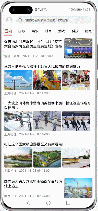
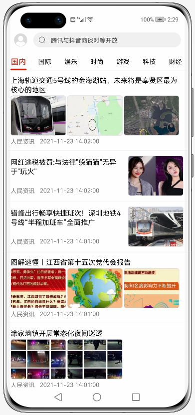
1. Home page
The home page is divided into three sections from top to bottom:
-
Title block
-
Tab tab
-
Data list
-
Title Block
The layout is very simple. Use Row layout to wrap: Image and Swiper (text in the search box switches up and down)
(partial code)
......
  // Title Block
  @Builder CustomTitleBar() {
    Row() {
      // head portrait
      Image(this.isLogin ? $r('app.media.ic_ldd_headpic') : $r('app.media.ic_default_headpic'))
        .width(30)
        .height(30)
        .borderRadius(15)
        .margin({ right: 10 })
        .onClick(() => {
          this.openSideMenu()
        })

      // Search box
      Row() {
        // Search Icon
        Image($r('app.media.ic_search'))
          .width(15).height(15)
          .margin({ left: 10 })

        // View up and down switching
        Swiper() {
          ForEach(this.listSearch, item => {
            Text(item)
              .height('100%')
              .fontSize(12)
              .fontColor('#505050')
              .margin({ left: 10 })
          }, item => item)
        }
        .vertical(true) // Direction: longitudinal
        .autoPlay(true) // Auto play
        .indicator(false) // Hide indicator
        .interval(3000) // Switching interval: 3 seconds
      }
      .layoutWeight(1)
      .height('100%')
      .backgroundColor('#F1F1F1')
      .borderRadius(15)
    }
    .width('100%')
    .height(50)
    .backgroundColor(Color.White)
    .padding({ top: 10, bottom: 10, left: 15, right: 15 })
  }
......-
Tab tab
This page is relatively simple. You can get the width of the tabItem according to the screen width and the total number of tab labels. For the indicator set at the bottom, click the tab to set the attribute animation according to index * itemWithd (width of each tab), and the switching effect is OK.
import { TabModel,getTabList} from '../../model/tabModel.ets';
import display from '@ohos.display';
@Component
export struct HomeTabs {
  // Tab data
  private listTab = getTabList()
  // Average width of tabItem
  @State tabIndicatorWidth: number = 152
  // indicator
  @State tabIndex: number = 0
  // Methods of external exposure
  private tabClick: (item: TabModel) => void

  private aboutToAppear() {
    display.getDefaultDisplay((err, data) => {
      if (!err) {
        // Gets the average width of the tabItem
        this.tabIndicatorWidth = data.width / this.listTab.length
      }
    })
  }

  build() {
    Column(){
      Stack({ alignContent: Alignment.Bottom }) {
        // tab content
        Row() {
          ForEach(this.listTab, item => {
            Button() {
              Text(item.name)
                .fontSize(this.tabIndex == item.id ? 15 : 13) // Change the font size according to the current selection
                .fontColor(this.tabIndex == item.id ? $r('app.color.app_theme') : '#000000 ') / / change the font color according to the current selection
            }
            .layoutWeight(1)
            .height(35)
            .type(ButtonType.Normal)
            .backgroundColor(Color.White)
            .onClick(() => {
              this.tabIndex = item.id // Update index
              this.tabClick(item) // Provided to external calls
            })
          }, item => item.tabType)
        }.height(35)

        // indicator
        Row() {
          Divider()
            .width(`${this.tabIndicatorWidth}px`) // Average width
            .strokeWidth(3)
            .color($r('app.color.app_theme'))
            .lineCap(LineCapStyle.Round) // fillet
            .padding({ left: 10, right: 10 })
            .offset({ x: `${this.tabIndex * this.tabIndicatorWidth}px`, y: 0 }) // Change offset
            .animation({ duration: 300 })// Attribute animation
        }.width('100%')
      }.backgroundColor(Color.White)
      Divider().color('#e8e8e8')
    }
  }
}-
Data list
According to different data, the layout styles of displayed item s are also different, which can be divided into two cases: single picture and multiple pictures. Pull down refresh and load more functions. See my previous posts.
(partial code)
......
List() {
ForEach(this.listNews, (item: NewsData) => {
ListItem() {
Column(){
// Display different layout styles according to the data
if (item.thumbnail_pic_s02 == undefined) {
// Single picture style
this.ItemSinglePic(item)
} else {
// Multiple picture styles
this.ItemMorePic(item)
}
}.width('100%')
}.padding(10)
}, item => item.uniquekey)
}
.divider({ strokeWidth: 1, color: '#f5f5f5' })
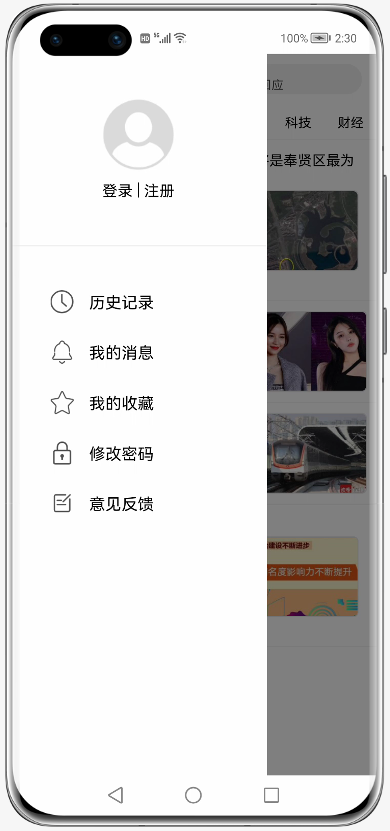
......2. Sidebar
Gesture control is not added to the sidebar, but simply click the avatar animation to open and click the shadow animation to close. It is closed by default
@Entry
@Component
struct MainPage {
  // Screen width
  private screenWidth = 0
  // x position of sidebar
  @State sideBarX: number = -2000
  // Transparency of sidebar background
  @State sideBarBgopacity: number = 0
  // Sidebar background display value
  @State sideBarBgVisibility: Visibility = Visibility.Hidden

  private aboutToAppear() {
    display.getDefaultDisplay((err, data) => {
      if (!err) {
        // Get screen width
        this.screenWidth = data.width
        // Set sidebar offset: negative screen width
        this.sideBarX = -this.screenWidth
      }
    })
  }

  // Open sidebar
  private openSideMenu() {
    this.sideBarX = 0
    this.sideBarBgopacity = 1
    this.sideBarBgVisibility = Visibility.Visible
  }

  // Close sidebar
  private closeSideMenu() {
    this.sideBarX = -this.screenWidth
    this.sideBarBgopacity = 0
  }

  build() {
    Stack() {
      Column() {
        // Home page interface
      }

      // Translucent background
      Stack()
        .width('100%')
        .height('100%')
        .backgroundColor('#80000000')
        .opacity(this.sideBarBgopacity)
        .animation({ // Attribute animation. When the transparency is 0, the background is hidden
          duration: 300,
          onFinish:()=>{
            if(this.sideBarBgopacity == 0){
              this.sideBarBgVisibility = Visibility.Hidden
            }
          }
        })
        .visibility(this.sideBarBgVisibility)

      // sidebar
      Row() {
        Column() {
          SideMenu({ isLogin: $isLogin, closeMenu: () => {
            this.closeSideMenu()// Sidebar layout
          } })
        }
        .width('70%')
        .height('100%')
        .backgroundColor(Color.White)

        Blank().onClick(() => {
          this.closeSideMenu()
        })
      }
      .width('100%')
      .height('100%')
      .position({ x: `${this.sideBarX}px`, y: 0 })// Dynamic position change
      .animation({ duration: 300 })// Attribute animation
    }
    .width('100%')
    .height('100%')
  }
}
From the above code, you only need to set the value. After setting the attribute animation, the animation effect of the sidebar will come out, which is also very convenient.
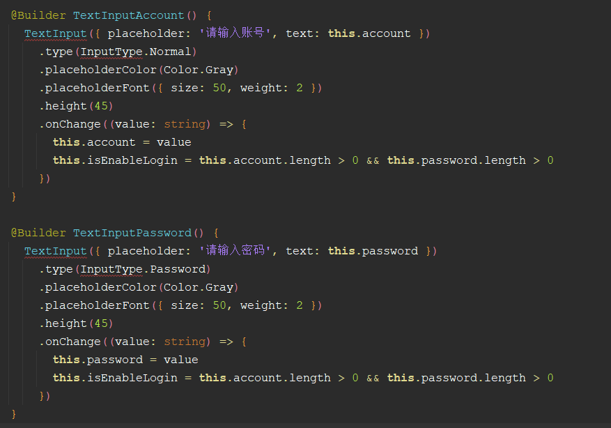
3. Login
Login is also relatively simple, but there is no document data in the input box on the official website. This input box is still from Codelabs: streaming layout (eTS) See it above. Determine the enabled status of the button according to whether there is content in the input box.
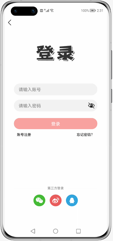
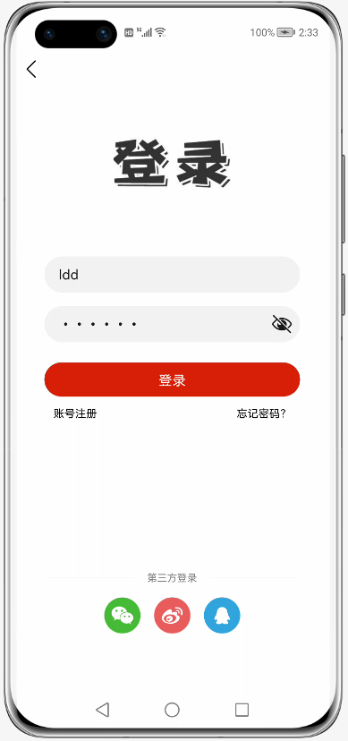
Although there are errors in the code prompt pasted into the editor, it can run and preview normally. I guess the type of password box! Ha ha, you guessed right.
4. Save login status
According to the official website information: there are still problems with lightweight storage and official website examples. I asked Huawei's little partner. He told me that this path needs to be in / data/data /. However, at present, the simulator is not fully compatible with this function and cannot be persistent. If the program is killed in the background, the data will be gone
import dataStorage from '@ohos.data.storage';
// Set the storage path. The path must be under / data/data /
const STORAGE_PATH = '/data/data/info'

export class InfoStorage {
  // Save user ID
  setUserId(userId: string) {
    let store = dataStorage.getStorageSync(STORAGE_PATH)
    store.putSync('userId', userId)
  }

  // Get user ID
  getUserId() {
    let store = dataStorage.getStorageSync(STORAGE_PATH)
    return store.getSync('userId', '').toString()
  }

}
Project address: https://gitee.com/liangdidi/NewsDemo.git (you need to log in to see the demo)
---
Original: Lao Wang [official account: Wang Meng developer Lao Wang] HUAWEI certified lecturer / Tencent certified lecturer / Hong Meng pioneer