Two column layout
Method 1: BFC construction
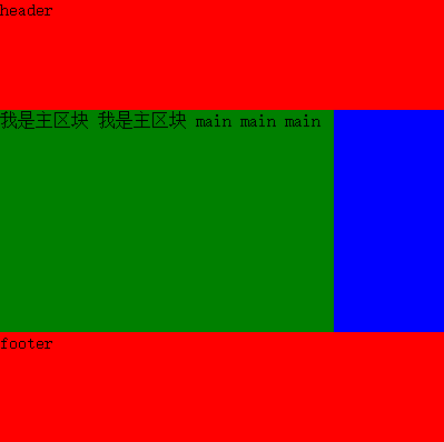
The two column layout is dominated by the main content area, with one column on the left (right) side. The code is as follows:
    <style>
        #header, #footer{
            height: 100px;
            background: red;
         }
        #content .main{
            height: 200px;
            background: green;
            overflow: auto;
        }
        #content .aside{
            height: 200px;
            width: 100px;
            background: blue;
            float: left;
        }
    </style>
   <body>
    <div id="header"></div>
    <div id="content">
        <div class="aside"></div>
        <div class="main">
            main main main main main main
        </div>
    </div>
    <div id="footer"></div>
</body>
Key points: float the side block < aside > domain, cover the green < main > after the < aside > floating, and then form BFC and independent region by < main > overflow: Auto. 
If you want to know more about BFC, you can see what I sent before Fully understand BFC
Method 2: use negative margin
Code example:
<style type="text/css">
        html,body{
            padding: 0;
            margin: 0;
        }
        #header, #footer{
            height: 100px;
            background: red;
            overflow: hidden;
         }
         #main{
            overflow: auto;
         }
        #main .center{
            height: 200px;
            width: 100%;
            float: left;
        }
        .center .content{
            height: 200px;
            background: green;
            margin-right: 100px;
        }
        #main .aside{
            height: 200px;
            width: 100px;
            background: blue;
            float: left;
            margin-left: -100px;
        }
    </style>

 </head>
 <body>
    <div id="header">header</div>
    <div id="main">
        <div class="center">
            <div class="content">
                //I am the main block. I am the main block. Main main main
            </div>
        </div>
        <div class="aside"></div>
    </div>
    <div id="footer">footer</div>
</body>- Add parent element to element content, set left float, width is 100%;
- content set the right margin, the width is the width of the aside (leave the space for the aside to float up);
- aside floats to the left and sets a negative margin equal to its own width.
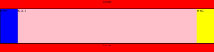
The three column layout is based on two columns:
- content sets the left and right margins. The width is equal to the width of side1. Side1 floats to the left. The negative margin of side1 is set to - 100%.
- side2 floats to the left, setting the negative margin equal to its own width value.