If you feel that the article is well written, if you want data in blog articles, please pay attention to the official account: the beauty of data analysis and statistics, add the author, personal WeChat, and enter the group to communicate with the author.
catalogue
1. Project background and analysis description 1) Project background 2) Data and field description 3) Dimensions of analysis 4) Common analysis methods of e-commerce 5) What is funnel analysis? 2. Import related libraries 3. Data preview and data preprocessing 1) Calculate the missing rate 2) Delete the geographic location column 3) The processing time column is divided into date column and hour column 4) Change the time and date columns to the standard date format, and the hour column to the int format 5) Arrange the data in ascending order according to the time column 6) Processing of company type field 7) Use the describe() function to view the distribution of data 8) Give an overview of the time data 4. Model construction 1) Treatment of flow indicators ① Total pv and uv ② uv and pv in date dimension ③ pv and uv in time dimension 2) User behavior indicators ① Total: click, collect, add shopping cart and pay users ② Click, collect, add shopping cart and pay users in the date dimension ③ Click, collect, add shopping cart and pay users in the time dimension ④ Breakdown of user behavior in the top 10 payment times ⑤ ARPPU analysis ⑥ Daily ARPU analysis ⑦ Payment rate PUR ⑧ Analysis of repurchase 3) Funnel analysis 4) Customer value analysis (RFM analysis)
1. Project background and analysis description
1) Project background
online shopping has become an indispensable part of people's life. Based on the data of Taobao app platform, this project analyzes user behavior through relevant indicators, so as to explore user related behavior patterns.
2) Data and field description
the data set used in this paper contains the user behavior data of Taobao App mobile terminal within one month from November 18, 2014 to December 18, 2014. The data is recorded for 12256906 days, with a total of 6 columns of data.
- user_id: user identity
- item_id: Commodity id
- behavior_type: user behavior type (including clicking, collecting, adding to shopping cart and paying, represented by numbers 1, 2, 3 and 4 respectively)
- user_geohash: geographic location
- item_category: category ID (category to which the commodity belongs)
- Time: the time when the user behavior occurs
3) Dimensions of analysis
- Flow index analysis
- User behavior analysis
- Funnel loss analysis
- User value RFM analysis
4) Common analysis methods of e-commerce

5) What is funnel analysis?
- "Funnel analysis" is a set of process data analysis, which can scientifically reflect the user behavior state and the user conversion rate at each stage from the starting point to the end point.

2. Import related libraries
import numpy as np
import pandas as pd
import matplotlib as  mpl
import matplotlib.pyplot as  plt
import seaborn as sns
import warnings
# Set to seaborn drawing style
sns.set(style="darkgrid",font_scale=1.5)

# Used to display Chinese labels
mpl.rcParams["font.family"] = "SimHei"

# Used to display negative signs
mpl.rcParams["axes.unicode_minus"] = False

# Sometimes there will be a lot of warning output when running the code, such as reminding the new version. If you don't want these messy outputs, you can use the following code
warnings.filterwarnings('ignore')
3. Data preview and data preprocessing
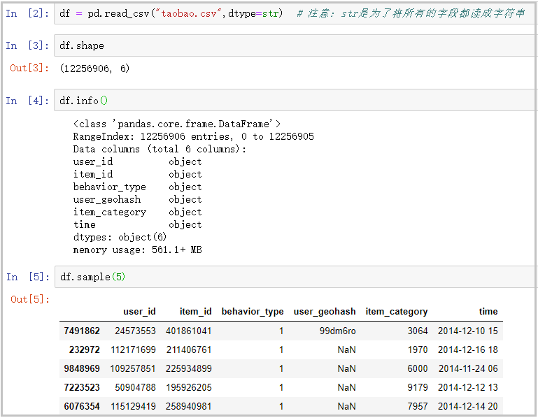
# Note: str is to read all fields as strings
df = pd.read_csv("taobao.csv",dtype=str)
df.shape
df.info()
df.sample(5)
The results are as follows:
1) Calculate the missing rate
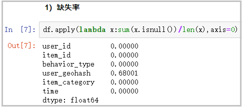
# Because there are too many missing values in the geographical location, we can't fill in, so delete this column first
df.apply(lambda x:sum(x.isnull())/len(x),axis=0)
The results are as follows:
2) Delete the geographic location column
df.drop(["user_geohash"],axis=1,inplace=True)
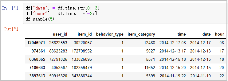
3) The processing time column is divided into date column and hour column
df["date"] = df.time.str[0:-3]
df["hour"] = df.time.str[-2:]
df.sample(5)
The results are as follows:
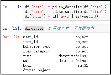
4) Change the time and date columns to the standard date format, and the hour column to the int format
df["date"] = pd.to_datetime(df["date"])
df["time"] = pd.to_datetime(df["time"])
df["hour"] = df["hour"].astype(int)
df.dtypes
The results are as follows:
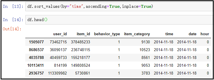
5) Arrange the data in ascending order according to the time column
df.sort_values(by="time",ascending=True,inplace=True)
df.head()
The results are as follows:
6) Delete the original index and rebuild the new index
df.reset_index(drop=True,inplace=True)
df.head()
The results are as follows:
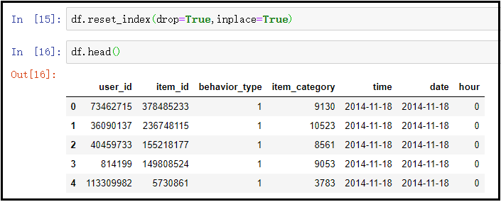
Knowledge points: pay attention to reset_ This usage of the drop parameter passed in index ().
7) Use the describe() function to view the distribution of data. Here, an include parameter is used. Note that
# View the data distribution of all object string types
df.describe(include=["object"])
# By default, describe() only counts the data distribution of numeric variables.
df.describe()
# View the data distribution of all data types
df.describe(include="all")
The results are as follows:
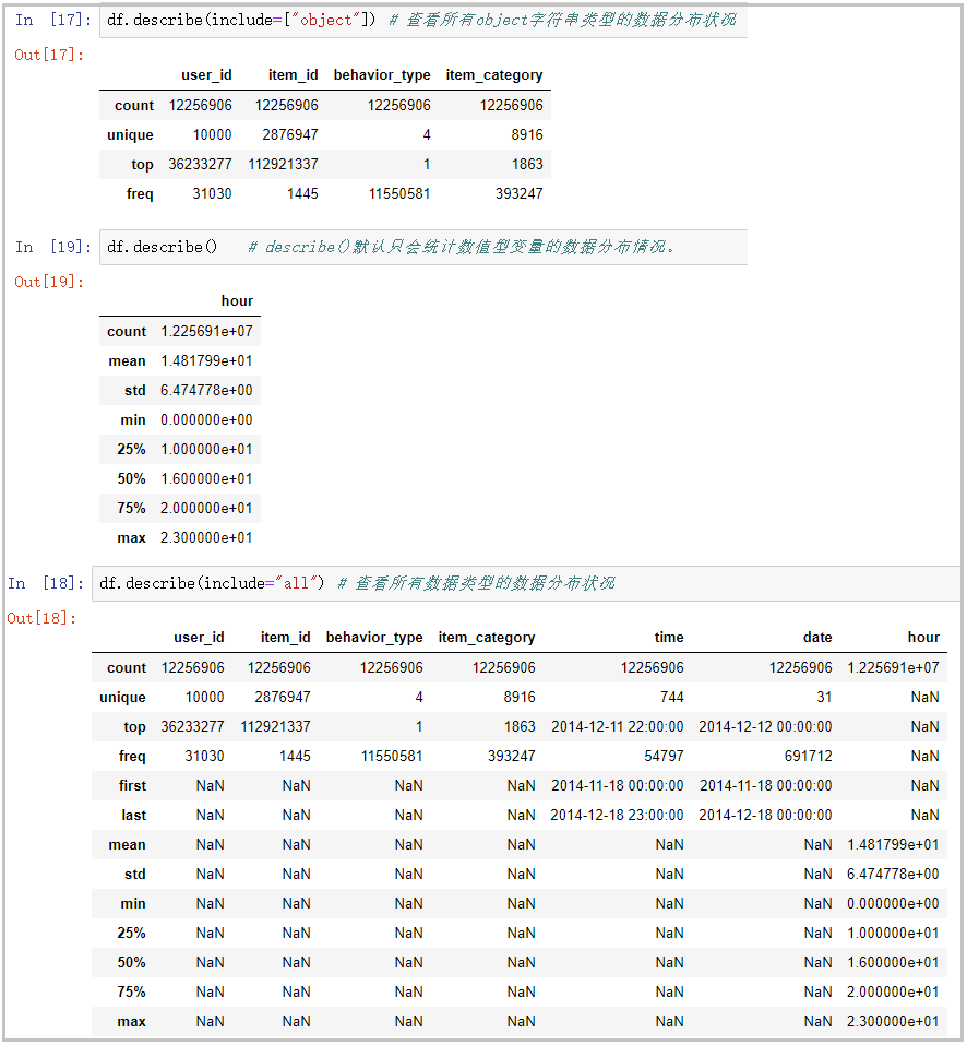
Knowledge points: pay attention to the usage of the incoming parameter include in the describe() function.
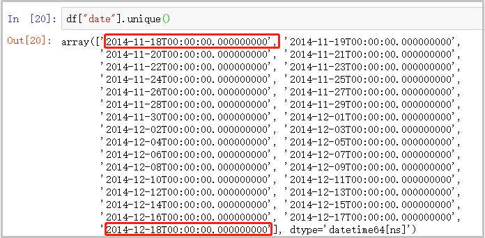
8) Give an overview of the time data
df["date"].unique()
The results are as follows:
4. Model construction
1) Treatment of flow indicators
- pv: refers to the total page views. Every time a user refreshes a web page, it will add pv.
- uv: refers to the number of independent visitors. A computer is an ip, that is, an independent visitor. In the actual analysis, we all think that everyone uses only one computer, that is, each independent visitor represents a user.
① Total pv and uv
total_pv = df["user_id"].count()
total_pv
total_uv = df["user_id"].nunique()
total_uv
The results are as follows:
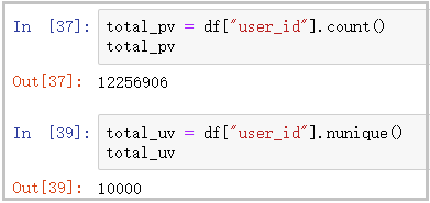
Result analysis: as can be seen from the figure, the total page views of the website are 12256906 times, and the number of independent visitors on the page is 10000.
② uv and pv in the date dimension: uv represents the total page views, and pv represents the number of independent visitors
pv_daily = df.groupby("date")['user_id'].count()
pv_daily.head(5)
uv_daily = df.groupby("date")['user_id'].apply(lambda x: x.nunique())
# uv_daily = df.groupby("date")['user_id'].apply(lambda x: x.drop_duplicates().count())
uv_daily.head()
pv_uv_daily = pd.concat([pv_daily,uv_daily],axis=1)
pv_uv_daily.columns = ["pv","uv"]
pv_uv_daily.head()
# The drawing code is as follows
plt.figure(figsize=(16,10))
plt.subplot(211)
plt.plot(pv_daily,c="r")
plt.title("Total page views per day(PV)")
plt.subplot(212)
plt.plot(uv_daily,c="g")
plt.title("Number of unique visitors per page per day(UV)")
#Plt.suptitle ("trend of PV and UV")
plt.tight_layout()
plt.savefig("PV and UV Change trend of",dpi=300)
plt.show()
The results are as follows:
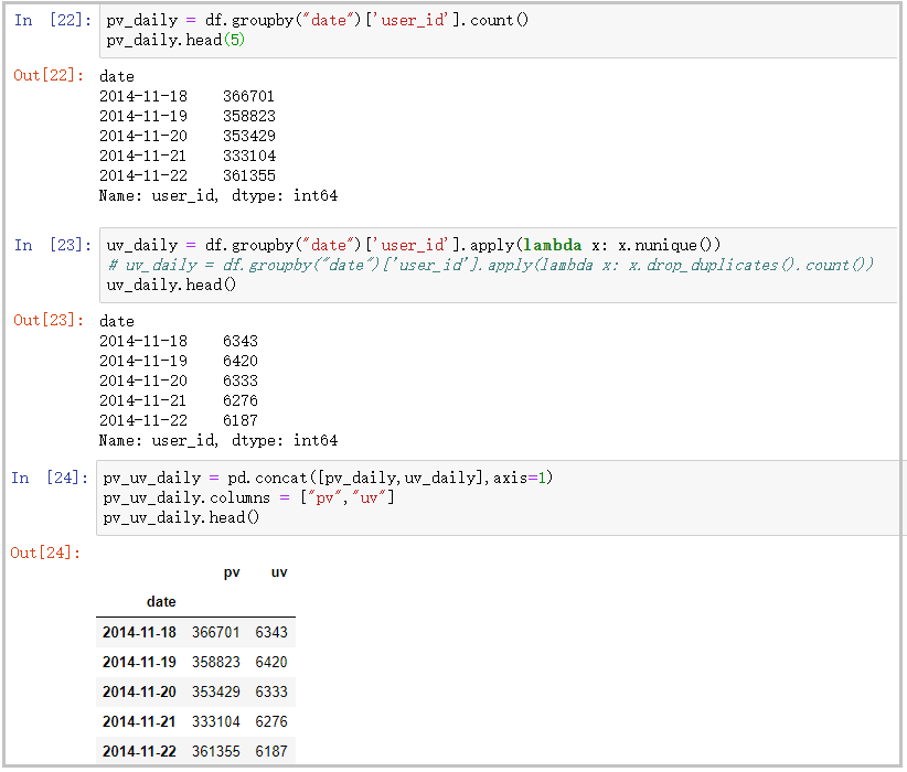
The drawing is as follows:
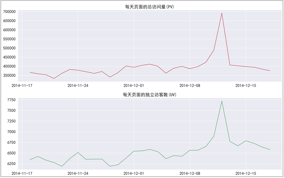
Result analysis: it can be seen from the figure that pv and uv data show a high positive correlation. Before and after the double 12, pv and uv fluctuated between 350000 and 400000. During the double 12, page views increased sharply, which proved that the effect of this activity was very good.
③ pv and uv in time dimension
pv_hour = df.groupby("hour")['user_id'].count()
pv_hour.head()
uv_hour = df.groupby("hour")['user_id'].apply(lambda x: x.nunique())
uv_hour.head()
pv_uv_hour = pd.concat([pv_hour,uv_hour],axis=1)
pv_uv_hour.columns = ["pv_hour","uv_hour"]
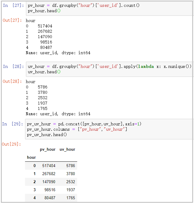
pv_uv_hour.head()
# The drawing code is as follows
plt.figure(figsize=(16,10))
pv_uv_hour["pv_hour"].plot(c="steelblue",label="Total page views per hour")
plt.ylabel("Page views")

pv_uv_hour["uv_hour"].plot(c="red",label="Page unique visitors per hour",secondary_y=True)
plt.ylabel("Page unique visitors")
plt.xticks(range(0,24),pv_uv_hour.index)

plt.legend(loc="best")
plt.grid(True)

plt.tight_layout()
plt.savefig("Hourly PV and UV Change trend of",dpi=300)
plt.show()
The results are as follows:
The drawing is as follows:
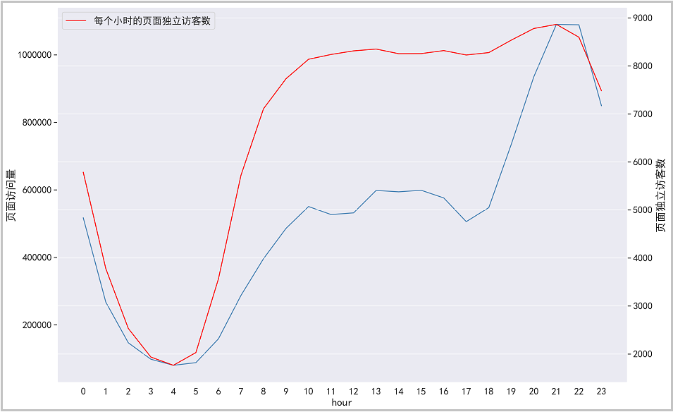
Result analysis: it can be seen from the figure that from 22:00 p.m. to 5:00 a.m., the number of users and visits to the page gradually decrease, and many people are resting during this period. From 6:00 to 10:00 in the morning, the number of users gradually shows an upward trend, and there is a relatively stable state from 10:00 to 18:00. This time period is normal working hours. However, from 18:00 to 22:00 in the evening, the number of users surged sharply, reaching the maximum number of users visited in a day. Operators can refer to the active time period of users and take some promotional activities.
2) User behavior indicators
① Total click, collection, shopping cart addition and payment of users
type_1 = df[df['behavior_type']=="1"]["user_id"].count()
type_2 = df[df['behavior_type']=="2"]["user_id"].count()
type_3 = df[df['behavior_type']=="3"]["user_id"].count()
type_4 = df[df['behavior_type']=="4"]["user_id"].count()
print("Click user:",type_1)
print("Favorite users:",type_2)
print("Add cart user:",type_3)
print("Payment user:",type_4)
The results are as follows:
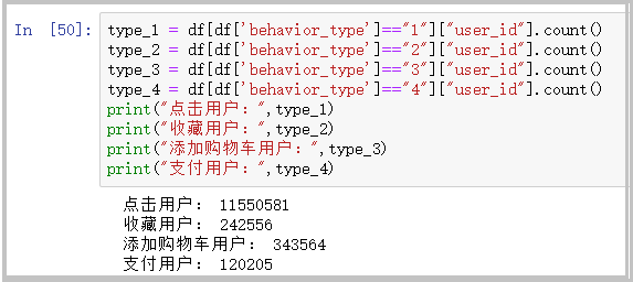
Result analysis: as can be seen from the figure, users click on the page – > collect and add such as shopping cart – > pay, which gradually shows a downward trend. This analysis will be further explained in the funnel diagram below.
② Click, collect, add shopping cart and pay users in the date dimension
pv_date_type = pd.pivot_table(df,index='date',
                             columns='behavior_type',
                             values='user_id',
                             aggfunc=np.size)
pv_date_type.columns = ["click","Collection","add to cart","payment"]
pv_date_type.head()
# The drawing is as follows
plt.figure(figsize=(16,10))
sns.lineplot(data=pv_date_type[['Collection', 'add to cart', 'payment']])

plt.tight_layout()
plt.savefig("Different user behaviors on different dates PV Change trend",dpi=300)
plt.show()
The results are as follows:
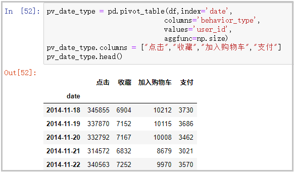
The drawing is as follows:
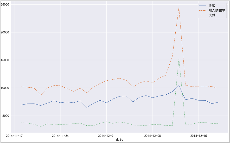
③ Click, collect, add shopping cart and pay users in the time dimension
pv_hour_type = pd.pivot_table(df,index='hour',
                             columns='behavior_type',
                             values='user_id',
                             aggfunc=np.size)
pv_hour_type.columns = ["click","Collection","add to cart","payment"]
pv_hour_type.head()
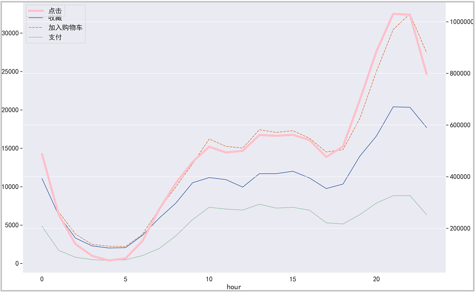
# The drawing is as follows
plt.figure(figsize=(16,10))
sns.lineplot(data=pv_hour_type[['Collection', 'add to cart', 'payment']])

pv_hour_type["click"].plot(c="pink",linewidth=5,label="click",secondary_y=True)
plt.legend(loc="best")

plt.tight_layout()
plt.savefig("Different user behaviors in different hours PV Change trend",dpi=300)
plt.show()
The results are as follows:
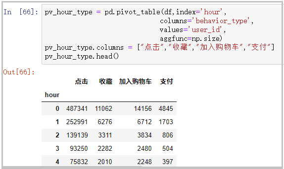
The drawing is as follows:
④ Breakdown of user behavior in the top 10 payment times
df["user_id1"] = df["user_id"]
buy_first = pd.pivot_table(df,index='user_id',
                             columns='behavior_type',
                             values='user_id1',
                             aggfunc="count")
buy_first.columns = ["click","Collection","add to cart","payment"]
buy_first_10 = buy_first.sort_values(by="payment",ascending=False)[:10]
buy_first_10
# The drawing is as follows
plt.figure(figsize=(16,10))
plt.subplot(311)
plt.plot(buy_first_10["click"],c="r")
plt.title("Change trend of hits")
plt.subplot(312)
plt.plot(buy_first_10["Collection"],c="g")
plt.title("Change trend of collection number")
plt.subplot(313)
plt.plot(buy_first_10["add to cart"],c="b")
plt.title("Change trend of adding shopping cart")

plt.xticks(np.arange(10),buy_first_10.index)

plt.tight_layout()
plt.savefig("The top 10 paying users have the change trend of clicking, collecting and adding to the shopping cart",dpi=300)
plt.show()
The results are as follows:
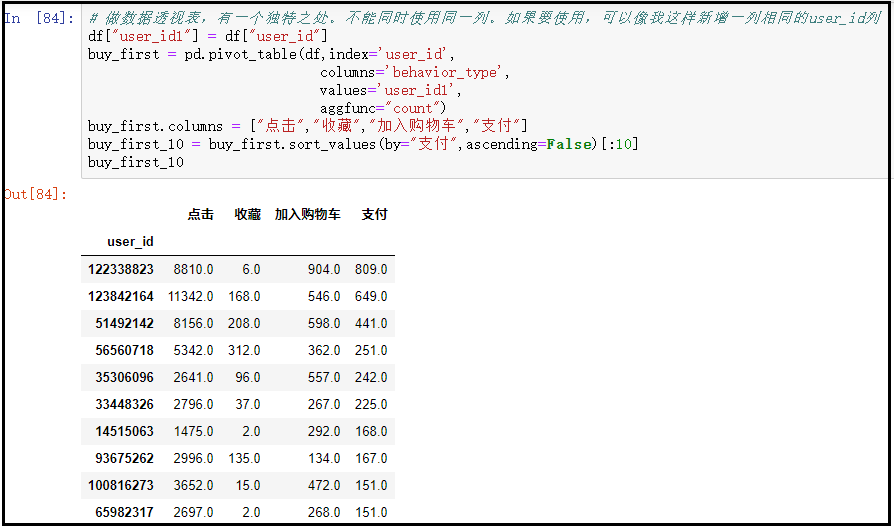
The drawing is as follows:
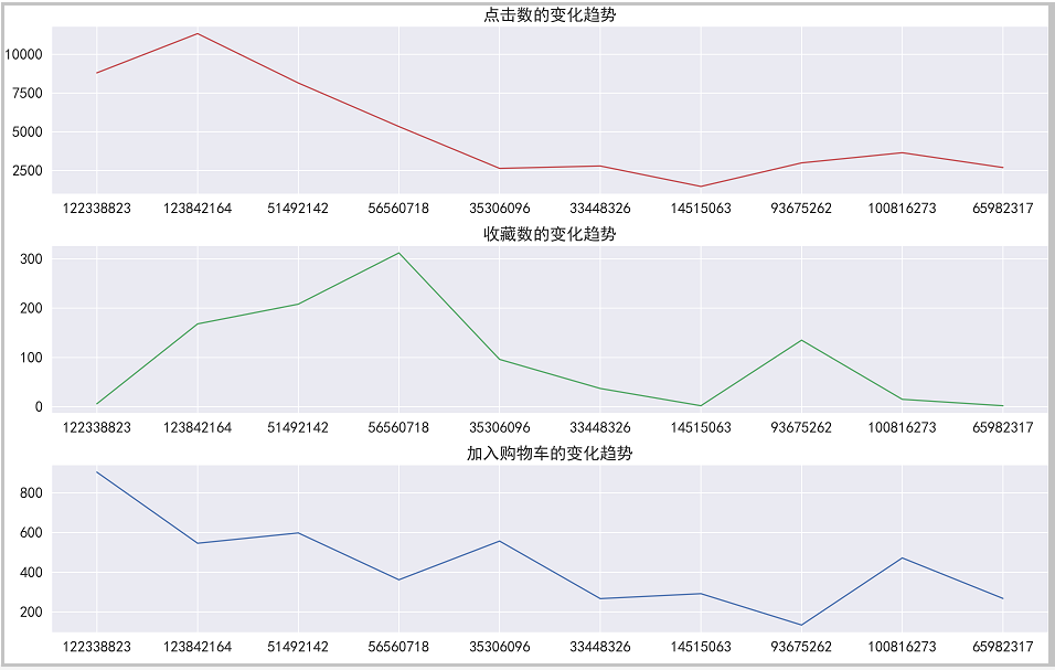
Result analysis: through this analysis, we can see that the users who purchase the most often do not necessarily click, collect and join to buy the car the most,
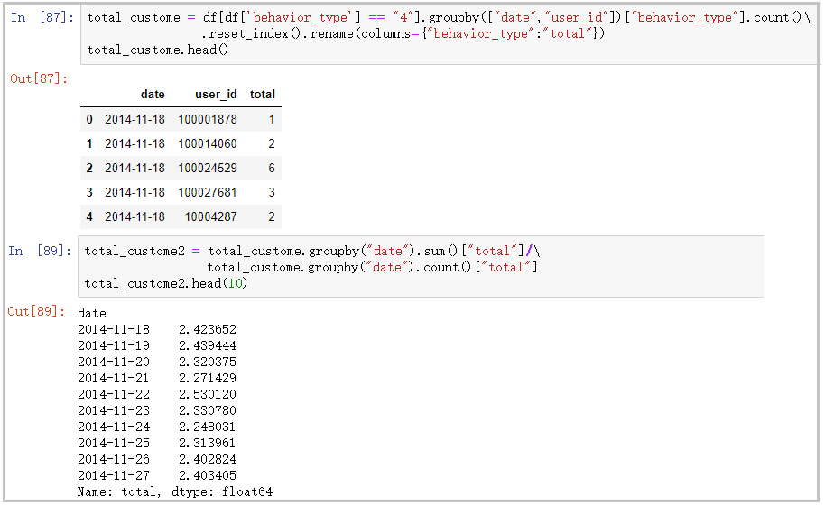
⑤ ARPPU analysis: the average revenue per user can be calculated by "total revenue / AU"
total_custome = df[df['behavior_type'] == "4"].groupby(["date","user_id"])["behavior_type"].count()\
                .reset_index().rename(columns={"behavior_type":"total"})
total_custome.head()
total_custome2 = total_custome.groupby("date").sum()["total"]/\
                 total_custome.groupby("date").count()["total"]
total_custome2.head(10)
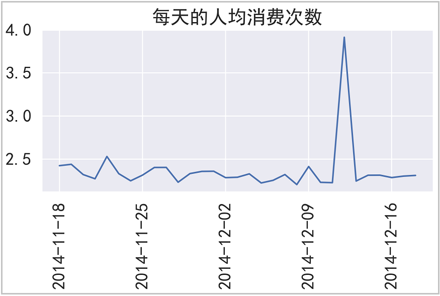
# The drawing is as follows
x = len(total_custome2.index.astype(str))
y = total_custome2.index.astype(str)

plt.plot(total_custome2.values)
plt.xticks(range(0,30,7),[y[i] for i in range(0,x,7)],rotation=90)
plt.title("Per capita consumption per day")

plt.tight_layout()
plt.savefig("Per capita consumption per day",dpi=300)
plt.show()
The results are as follows:
The drawing is as follows:
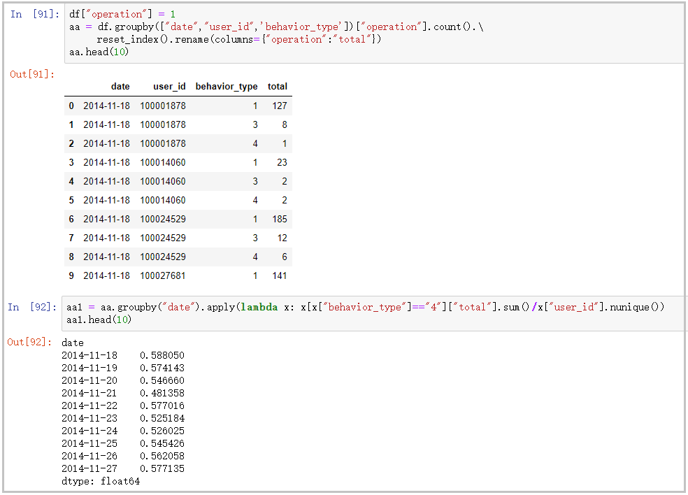
⑥ Daily ARPU analysis: it represents the average revenue per user. ARPU = total revenue / AU
df["operation"] = 1
aa = df.groupby(["date","user_id",'behavior_type'])["operation"].count().\
     reset_index().rename(columns={"operation":"total"})
aa.head(10)
aa1 = aa.groupby("date").apply(lambda x: x[x["behavior_type"]=="4"]["total"].sum()/x["user_id"].nunique())
aa1.head(10)
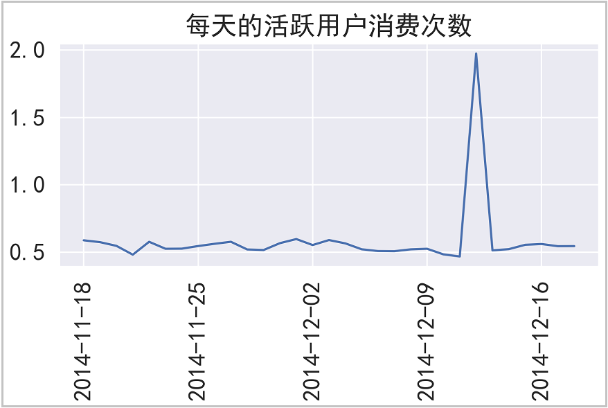
# The drawing is as follows
x = len(aa1.index.astype(str))
y = aa1.index.astype(str)

plt.plot(aa1.values)
plt.xticks(range(0,30,7),[y[i] for i in range(0,x,7)],rotation=90)
plt.title("Consumption times of active users per day")

plt.tight_layout()
plt.savefig("Consumption times of active users per day",dpi=300)
plt.show()
The results are as follows:
The drawing is as follows:
⑦ The payment rate PUR = APA/AU, which is replaced by [number of consumers / number of active users]
rate = aa.groupby("date").apply(lambda x: x[x["behavior_type"]=="4"]["total"].count()/x["user_id"].nunique())
rate.head(10)
# The drawing is as follows
x = len(rate.index.astype(str))
y = rate.index.astype(str)

plt.plot(rate.values)
plt.xticks(range(0,30,7),[y[i] for i in range(0,x,7)],rotation=90)
plt.title("Payment rate analysis")

plt.tight_layout()
plt.savefig("Payment rate analysis",dpi=300)
plt.show()
The results are as follows:
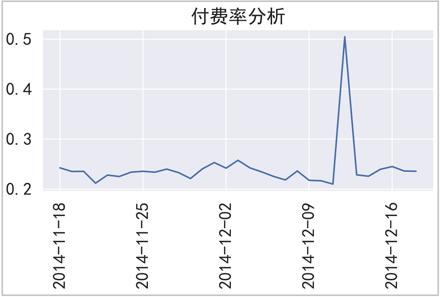
⑧ Repurchase analysis (repurchase rate)
re_buy = df[df["behavior_type"]=="4"].groupby("user_id")["date"].apply(lambda x: x.nunique())
print(len(re_buy))
re_buy[re_buy >= 2].count() / re_buy.count()
The results are as follows:

3) Funnel analysis
df_count = df.groupby("behavior_type").size().reset_index().\
           rename(columns={"behavior_type":"link",0:"Number of people"})

type_dict = {
    "1":"click",
    "2":"Collection",
    "3":"add to cart",
    "4":"payment"
}
df_count["link"] = df_count["link"].map(type_dict)

a = df_count.iloc[0]["Number of people"]
b = df_count.iloc[1]["Number of people"]
c = df_count.iloc[2]["Number of people"]
d = df_count.iloc[3]["Number of people"]
funnel = pd.DataFrame({"link":["click","Collect and add shopping cart","payment"],"Number of people":[a,b+c,d]})

funnel["Overall conversion"] = [i/funnel["Number of people"][0] for i in funnel["Number of people"]]
funnel["Single conversion"] = np.array([1.0,2.0,3.0])
for i in range(0,len(funnel["Number of people"])):
    if i == 0:
        funnel["Single conversion"][i] = 1.0
    else:
        funnel["Single conversion"][i] = funnel["Number of people"][i] / funnel["Number of people"][i-1]
# The drawing is as follows
import plotly.express as px
import plotly.graph_objs as go

trace = go.Funnel(
    y = ["click", "Collect and add shopping cart", "purchase"],
    x = [funnel["Number of people"][0], funnel["Number of people"][1], funnel["Number of people"][2]],
    textinfo = "value+percent initial",
    marker=dict(color=["deepskyblue", "lightsalmon", "tan"]),
    connector = {"line": {"color": "royalblue", "dash": "solid", "width": 3}})

data =[trace]

fig = go.Figure(data)

fig.show()
The results are as follows:
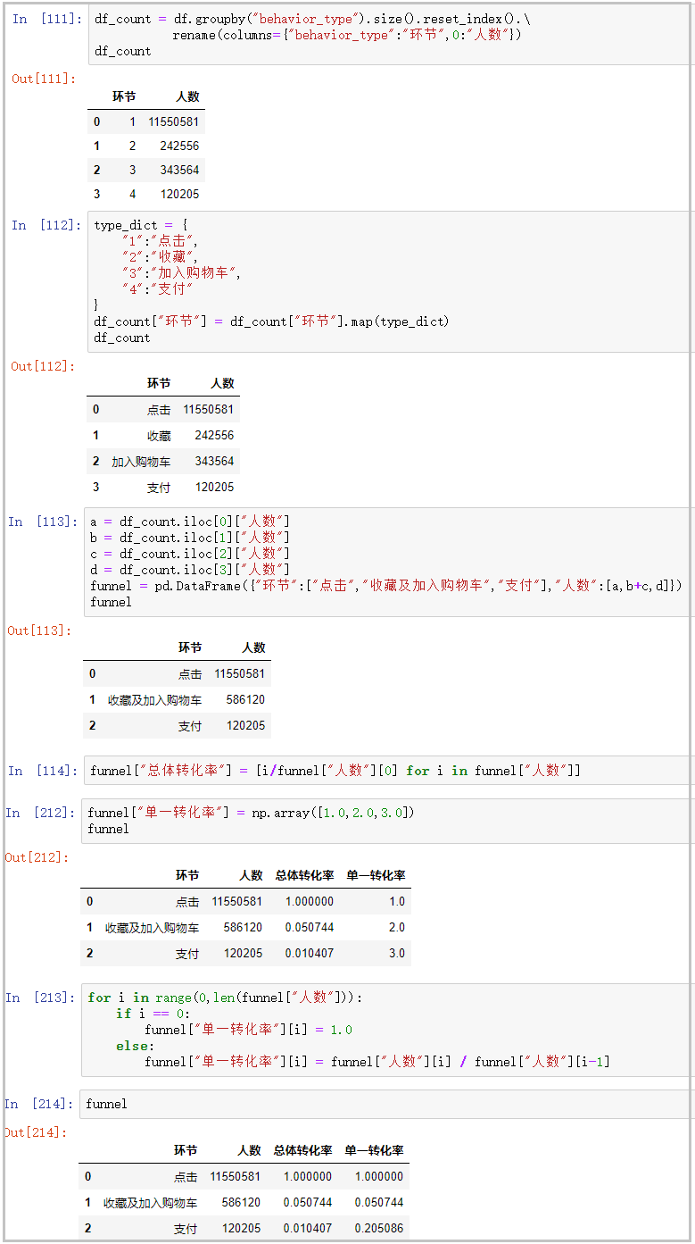
The drawing is as follows:
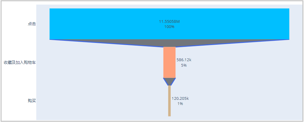
Result analysis: since collecting and joining car purchase are user behaviors with purchase intention, regardless of order, we regard their combination as a stage. As can be seen from the funnel chart and the funnel table above, the conversion rate from browsing to having purchase intention (collecting and adding to the shopping cart) is only 5%, but the conversion rate from real purchase to purchase is only 1%. Looking at the "single conversion rate", the conversion rate from having purchase intention to real purchase has reached 20%. It shows that the stage from browsing to collecting and adding to the shopping cart is an important link in the improvement of indicators.
4) Customer value analysis (RFM analysis)
from datetime import datetime
# Number of days since the last purchase
recent_buy = df[df["behavior_type"]=="4"].groupby("user_id")["date"].\
             apply(lambda x:datetime(2014,12,20) - x.sort_values().iloc[-1]).reset_index().\
             rename(columns={"date":"recent"})
recent_buy["recent"] = recent_buy["recent"].apply(lambda x: x.days)
recent_buy[:10]
# Calculation of purchase times
buy_freq = df[df["behavior_type"]=="4"].groupby("user_id")["date"].count().reset_index().\
          rename(columns={"date":"freq"})
buy_freq[:10]
# Combine the above two columns of data
rfm = pd.merge(recent_buy,buy_freq,on="user_id")
rfm[:10]
# Rate different types
r_bins = [0,5,10,15,20,50]
f_bins = [1,30,60,90,120,900]
rfm["r_score"] = pd.cut(rfm["recent"],bins=r_bins,labels=[5,4,3,2,1],right=False)
rfm["f_score"] = pd.cut(rfm["freq"],bins=f_bins,labels=[1,2,3,4,5],right=False)
for i in ["r_score","f_score"]:
    rfm[i] = rfm[i].astype(float)
rfm.describe()
# Compare the scores with their respective mean values
rfm["r"] = np.where(rfm["r_score"]>3.943957,"high","low")
rfm["f"] = np.where(rfm["f_score"]>1.133356,"high","low")
# Combine the strings of columns r and f
rfm["value"] = rfm["r"].str[:] + rfm["f"].str[:]
rfm.head()
# Custom functions label users
def trans_labels(x):
    if x == "high":
        return "Important value customers"
    elif x == "Low high":
        return "Important call back customers"
    elif x == "height":
        return "Important deep ploughing customers"
    else:
        return "Important customer recovery"
rfm["label"] = rfm["value"].apply(trans_labels)
# Calculate the number of users per tag
rfm["label"].value_counts()
The results are as follows:
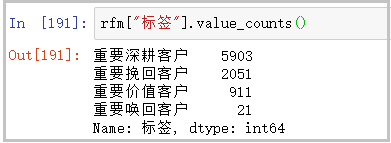
for the analysis of RFM results, you can refer to my other article: https://blog.csdn.net/weixin_41261833/article/details/104425817