Navigation menus are made in various ways, and there are various ways to achieve cool effects on the Internet. So today I want to talk about the specific use of Navigation View launched by Google after Android 5.0.
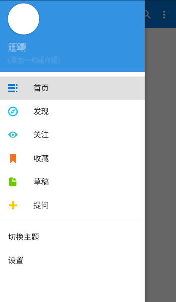
Navigation View has been seen on many App s. It is known in China (the part that slides out of the side-pull menu belongs to Navigation View). Here is the following picture:
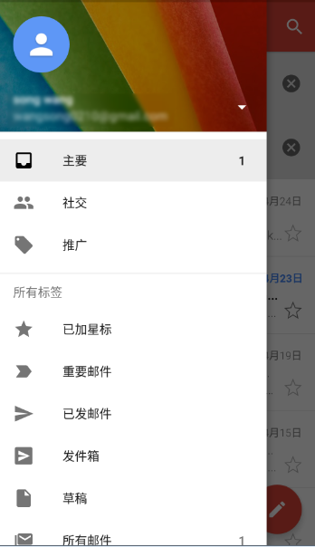
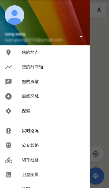
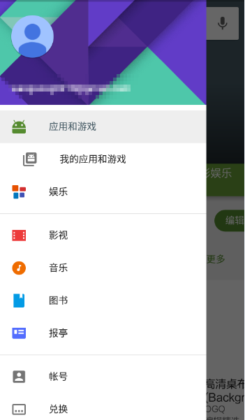
And Google's own app s, which basically all use Navigation View, are Gmail, Google Map and Google Play as follows:
OK, after looking at the picture, let's talk about the Navigation View.
1. What is Navigation View?
Long ago, when we make the drawer menu, the layout of the part sliding out on the left is defined by ourselves. If we write it by ourselves, it takes time to make a nice side-pull menu, but it always takes time. So Google launched NavitationView after 5.0, which is the menu sliding out on the left. The menu is divided into two parts as a whole. The top part is called Header Layout, and the clicks below are menu. This effect can be written if we want to write it by ourselves, but it is not necessary. Now that Google provides this control, let's see how to use it.
2. How to use Navigation View
Like the normal way of making side-pull menus, first of all, everything is in a Drawer Layout (if you are not familiar with Drawer Layout, please refer to this article). Using Drawer Layout to Realize Side-pull Menu But this time we're replacing the layout of the left slider menu with a Navigation View, code as follows:
OK, let me explain the meaning of several attributes here.
1.Android The layout_gravity="left" attribute indicates that the View is a sliding menu on the left. The meaning of this attribute is needless to say. This is the knowledge point in DrawerLayout's usage.
2.app:headerLayout="@layout/header_layout" means referring to a header layout file, which is the background image we saw above, including the control that displays the user name on the background image, and so on.
3.app:menu="@menu/main" means referring to a menu as the following click item
OK, let's look at the header layout file again.
Look at the menu file again:
OK, run to see the effect:
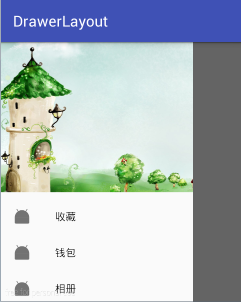
OK, it's already shown, but there's a problem. The pictures are grey. How to break them? There are two ways:
1. Add the attribute app:itemIconTint="@color/blue" in the layout file to indicate that the color of the set picture is all blue. The effect is as follows:
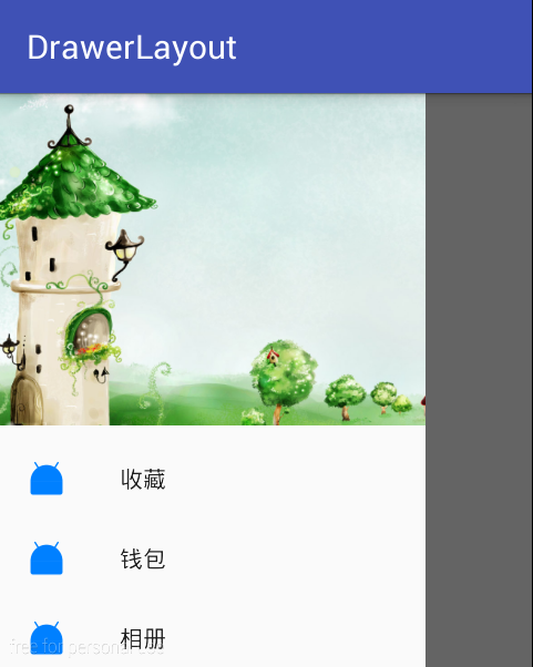
2. The first solution will let all the pictures show in one color. What if I want the picture to show its own color? stay Java The following method is called in the code:
The results are as follows:
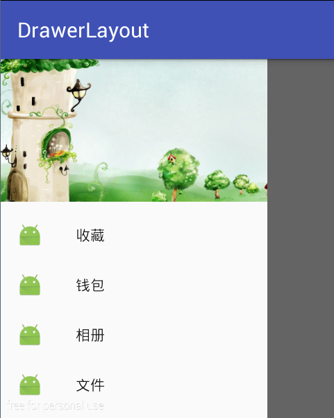
This is normal.
There are also two commonly used API s:
1. app: itemBackground="@color/color Accent" sets the background color of each item
2.app:itemTextColor="" Sets the background color of item
OK, what if I want to add a separator between Navigation View items? Simply put the item into a group in menu and give it an id. The code is as follows:
The results are as follows:
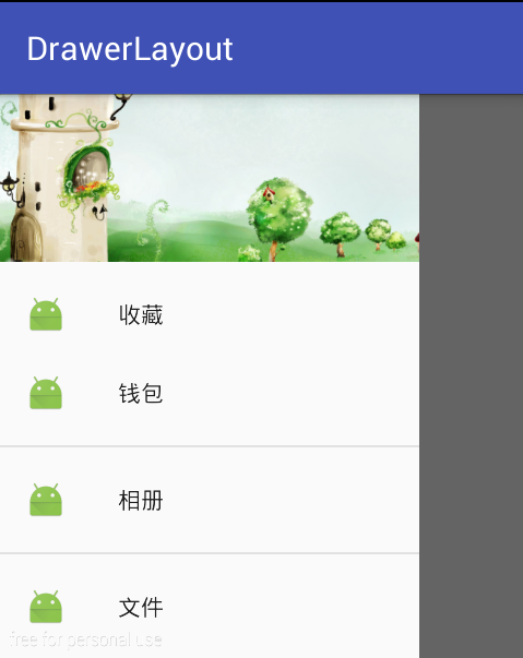
OK, the splitting line has been added successfully.
Next, let's look at how to handle event listening in Navigation View.
The event handling in Navigation View is mainly two aspects, one is the click event in the head, and the other is the click event in itemView. Let's take a look at them separately.
1. Head Click Event
To deal with the header click event, we need to get the header control first. In Java code, we can get the header control in the following way.
Then, by calling the findViewById method in headerView, we can find the control of the header and set the click event.
2.item Click Events
OK, that's all about the use of the basic Navigation View. Welcome to contact us if you have any questions.
Above.