1, Brief introduction to components
A container is an element designed to contain page elements to a reasonable maximum width according to the size of the user's screen. This is useful for use with other UI elements, such as useful grids or menus, to limit their width to a reasonable display size.
Advantage: containers are designed to responsively adjust their maximum width according to the screen size they appear., It facilitates the development of responsive pages
- Containers are designed to responsively adjust their maximum width according to the screen size in which they appear
- The usage is also simple. Some components contain response layouts
- For example, the row and column components in the Grid layout
2, Basic usage of components
(1) Basic container
<div class="ui container">
</div>
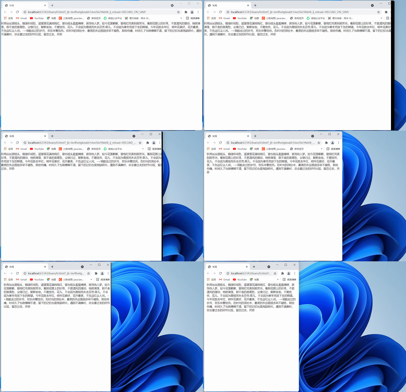
When the page is stretched and shrunk, the content will change in response
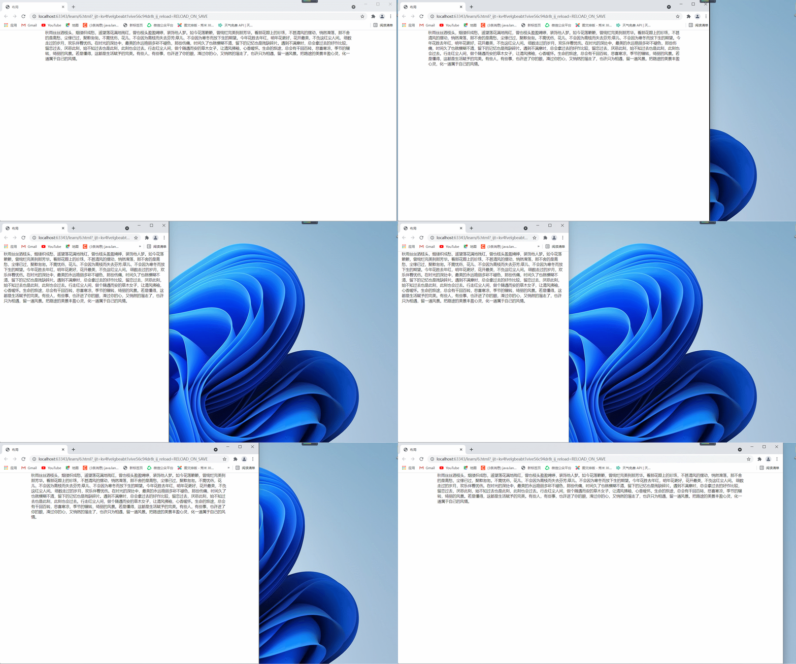 Therefore, the change of container depends on the change of size
(2) Text container
<div class="ui text container">
</div>
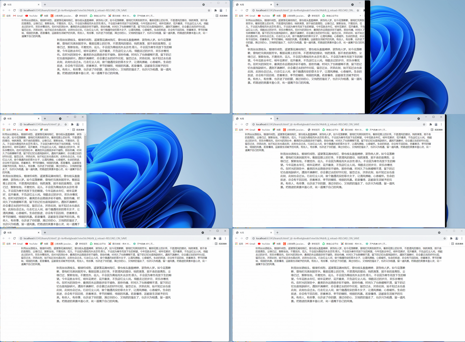
Compare the changes of the two containers. Text containers can better display text.
The upper part is the basic container and the lower part is the text container
It is not difficult to find that text containers control the distance between characters and look better
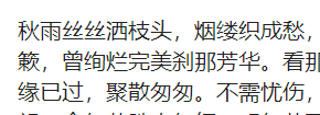
 Take out a segment for more intuitive comparison:
Ordinary type: narrow and crowded

Text: just right
(3) Aligned container
<div class="ui left aligned container">
  <p>Align left</p>
</div>
<div class="ui center aligned container">
  <p>Center alignment</p>
</div>
<div class="ui right aligned container">
  <p>Right align</p>
</div>
<div class="ui justified container">
  <p>Line alignment</p>
</div>
The effects are as follows:

(4) Fluid container
Fluid containers can be used to set text alignment or other alignment, regardless of width
<div class="ui fluid container">
</div>
3, Nested use of components
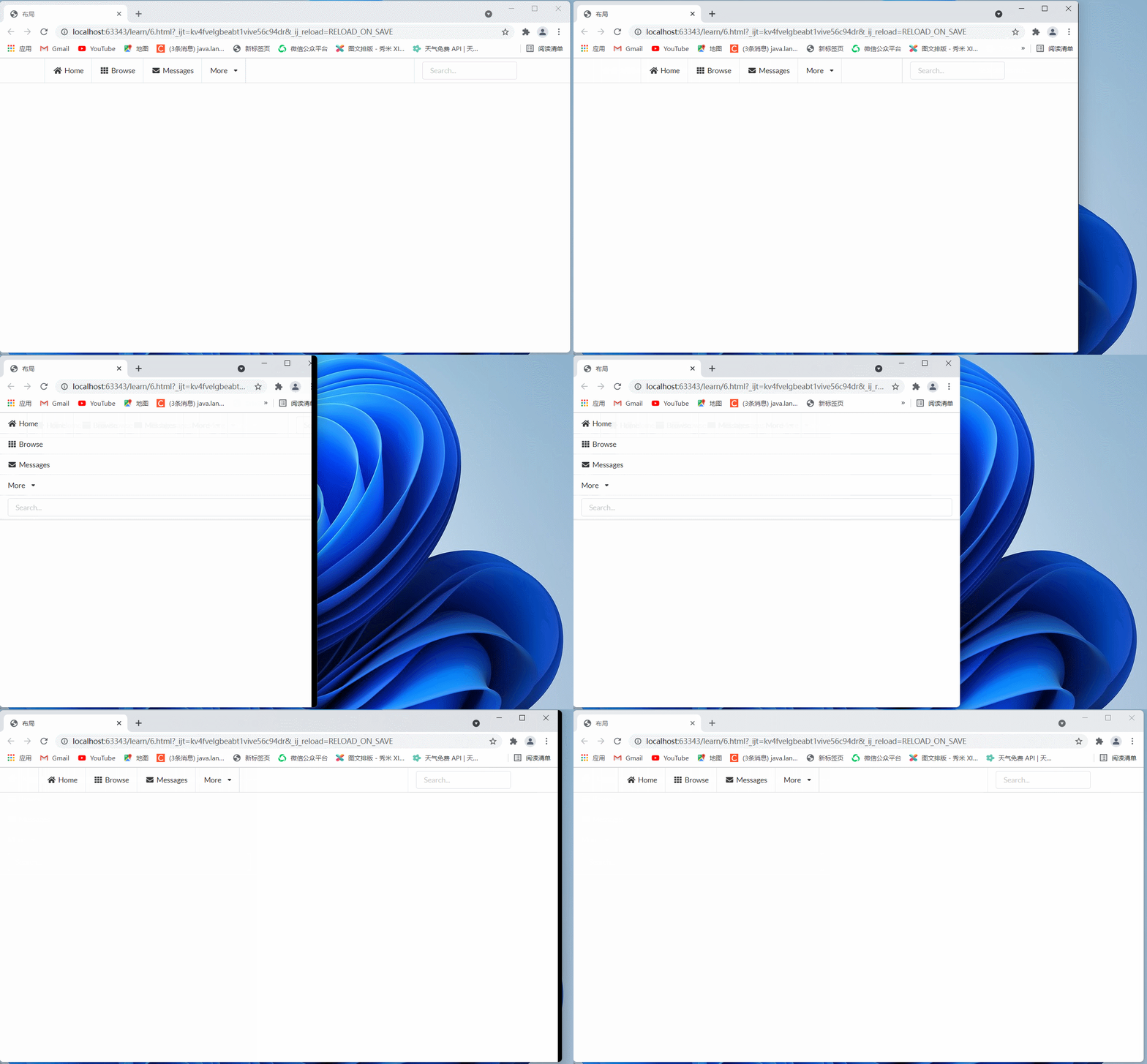
(1) Use with menu layout to achieve simple responsive navigation bar effect
<div class="ui attached stackable menu">
  <div class="ui container">
    <a class="item">
      <i class="home icon"></i> Home
    </a>
    <a class="item">
      <i class="grid layout icon"></i> Browse
    </a>
    <a class="item">
      <i class="mail icon"></i> Messages
    </a>
    <div class="ui simple dropdown item">
      More
      <i class="dropdown icon"></i>
      <div class="menu">
        <a class="item"><i class="edit icon"></i> Edit Profile</a>
        <a class="item"><i class="globe icon"></i> Choose Language</a>
        <a class="item"><i class="settings icon"></i> Account Settings</a>
      </div>
    </div>
    <div class="right item">
      <div class="ui input"><input type="text" placeholder="Search..."></div>
    </div>
  </div>
</div>
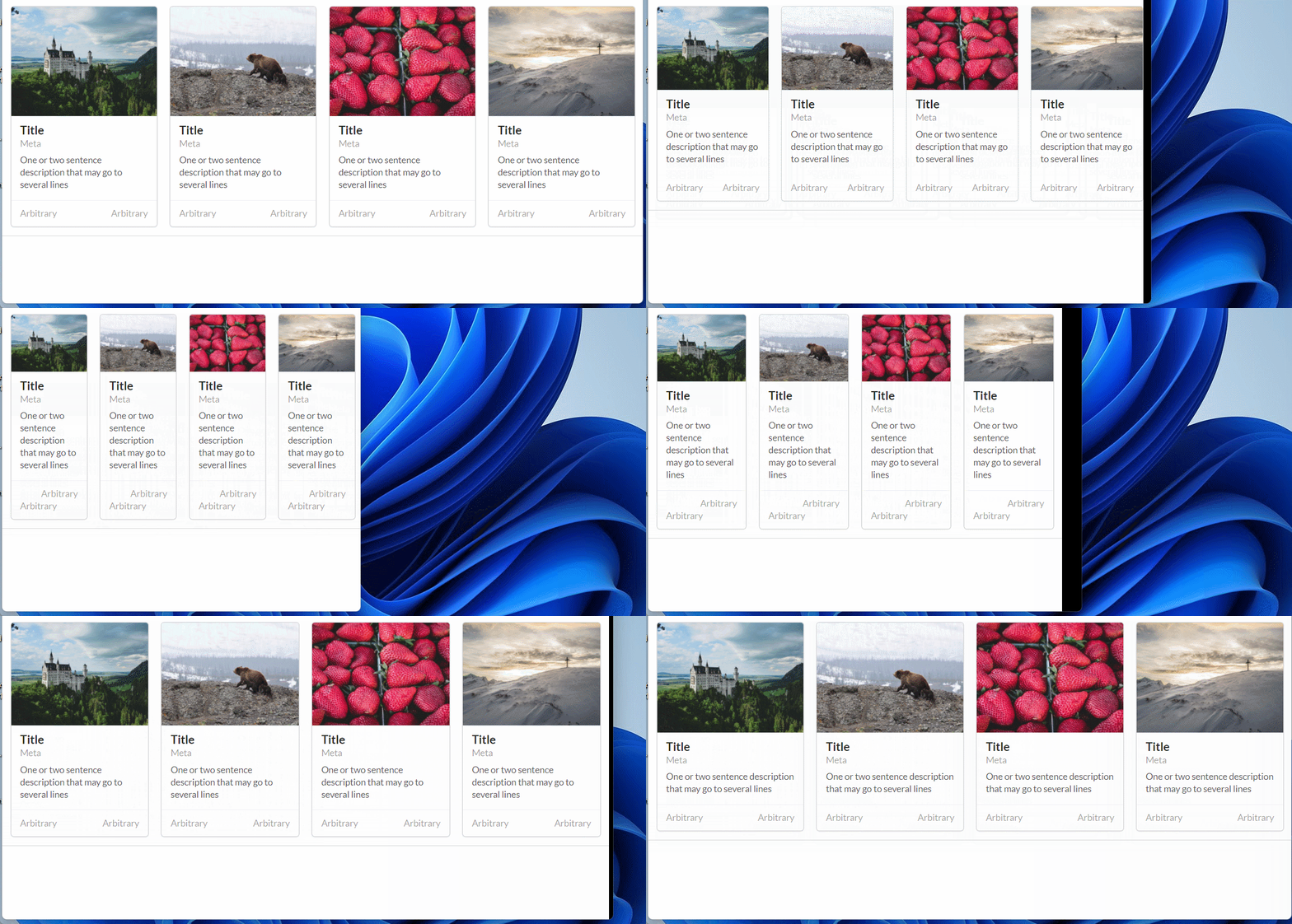
(2) Combined with grid, card and other layouts to achieve card list effect
Here is a code fragment I wrote before. It's a little long
But the effect is very good
<div class="ui attached segment">
        <div class="ui four cards">
            <div class="ui card">
                <div class="image dimmable">
                    <div class="ui blurring inverted dimmer transition hidden">
                        <div class="content">
                            <div class="center">
                                <div class="ui teal button">Add Friend</div>
                            </div>
                        </div>
                    </div>
                    <img src="https://picsum.photos/id/1040/800/600">
                </div>
                <div class="content">
                    <div class="header">Title</div>
                    <div class="meta">
                        <a class="group">Meta</a>
                    </div>
                    <div class="description">One or two sentence description that may go to several lines</div>
                </div>
                <div class="extra content">
                    <a class="right floated created">Arbitrary</a>
                    <a class="friends">
                        Arbitrary</a>
                </div>
            </div>
            <div class="ui card">
                <div class="image dimmable">
                    <div class="ui blurring inverted dimmer transition hidden">
                        <div class="content">
                            <div class="center">
                                <div class="ui teal button">Add Friend</div>
                            </div>
                        </div>
                    </div>
                    <img src="https://picsum.photos/id/1020/800/600">
                </div>
                <div class="content">
                    <div class="header">Title</div>
                    <div class="meta">
                        <a class="group">Meta</a>
                    </div>
                    <div class="description">One or two sentence description that may go to several lines</div>
                </div>
                <div class="extra content">
                    <a class="right floated created">Arbitrary</a>
                    <a class="friends">
                        Arbitrary</a>
                </div>
            </div>
            <div class="ui card">
                <div class="image dimmable">
                    <div class="ui blurring inverted dimmer transition hidden">
                        <div class="content">
                            <div class="center">
                                <div class="ui teal button">Add Friend</div>
                            </div>
                        </div>
                    </div>
                    <img src="https://picsum.photos/id/1080/800/600">
                </div>
                <div class="content">
                    <div class="header">Title</div>
                    <div class="meta">
                        <a class="group">Meta</a>
                    </div>
                    <div class="description">One or two sentence description that may go to several lines</div>
                </div>
                <div class="extra content">
                    <a class="right floated created">Arbitrary</a>
                    <a class="friends">
                        Arbitrary</a>
                </div>
            </div>
            <div class="ui card">
                <div class="image dimmable">
                    <div class="ui blurring inverted dimmer transition hidden">
                        <div class="content">
                            <div class="center">
                                <div class="ui teal button">Add Friend</div>
                            </div>
                        </div>
                    </div>
                    <img src="https://picsum.photos/id/1000/800/600">
                </div>
                <div class="content">
                    <div class="header">Title</div>
                    <div class="meta">
                        <a class="group">Meta</a>
                    </div>
                    <div class="description">One or two sentence description that may go to several lines</div>
                </div>
                <div class="extra content">
                    <a class="right floated created">Arbitrary</a>
                    <a class="friends">
                        Arbitrary</a>
                </div>
            </div>
        </div>
    </div>
The effects are as follows:
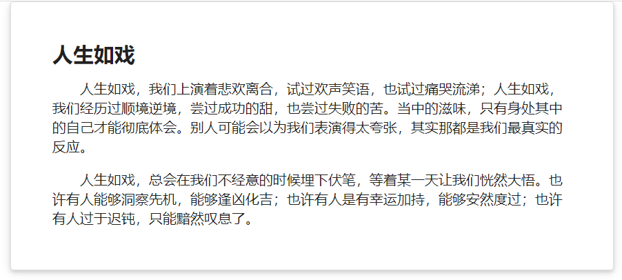
(3) Combined with clip layout to achieve shadow card effect
<div class="ui raised very padded text container segment">
</div>
