uni-app Customized Modal Bullet Window Template uniPop, uniapp Imitated Wechat, android, ios Bullet Window Effect
uniPop has built-in animation effects, optional ios/android, customizable pop-up window style/customizable multi-button and event/pop-up window display location, auto-closing seconds, transparency of the mask layer, and whether or not to click on the mask to close
As shown above: H5 / Applet / App three-terminal effect compatibility is consistent. (Follow-up maps show the App side)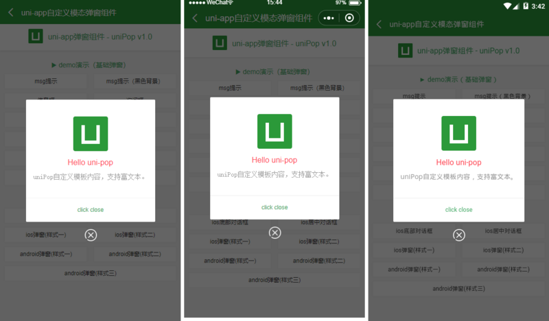
Introduction mode
uniPop.vue Bullet Window Components are introduced in two ways:
1. Introducing global components into main.js
import uniPop from './components/uniPop/uniPop.vue'
Vue.component('uni-pop', uniPop)
2. Introducing Components into Pages
<template>
    <view class="container">
        ...

        <!-- Pop-up template -->
        <uni-pop ref="uniPop"></uni-pop>
    </view>
</template>

<script>
    import uniPop from './components/uniPop/uniPop.vue'
    export default {
        data() {
            return {
                ...
            }
        },
        components:{
            uniPop
        },
        ...
    }
</script>
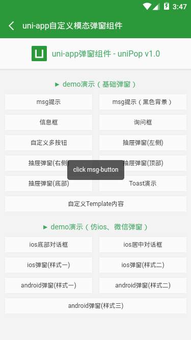
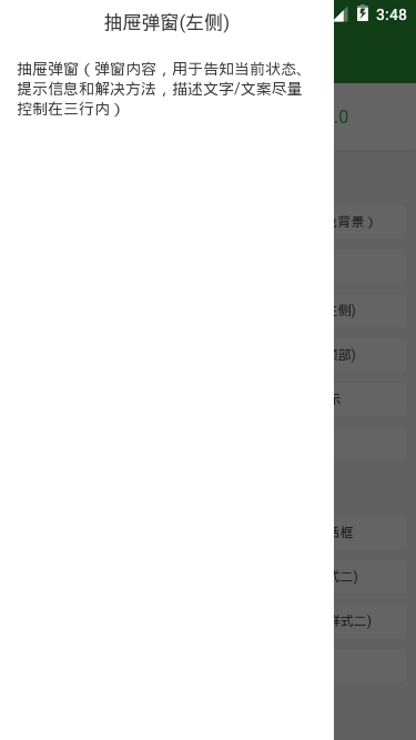
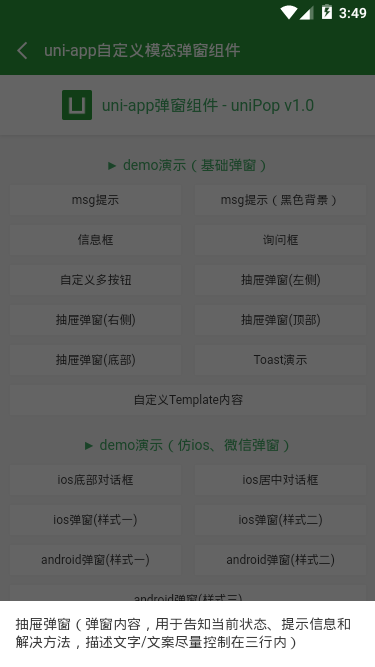
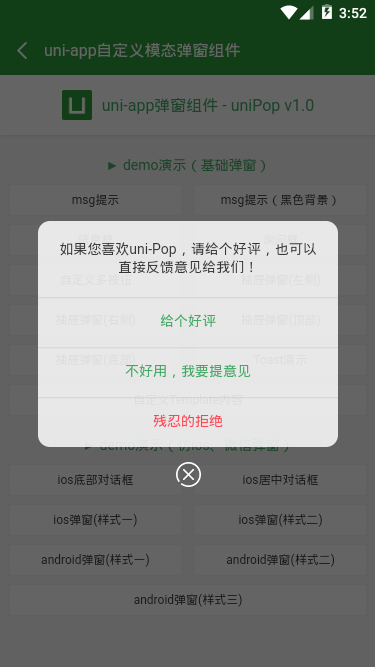
Here are several types of bullet windows and their invocation methods
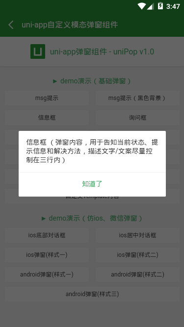
msg information box effect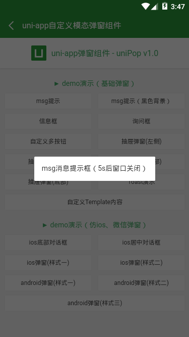
this.$refs.uniPop.show({
    content: 'msg Message prompt box (5) s Back window closed)',
    shade: true,
    shadeClose: false,
    time: 5,
    anim: 'fadeIn',
})
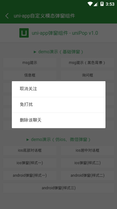
ios bottom dialog effect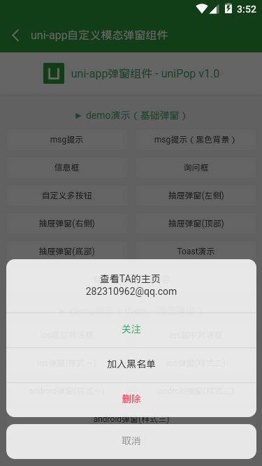
let uniPop = this.$refs.uniPop
uniPop.show({
    skin: 'footer',
    content: '<div>See TA Home page <br/> 282310962@qq.com</div>',
    shadeClose: false,
    anim: 'bottom',

    btns: [
        {
            text: 'follow',
            style: 'color: #41a863',
            onTap() {
                console.log('You clicked attention!');
            }
        },
        {text: 'Blacklist'},
        {
            text: 'delete',
            // style: {color: '#e63d23'},
            style: 'color: #ff4350',
            onTap() {
                console.log('You clicked Delete!');

                //Delete callback prompt
                uniPop.show({
                    anim: 'fadeIn',
                    content: 'You clicked the Delete function',
                    shade: true,
                    time: 3
                });
            }
        },
        {
            text: 'cancel',
            style: 'color: #999',
            onTap() {
                console.log('You clicked Cancel!');
                uniPop.close();
            }
        }
    ]
})
Toast weak prompt effect (support success/info/error/loading four icons)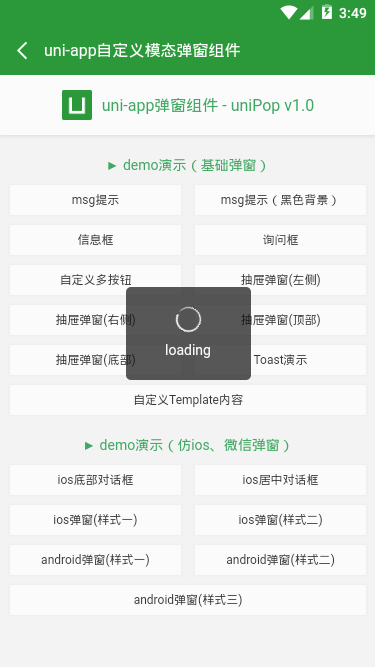

this.$refs.uniPop.show({
    skin: 'toast',
    content: 'loading',
    icon: 'loading', //success | info | error | loading
    shade: false,
    time: 3
})
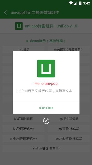
uniPop custom component template
/**
  * @tpl        uni-app Custom Bullet Window Component - uniPop.vue
  * @author     andy by 2019-09-20
  * @about      Q: 282310962  wx: xy190310
  */

<template>
    <view v-if="opts.isVisible" class="uniPop" :class="opts.isCloseCls">
        <view class="unipop__ui_panel">
            <view v-if="opts.shade" class="unipop__ui_mask" @tap="shadeTaped"></view>
            <view class="unipop__ui_main">
                <view class="unipop__ui_child" :style="opts.style">
                    <!-- Title -->
                    <view v-if="opts.title" class="unipop__ui_tit">{{opts.title}}</view>
                    <!-- content -->
                    <view v-if="opts.content" class="unipop__ui_cnt" :style="opts.contentStyle">
                        {{opts.content}}
                    </view>
                    <view v-if="opts.btns" class="unipop__ui_btns">
                        <text v-for="(item,index) in opts.btns" :key="index" class="btn" :style="item.style" @tap="btnTaped(item)">{{item.text}}</text>
                    </view>
                </view>
                <!-- xclose -->
                <view v-if="opts.xclose" class="unipop__xclose" @tap="close"></view>
            </view>
        </view>
    </view>
</template>
data() {
    return {
        defaultOptions: {
            isVisible: false,       //Whether to Display Bullet Window

            title: '',              //Title
            content: '',            //content
            contentStyle: '',       //Content style
            style: null,            //Custom Bullet Window Style
            skin: '',               //Pop-up style
            icon: '',               //Pop-up Icon
            xclose: false,          //Custom Close Button

            shade: true,            //mask
            shadeClose: true,       //Click on the mask to close
            opacity: '',            //mask opacity
            time: 0,                //Automatic shutdown seconds
            end: null,              //Destruction Bullet Window Callback Function

            anim: 'scaleIn',        //Bullet window animation scaleIn (default) | fadeIn | shake | top | right | bottom | left
            position: '',           //Bullet window position top | right | bottom | left

            btns: null,             //Pop button
        },
        opts: {},
        timer: null
    }
},
show(args) {
    this.opts = Object.assign({}, this.defaultOptions, args, {isVisible: true})
    // console.log(this.opts)

    // Automatic closing
    if(this.opts.time) {
        this.timer = setTimeout(() => {
            this.close()
        }, this.opts.time * 1000)
    }
},
Above is the introduction of uniApp custom component pop-up window. I hope I like ____________.~~
Attach uniapp custom top navigation bar and bottom tabBar component
uniapp custom navigation bar: https://blog.csdn.net/yanxiny...
uniapp custom tabbar: https://blog.csdn.net/yanxiny...