BFC believe that everyone has heard about it, in the layout of the page will certainly be contacted, but for BFC really know how much, these days review contacted BFC, so I take a summary, but also to sort out their own ideas.
I. What is BFC?
BFC, called block-level formatting context, is a concept introduced in the W3C CSS 2.1 specification. In general flow, boxes participate in a formatting context, block-level boxes participate in a block-level formatting context (BFC), and row-level boxes participate in a row-level formatting context (IFC).
BFC determines how elements locate their content and interact with other elements. A simple understanding of BFC is an independent rendering area, which stipulates that the content in this area has nothing to do with the outside of the area, that is, no influence on each other.
II. Formation Rules of BFC
- float is not none.
- The position is absolute or fixed.
- overflow is not visibility.
- Displaying is inline-block, table-cell, table-caption, flex, inline-flex
- overflow is not visible
III. Characteristics of BFC
- The box es are arranged in the vertical direction in turn.
- The distance in the vertical direction of box is determined by margin, and the margin values of boxes belonging to the same BFC region will be superimposed.
- When calculating the height of BFC region, floating elements should also participate in the calculation.
- The left side of the margin box for each element is in contact with the left side containing the block border box, even if there is a float.
- The BFC area does not overlap with the float box.
4. Understanding with examples
Having said so much, I'd like to have some dry goods combined with understanding.
Adaptive two-column layout
 <style type="text/css">
      *{
            margin: 0;
            padding: 0;
        }
       body{
          height: 500px;
          width: 100%;
       }
       .Div1{
          height: 100%;
          width: 40%;
          float: left;
          background-color: red;
       }
       .Div2{
          height: 100%;
          width: 60%;
          background-color: blue;
       }
</style>
<body>
    <div class="Div1"></div>
    <div class="Div2"></div>
</body>
Understanding: Div1 forms a bfc region by setting floats. According to the bfc characteristics (the left side of each element's margin box touches the left side of the containing block border box, even if there is a float), the left boundary of Div2 will coincide with the body, so the two boxes will overlap.
Next, change the code to see the effect:
  <style type="text/css">
      *{
          margin: 0;
          padding: 0;
        }
       body{
          height: 500px;
          width: 100%;
       }
       .Div1{
          height: 100%;
          width: 40%;
          float: left;
          background-color: red;
       }
       .Div2{
          height: 100%;
          width: 60%;
          background-color: blue;
          overflow: hidden;
       }
</style>
<body>
    <div class="Div1"></div>
    <div class="Div2"></div>
</body>
Understanding: Div2 forms a BFC region by setting overflow. According to the characteristics of BFC (the region of BFC does not overlap with float box), the overlapping part is removed, which is what we want.
It's easy to use the idea of bfc to construct a three-column layout. The code is as follows:
<style type="text/css">
      *{
          margin: 0;
          padding: 0;
       }
       body{
          height: 500px;
          width: 100%;
       }
       .Div1{
          height: 100%;
          width: 40%;
          float: left;
          background-color: red;
       }
       .Div2{
          height: 100%;
          width: 30%;
          background-color: blue;
          float: left;
          overflow: hidden;
       }
       .Div3{
          height: 100%;
          width: 30%;
          background-color: green;
          overflow: hidden;
       }
</style>
<body>
    <div class="Div1"></div>
    <div class="Div2"></div>
    <div class="Div3"></div>
</body>
Understanding: According to the idea of the above two columns layout, I first put the first two boxes into two columns layout, and then the second and third boxes are also based on the idea of two columns layout. This idea can be used in the adaptive four columns, five columns and so on.
Clear floating
<style type="text/css">
    .par {
          border: 5px solid #fcc;
          width: 300px;
          }
    .child {
          border: 5px solid #f66;
          width:100px;
          height: 100px;
          float: left;
        }
</style>
<body>
        <div class="par">
            <div class="child"></div>
            <div class="child"></div>
        </div>
</body>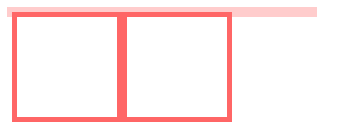
Understanding: We expect the height of the par box to be stretched by the contents inside, but there is No. The boxes inside set float values to form bfc, while BFC is a separate container that does not interact with the elements outside, so par is not affected by the contents inside at all. So what should we do? Let's deal with the code as follows:
<style type="text/css">
         .par {
                border: 5px solid #fcc;
                width: 300px;
                overflow: hidden;
            }
        .child {
            border: 5px solid #f66;
            width:100px;
            height: 100px;
            float: left;
        }
</style>
<body>
        <div class="par">
            <div class="child"></div>
            <div class="child"></div>
        </div>
</body>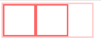
Understanding: Par boxes form a BFC by setting the overflow value, a BFC feature (floating elements are also involved in the calculation of the height of the BFC area), so when calculating the height of par boxes, it is also necessary to include the height of the boxes inside.
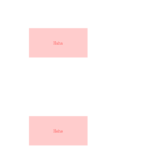
Preventing vertical margin overlap
<style type="text/css">
        p {
            color: #f55;
            background: #fcc;
            width: 200px;
            line-height: 100px;
            text-align:center;
            margin: 100px;
        }
</style>
<body>
    <p>Haha</p>
    <p>Hehe</p>
</body>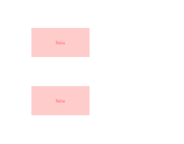
Understanding: According to the characteristics of BFC (the distance in the vertical direction of the box is determined by margin, and the margin values of boxes belonging to the same BFC region will overlap), so the height between the two p tags is 100px, and the overlap occurs. But this is not the result we want, so we can consider separating the two boxes, that is, not to let them in the same bfc, there will be no overlap, the code changes as follows:
<style type="text/css">
        .wrap {
            overflow: hidden;
        }
        p {
            color: #f55;
            background: #fcc;
            width: 200px;
            line-height: 100px;
            text-align:center;
            margin: 100px;
        }
</style>
<body>
    <p>Haha</p>
    <div class="wrap">
        <p>Hehe</p>
    </div>
</body>