With the advent of HTML5, the input element has added various types to accept various types of user input. Among them, button, checkbox, file, hidden, image, password, radio, reset, submit and text are traditional input controls, and 13 new ones are color, date, date time, datetime local, email, month, number, range, search, tel, time, url and week
Traditional type
text Define the input field of a single line where you can enter text
password Define password fields. The characters in this field are masked
file Define input fields and browse buttons for file upload
radio Define radio buttons
checkbox Define check box
hidden Define hidden input fields
button Define clickable buttons (in most cases, for launching scripts through JavaScript)
image Define submit button in image form
reset Define the reset button. The reset button clears all data in the form
submit Define the submit button. The submit button sends the form data to the server
text
type="text" indicates a text input box. It is the default input type. It is a single line control, generally a rectangle with an embedded box
password
As like as two peas, the type= password is a password input box. It is almost the same as the text input box. The only different letters will be hidden after the input, usually a series of points.
Default style

chrome/safari/opera
    padding: 1px 0px;
    border: 2px inset;
firefox
    padding: 2px;
    border-width: 1px;
ie
    padding: 2px 1px;
    border-width: 1px;
[default width and height]
chrome
    height: 14px;
    width: 148px;
safari
    height: 15px;
    width: 148px;
firefox
    height: 17px;
    width: 137px;
IE9+
    height: 14px;
    width: 147px;
IE8-
    height: 16px;
    width: 149px;
[reset style]
padding: 0;
border: 1px solid;
[note] the width and height of the input element of type="text" or "password" set by IE6 browser is the width and height containing padding and border
< demo box > click the corresponding button below to demonstrate
[tips] display and hide function of simulated password
Note: many software now have a small eye on the right side of the password box, which is used to set the password display and hide. This is achieved by changing the type attribute of the input element
<style>
body{
    margin: 0;
    font-size: 16px;
}
#show{
    padding: 0;
    border: 1px solid black;
    height: 20px;
    width: 200px;
    line-height: 20px;
}
#set{
    display: inline-block;
    height: 22px;
    background-color: rgba(0,0,0,0.5);
    color: white;
    line-height: 18px;
    margin-left: -72px;
    cursor: pointer;
}
</style>
</head>
<body>
<input id="show" type="password" maxlength="6">
<span id="set">Display password</span>
<script>
set.onclick = function(){
    if(this.innerHTML == 'Display password'){
        this.innerHTML = 'Hidden password';
        show.type="text";
    }else{
        this.innerHTML = 'Display password';
        show.type="password";
    }
}
</script>
file
type="file" defines the input field and "Browse" button for file upload
[reset style]
padding: 0;
    border: 0;
[default width and height]
chrome
    height: 21px;
    width: 238px;
safari
    height: 21px;
    width: 238px;
firefox
    height: 27px;
    width: 222px;
IE9+
    height: 21px;
    width: 220px;
IE8
    height: 16px;
    width: 214px;
IE7-
    height: 15px;
    width: 210px;
[note] the width and height of the input element of type="file" set by IE8 browser is the width and height containing padding and border
This type of input element supports the accept attribute and the multiple attribute
More information about the accept property moves to this point
More information about the multiple attribute moves to this point
radio
type="radio" defines a radio button that allows the user to select an option from a given number of choices. For the same group of buttons, the name value must be the same
[note] input element of radio type cannot set padding and border (except IE10 browser)
Default style
chrome/safari/opera/firefox
    margin: 3px 3px 0 5px;
    box-sizing:border-box;
ie11
    margin: 3px 3px 3px 4px;
    box-sizing:border-box;
ie10-
    padding: 3px;
    box-sizing:border-box;
[default width and height]
chrome/safari/IE
    height: 13px;
    width: 13px;
firefox
    height: 16px;
    width: 16px;
[reset style]
padding: 0;
    margin: 0;
    border: 0;
checkbox
type="checkbox" define multiple selection buttons, allowing users to select one or more options in a given number of choices. For buttons of the same group, the value of name must be the same
[note] input element of type checkbox cannot set padding and border (except IE10 browser)
Default style
chrome/safari/opera/firefox/ie11
    margin: 3px 3px 3px 4px;
    box-sizing:border-box;
ie10-
    padding: 3px;
    box-sizing:border-box;
[default width and height]
chrome/safari/IE
    height: 13px;
    width: 13px;
firefox
    height: 16px;
    width: 16px;
[reset style]
padding: 0;
    margin: 0;
    border: 0;
The input element of type="radio" or "checkbox" supports the checked attribute
The details of the checked property are moved here
hidden
type="hidden" define hidden input type to add additional data that is invisible to users but needs to be submitted in the form
[note] the disabled attribute cannot be used with the input element of type="hidden"
//After clicking the submit button, the content of the hidden domain test=12 will be included in the URL
<form name="form" action="#">
    <input type="hidden" name="test" value="12">
    <input type="submit">
</form>
button
The input input type of type="button" defines the clickable button, but has no behavior. It is often used to start javascript programs when users click
[default style of button, submit and reset]
chrome/safari
    padding: 1px 6px;
    border: 2px outset buttonface;
    box-sizing:border-box;
firefox
    padding: 0 6px;
    border: 3px outset;
    box-sizing:border-box;
IE9+
    padding: 3px 10px;
    border: 1px outset;
    box-sizing:border-box;
IE8
    padding: 3px 10px;
    border: 1px outset;
IE7-
    padding: 1px 0.5px;
    border: 1px outset;
[note] IE8 browser's box sizing: content box; other browsers' box sizing: border box;
<input type="button" value="Click me" onclick="alert(1)" />
The input input type of type="button" and button element have many overlapping features
More information about the button element moves to this point
image
The input type of type="image" defines the submit button in the form of image, which can set the four attributes of width, height, src and alt
Using the picture as the submit button will send the x and y coordinates clicked on the picture together, which can be used in combination with the server-side picture map. If the picture has the name attribute, it will also be sent along with the coordinates
<form action="#">
    <input name="test">
    <input type="image" name="imagesubmit" src="http://Sandbox.runjs.cn/uploads/rs/26/ddzmgynp/submit.jpg "width =" 99 "height =" 99 "ALT =" test picture ">
</form>
submit
The input input type of type="submit" is used to create the button for submitting the form
reset
Input input type of type="reset" button used to create reset form
<form action="#" method="get">
    <input>
    <input type="reset" value="Reset" />
    <input type="submit" value="Submit" />
</form>
New type
color Define palette
tel Define the input field containing the phone number
email Define the input field containing the email address
url Define the input field containing the URL address
search Define search fields
number Define input fields that contain values
range Define the input field that contains a range of numeric values
date Define the input fields of the selected day, month and year
month Define the input fields of the selected month and year
week Define the input fields of the selected week and year
time Define the input fields of the selected month and year
datetime Define the input fields (UTC time) for the selected time, day, month, and year
datatime-local Define the input fields (local time) for the selected time, day, month and year
color
The input type of type="color" will create a palette to select the color, and the color value will be submitted with the URL encoded hexadecimal value. If it is black, it will be sent as% 23000000, where% 23 is the URL code of ා
[note] safari and IE do not support this type
Default style
chrome
    width:44px;
    height:23px;
    border: 1px solid rgb(169,169,169);
    padding: 1px 2px;
firefox
    width:46px;
    height:17px;
    border: 3px solid rgb(169,169,169);
    padding: 6px 0;
<input type="color">
tel
The input type of type="tel" is used to represent the semantic phone input field, which is no different from the input type of type="text" in appearance. The numeric keypad will be called out on the mobile terminal
<form action="#">
    <input type="tel" placeholder="Please input 11 mobile numbers" pattern="\d{11}">
    <input type="submit">
</form>
The input type of type = "e mail" is used to represent the semantic e-mail address input field. It will automatically verify the value of the email field. It has no difference with the input type of type="text" in appearance. The English keyboard will be called on the mobile phone
input element of email type supports multiple attribute
[note] IE9 browser and safari browser do not support
<form action="#" >
    <input type="email" name="email" multiple>
    <input type="submit">
</form>
url
The input input type of type="url" is used to represent the input field of the semantic url address. It will automatically verify the value of the url field, which is no different from the input type of type="text" in appearance
[note] IE9 browser and safari browser do not support
<input type="url">
search
The input input type of type="search" is used to represent the semantic search box, which is no different from the input type of type="text" in appearance
<input type="search">
number
The input type of type="number" is used to process digital input, and the numeric keypad will be called out at the mobile terminal
[note] IE does not support this type
Default style
chrome/safari
    border: 2px inset;
    padding-left: 1px;
firefox
    border: 1px inset;
    padding: 2px;
[attribute]
max specifies the maximum value allowed
min specifies the minimum value allowed
step specifies the legal digital interval
Value specifies the default value
[note] the value of the attribute can be decimal
<input type="number" min="0" max="10" step="0.5" value="6" />
range
The input type of type="range" is used to process digital input within a certain range, similar to the input type of type="number"
[note] IE9 - this type is not supported
Default style
chrome/safari
    margin: 2px;
firefox
    border: 1px inset;
    padding: 1px;
    margin: 0 9.3px;
IE10+
    padding: 17px 0 32px;
[attribute]
max specifies the maximum value allowed
min specifies the minimum value allowed
step specifies the legal digital interval
Value specifies the default value
[note] the value of the attribute can be decimal
<input type="range" min="0" max="10" step="0.5" value="6" />
[note] if the min and Max attributes are not set, min=0 and max=100 are default
HTML5 has multiple new input types for selecting dates and times
date
input type of type="date" is used to select day, month and year
month
input type of type="month" is used to select month and year
week
input type of type="week" is used to select week and year
time
input type of type="time" is used to select time and minute
datetime
input type of type="datetime" is used to select time, day, month and year (UTC time)
datetime-local
Input input type of type = "datetime local" is used to select time, day, month and year (local time)
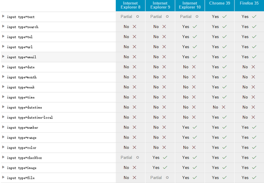
[note] IE and firefox do not support the six date types, and chrome does not support the datetime type
Default style
chrome/safari
    border: 2px inset;
    padding-left: 1px;
<input type="date"><br><br>
<input type="month"><br><br>
<input type="week"><br><br>
<input type="time"><br><br>
<input type="datetime"><br><br>
<input type="datetime-local">
To preset the date and time of a control, set the value property with a string
[value attribute format]
date                   YYYY-MM-DD
time                   hh:mm:ss.s
datetime               YYYY-MM-DDThh:mm:ss:sZ
datetime-local           YYYY-MM-DDThh:mm:ss:s
month                 YYYY-MM
week                   YYYY-Wnn
YYYY=
MM= months
 DD= day
 hh= hours
 mm= minutes
 ss= seconds
 s=0.1 seconds
 T = separator between date and time
 Z = time zone of Zulu time
 Wnn=W weeks, from the first week of January to 52
The value attribute format of this type can also be used in min and max attributes to create a time span; step can be used to set the moving scale
[note] chrome does not support step settings of this type