UI implementation sharing: dynamic navigation bar
text
1. Achieve results
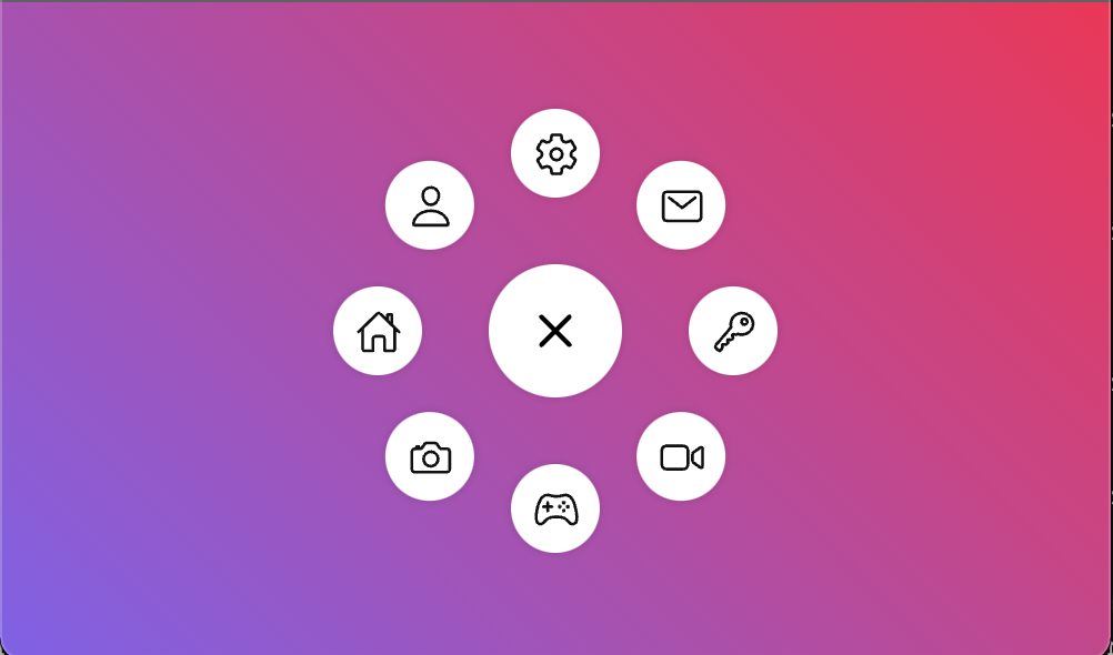
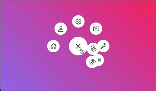
Let's take a look at the final effect
- Static graph
- Dynamic effect
2. Implementation details
2.1 html layout
The element layout is relatively simple. It is divided into the central. toggle element and the list of surrounding li elements
- index.html
    <div id="app">
      <ul class="menu">
        <div class="toggle">
          <ion-icon name="add-outline"></ion-icon>
        </div>
      </ul>
    </div>
li in the list part, let's use JavaScript for list rendering
- index.js
const menu = document.querySelector('.menu');

const items = [
  'home-outline',
  'person-outline',
  'settings-outline',
  'mail-outline',
  'key-outline',
  'videocam-outline',
  'game-controller-outline',
  'camera-outline',
];

items.forEach((type, i) => {
  const li = document.createElement('li');
  li.style = `--i: ${i}`;
  li.innerHTML = `<a><ion-icon name="${type}"></ion-icon></a>`;

  menu.appendChild(li);
});
Note that < ion icon > here is imported using the webcomponent icon of cdn
Just stick these two sentences in < head >
<script
  type="module"
  src="https://unpkg.com/ionicons@5.5.2/dist/ionicons/ionicons.esm.js"
></script>
<script
  nomodule
  src="https://unpkg.com/ionicons@5.5.2/dist/ionicons/ionicons.js"
></script>
2.2 element positioning
The important part of UI implementation is the setting of CSS properties. First, let's look at the layout and positioning related
- index.html
Set the gradient background color for the part of the body
body {
  width: 100vw;
  height: 100vh;
  margin: 0;
  font-family: 'Poppins', sans-serif;
  background: linear-gradient(45deg, #8460ed, #ff1252);
  display: flex;
  justify-content: center;
  align-items: center;
}
Next, define the structure of the whole navigation bar
The Menu is 200 * 200, and then use flex to center horizontally and vertically
.menu {
  position: relative;
  width: 200px;
  height: 200px;
  display: flex;
  justify-content: center;
  align-items: center;
}
The middle button is 60 * 60, and then use flex to center the icon relatively
.toggle {
  width: 60px;
  height: 60px;
  font-size: 2em;
  z-index: 100;
}
2.3 navigation bar list items
Next, it is difficult to locate the peripheral navigation bar list items one by one. Therefore, we use the effect of transform origin + transform: rotate to create the effect of multiple icons rotating around the same center (i variable is also used to assist in calculation)
.menu li {
  position: absolute;
  left: 0;
  list-style: none;
  transform-origin: 100px;
  transform: rotate(calc(360deg / 8 * var(--i)));
  z-index: 1;
}
At the same time, because each small item rotates around the external point, it also needs to turn back to ensure that the icon is facing upward
.menu li a {
  width: 40px;
  height: 40px;
  font-size: 1.3em;
  transform: rotate(calc(360deg / -8 * var(--i)));
  color: #111;
}
2.4 animation effect
Finally, we will realize the animation effect
First, add a click event to the center point to switch the active property
const menu = document.querySelector('.menu');
const toggle = document.querySelector('.toggle');

let disable = false;

toggle.addEventListener('click', () => {
  // menu.classList.toggle('active');
  if (!disable) {
    disable = true;
    menu.classList.toggle('active');
    setTimeout(() => {
      disable = false;
    }, 1300);
  }
});
A timer is added here. The whole animation will last about 1.3 seconds. Don't click again until the animation is over
Rotate the center point 315 degrees so that the + symbol becomes x after rotation
.menu.active .toggle {
  transform: rotate(315deg);
}
Next is the list item. At first, we hide each item behind the big button in the middle, and then click to rotate it
.menu li {
  transform-origin: 100px;
  transform: rotate(0) translateX(80px);
  transition-delay: calc(0.1s * var(--i));
  transition-duration: 0.5s;
  z-index: 1;
}

.menu.active li {
  transform: rotate(calc(360deg / 8 * var(--i)));
}
2.5 hover discoloration
After hover changes the icon color, needless to say
.menu.active li a:hover {
  color: #ff1252;
}
Other resources
Reference connection
| Title | Link |
|---|---|
| Animated Circular Navigation Menu using Html CSS & Vanilla Javascript | Simple Radial Menu |