To understand how to implement a triangle with css, first of all, you need to know that the triangle must be implemented with border
Let's start with a piece of code
<!DOCTYPE html>
<html>
<head>
<title></title>
<style type="text/css">
div{
width: 0;
height: 0;
border-left: 30px solid red;
border-right:30px solid yellow;
border-top: 30px solid blue;
border-bottom: 30px solid black;
}
</style>
</head>
<body>
<div></div>
</body>
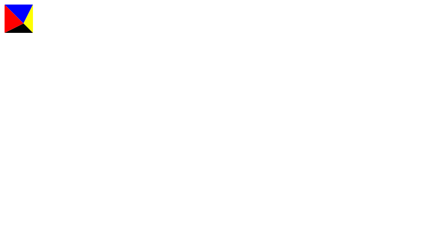
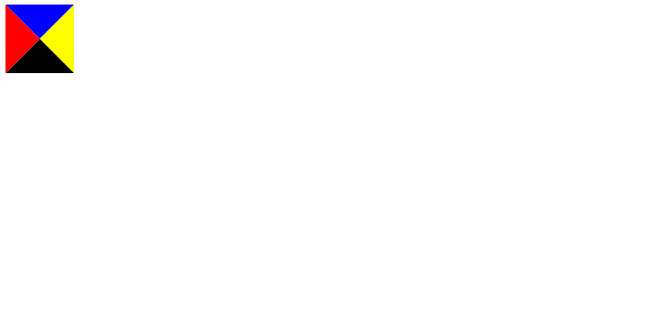
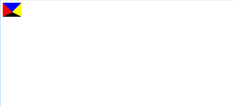
</html>Here is the rendering. Here we can find that when there is no content in a div, if there is a border, the content is made up of margins. The margin on the left represents a red triangle. Similarly, the margin on the right represents a yellow triangle.
If we only need an isosceles right triangle, we only need to change the color of the other three sides to transparent.
<!DOCTYPE html>
<html>
<head>
	<title></title>
	<style type="text/css">
		div{
			width: 0;
			height: 0;
			border-left: 30px solid transparent;
			border-right:30px solid transparent;
			border-top: 30px solid transparent;
			border-bottom: 30px solid black;
		}
	</style>
</head>
<body>
<div></div>
</body>
</html>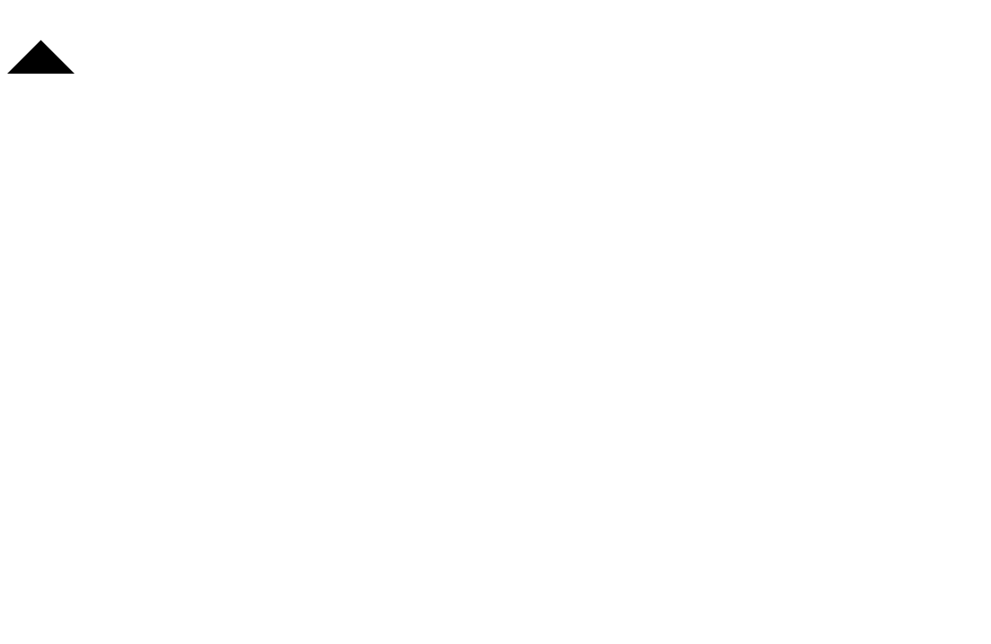
This is a black triangle.
If one margin is different from the others
<!DOCTYPE html>
<html>
<head>
	<title></title>
	<style type="text/css">
		div{
			width: 0;
			height: 0;
			border-left: 30px solid red;
			border-right:30px solid yellow;
			border-top: 30px solid blue;
			border-bottom: 15px solid black;
		}
	</style>
</head>
<body>
<div></div>
</body>
</html>
The bottom margin is half of the top margin, and the scale is 1:2. We find that in the vertical direction, the ratio between the bottom triangle and the top triangle is also 1:2. The bisector of the horizontal distance of the longitudinal triangle (left and right) is exactly the intersection of the horizontal triangle (top and bottom)
Now increase the difficulty to make the values of both sides unequal
<!DOCTYPE html>
<html>
<head>
	<title></title>
	<style type="text/css">
		div{
			width: 0;
			height: 0;
			border-left: 30px solid red;
			border-right:15px solid yellow;
			border-top: 30px solid blue;
			border-bottom: 15px solid black;
		}
	</style>
</head>
<body>
<div></div>
</body>
</html>
Here is the rendering. We find that the scale of horizontal distance is also 1:2, and the intersection of horizontal distance is exactly the intersection of longitudinal triangle. Step by step, using border left|right|top|bottom color: transparent; we can achieve a variety of triangles.