I've been working in React Native before. When I write animations, I either use transitions / animations in CSS or rely on libraries like GreenSock. Recently, I turned to the Web. I got a lot of responses from big guys about React Web animation on Tweet. So I decided to share them with you. If there are other opinions, I would like to share them in the comments below.
Here are some ways to create React animation that I want to share with you
- CSS animation
- JS Style
- React Motion
- Animated
- Velocity React
Next, Le's next big big big big big big big big big big big big big big big big big big big big big big big big big big big big big big big big big big big big big big big big big big big big big big big big big big big big big big.
CSS animation
Adding class es to elements is the simplest and most common way to write. If your app is using CSS, it will be your most pleasant choice.
Pro: We can build basic animations by modifying attributes like opacity and transform ation, and in components, we can easily update these values through state.
Opponents: It's not cross-platform, it's not applicable in React Native, and it's hard to control for more complex animation.
Next, let's take an example of how to create an input focus: when it comes to input focus, we increase its width.
First, we will create two class es for input
.input {
  width: 150px;
  padding: 10px;
  font-size: 20px;
  border: none;
  border-radius: 4px;
  background-color: #dddddd;
  transition: width .35s linear;
  outline: none;
}

.input-focused {
  width: 240px;
}
One is its original style and the other is its focus style.
Next, let's start writing our React component
Here, I recommend one. Online React VS Code IDE It's really powerful. Readers don't want to build their own React app s, where they can test the correctness of the following code
class App extends Component {
  state = {
    focused: false,
  }

  componentDidMount() {
    this._input.addEventListener('focus', this.focus);
    this._input.addEventListener('blur', this.focus);
  }

  focus = () => {
    this.setState(prevState => ({
      focused: !prevState.focused,
    }));
  }

  render() {
    return (
      <div className="App">
        <div className="container">
          <input
            ref={input => this._input = input}
            className={['input', this.state.focused && 'input-focused'].join(' ')}
          />
        </div>
      </div>
    );
  }
}
- We have a focused state with an initial value of false, and we create our animation by updating that value.
- In CompoonentDidMount, we add two listeners, one focus and one blur, and the specified callback functions are focus.
- The focus method takes the value of the previous focus and is responsible for switching that value.
- In render, we use state to change the classNames of input to implement our animation
JS Style
JavaScipt styles are similar to classes in CSS. In JS files, we can have all the logic.
Advocate: Like CSS animation, and its performance is clearer. It's also a good way to do this without relying on any CSS.
Opponents: Like CSS animation, it is not cross-platform, and once the animation is complex, it is difficult to control.
In the following example, we will create an input, and when the user enters, we will change a button from disable to enable.
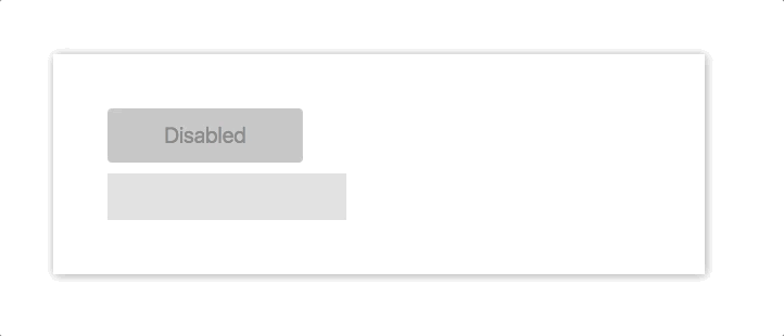
class App extends Component {
  state = {
    disabled: true,
  }

  onChange = (e) => {
    const length = e.target.value.length;

    if (length > 0) {
      this.setState({ disabled: false });
    } else {
      this.setState({ disabled: true });
    }
  }
  render() {
    const { disabled } = this.state;
    const label = disabled ? 'Disabled' : 'Submit';

    return (
      <div style={styles.App}>
        <input
          style={styles.input}
          onChange={this.onChange}
        />
        <button
          style={Object.assign({},
            styles.button,
            !this.state.disabled && styles.buttonEnabled
          )}
          disabled={disabled}
        >
          {label}
        </button>
      </div>
    );
  }
}


const styles = {
  App: {
    display: 'flex',
    justifyContent: 'left',
  },
  input: {
    marginRight: 10,
    padding: 10,
    width: 190,
    fontSize: 20,
    border: 'none',
    backgroundColor: '#ddd',
    outline: 'none',
  },
  button: {
    width: 90,
    height: 43,
    fontSize: 17,
    border: 'none',
    borderRadius: 4,
    transition: '.25s all',
    cursor: 'pointer',
  },
  buttonEnabled: {
    width: 120,
    backgroundColor: '#ffc107',
  }
}
- We have a disabled state with an initial value of true
- The onChange method takes the user's input and switches the value of disabled when the input is not empty.
- Determine whether buttonEnabled is added to the button based on the value of disabled
React Motion
React Motion is Cheng Lou Write a very good open source project. The idea is that you can simply style Motion components, and then you can enjoy animation by using these values in the callback function.
For the vast majority of animation components, we often do not want to hard-code the changing time of animation attributes (width, height, color, etc.). The spring function provided by react-motion is used to solve this demand. It can simulate the real physical effects, that is, all kinds of retarding effects we often see.
Here's an example of a breakdown
<Motion style={{ x: spring(this.state.x) }}>
  {
    ({ x }) =>
      <div style={{ transform: `translateX(${x}px)` }} />
  }
</Motion>
This is a few demo s officially provided. It can really be a surprise if you don't know.
Advocate: React Motion can be used on React Web or React Native because it is cross-platform. The spring concept was strange to me at first, but when I got started, I found it really amazing, and it had a very detailed API.
Opponents: In some cases, he is not as good as pure CSS / JS animation. Although it has a good API and is easy to use, it also needs learning costs.
To use it, we first need to install it with yarn or npm
yarn add react-motion
In the following example, we will create a drop down menu, which will expand friendly when the button is clicked.
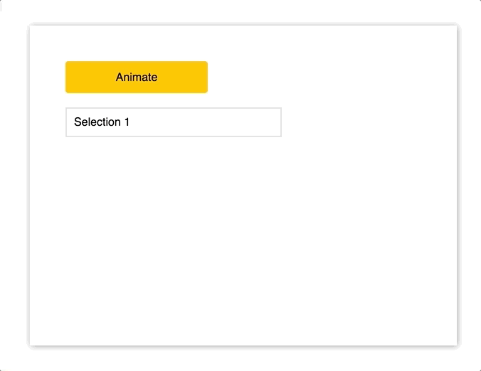
class App extends Component {
  state = {
    height: 38,
  }

  animate = () => {
    this.setState((state) => ({ height: state.height === 233 ? 38 : 233 }));
  }

  render() {
    return (
      <div className="App">
        <div style={styles.button} onClick={this.animate}>Animate</div>
        <Motion
          style={{ height: spring(this.state.height) }}
        >
          {
            ({ height }) =>
            <div style={Object.assign({}, styles.menu, { height } )}>
              <p style={styles.selection}>Selection 1</p>
              <p style={styles.selection}>Selection 2</p>
              <p style={styles.selection}>Selection 3</p>
              <p style={styles.selection}>Selection 4</p>
              <p style={styles.selection}>Selection 5</p>
              <p style={styles.selection}>Selection 6</p>
            </div>
          }
        </Motion>
      </div>
    );
  }
}

const styles = {
  menu: {
    marginTop: 20,
    width: 300,
    border: '2px solid #ddd',
    overflow: 'hidden',
  },
  button: {
    display: 'flex',
    width: 200,
    height: 45,
    justifyContent: 'center',
    alignItems: 'center',
    border: 'none',
    borderRadius: 4,
    backgroundColor: '#ffc107',
    cursor: 'pointer',
  },
  selection: {
    margin: 0,
    padding: 10,
    borderBottom: '1px solid #ededed',
  },
}
``
- We import Motion and spring from react-motion
- We have a height state with an initial value of 38, which represents the height of the menu.
- The animate method sets the height of menu. If the original height is 38, the new height is 233. If the original height is 233, the new height is 38.
- In render, we wrap the entire p-tag list with the Motion component, set the current value of this.state.height to the height of the component, and then use that value as the entire drop-down height in the component's callback function.
- When the button is clicked, we switch the drop-down height through this.animate
Animated
Animated is based on the same animation library used by React Native.
The idea behind it is to create declarative animation and control animation by passing configuration objects.
Advocate: Cross-platform, it's already very stable in React Native. If you've used it in React Native, you won't have to repeat it. Interolate is a magical interpolation function, as we will see below.
Opponents: Based on Twitter's communication, it seems not 100% stable at present. In old browsers, there are problems of prefix and performance, and it also has learning costs.
To use Animated, we first need to install it with yarn or npm
yarn add animated
In the following example, we will simulate the animated message displayed after submitting the form successfully
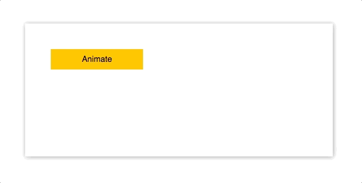
import Animated from 'animated/lib/targets/react-dom';
import Easing from 'animated/lib/Easing';

class AnimatedApp extends Component {
  animatedValue = new Animated.Value(0);

  animate = () => {
    this.animatedValue.setValue(0);

    Animated.timing(
      this.animatedValue,
      {
        toValue: 1,
        duration: 1000,
        easing: Easing.elastic(1),
      }
    ).start();
  }

  render() {
    const marginLeft = this.animatedValue.interpolate({
      inputRange: [0, 1],
      outputRange: [-120, 0],
    });

    return (
      <div className="App">
          <div style={styles.button} onClick={this.animate}>Animate</div>
          <Animated.div
            style={
              Object.assign(
                {},
                styles.box,
                { opacity: this.animatedValue, marginLeft })}
          >
            <p>Thanks for your submission!</p>
          </Animated.div>
      </div>- We will `animatedValue`
 //And `margin Left'as `style' attributes of `Animated.div';
  }
}

const styles = {
  button: {
    display: 'flex',
    width: 125,
    height: 50,
    justifyContent: 'center',
    alignItems: 'center',
    border: 'none',
    borderRadius: 4,
    backgroundColor: '#ffc107',
    cursor: 'pointer',
  },
  box: {
    display: 'inline-block',
    marginTop: 10,
    padding: '0.6rem 2rem',
    fontSize:'0.8rem',
    border: '1px #eee solid',
    borderRadius: 4,
    boxShadow: '0 2px 8px rgba(0,0,0,.2)',
  },
}
- import Animated and Easing from animated
- Create a class attribute with a value of 0 using new Animated.Value(0) - animated Value
- Create an animate method to process all animations. First, initialize the animation value through this. animated Value. setValue (0). The effect is to re-execute the animation every time, then call Animated.timing, animated Value as the first parameter, configure the object as the second parameter, set the final animation value, set the duration, and set slowly. Dynamic effect
- In render, we create a marginLeft object with interpolate method, including an array of inputRange and outputRange, which we use as the style attribute of message in the UI
- We use Animated.div instead of the default div
- We use animatedValue and marginLeft as style attributes of Animated.div
Velocity React
Velocity React was built on existing Velocity
Advocate: Easy to start, simple API, easier to master than other libraries
Opponents: There are some problems that have to be overcome, such as that post-component DidMount animation does not really work, and it does not cross-platform.
Here's an example of a breakdown
<VelocityComponent
  animation={{ opacity: this.state.showSubComponent ? 1 : 0 }}
  duration={500}
>
  <MySubComponent/>
</VelocityComponent>
First, install it with yarn or npm
yarn add velocity-react
In the following example, we will create a cool animation input
import { VelocityComponent } from 'velocity-react';

const VelocityLetter = ({ letter }) => (
  <VelocityComponent
    runOnMount
    animation={{ opacity: 1, marginTop: 0 }}
    duration={500}
  >
    <p style={styles.letter}>{letter}</p>
  </VelocityComponent>
)

class VelocityApp extends Component {
  state = {
    letters: [],
  }

  onChange = (e) => {
    const letters = e.target.value.split('');
    const arr = [];

    letters.forEach((l, i) => {
      arr.push(<VelocityLetter letter={l} />)
    });
    this.setState({ letters: arr });
  }

  render() {
    return (
      <div className="App">
        <div className="container">
          <input onChange={this.onChange} style={styles.input} />
          <div style={styles.letters}>
            {
              this.state.letters
            }
          </div>
        </div>
      </div>
    );
  }
}

const styles = {
  input: {
    marginBottom: 20,
    padding: 8,
    width: 200,
    height: 40,
    fontSize: 22,
    backgroundColor: '#ddd',
    border: 'none',
    outline: 'none',
  },
  letters: {
    display: 'flex',
    height: 140,
  },
  letter: {
    marginTop: 100,
    fontSize: 22,
    whiteSpace: 'pre',
    opacity: 0,
  }
}
- Import Velocity Component from velocity-react
- We want to create a reusable component to satisfy each letter's animation
- In this component, we set opacity of animation to 1 and marginTop to 0. These values represent the override values of the incoming subcomponent. When the component is created, opacity of the component changes from 0 to 1, marginTop from 100 to 0, and we also set the duration of 500 ms. Finally, it is worth mentioning the runOnMount attribute, which means Execute the animation after the component is mounted or created
- The onChange method takes each input from the user and creates a new array of VelocityLetter s
- In render, we use this array to render letters in the UI
summary
Overall, basic animation, I will choose JS style, complex animation, I prefer React Motion. As for React Native, I still insist on using Animated. Once Animated is mature, it may be put into use on the Web. At present, I really enjoy React Motion.
Links to the original text: React Animations in Depth