Actually, everyone in PHP should have heard of bootstrap, right, but some friends were confused by bootstrap's so-called response when they first contacted. Today we're going to talk about bootstrap's simple build page. All you need to do is you have the basic knowledge of HTML and the so-called official manual. It's all done easily. First, let's take a look at the manual of the official website. This is bootstrap Chinese Network. Click to open the link.
Next, there will be an arrival head as shown in the figure below, corresponding to different versions of the boostrap framework's manual information. As shown in the figure:
If we choose any version, I will use bootstrap 3 directly. We will click the navigation button. You'll see a couple of navigations, as shown in the figure
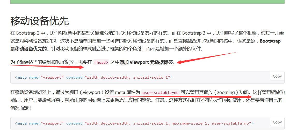
They are start, style, components, plug-ins, customization and website examples. Let's click Start to see how to install bootstrap. Let's click Start. There are several ways to install it. Here we download the compressed package directly and extract it into the static folder of your project. Here we use thinkPHP5 to demonstrate the framework directly. After decompression, we put the corresponding bootstrap folder directly into the static folder of the public in TP5. Let's look at the style first. The official website says bootstrap is a mobile device-first framework. If you want a responsive screen size, you need to add tags in the head, as shown in the figure:
Of course, scaling can also be used directly. Next, we need to know the so-called layout container is the CSS class name definition, which means that everything has to be held in it. There are two containers and 100% containers-fluid. The former is fixed width, the latter is full of viewport.When the screen is smaller, the overall page layout changes, so understand that it changes with the screen, row must be in the container label. And col-type can actually be understood as columns. Here are the grid parameters

Generally speaking, we use 12 columns of this kind of more, of course, depending on your actual use. The function of class prefix is actually to distinguish how small the screen is when typesetting, you can understand that. Here's a little trick. Column col-sm-2 takes up two column widths. You can see that the combined widths of all class prefixes are less than or equal to 12. Suppose we have a page that needs to be generated, with a menu on the left and a content on the right. Then we can define it as follows:
<div class="container">
    <div class="row">
        <!--Left menu-->
        <div class="col-xs-2 col-sm-2 col-md-2 col-lg-2">

        </div>
        <!--The content section on the right-->
        <div class="col-xs-10 col-sm-10 col-md-10 col-lg-10">

        </div>
    </div>
</div>
So, do you understand this very well? Of course, if you want to move the menu div to the right, you can look at the css style. There's a offset that can be set in the label attribute, but remember to offset two positions plus two positions occupied by columns, and the rest is only eight widths, you see? Of course, there are also push attributes here, you can push a few widths to the left, you can also push a few widths to the right. Next we'll look at the components in bootstrap. There are a lot of pages. It's enough to build a background page.
The Prime Minister sees some font icons in bootstrap. One thing to note here is to try to nest the style on the span tag. There are about 200 icons on the official website, and some of the commonly used background pictures are enough. For example, a page like the following:

The mobile terminal is like this:
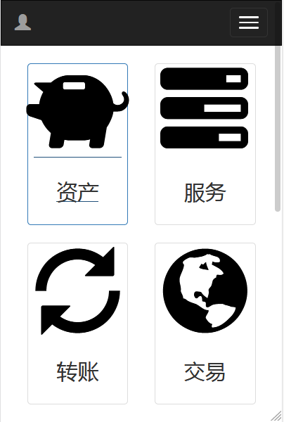
Does it feel like it's not lazy yet? It's very practical. Now let's talk about the components used here. header is the navigation bar, drop-down menu, thumbnail component and font icon can achieve this effect.
The following is the implementation of the code:
<body>
<!--The navigation bar part is the head.-->
<nav class="navbar navbar-inverse">
    <div class="container">
        <div class="navbar-header">
            <button type="button" class="navbar-toggle collapsed" data-toggle="collapse" data-target="#bs-example-navbar-collapse-1" aria-expanded="false">
                <span class="sr-only">Toggle navigation</span>
                <span class="icon-bar"></span>
                <span class="icon-bar"></span>
                <span class="icon-bar"></span>
            </button>
            <a class="navbar-brand" href="#">
                <span class="glyphicon glyphicon-user"></span>
            </a>
        </div>
        <!--Reduced drop-down menu-->
        <div class="collapse navbar-collapse" id="bs-example-navbar-collapse-1">
            <ul class="nav navbar-nav navbar-right">
                <li class="dropdown">
                    <a href="#" class="dropdown-toggle" data-toggle="dropdown" role="button" aria-haspopup="true"
                       aria-expanded="false">Personal settings <span class="caret"></span></a>
                    <ul class="dropdown-menu">
                        <li><a href="#"> Modify Password</a></li>
                        <li><a href="#">Personal Data</a></li>
                        <li><a href="#">Personal assets</a></li>
                        <li><a href="#"> Log out</a></li>
                    </ul>
                </li>
            </ul>
        </div><!-- /.navbar-collapse -->
    </div><!-- /.container-fluid -->
</nav>
<div class="container">
    <div class="col-xs-6 col-md-3">
        <a href="{:url('Index/Assets/index')}" class="thumbnail">
            <span class="kuangji glyphicon glyphicon-piggy-bank">

            </span>
            <div class="caption">
                <h3>Assets</h3>
            </div>
        </a>
    </div>
    <div class="col-xs-6 col-md-3">
        <a href="{:url('Index/Miningmachine/index')}" class="thumbnail">
                <span class="kuangji glyphicon glyphicon-tasks">

                </span>
            <div class="caption">
                <h3>service</h3>
            </div>
        </a>
    </div>
    <div class="col-xs-6 col-md-3">
        <a href="#" class="thumbnail">
                <span class="kuangji glyphicon glyphicon-refresh">

                </span>
            <div class="caption">
                <h3>Transfer accounts</h3>
            </div>
        </a>
    </div>
    <div class="col-xs-6 col-md-3">
        <a href="#" class="thumbnail">
                <span class="kuangji glyphicon glyphicon-globe">

                </span>
            <div class="caption">
                <h3>transaction</h3>
            </div>
        </a>
    </div>
    <div class="col-xs-6 col-md-3">
        <a href="{:url('Index/Recharge/index')}" class="thumbnail">
                <span class="kuangji glyphicon glyphicon-yen">

                </span>
            <div class="caption">
                <h3>Recharge</h3>
            </div>
        </a>
    </div>
    <div class="col-xs-6 col-md-3">
        <a href="#" class="thumbnail">
                <span class="kuangji glyphicon glyphicon-credit-card">

                </span>
            <div class="caption">
                <h3>Cash withdrawal</h3>
            </div>
        </a>
    </div>
    <div class="col-xs-6 col-md-3">
        <a href="#" class="thumbnail">
                <span class="kuangji glyphicon glyphicon-shopping-cart">

                </span>
            <div class="caption">
                <h3>Shopping Mall</h3>
            </div>
        </a>
    </div>
    <div class="col-xs-6 col-md-3">
        <a href="#" class="thumbnail">
                <span class="kuangji glyphicon glyphicon-bitcoin">

                </span>
            <div class="caption">
                <h3>Profit</h3>
            </div>
        </a>
    </div>
</div>
</body>
If you use phpstorm, you will be tired of memorizing the names of these classes. So here we introduce the installation of bootstrap plug-in in phpstorm. After installation, you can input and prompt which component you want to use. After return, you can automatically generate demo samples of related components, and then modify and adjust them by yourself.
First we need to open the phpstorm editor, then we click on the file, set it up, and the following image will appear:
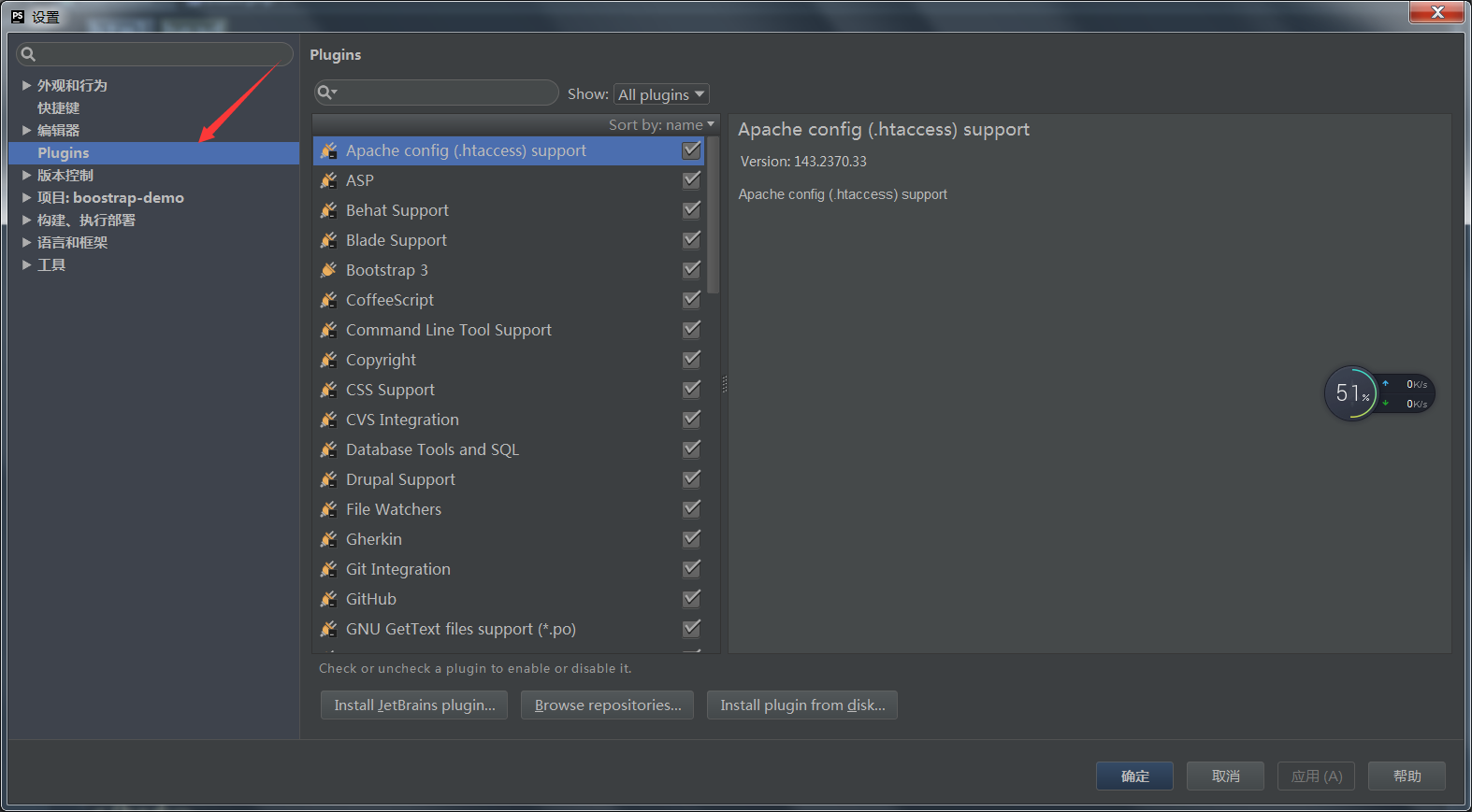
Select the place on the left, click the Browse button, and then enter bootstrap in the search box.
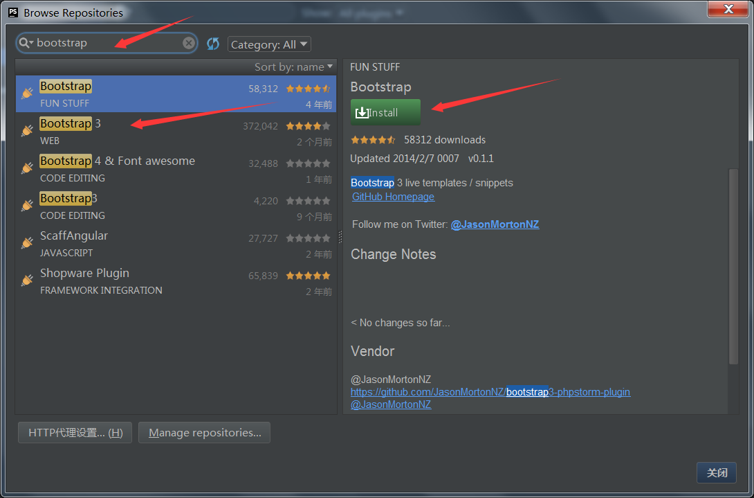
After clicking instal installation, restart takes effect.
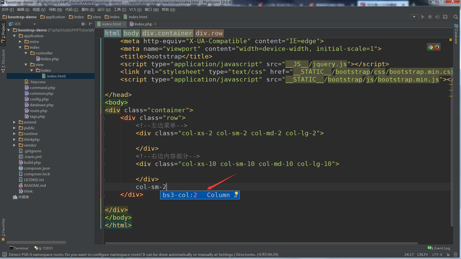
After you remember to enter some keywords, press Ctrl+j and you will be prompted. Finally, some of the progress bar components in the JavaScript component are good, so I won't go too long, but remember to introduce jQuery, and jQuery must be introduced before boostrap style, otherwise some components may not be able to use properly. That's the way to go first. You can leave a message directly where it's not clear. Bye-bye.