I. Introduction
: before and:: after are pseudo elements. (in CSS3, in order to distinguish them from pseudo classes, pseudo elements are written with double colons. However, due to compatibility issues, most of them are now unified single colons, such as: first line,: first letter,: before,: after, etc., but the new pseudo elements introduced in CSS3 are not allowed to use single colons.)
The ": before" pseudo element can insert new content before the content of the element.
The ": after" pseudo element can insert new content after the content of the element.
: before or:: after must be used in combination with the content attribute. The content cannot be absent, and the content must be at least empty. The display of the pseudo element defaults to inline, which can be modified by itself
Two, usage
1. Use the value of content:
(1) content: "string";
You can add some characters before or after the words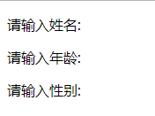
p:after{~~Remove line formatting~~
		content:":";
}

<body>
	<p>Please enter a name</p>
	<p>Please enter age</p>
	<p>Please enter gender</p>
</body>
(2)content:url(...)
You can add some small icons in front of the words, and adjust the position by positioning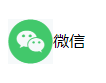
p::before{
			content:url(footer3.png);
			position: relative;
			top:17px;
		}
<body>
	<p>WeChat</p>
</body>
(3) Call the attribute of the element through the attr() attribute, such as displaying the alt prompt text of the picture or the link's href address.
The attr() function returns the attribute value of the selected element.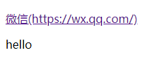
a::after{
			content:"(" attr(href) ")";
		}
p:after{
			content:attr(class);
		}
<p><a href="https://wx.qq.com/">WeChat</a></p>
<p class="hello"></p>
2. Realize triangle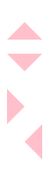
In the same way, we can get hexagon: set the box itself as a regular triangle, set the box:: after as an inverted triangle, and realize hexagon by positioning and overlapping together
#top-triangle{
			width:0px;
			height:0px;
			border:20px solid transparent;
			border-bottom:20px solid pink;
		}
#right-triangle{
			width:0px;
			height:0px;
			border:20px solid transparent;
			border-left:20px solid pink;
		}
#bottom-triangle{
			width:0px;
			height:0px;
			border:20px solid transparent;
			border-top:20px solid pink;
		}
#left-triangle{
			width:0px;
			height:0px;
			border:20px solid transparent;
			border-right:20px solid pink;
		}


<body>
	<div id="top-triangle"></div>
	<p></p>
	<div id="bottom-triangle"></div>
	<div id="right-triangle"></div>
	<div id="left-triangle"></div>
</body>
3. Achieve dialog effect: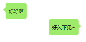
		.left,.right{
			position: relative;    /*Move back to the box position*/
			display: table;
			min-height: 40px;
			text-align: center;
			background-color: #9EEA6A;
			margin: 0;
			border-radius: 7px;
		}
		.left{
			left:10px;
		}
		.left::before,.right::after{
			position: absolute;
			display: inline-block;
			content: "";
			width: 0px;
			height: 0px;
			border: 8px solid transparent;
			top: 15px;		/*Move to the middle*/
		}
		.left::before{
			border-right-color: #9EEA6A;
			left: -16px;
		}
		.right::after{
			border-left-color: #9EEA6A;
			right: -16px;
		}
		.left p,.right p{
			padding:0px 10px;
		}
		.right{
			right:-150px;
		}

    <div class="left">
        <p>How do you do</p>
    </div>
    <div class="right">
        <p>Long time no see.~</p>
    </div>
4. Implementation arrow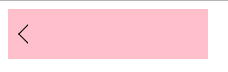
		.box{
			position: relative;
			width: 200px;
			height: 50px;
			background-color: pink;
		}
		.box::before{
			position: absolute;
			content:"";
			width: 12px;
			height: 12px;
			border: 1px solid black;
			border-bottom-color: transparent;
			border-right-color: transparent;
			transform: translate(-50%, -50%) rotate(-45deg);
			left: 20px;
			top: 50%;
		}
<body>
	<div class="box"></div>
</body>
5. Clear float
Principle: use: after and: before to insert two element blocks inside the element, so as to achieve the effect of clearing floating.
.outer:after {
		clear:both; 	/*Clear floating*/
		content:'';
		display:block; /*Show pseudo elements*/
		width:0;
		height:0;		/*No occupying position*/
		visibility:hidden; 	/*Allow the browser to render it, but do not show it*/
}
6. Implement some label support for placeholder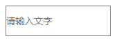
		.input{
			width:150px;
			height:40px;
			border:1px solid gray;
		}
		.input:empty::before{
			content:attr(placeholder);
			color:gray;
		}
<body>
	<input class="input" placeholder="Please enter text"></div>
</body>
(this article refers to a lot of blogs, which are not completely original)

