
Preface
- V-Layout is Ali's basic UI framework, which is used to quickly realize the complex layout of pages, and is widely used in Android version of Skycat Mobile Phone.

- It's exciting that V- Layout finally opened up on Github last month!
- During the May Day holiday, I made a detailed analysis of V-Layout. I will present a strategy of using V-Layout, source code analysis. I hope you will like it.
Catalog
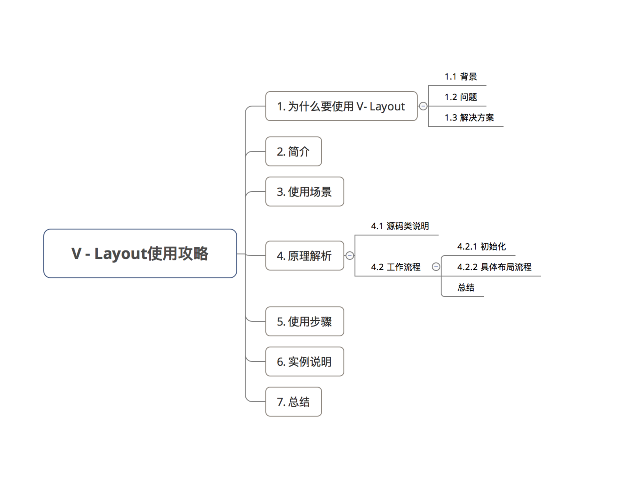
1. Why use V - Layout
Before explaining V - Layout, let's get to the point: Why use V - Layout?
1.1 background
-
UI performance consumption in Android comes mainly from two aspects:
- Layout hierarchy nesting leads to multiple measures/layout
- Creation and Destruction of View Controls
-
To solve these problems, the existing solutions are:
- Less Nested Layout
- Use basic spaces such as ListView/GirdView/RecyclerView to handle the recovery and reuse of Views.
However, many times we need to do a variety of types of layout under a long list to allocate various elements, especially the home page of e-commerce platform, layout elements structure is more complex and diverse. The following picture:
At this point, the solution changes: instead of reusing sub-Views, only one main reuse container (such as ListView or RecyclerView + Linear Layout Manager) is used, where nested components are directly spliced together to reduce the reuse capability.
1.2 problem
This approach will still lose the performance of Android applications.
1.3 Solution
- Manage all layout types by customizing Layout Manager
- That is, VirtualLayout, Ali's basic UI framework project, uses this approach to solve the above problems.
2. introduction
- Definition: Virtual Layout is Ali's basic UI framework project
- Function: Fast mixing of complex layout formats
- Extension Based on RecyclerView & LayoutManager
- Currently open source in Github: Github - alibaba - vlayout
3. Application scenarios
- Complex layout formats, such as floating layout, grid layout, column layout, one-drag N layout, waterfall flow layout, can also be combined to use these layouts.
- Specific scenarios are: e-commerce platform home page, activity page, etc.
V - Layout is now widely used in the Android version of mobile phone Tianmao & Taobao
4. Principle analysis
The essential principle of V-Layout is to quickly realize the requirement of composite layout by customizing a Virtual Layout Manager (inherited from Layout Manager) to manage a series of Layout Helpers and handing over specific layout capabilities to Layout Helper.
- Each LayoutHelper is responsible for layout within a certain range of pages
-
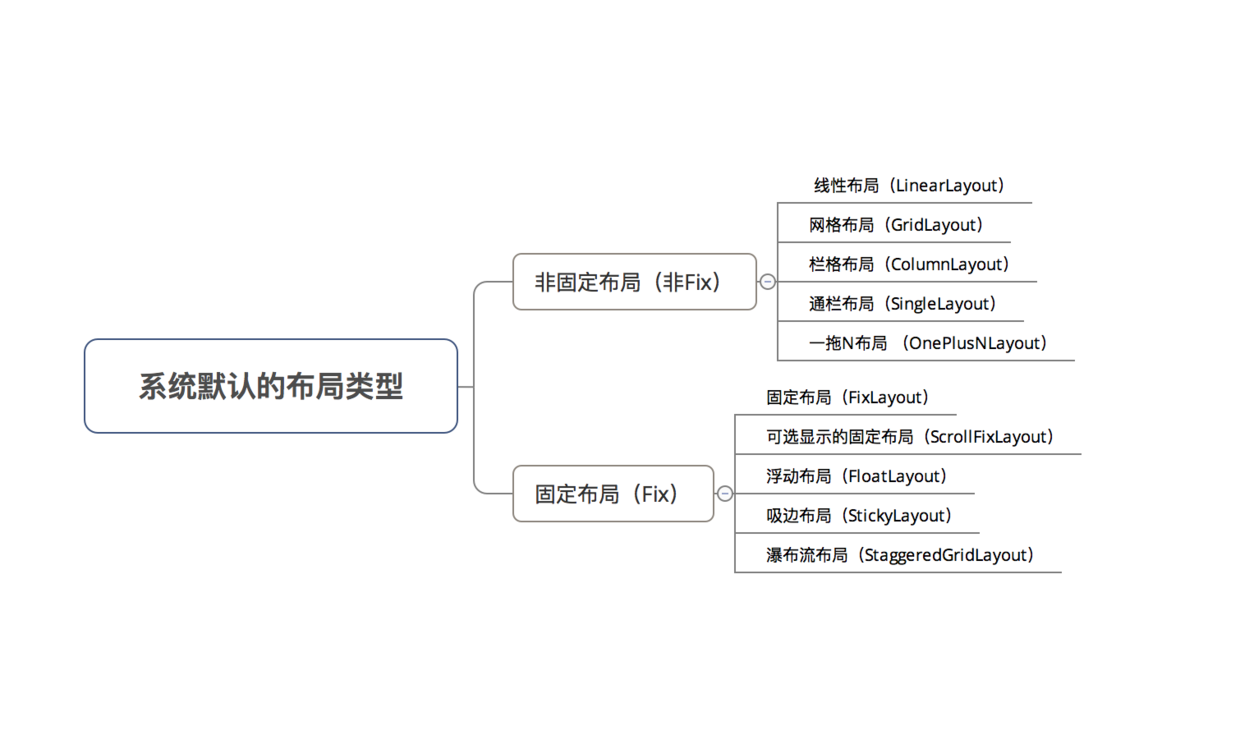
V - Layout implements 10 default layouts by default: (corresponding to Layout Helper with the same name)
 Layout type

4.1 Source Class Description
The source class diagram of V - Layout is as follows:

1.RecyclerView
- Definition: Subject of Page Layout
- Special note: Bind Virtual Layout Adapter (inheritance Adapter) in the V - layout Framework & Virtual Layout Manager (inheritance Layout Manager)
2. VirtualLayoutAdapter
- Definition: Data adapter.
Adaper inherited from the system
- Role: Create Components & Bind Data to Components
- Additional: Two interfaces are defined:
- getLayoutHelper(): A LayoutHelper (): Used to return a component corresponding to a location
-
setLayoutHelpers(): A series of LayoutHelpers required to call this method to set up the entire page
The implementation of these two methods is delegated to Virtual Layout Manager.
3. VirtualLayoutManager
- Definition: Layout Manager
Linear Layout Manager inherited from the system
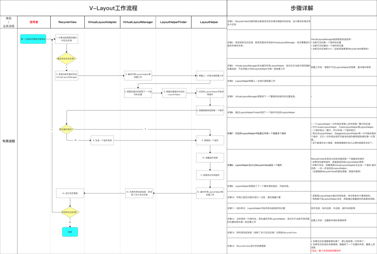
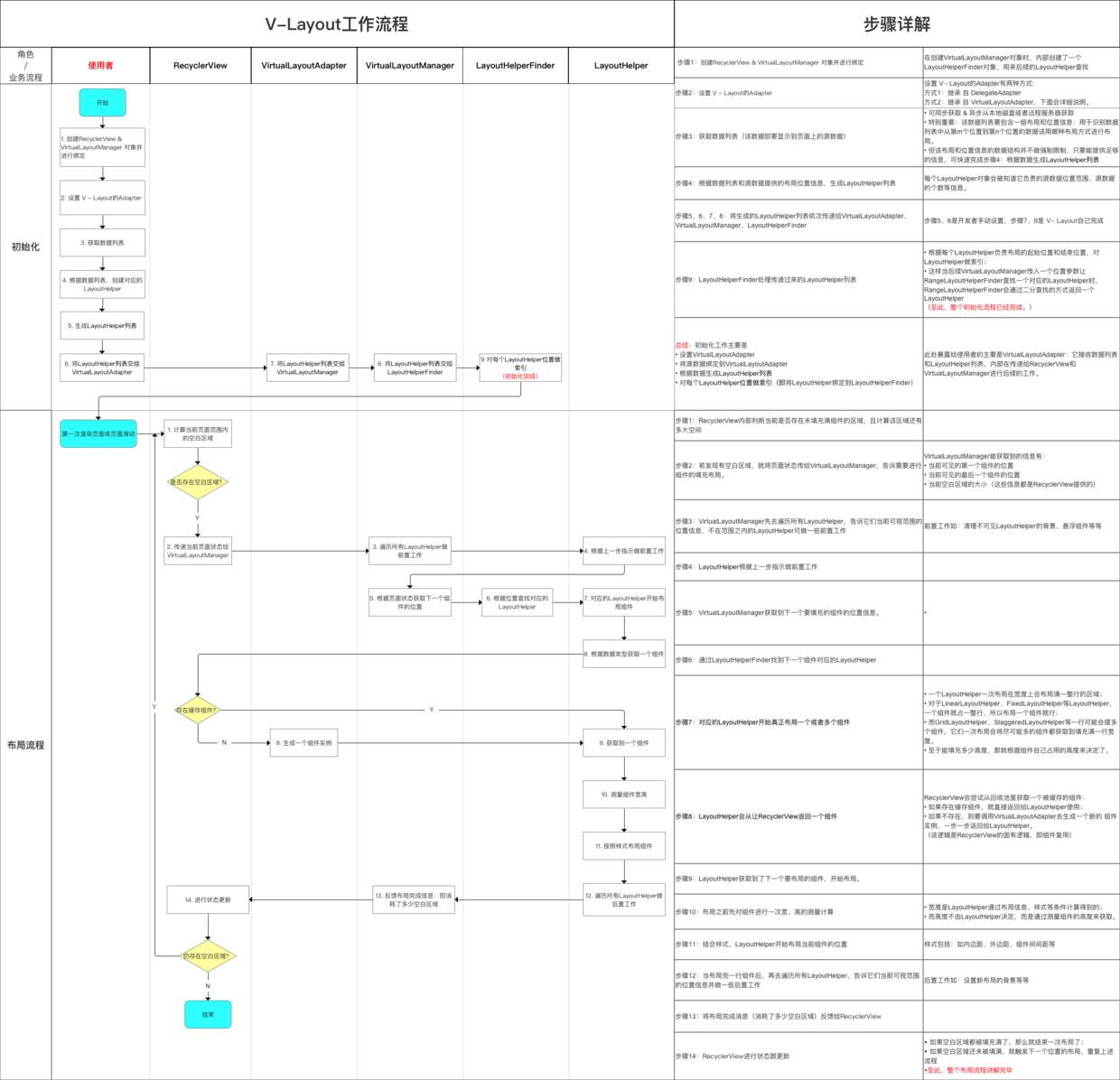
- Effect:
- Call layoutChunk () of VirtualLayoutManager when RecyclerView loads or slides, returning which blank areas are currently available for the component to be placed
- Manage the LayoutHelper list
- Additional: Implementation of getLayoutHelper () and setLayoutHelpers () of Virtual LayoutAdapter
4. LayoutHelperFinder
- Definition: LayoutHelper Finder
- Function: Find the corresponding Layout Helper according to the page status and return it to Virtual Layout Manager
- Virtual Layout Manager holds a Layout Helper Finder
- When layoutChunck () is called, a location parameter is passed in telling VirtualLayoutManager which component to lay out at the moment.
- Virtual Layout Manager notifies the holding Layout Helper Finder to find the Layout Helper corresponding to the location of the incoming parameter (each Layout Helper binds the start and end locations of the layout area it is responsible for)
5. LayoutHelper
- Definition: Layout Assistant
- Role: Responsible for specific layout logic
- It defines a series of interfaces for communicating with Virtual Layout Manager:
| Interface | Effect |
|---|---|
| isOutOfRange() | Tell Virtual Layout Manager whether the location it passes over is in the current Layout Helper layout area; |
| setRange() | Set the layout area currently in LayoutHelper's charge |
| doLayout() | Real Layout Logic Interface |
| beforeLayout() | Do some front-end work before layout |
| afterLayout() | Do some post-work after the layout is completed |
6. MarginLayoutHelper
- Definition: inherited from Layout Helper
- Function: Extend Layout Helper to provide the computing functions of padding and margin in layout.
7. BaseLayoutHelper
- Definition: Layer 1 implementation of Margin Layout Helper
- Function: Fill in the current LayoutHelper's logic of specific area background color, background image and so on within the scope of the screen
8. SubLayout Helper
- Definition: Layer 2 implementation of Margin Layout Helper
- Role: Responsible for specific layout logic
- Each seed Layout Helper is responsible for a layout logic
- Focus on the realization of beforeLayout(), doLayout(), afterLayout()
- In particular, doLayout(): Gets a set of components, calculates the size of components, and lays out the interface.
- V - Layout implements 10 default layouts by default: (corresponding to Layout Helper with the same name)
Details will be given below.
- Special attention should be paid to:
- Each Layout Helper is responsible for laying out a batch of components within the scope of a component. If the types of components within different components are the same, reuse can be reclaimed in the sliding process. Therefore, the recovery granularity is fine and can be reused across layout types.
- Support Extended External: Register a new Layout Helper to achieve a special layout. Details will be given below.
After introducing the classes, I will analyze the workflow of V - Layout in detail.
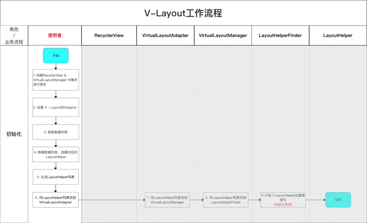
4.2 Workflow
- V-Layout's workflow is divided into initialization-layout process. The following picture:
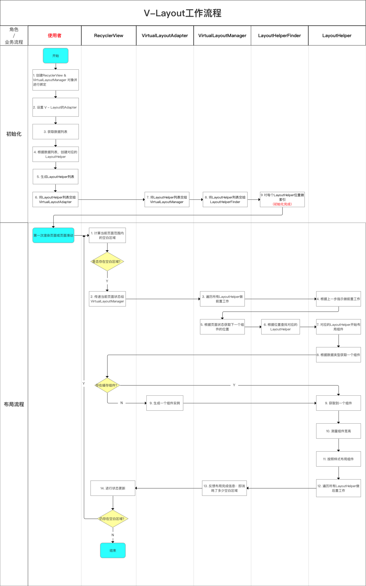
- Next, I will give a detailed analysis of the initialization-layout process.
4.2.1 Initialization
- Before using V - layout to quickly implement complex layout, a series of initialization work is needed.
The initialization process is basically the same as the ordinary RecyclerView + LayoutManager initialization process: the user of Vlayout
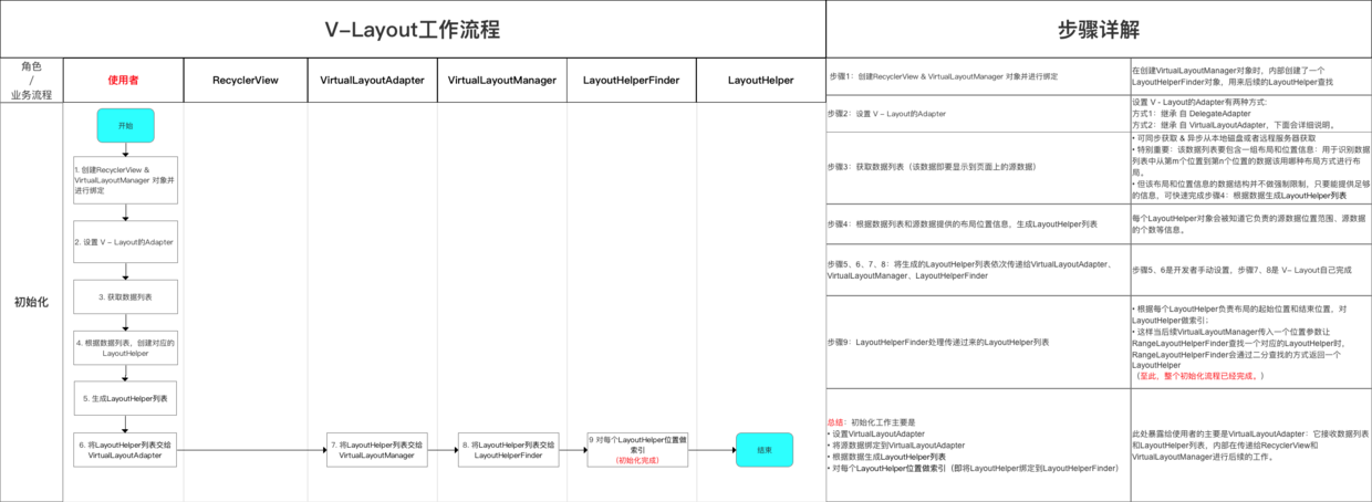
The initialization here is actually the initialization work that users need to do when using V - layout. I will explain it in more detail in the following examples.
4.2.2 Specific Layout Flow
- When initialization is completed, a layout process is performed whenever the user has just opened the page to render the layout for the first time or when the user slides the page.
- The essence of layout process is to customize Virtual Layout Manager to continuously obtain page status and find the corresponding Layout Helper through Layout Helper Finder, so as to realize the corresponding layout logic, so as to quickly meet the needs of composite layout.
- The specific process is as follows
summary
Here's a diagram to summarize the principle of V - Layout - workflow
After that, how do I use V - Layout?
5. Use steps
- The use of V - Layout is actually the initialization work mentioned above.
- The steps are as follows:
I will elaborate on each step below.
Step 1: Create RecyclerView & VirtualLayoutManager objects and bind them
recyclerView = (RecyclerView) findViewById(R.id.my_recycler_view);
        // Create RecyclerView objects

        VirtualLayoutManager layoutManager = new VirtualLayoutManager(this);
        // Create a VirtualLayoutManager object
        // At the same time, a LayoutHelperFinder object is created internally for subsequent LayoutHelper lookups.

        recyclerView.setLayoutManager(layoutManager);
        // Binding Virtual Layout Manager to recyclerView
Step 2: Set the recycle reuse pool size
If there are many views of the same type on the screen, you need to set an appropriate size to prevent re-creating the View when scrolling back and forth.
// Setting up Component Reuse Recycling Pool
        RecyclerView.RecycledViewPool viewPool = new RecyclerView.RecycledViewPool();
        recyclerView.setRecycledViewPool(viewPool);
        viewPool.setMaxRecycledViews(0, 10);
Step 3: Set up the Adapter
There are two ways to set up the Adapter of V - Layout:
- Mode 1: Inheritance from Delegate Adapter
- Mode 2: Inheritance from Virtual Layout Adapter
Details will be given below:
Mode 1: Inheritance from Delegate Adapter
- Definition: Delegate Adapter is a V - Layout custom adapter for managing Layout Helper
Inheritance from Virtual Layout Adapter
- Function: By managing different Layout Helper layouts and then different Layout Helper layouts, different combinatorial layouts can be used
- Special note: Although LayoutHelper cannot be bound directly, it has an internal class adapter inherited from RecyclerView.Adapter that can bind LayoutHelper.
- That is, through a List, the bound Adapter is packaged and Delegate Adapter is put away, so that different layouts can be combined.
- Specific practices:
- Writing is very similar to the Adapter that comes with the replication system: only the onCreateLayoutHelper method needs to be overloaded more than the Recycler Adapter that comes with the system, and the rest are similar
- See my article about the use of Recycler Adapter in Android system Android development: full analysis of ListView, AdapterView and RecyclerView
public class MyAdapter extends DelegateAdapter.Adapter<MyAdapter.MainViewHolder> {

// Multiple load onCreateLayoutHelper () is required than the Recycler Adapter that comes with the system.

    @Override
    public LayoutHelper onCreateLayoutHelper() {
        return layoutHelper;
    }

... // The rest of the writing is the same as the Adapter that comes with the copy system.
}
Mode 2: Inheritance from Virtual Layout Adapter
-
Definition: When complex requirements need to be implemented, a custom adapter can be implemented by inheriting the Virtual Layout Adapter
-
Specific use
public class MyAdapter extends VirtualLayoutAdapter {
   ...// Custom Adapter Logic
}
Step 4: Create the corresponding Layout Helper based on the data list
- The system encapsulates the following layout types (corresponding to Layout Helper of the same name)
- Specific uses are as follows:
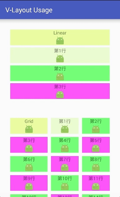
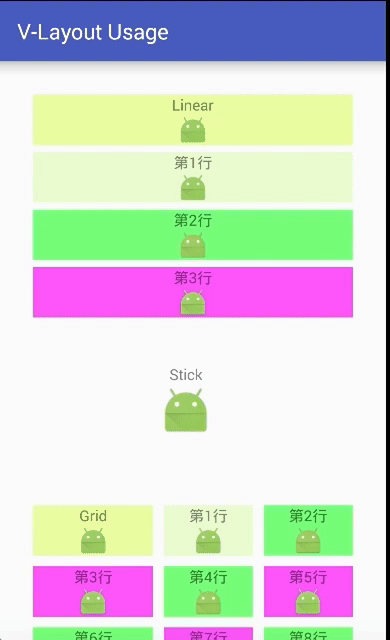
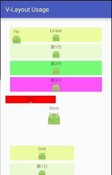
1. Linear Layout Helper
- Layout description: Layout subelements (Item s) are laid out linearly
- Specific use
/**
    Setting up Linear Layout
       */
        LinearLayoutHelper linearLayoutHelper = new LinearLayoutHelper();
        // Create the corresponding LayoutHelper object

 // Common attributes for all layouts (attributes are described in detail below)
        linearLayoutHelper.setItemCount(4);// Set the number of Item s in the layout
        linearLayoutHelper.setPadding(10,10,10,10);// Set the distance between the child elements of LayoutHelper and the edge of LayoutHelper
        linearLayoutHelper.setMargin(10,10,10,10);// Set the distance between the LayoutHelper edge and the parent control (RecyclerView)
        linearLayoutHelper.setBgColor(Color.GRAY);// Set the background color
        linearLayoutHelper.setAspectRatio(6);// Set the ratio of width to height for each line layout in the layout

 // linearLayoutHelper's unique attributes
        linearLayoutHelper.setDividerHeight(1); // Set the distance of Item per row
1. Common attributes of all layouts:
a. setItemCount property
- Function: Set the number of Item s in the entire layout
If the total number of Items set is different from the number returned by the Adapter's getItemCount() method, it will depend on the latter.
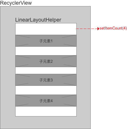
- Specific use
// Interface hint
    public void setItemCount(int Count)

// Specific use
        linearLayoutHelper.setItemCount(4);
B. Adding & Margin attributes
-
Definition: Both have the meaning of margin, but they have different definitions of margin:
- Padding: The distance between the child elements of LayoutHelper and the edge of LayoutHelper.
-
Margin: The distance between the edge of LayoutHelper and the parent control (RecyclerView). Specifically as follows:
 Sketch Map
-
Specific use
// Interface hint
    public void setPadding(int leftPadding, int topPadding, int rightPadding, int bottomPadding)
    public void setMargin(int leftMargin, int topMargin, int rightMargin, int bottomMargin)

// Specific use
        linearLayoutHelper.setPadding(10,10,10,10);
        // Set the distance between the child elements of LayoutHelper and the edge of LayoutHelper

        linearLayoutHelper.setMargin(10,10,10,10);
        // Set the distance between the LayoutHelper edge and the parent control (RecyclerView)
c. bgColor attribute
- Function: Set the layout background color
- Specific use:
// Interface hint
public void setBgColor(int bgColor)

// Specific use
linearLayoutHelper.setBgColor(Color.YELLOW);
d. aspectRatio attribute
- Function: Set the ratio of width to height of each line layout in the layout. Following chart
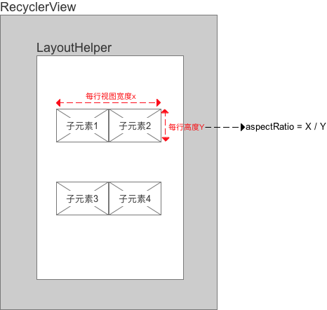
- Specific use
// Interface hint
public void setAspectRatio(float aspectRatio);
// aspectRatio defined by LayoutHelper

((VirutalLayoutManager.LayoutParams) layoutParams).mAspectRatio
// aspectRatio defined by LayoutParams of views
// After LayoutHelper calculates the view width, it is used to determine the view height. It covers the view height calculated by LayoutHelper's aspectRatio, so it has a higher priority.

// Specific use
        linearLayoutHelper.setAspectRatio(6);
2. Description of the unique attributes of the Linear Layout Helper layout
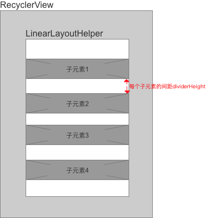
a. dividerHeight attribute
- Function: Set the distance between Item s per row
The set interval superimposes the interval added by addItemDecoration () of RecyclerView
- Specific use
// Interface hint
public void setDividerHeight(int dividerHeight)

// Specific use
 linearLayoutHelper.setDividerHeight(1);
2. Grid Layout
- Layout description: Item s in the layout are arranged in grid form
- Specific use
        /**
        Setting up Grid Layout
        */
        GridLayoutHelper gridLayoutHelper = new GridLayoutHelper(3);
        // Set the number of grids per row in the constructor

        // Public attribute
        gridLayoutHelper.setItemCount(6);// Set the number of Item s in the layout
        gridLayoutHelper.setPadding(20, 20, 20, 20);// Set the distance between the child elements of LayoutHelper and the edge of LayoutHelper
        gridLayoutHelper.setMargin(20, 20, 20, 20);// Set the distance between the LayoutHelper edge and the parent control (RecyclerView)
        gridLayoutHelper.setBgColor(Color.GRAY);// Set the background color
        gridLayoutHelper.setAspectRatio(6);// Set the ratio of width to height for each line layout in the layout

        // Specific attributes of gridLayoutHelper (detailed below)
        gridLayoutHelper.setWeights(new float[]{40, 30, 30});//Set the ratio of the width of each grid to the total width of each row in each row
        gridLayoutHelper.setVGap(20);// Control the vertical spacing between sub-elements
        gridLayoutHelper.setHGap(20);// Controlling horizontal spacing between sub-elements
        gridLayoutHelper.setAutoExpand(false);//Whether to fill the blank area automatically
        gridLayoutHelper.setSpanCount(3);// Set how many grids per row
        // Control the number of meshes occupied by an Item by customizing SpanSizeLookup
        gridLayoutHelper.setSpanSizeLookup(new GridLayoutHelper.SpanSizeLookup() {
            @Override
            public int getSpanSize(int position) {
                if (position > 7 ) {
                    return 3;
                    // After the seventh position, each Item occupies three grids
                }else {
                    return 2;
                    // Before the seventh position, each Item occupies two grids
                }
            }
        });
Specific attributes of GridLayoutHelper layout
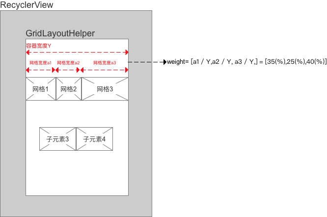
a. weights attributes
- Role: Set the ratio of the width of each grid to the total width of each row in each row
- By default, the width of each grid in each row is equal
- The weights attribute is a float array, each representing the percentage of the total width of each row in the grid; the total is 100, otherwise the layout will exceed the container width;
- If there are four columns in the layout, the length of weights should also be 4; if the length is greater than 4, the extra part does not participate in the width calculation; if less than 4, the insufficient part divides the remaining space by default.
- Specific use
// Interface hint
public void setWeights(float[] weights)

// Specific use
gridLayoutHelper.setWeights(new float[]{40, 30, 30});
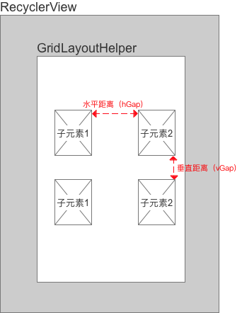
b. vGap, hGap attributes
- Function: Control the vertical and horizontal spacing between sub-elements respectively.
- Specific use
// Interface hint
    public void setHGap(int hGap)
    public void setVGap(int vGap)

// Specific use
    gridLayoutHelper.setVGap(20);// Control the vertical spacing between sub-elements
    gridLayoutHelper.setHGap(20);// Controlling horizontal spacing between sub-elements
c. spanCount, spanSizeLookup attributes
- Effect:
- spanCount: Set how many grids per row
- spanSizeLookup: Sets how many grids each Item occupies (default = 1)
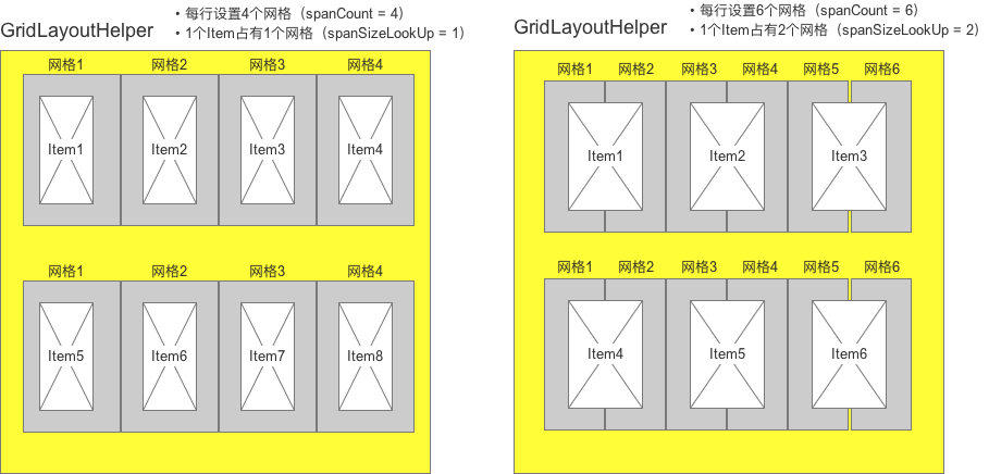
- Specific use
// Interface hint
public void setSpanCount(int spanCount)
public void setSpanSizeLookup(SpanSizeLookup spanSizeLookup)

// Specific use
        gridLayoutHelper.setSpanCount(5);// Set how many grids per row

        // Control the number of meshes occupied by an Item by customizing SpanSizeLookup
        gridLayoutHelper.setSpanSizeLookup(new GridLayoutHelper.SpanSizeLookup() {
            @Override
            public int getSpanSize(int position) {
                if (position > 7 ) {
                    return 3;
                    // After the seventh position, each Item occupies three grids
                }else {
                    return 2;
                    // Before the seventh position, each Item occupies two grids
                }
            }
        });
d. autoExpand attribute
- Function: When the number of items in a row is < (number of grid columns per row - span Count value / two grid-setSpanSizeLookup per Item), whether the blank area is filled automatically or not
- If autoExpand=true, the total width of the view fills the available area.
- Otherwise, a blank area will be left on the screen.
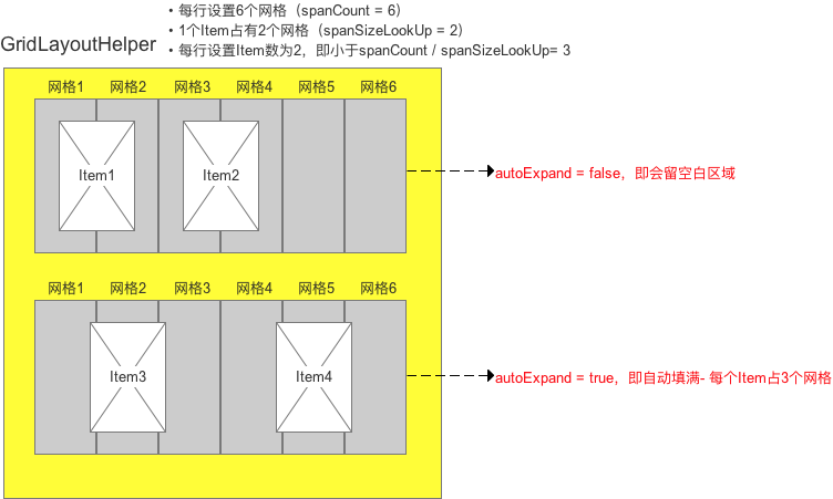
- Specific use
// Interface hint
public void setAutoExpand(boolean isAutoExpand)

// Specific use
gridLayoutHelper.setAutoExpand(false);
3. Fix Layout Helper
- Layout description: Item fixed position in layout
Fixed somewhere on the screen and not dragged & not scrolled along with the page. The following picture: (upper left corner)
- Specific use
/**
         Setting Fixed Layout
         */

        FixLayoutHelper fixLayoutHelper = new FixLayoutHelper(FixLayoutHelper.TOP_LEFT,40,100);
        // Description of parameters:
        // Parameter 1: Set alignType when sucking edges - There are four values: TOP_LEFT (default), TOP_RIGHT, BOTTOM_LEFT, BOTTOM_RIGHT.
        // Parametric 2: offset x of reference position
        // Parametric 3: offset y of reference position


        // Public attribute
        fixLayoutHelper.setItemCount(1);// Set the number of Item s in the layout
        // As you can see from the source code that sets the number of Item s, a FixLayoutHelper can only set one.
//        @Override
//        public void setItemCount(int itemCount) {
//            if (itemCount > 0) {
//                super.setItemCount(1);
//            } else {
//                super.setItemCount(0);
//            }
//        }
        fixLayoutHelper.setPadding(20, 20, 20, 20);// Set the distance between the child elements of LayoutHelper and the edge of LayoutHelper
        fixLayoutHelper.setMargin(20, 20, 20, 20);// Set the distance between the LayoutHelper edge and the parent control (RecyclerView)
        fixLayoutHelper.setBgColor(Color.GRAY);// Set the background color
        fixLayoutHelper.setAspectRatio(6);// Set the ratio of width to height for each line layout in the layout

        // FixeLayoutHelper-specific attributes
        fixLayoutHelper.setAlignType(FixLayoutHelper.TOP_LEFT);// Setting alignType
        fixLayoutHelper.setX(30);// Setting the transverse offset of the reference position X
        fixLayoutHelper.setY(50);// Setting the vertical offset Y of the reference position
FixLayoutHelper Specific Attribute Description
a. AlignType, x, y attributes
- Effect:
- alignType: Suction Benchmark Type
There are four values: TOP_LEFT (default), TOP_RIGHT, BOTTOM_LEFT, BOTTOM_RIGHT. See the diagram below for details.
- x: Transverse offset of reference position
- y: Longitudinal offset of reference position
- alignType: Suction Benchmark Type
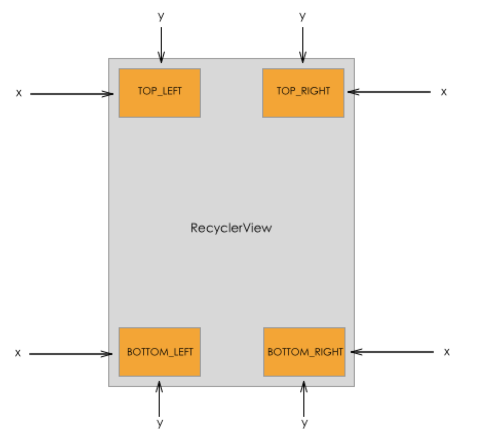
- Acting objects: attributes of FixLayoutHelper, ScrollFixLayoutHelper, FloatLayoutHelper
// Interface hint
public void setAlignType(int alignType)
public void setX(int x)
public void setY(int y)

// Specific use
fixLayoutHelper.setAlignType(FixLayoutHelper.TOP_LEFT);
fixLayoutHelper.setX(30);
fixLayoutHelper.setY(50);
4. ScrollFix Layout Helper
- Layout description: Item fixed position in layout
- Fixed somewhere on the screen and not dragged & not scrolled along with the page (inherited from Fix Layout Helper)
- The only difference is that you can freely set when the Item will be displayed (to the top / bottom), as shown in the following figure: (upper left corner)
- Requirement scenario: To display the button function of "one button to the top" at the bottom of the page
The following schematic diagram shows that the layout is displayed in the upper left corner by sliding to the bottom.
- Specific use
/**
         Setting Optional Fixed Layout
         */

        ScrollFixLayoutHelper scrollFixLayoutHelper = new ScrollFixLayoutHelper(ScrollFixLayoutHelper.TOP_RIGHT,0,0);
        // Description of parameters:
        // Parameter 1: Set alignType when sucking edges - There are four values: TOP_LEFT (default), TOP_RIGHT, BOTTOM_LEFT, BOTTOM_RIGHT.
        // Parametric 2: offset x of reference position
        // Parametric 3: offset y of reference position

        // Public attribute
        scrollFixLayoutHelper.setItemCount(1);// Set the number of Item s in the layout
        // As you can see from the source code that sets the number of Item s, a FixLayoutHelper can only set one.
//        @Override
//        public void setItemCount(int itemCount) {
//            if (itemCount > 0) {
//                super.setItemCount(1);
//            } else {
//                super.setItemCount(0);
//            }
//        }
        scrollFixLayoutHelper.setPadding(20, 20, 20, 20);// Set the distance between the child elements of LayoutHelper and the edge of LayoutHelper
        scrollFixLayoutHelper.setMargin(20, 20, 20, 20);// Set the distance between the LayoutHelper edge and the parent control (RecyclerView)
        scrollFixLayoutHelper.setBgColor(Color.GRAY);// Set the background color
        scrollFixLayoutHelper.setAspectRatio(6);// Set the ratio of width to height for each line layout in the layout

        // FixeLayoutHelper-specific attributes
     scrollFixLayoutHelper.setAlignType(FixLayoutHelper.TOP_LEFT);// Setting alignType
        scrollFixLayoutHelper.setX(30);// Setting the transverse offset of the reference position X
        scrollFixLayoutHelper.setY(50);// Setting the vertical offset Y of the reference position
        scrollFixLayoutHelper.setShowType(ScrollFixLayoutHelper.SHOW_ON_ENTER);// Setting the display mode of Item
ScrollFixLayoutHelper Specific Attribute Description
a. AlignType, x, y attributes
- Effect:
- alignType: Suction Benchmark Type
There are four values: TOP_LEFT (default), TOP_RIGHT, BOTTOM_LEFT, BOTTOM_RIGHT. See the diagram below for details.
- x: Transverse offset of reference position
- y: Longitudinal offset of reference position
- alignType: Suction Benchmark Type
- Specific use
// Interface hint
public void setAlignType(int alignType)
public void setX(int x)
public void setY(int y)

// Specific use
ScrollFixLayoutHelper.setAlignType(FixLayoutHelper.TOP_LEFT);
ScrollFixLayoutHelper.setX(30);
ScrollFixLayoutHelper.setY(50);
b. ShowType attribute
-
Function: Set the display mode of Item
There are three display modes
- SHOW_ALWAYS: Always show (i.e. the same effect as the fixed layout)
- SHOW_ON_ENTER: The view is not displayed by default, but only when the page scrolls to the view position.
- SHOW_ON_LEAVE: The view is not displayed by default, but only when the page rolls out of the view position.
-
Specific use
// Interface hint
public void setShowType(int showType)

// Specific use
scrollFixLayoutHelper.setShowType(ScrollFixLayoutHelper.SHOW_ON_ENTER);
5. Float Layout Helper
- Layout description: There is only one Item in the layout.
- It can be dragged at will, but eventually it will be sucked to both sides.
- Do not move with page scroll

- Specific use
/**
         Setting Floating Layout
         */
        FloatLayoutHelper floatLayoutHelper = new FloatLayoutHelper();
        // Create FloatLayoutHelper objects

        // Public attribute
        floatLayoutHelper.setItemCount(1);// Set the number of Item s in the layout
        // As you can see from the source code that sets the number of Item s, a FixLayoutHelper can only set one.
//        @Override
//        public void setItemCount(int itemCount) {
//            if (itemCount > 0) {
//                super.setItemCount(1);
//            } else {
//                super.setItemCount(0);
//            }
//        }
        floatLayoutHelper.setPadding(20, 20, 20, 20);// Set the distance between the child elements of LayoutHelper and the edge of LayoutHelper
        floatLayoutHelper.setMargin(20, 20, 20, 20);// Set the distance between the LayoutHelper edge and the parent control (RecyclerView)
        floatLayoutHelper.setBgColor(Color.GRAY);// Set the background color
        floatLayoutHelper.setAspectRatio(6);// Set the ratio of width to height for each line layout in the layout

        // floatLayoutHelper's unique attributes
        floatLayoutHelper.setDefaultLocation(300,300);// Setting the initial location of Item in the layout
6. Column Layout Helper
- Layout Description: This layout has only one column (which has multiple Item s)
It can be understood as a linear layout with only one line.
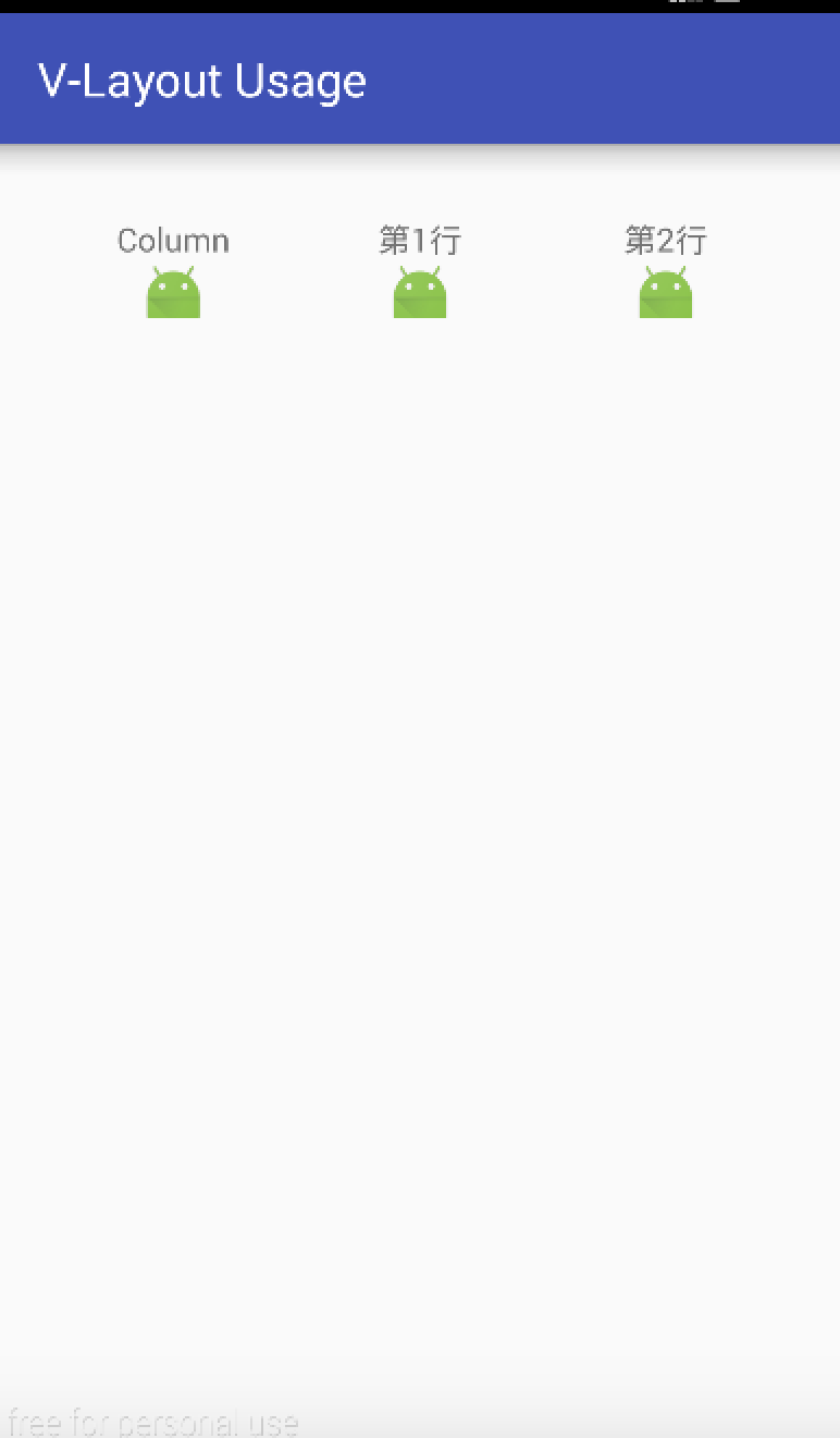
/**
         Set up the layout of the grid
         */
        ColumnLayoutHelper columnLayoutHelper = new ColumnLayoutHelper();
        // create object

        // Public attribute
        columnLayoutHelper.setItemCount(3);// Set the number of Item s in the layout
        columnLayoutHelper.setPadding(20, 20, 20, 20);// Set the distance between the child elements of LayoutHelper and the edge of LayoutHelper
        columnLayoutHelper.setMargin(20, 20, 20, 20);// Set the distance between the LayoutHelper edge and the parent control (RecyclerView)
        columnLayoutHelper.setBgColor(Color.GRAY);// Set the background color
        columnLayoutHelper.setAspectRatio(6);// Set the ratio of width to height for each line layout in the layout

        // Column Layout Helper's unique properties
        columnLayoutHelper.setWeights(new float[]{30, 40, 30});// Set the ratio of each Item to the total width of the row
        // Explain the Weigths attributes above
7. Single Layout Helper
- Layout description: Layout has only one column, which has only one Item
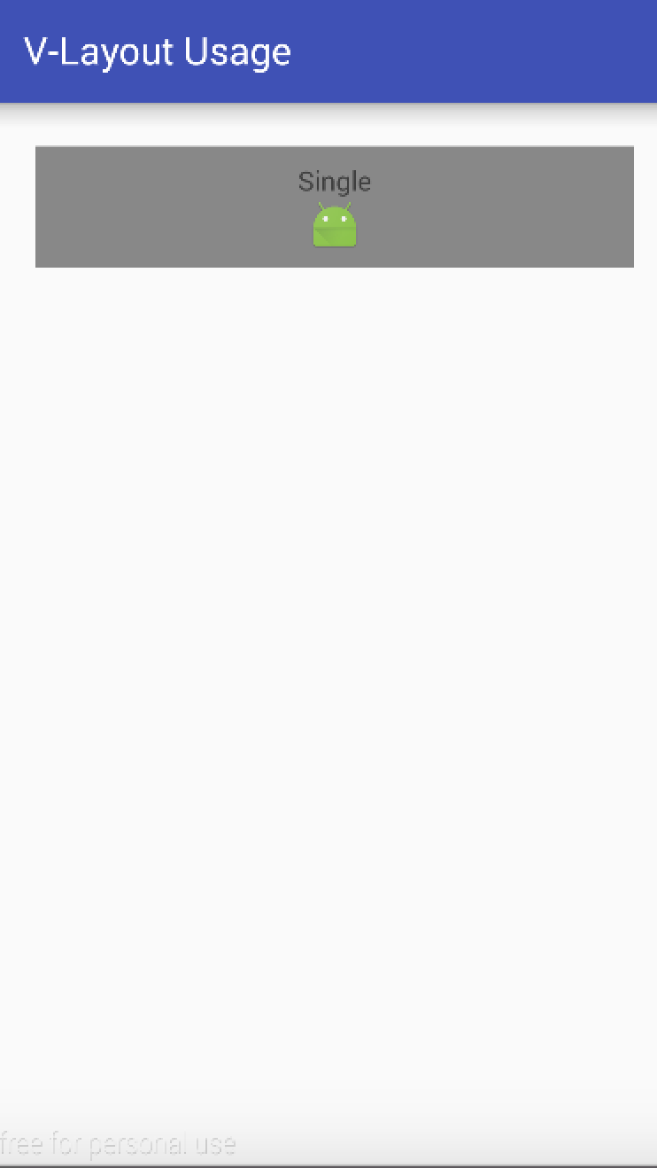
- Specific use
/**
         Setting up the layout of the banner
         */

        SingleLayoutHelper singleLayoutHelper = new SingleLayoutHelper();

        // Public attribute
        singleLayoutHelper.setItemCount(3);// Set the number of Item s in the layout
        singleLayoutHelper.setPadding(20, 20, 20, 20);// Set the distance between the child elements of LayoutHelper and the edge of LayoutHelper
        singleLayoutHelper.setMargin(20, 20, 20, 20);// Set the distance between the LayoutHelper edge and the parent control (RecyclerView)
        singleLayoutHelper.setBgColor(Color.GRAY);// Set the background color
        singleLayoutHelper.setAspectRatio(6);// Set the ratio of width to height for each line layout in the layout
8. One Plus N Layout Helper
- Layout Description: The layout is divided into different proportions, up to 1 drag 4. Specifically as follows
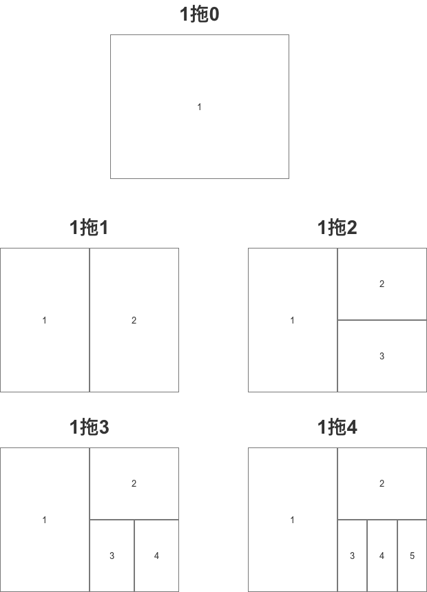

- Specific use
/**
         Set 1 drag N layout
         */
        OnePlusNLayoutHelper onePlusNLayoutHelper = new OnePlusNLayoutHelper(5);
        // The number of Item s displayed in the constructor is passed in
        // A maximum of four delays, or five delays

        // Public attribute
        onePlusNLayoutHelper.setItemCount(3);// Set the number of Item s in the layout
        onePlusNLayoutHelper.setPadding(20, 20, 20, 20);// Set the distance between the child elements of LayoutHelper and the edge of LayoutHelper
        onePlusNLayoutHelper.setMargin(20, 20, 20, 20);// Set the distance between the LayoutHelper edge and the parent control (RecyclerView)
        onePlusNLayoutHelper.setBgColor(Color.GRAY);// Set the background color
        onePlusNLayoutHelper.setAspectRatio(3);// Set the ratio of width to height for each line layout in the layout
9. Sticky Layout Helper
-
Layout description: Layout has only one Item. The display logic is as follows:
- When it contains components that are visible on the screen, it scrolls like a normal component as the page scrolls.
- When the component is about to be slid out of the screen and returned, it can be sucked to the top or bottom of the screen to achieve a suction effect.
-
Sketch (suck on top)
- Specific use
        /**
         Setting up suction edge layout
         */
        StickyLayoutHelper stickyLayoutHelper = new StickyLayoutHelper();

        // Public attribute
        stickyLayoutHelper.setItemCount(3);// Set the number of Item s in the layout
        stickyLayoutHelper.setPadding(20, 20, 20, 20);// Set the distance between the child elements of LayoutHelper and the edge of LayoutHelper
        stickyLayoutHelper.setMargin(20, 20, 20, 20);// Set the distance between the LayoutHelper edge and the parent control (RecyclerView)
        stickyLayoutHelper.setBgColor(Color.GRAY);// Set the background color
        stickyLayoutHelper.setAspectRatio(3);// Set the ratio of width to height for each line layout in the layout

        // Specific attributes
        stickyLayoutHelper.setStickyStart(true);
        // true = component sucked on top
        // false = component sucked at the bottom

        stickyLayoutHelper.setOffset(100);// Setting offset of suction edge position

        Adapter_StickyLayout = new MyAdapter(this, stickyLayoutHelper,1, listItem) {
            // Set the total number of data to display, where 1
            // To show the effect, set the first data of the layout to Stick by rewriting onBindViewHolder().
            @Override
            public void onBindViewHolder(MainViewHolder holder, int position) {
                super.onBindViewHolder(holder, position);
                if (position == 0) {
                    holder.Text.setText("Stick");
                }
            }
        };

        adapters.add(Adapter_StickyLayout) ;
        // Add the current Adapter to the Adapter list
stickyStart, offset attribute description
-
Effect:
-
stickyStart: Set the suction position
When the position of the view is within the scope of the screen, the view scrolls as the page scrolls; when the position of the view slides out of the screen, Sticky Layout Helper fixes the view at the top (stickyStart = true) or at the bottom (stickyStart = false).
-
Offset: Set the offset of the suction edge
-
-
Specific use
// Interface hint
        public void setStickyStart(boolean stickyStart)
        public void setOffset(int offset)

// Specific use
        stickyLayoutHelper.setStickyStart(true);
        // true = component sucked on top
        // false = component sucked at the bottom
        stickyLayoutHelper.setOffset(100);// Setting offset of suction edge position
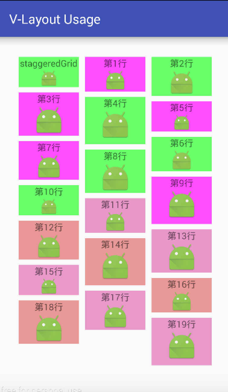
10. Staggered Grid Layout Helper
- Layout description: Layout in the form of grid. Similar to grid layout, the difference is that:
- The Item height of each column in the grid layout is equal.
- The Item height of each column in the waterfall flow layout can be unequal.
- Specific use
        /**
         Setting Waterfall Flow Layout
         */

        StaggeredGridLayoutHelper staggeredGridLayoutHelper = new StaggeredGridLayoutHelper();
        // create object

        // Public attribute
        staggeredGridLayoutHelper.setItemCount(20);// Set the number of Item s in the layout
        staggeredGridLayoutHelper.setPadding(20, 20, 20, 20);// Set the distance between the child elements of LayoutHelper and the edge of LayoutHelper
        staggeredGridLayoutHelper.setMargin(20, 20, 20, 20);// Set the distance between the LayoutHelper edge and the parent control (RecyclerView)
        staggeredGridLayoutHelper.setBgColor(Color.GRAY);// Set the background color
        staggeredGridLayoutHelper.setAspectRatio(3);// Set the ratio of width to height for each line layout in the layout

        // Specific attributes
        staggeredGridLayoutHelper.setLane(3);// Set the number of Item s per row that control the waterfall flow
        staggeredGridLayoutHelper.setHGap(20);// Set horizontal spacing between child elements
        staggeredGridLayoutHelper.setVGap(15);// Set the vertical spacing between child elements
Custom Layout Helper
In addition to using the default LayoutHelper layout provided by the system, developers can also customize LayoutHelper to achieve custom layout styles. There are three ways:
-
Inherit BaseLayout Helper: Top-down order - Internal View can be recycled by row layout; mainly implement layoutViews(), computeAlignOffset() and other methods.
Linear Layout Helper and GridLayout Helper are all implemented by this method.
-
Inheritance of AbstractFull Fill Layout Helper: View s within some layouts are not arranged from top to bottom (that is, the data order in Adatper is inconsistent with the order of physical views, so it may not be possible to lay out and recycle in data order), and a one-time layout is required.
Recycling. Mainly implements layoutViews() and other methodsOnePlus NLayout Helper is implemented by this method
-
Inherit the FixArea LayoutHelper: fix type layout, and the child nodes do not scroll as the page scrolls. The main implementation methods are layoutViews(), beforeLayout(), afterLayout().
Fix Layout Helper is implemented with this method
Step 5: Give the generated LayoutHelper to the Adapter and bind it to the RecyclerView object
The approach here will vary depending on the setup of the Adapter in Step 3
<-- Adapter Inherit from DelegateAdapter -->

// Step 1: Set the Adapter List (and also the LayoutHelper List)
        List<DelegateAdapter.Adapter> adapters = new LinkedList<>();

// Step 2: Create a custom Adapter object & bind data & bind the corresponding LayoutHelper above
// To bind, you need to show Layout Helper, just two of which are shown here.
        MyAdapter Adapter_linearLayout    = new MyAdapter(this, linearLayoutHelper,ListItem);
// ListItem is data that needs to be bound (depending on how your Adapter defines it)

        MyAdapter Adapter_gridLayoutHelper    = new MyAdapter(this, gridLayoutHelper,ListItem);

// Step 3: Put the created adapter object in the DelegateAdapter.Adapter list
        adapters.add(Adapter_linearLayout ) ;
        adapters.add(Adapter_gridLayoutHelper ) ;

// Step 4: Create the DelegateAdapter object & bind the layoutManager to the DelegateAdapter
DelegateAdapter delegateAdapter = new DelegateAdapter(layoutManager);

// Step 5: Bind the Delegate Adapter. Adapter list to Delegate Adapter
 delegateAdapter.setAdapters(adapters);

// Step 6: Bind the delegate adapter to recyclerView
recyclerView.setAdapter(delegateAdapter);


<-- Adapter Inherit from VirtualLayoutAdapter -->

// Step 1: Set up the LayoutHelper list
        List<LayoutHelper> helpers = new LinkedList<>();

// Step 2: Bind the corresponding LayoutHelper above
helpers.add(Adapter_linearLayout );
helpers.add(Adapter_gridLayoutHelper ) ;

// Step 3: Create a custom MyAdapter object & Bind Layout Manager
MyAdapter myAdapter = new MyAdapter(layoutManager);

// Step 4: Pass the layoutHelper list to adapter
myAdapter.setLayoutHelpers(helpers);

// Step 5: Bind adapter to recyclerView
recycler.setAdapter(myAdapter);
At this point, the use process is explained.
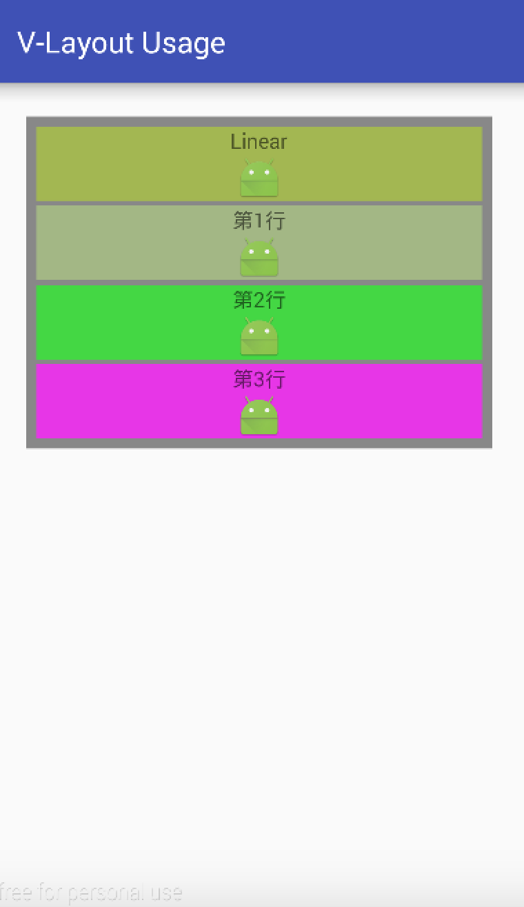
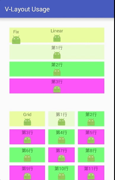
6. Illustration of examples
- The advantage of V-Layout is that it combines different layouts quickly.
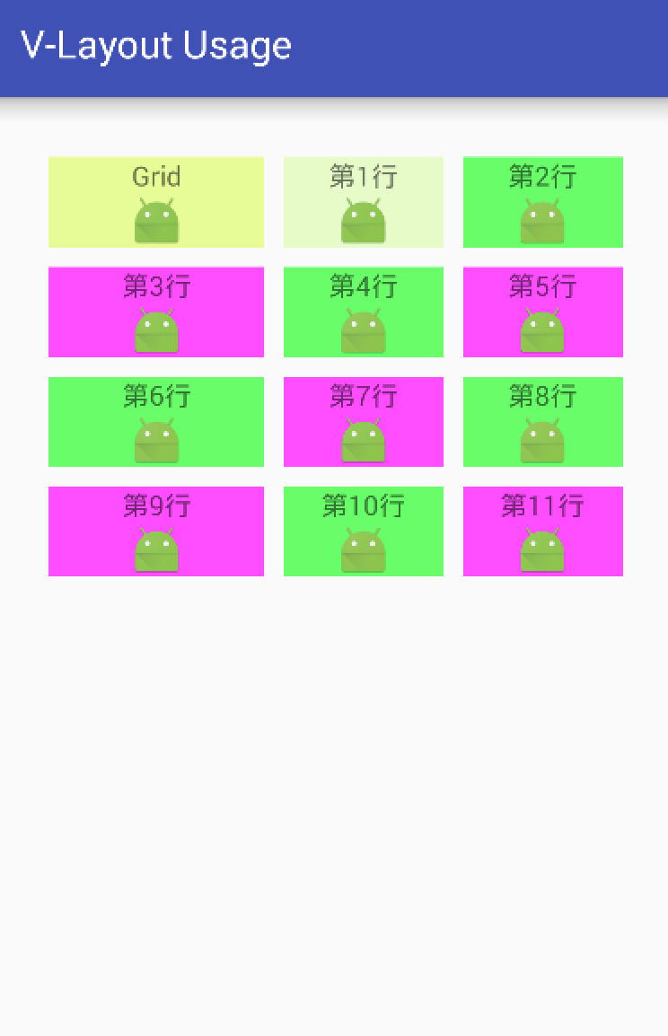
- Next, I'll use an example to quickly assemble the layout using V - Layout, as described in the steps above.
Step 1: Add dependencies to Android - Gradle
compile ('com.alibaba.android:vlayout:1.0.3@aar') {
        transitive = true
    }
Step 2: Define the master xml layout
activity_main.xml
<?xml version="1.0" encoding="utf-8"?>
<RelativeLayout xmlns:android="http://schemas.android.com/apk/res/android"
    xmlns:tools="http://schemas.android.com/tools"
    android:layout_width="match_parent"
    android:layout_height="match_parent"
    android:paddingBottom="@dimen/activity_vertical_margin"
    android:paddingLeft="@dimen/activity_horizontal_margin"
    android:paddingRight="@dimen/activity_horizontal_margin"
    android:paddingTop="@dimen/activity_vertical_margin"
    tools:context="scut.carson_ho.v_layoutusage.MainActivity">

    <android.support.v7.widget.RecyclerView
        android:id="@+id/my_recycler_view"
        android:layout_width="match_parent"
        android:layout_height="match_parent"
        android:scrollbars="horizontal" />
</RelativeLayout>
Step 3: Define the xml layout for each sub-element (Item) of RecyclerView
item.xml
The Item layout defined here is the usual top-word and bottom-word layout.
<?xml version="1.0" encoding="utf-8"?>
<LinearLayout xmlns:android="http://schemas.android.com/apk/res/android"
    android:orientation="vertical" android:layout_width="match_parent"
    android:layout_height="match_parent">

    <TextView
        android:layout_width="wrap_content"
        android:layout_height="wrap_content"
        android:layout_gravity="center"
        android:text="New Text"
        android:id="@+id/Item" />

    <ImageView
        android:layout_alignParentRight="true"
        android:layout_gravity="center"
        android:layout_width="wrap_content"
        android:layout_height="wrap_content"
        android:id="@+id/Image"/>

</LinearLayout>
Step 4: Set up the Adapter
-
There are two ways to set up the Adapter of V - Layout:
- Inherited from Delegate Adapter
This is the main way to demonstrate it here.
- Inheritance from Virtual Layout Adapter
- Inherited from Delegate Adapter
-
Specific use
MyAdapter.java
public class MyAdapter extends DelegateAdapter.Adapter<MyAdapter.MainViewHolder> {
    // The first thing to do with Delegate Adapter is to customize its internal class Adapter so that LayoutHelper and the data that needs to be bound can be passed in.
    // The Adapter defined here differs only one onCreateLayoutHelper() method from the ordinary RecyclerView Adapter, and the rest is the same.

    private ArrayList<HashMap<String, Object>> listItem;
    // Used to store data lists

    private Context context;
    private LayoutHelper layoutHelper;
    private RecyclerView.LayoutParams layoutParams;
    private int count = 0;

    private MyItemClickListener myItemClickListener;
    // Used to set Item click events

    //Constructor (the number of Item s shown in each data list passed in)
    public MyAdapter(Context context, LayoutHelper layoutHelper, int count, ArrayList<HashMap<String, Object>> listItem) {
        this(context, layoutHelper, count, new RecyclerView.LayoutParams(ViewGroup.LayoutParams.MATCH_PARENT, 300), listItem);
    }

    public MyAdapter(Context context, LayoutHelper layoutHelper, int count, @NonNull RecyclerView.LayoutParams layoutParams, ArrayList<HashMap<String, Object>> listItem) {
        this.context = context;
        this.layoutHelper = layoutHelper;
        this.count = count;
        this.layoutParams = layoutParams;
        this.listItem = listItem;
    }

    // Layout of binding ViewHolder to Item
    @Override
    public MainViewHolder onCreateViewHolder(ViewGroup parent, int viewType) {
        return new MainViewHolder(LayoutInflater.from(context).inflate(R.layout.item, parent, false));
    }

    // The Adapter defined here differs only one onCreateLayoutHelper() method from the ordinary RecyclerView Adapter
    @Override
    public LayoutHelper onCreateLayoutHelper() {
        return layoutHelper;
    }

    // Data bound to Item
    @Override
    public void onBindViewHolder(MainViewHolder holder, int position) {
        holder.Text.setText((String) listItem.get(position).get("ItemTitle"));
        holder.image.setImageResource((Integer) listItem.get(position).get("ItemImage"));

    }

    // Number of Item s returned
    @Override
    public int getItemCount() {
        return count;
    }

    // Setting Item Click Events
    // Bind the click listener that comes in from MainActivity
    public void setOnItemClickListener(MyItemClickListener listener) {
        myItemClickListener = listener;
    }


    //Define Viewholder
    class MainViewHolder extends RecyclerView.ViewHolder {
        public TextView Text;
        public ImageView image;

        public MainViewHolder(View root) {
            super(root);

            // Binding view
            Text = (TextView) root.findViewById(R.id.Item);
            image = (ImageView) root.findViewById(R.id.Image);

            root.setOnClickListener(new View.OnClickListener() {
                @Override
                public void onClick(View v) {
                    if (myItemClickListener != null)
                        myItemClickListener.onItemClick(v, getPosition());
                }

            }
            //Callback to MainActivity's onItemClick function on listening to clicks
            );

        }

        public TextView getText() {
            return Text;
        }
    }
}
The following steps will be written in the same. Java file
Step 5: Create RecyclerView & VirtualLayoutManager objects and bind them
Step 6: Set the recycle reuse pool size
Step 7: Set up the data to be stored
Step 8: Create the corresponding Layout Helper based on the data list
Step 9: Give the generated LayoutHelper to the Adapter and bind it to the RecyclerView object
See the notes for details.
MainActivity.java
public class MainActivity extends AppCompatActivity implements MyItemClickListener {
    RecyclerView recyclerView;
    MyAdapter Adapter_linearLayout,Adapter_GridLayout,Adapter_FixLayout,Adapter_ScrollFixLayout
            ,Adapter_FloatLayout,Adapter_ColumnLayout,Adapter_SingleLayout,Adapter_onePlusNLayout,
            Adapter_StickyLayout,Adapter_StaggeredGridLayout;
    private ArrayList<HashMap<String, Object>> listItem;

    @Override
    protected void onCreate(Bundle savedInstanceState) {
        super.onCreate(savedInstanceState);
        setContentView(R.layout.activity_main);

        /**
         * Step 1: Create RecyclerView & VirtualLayoutManager objects and bind them
         * */
        recyclerView = (RecyclerView) findViewById(R.id.my_recycler_view);
        // Create RecyclerView objects

        VirtualLayoutManager layoutManager = new VirtualLayoutManager(this);
        // Create a VirtualLayoutManager object
        // At the same time, a LayoutHelperFinder object is created internally for subsequent LayoutHelper lookups.

        recyclerView.setLayoutManager(layoutManager);
        // Binding Virtual Layout Manager to recyclerView

        /**
         * Step 2: Setting up a component reuse recycling pool
         * */
        RecyclerView.RecycledViewPool viewPool = new RecyclerView.RecycledViewPool();
        recyclerView.setRecycledViewPool(viewPool);
        viewPool.setMaxRecycledViews(0, 10);

        /**
         * Step 3: Set up the data to be stored
         * */
        listItem = new ArrayList<HashMap<String, Object>>();
        for (int i = 0; i < 100; i++) {
            HashMap<String, Object> map = new HashMap<String, Object>();
            map.put("ItemTitle", "The first" + i + "That's ok");
            map.put("ItemImage", R.mipmap.ic_launcher);
            listItem.add(map);

        }

        /**
         * Step 4: Create the corresponding Layout Helper based on the data list
         * */

        // To show the effect, all the layouts described above are shown here.

        /**
         Setting up Linear Layout
         */
        LinearLayoutHelper linearLayoutHelper = new LinearLayoutHelper();
        // Create the corresponding LayoutHelper object

        // Public attribute
        linearLayoutHelper.setItemCount(4);// Set the number of Item s in the layout
        linearLayoutHelper.setPadding(20, 20, 20, 20);// Set the distance between the child elements of LayoutHelper and the edge of LayoutHelper
        linearLayoutHelper.setMargin(20, 20, 20, 20);// Set the distance between the LayoutHelper edge and the parent control (RecyclerView)
        // Linear Layout Helper. setBgColor (Color. GRAY); // Set background color
        linearLayoutHelper.setAspectRatio(6);// Set the ratio of width to height for each line layout in the layout

        // linearLayoutHelper's unique attributes
        linearLayoutHelper.setDividerHeight(10);
        // Set interval height
        // The interval set is superimposed with the interval added by addItemDecoration () of RecyclerView.

        linearLayoutHelper.setMarginBottom(100);
        // Set the interval between the bottom of the layout and the next layout


        // Create a custom Adapter object-bound data-bind the corresponding LayoutHelper for layout drawing
         Adapter_linearLayout  = new MyAdapter(this, linearLayoutHelper, 4, listItem) {
             // Parametric 2: LayoutHelper corresponding to the binding
             // Parametric 3: Number of data to be displayed in the incoming layout
             // Parametric 4: Pass in data that needs to be bound

             // Set up richer layout effects by rewriting onBindViewHolder()
             @Override
             public void onBindViewHolder(MainViewHolder holder, int position) {
                 super.onBindViewHolder(holder, position);
                 // To show the effect, set the first data of the layout to linearLayout
                 if (position == 0) {
                     holder.Text.setText("Linear");
                 }

                  //In order to show the effect, Item in different locations in the layout is used to set the background color.
                 if (position < 2) {
                     holder.itemView.setBackgroundColor(0x66cc0000 + (position - 6) * 128);
                 } else if (position % 2 == 0) {
                     holder.itemView.setBackgroundColor(0xaa22ff22);
                 } else {
                     holder.itemView.setBackgroundColor(0xccff22ff);
                 }

             }
         };

        Adapter_linearLayout.setOnItemClickListener(this);
        // Set click events for each Item

        ....// There are other layouts that are not posted because of the large amount of code.

        /**
         *Step 5: Give the generated LayoutHelper to the Adapter and bind it to the RecyclerView object
         **/

        // 1. Set the Adapter List (and also the LayoutHelper List)
        List<DelegateAdapter.Adapter> adapters = new LinkedList<>();

        // 2. Put the created adapter object in the DelegateAdapter.Adapter list
        adapters.add(Adapter_linearLayout) ;
        adapters.add(Adapter_StickyLayout) ;
        adapters.add(Adapter_ScrollFixLayout) ;
        adapters.add(Adapter_GridLayout) ;
        adapters.add(Adapter_FixLayout) ;
        adapters.add(Adapter_FloatLayout) ;
        adapters.add(Adapter_ColumnLayout) ;
        adapters.add(Adapter_SingleLayout) ;
        adapters.add(Adapter_onePlusNLayout) ;
        adapters.add(Adapter_StaggeredGridLayout) ;

        // 3. Create DelegateAdapter Objects & Bind Layout Manager to DelegateAdapter
        DelegateAdapter delegateAdapter = new DelegateAdapter(layoutManager);

        // 4. Bind the Delegate Adapter. Adapter list to Delegate Adapter
        delegateAdapter.setAdapters(adapters);

        // 5. Bind delegate adapter to recyclerView
        recyclerView.setAdapter(delegateAdapter);


        /**
         *Step 6: Interval between Items
         **/

        recyclerView.addItemDecoration(new RecyclerView.ItemDecoration() {
            public void getItemOffsets(Rect outRect, View view, RecyclerView parent, RecyclerView.State state) {
                outRect.set(5, 5, 5, 5);
            }
        });


    }

    /**
     *Step 7: Implement Item Click Event
     **/
    // Click event callback function
    @Override
    public void onItemClick(View view, int postion) {
        System.out.println("Click the first"+postion+"That's ok");
        Toast.makeText(this, (String) listItem.get(postion).get("ItemTitle"), Toast.LENGTH_SHORT).show();
    }
}
Design sketch
Source address
Github address of Carson_Ho: V - Layout
Reference documents:
https://github.com/alibaba/vlayout
http://pingguohe.net/2017/02/28/vlayout-design.html
7. summary
- After reading this article, you should have a good understanding of the use of V - Layout produced by Ali
- But there are still many small Bug s in the open source library. I also submitted some on Github. I hope you can join us in the Github - alibaba - vlayout Perfect and contribute to the cause of open source together! uuuuuuuuuuuu
- Next, I'll continue to analyze Android's other excellent open source libraries in detail, which I'm interested in continuing to focus on. Carson_Ho's Notes on Android Development
Please praise! Because your encouragement is my greatest motivation to write!
Reading Related Articles
Android development: the most comprehensive and understandable Android screen adaptation solution
Android Event Distribution Mechanisms: The Most Comprehensive and Easiest to Understand in History
Android Development: The Most Complete Android Message Push Solution in History
Android development: the most comprehensive and understandable Web view in detail
Android development: JSON profile and the most comprehensive parsing method!
Four components of Android: the most comprehensive analysis in Service history
Four components of Android: the most comprehensive analysis in the history of Broadcast Receiver
Welcome to your attention. Carson_Ho The short book!
Share dried products about Android development from time to time, pursuing short, flat and fast, but without lack of depth.