Hello, I'm the senior brother of the front-end laboratory!
preface
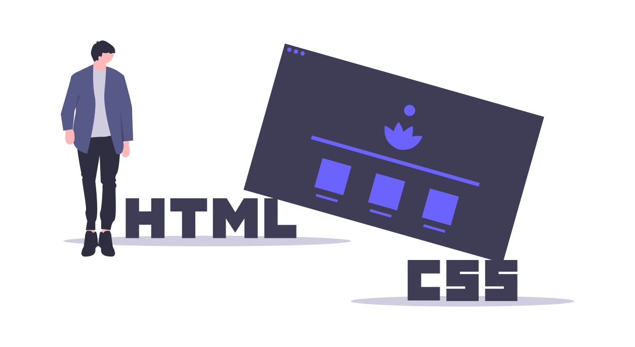
CSS is a very special language. You think CSS can only be used to control the structure and style of web pages, but as long as you have rich imagination, you can create unlimited possibilities.
In this article, senior brother has selected 10 cool text effects implemented with pure CSS for you. After enjoying them, you must realize them and experience them yourself~
1, Gradient text effect
This effect mainly uses background clip: text with color to realize the gradual text effect
First, learn about background clip: text; The text in the box is used as the cutting area to cut out, and the areas outside the text will be cut out.
- Set gradient background for text container
background: linear-gradient(90deg, black 0%, white 50%, black 100%);
- Set the WebKit background clip property to clip the text outward as the clipping region
-webkit-background-clip: text;
        background-clip: text;
- This can be achieved by animating the - WebKit animation property
-webkit-animation: shining 3s linear infinite;
        animation: shining 3s linear infinite;
2, Rainbow text effect (running lantern)
.text {
	letter-spacing: 0.2rem;
	font-size: 1.5rem;
	background-image: -webkit-linear-gradient(left, #147B96, #E6D205 25%, #147B96 50%, #E6D205 75%, #147B96);
	-webkit-text-fill-color: transparent;
	-webkit-background-clip: text;
	-webkit-background-size: 200% 100%;
}
This effect is also realized by using background clip: text and linear gradient attribute. The effect of rainbow text is realized by setting the regional color value.
The - WebKit animation property needs to be set for dynamic rainbow text
-webkit-animation: maskedAnimation 4s infinite linear;

@keyframes maskedAnimation {
	0% {
		background-position: 0 0;
	}

	100% {
		background-position: -100% 0;
	}
}
3, Luminous text effect
This effect is mainly realized by using the text shadow attribute. The text shadow property adds one or more shadows to the text. This attribute is a comma separated list of shadows, each specified by two or three length values and an optional color value.
.neon {
	color: #cce7f8;
	font-size: 2.5rem;
	-webkit-animation: shining 0.5s alternate infinite;
	animation: shining 0.5s alternate infinite;
}
@-webkit-keyframes shining {
	from {
		text-shadow: 0 0 10px lightblue, 0 0 20px lightblue, 0 0 30px lightblue, 0 0 40px skyblue, 0 0 50px skyblue, 0 0 60px skyblue;
	}

	to {
		text-shadow: 0 0 5px lightblue, 0 0 10px lightblue, 0 0 15px lightblue, 0 0 20px skyblue, 0 0 25px skyblue, 0 0 30px skyblue;
	}
}
4, Typewriter effect
This effect is mainly achieved by changing the width of the container.
.typing {
	color: white;
	font-size: 2em;
	width: 21em;
	height: 1.5em;
	border-right: 1px solid transparent;
	animation: typing 2s steps(42, end), blink-caret .75s step-end infinite;
	font-family: Consolas, Monaco;
	word-break: break-all;
	overflow: hidden;
}
/* Print effect */
@keyframes typing {
	from {
		width: 0;
	}

	to {
		width: 21em;
	}
}

/* cursor */
@keyframes blink-caret {

	from,
	to {
		border-color: transparent;
	}

	50% {
		border-color: currentColor;
	}
}
White space: nowrap attribute is mainly used to ensure one line display. Considering the display of English letters, this attribute is removed to ensure that there will be no character interruption.
Word break: break all enables English characters to be presented one by one.
The steps function in the animation property allows the animation to be executed intermittently rather than continuously.
steps() syntax: steps(number, position), where number keyword indicates how many segments the animation is divided into
; position keyword indicates whether the animation is continuous from the beginning or end of the time period. start and end keywords are supported, with the meanings as follows:
- Start: indicates direct start
- End: indicates an abrupt end, which is the default value
The cursor effect is realized through box shadow simulation.
Through these properties, you can achieve a simple typewriter effect~
5, Fault style text effect
The animation effect is complex, mainly using CSS pseudo elements, element custom attributes, mask attributes, animation animation and so on.
<div class="text" data-text="Welcome to WeChat official account.">
  Welcome to WeChat official account.
</div>
Here, the user-defined attribute, data - plus the user-defined attribute name, is used to assign the text to be displayed for the pseudo element to obtain the corresponding text.
@keyframes animation-before{
    0% {
        clip-path: inset(0 0 0 0);
    }
    ...
    100% {
        clip-path: inset(.62em 0 .29em 0);
    }
}

@keyframes animation-after{
      0% {
        clip-path: inset(0 0 0 0);
    }
    ...
    100% {
        clip-path: inset(.29em 0 .62em 0);
    }
}
Two keyframes are set here: animation before and animation after. The former is for the pseudo element before and the latter is for the pseudo element after.
The clip path attribute is the new attribute mask of CSS3. The inset() value indicates that the mask shape is rectangular. After defining the action area of the mask, set the frame by frame animation through @ keyframes to make the action area of the mask change all the time in the vertical direction and realize the effect of shaking up and down.
.text::before{
    content: attr(data-text);
    position: absolute;
    left: -2px;
    width: 100%;
    background: black;
    text-shadow:2px 0 red;
    animation: animation-before 3s infinite linear alternate-reverse;
}
.text::after{
    content: attr(data-text);
    position: absolute;
    left: 2px;
    width: 100%;
    background: black;
    text-shadow: -2px 0 blue;
    animation: animation-after 3s infinite linear alternate-reverse;
}
Finally, we set two pseudo elements before and after, respectively locate them at the same position as the parent element, and then move a little distance to the left and right respectively to create a misplaced effect. Then, we set the background color to the same color as the background color of the parent element to block the parent element
In this way, a perfect fault style text display animation can be realized~
The cool effects can add different styles to our web pages. The source code of this article has been uploaded to Github, and the official account can be recovered by text effect. Come and learn with us.
When you enter the front door, you are a family
It's not easy to be original. Praising, leaving messages and sharing are the driving force for senior brother to write!