1. rem Foundation
rem unit
rem (root em) is a relative unit, similar to em. EM is the font size of the parent element, and the benchmark of rem is the font size of the html element.
For example, if the root element (html) is set to font size = 12px and the non root element is set to width:2rem, then changing to PX means 24px.
/* The root html is 12px */
html {
   font-size: 12px;
}
/* At this time, the font size of div is 24px */
div {
    font-size: 2rem;
}
The advantage of rem: the text size of the parent element may not be the same, but the whole page has only one html, which can control the element size of the whole page well.
2. Media query
2.1 what is media query
Media Query is a new syntax of CSS3.
- Using @ media query, you can define different styles for different media types
- @media can set different styles for different screen sizes
- When you reset the browser size, the page will also re render based on the width and height of the browser
- At present, many apple phones, Android phones, tablets and other devices are used to get media queries
2.2 media query syntax specification
- Start with @ media notice the @ sign
- mediatype media type
- Keyword and not only
- media feature media features must be enclosed in parentheses
/* Grammatical format */
@media mediatype and|not|only (media feature) {
    CSS-Code;
}
2.2.1 media type query type
Dividing different terminal devices into different types is called media type
| value | Explain |
|---|---|
| all | All equipment |
| Printer or print preview | |
| screen | Screen of computer, tablet and Smartphone |
2.2.2 keywords
Keyword to connect media types or multiple media properties together as a condition for media queries.
- And: multiple media features can be connected together, which means "and".
- not: to exclude a media type is equivalent to "non", which can be omitted.
- only: specifies a specific media type, which can be omitted.
2.2.3 media characteristics
Each media type has its own specific characteristics. Different display styles are set according to the media characteristics of different media types. Let's know three.
Notice that they need brackets
| value | Explain |
|---|---|
| width | Width of visible area in output device |
| min-width | Minimum visible area width in output device |
| max-width | Maximum visible area width in output device |
<!-- Example -->
<!DOCTYPE html>
<html lang="en">
<head>
    <meta charset="UTF-8">
    <meta name="viewport" content="width=device-width, initial-scale=1.0">
    <meta http-equiv="X-UA-Compatible" content="ie=edge">
    <title>Document</title>
    <style>
    /* Default style */
    div{
        background: orange;
        width: 400px;
        height: 400px;
    }

    /* For the display screen, and its maximum width is 1000px (that is, when the screen width is less than 1000px) */
    @media screen and (max-width: 1000px) {
        /* Here is the style set when the conditions are met */
        div{
            background: red;
            width: 300px;
            height: 300px;
        }
    }

    /* For the display screen, that is, when the screen width is greater than 501px and less than 800px */
    @media screen and (min-width: 501px) and (max-width: 800px) {
        /* Here is the style set when the conditions are met */
        div{
            background: green;
            width: 200px;
            height: 200px;
        }
    }

    /* For the display screen, and its maximum width is 500px (that is, when the screen width is less than 500px) */
    @media screen and (max-width: 500px) {
        /* Here is the style set when the conditions are met */
        div{
            background: blue;
            width: 100px;
            height: 100px;
        }
    }
    </style>
</head>
<body>
    <div></div>
</body>
</html>
2.2.4 media query writing rules
Note: in order to prevent confusion, media queries should be written from small to large or from large to small. For example, from small to large, you can plan as follows: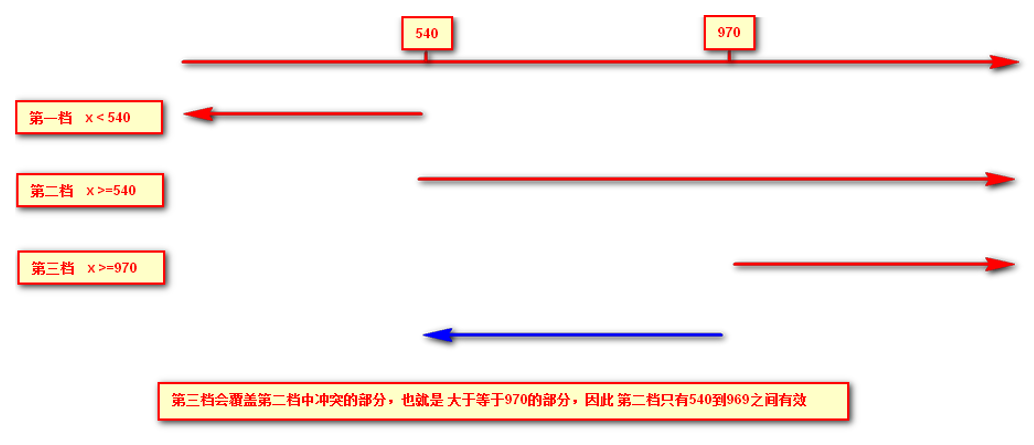
2.2.5 introduction resources of another writing method of media query
<!DOCTYPE html>
<html lang="en">
<head>
    <meta charset="UTF-8">
    <meta name="viewport" content="width=device-width, initial-scale=1.0">
    <meta http-equiv="X-UA-Compatible" content="ie=edge">
    <!-- When the screen width is greater than or equal to 800 px When it's time to introduce big.css -->
    <link rel="stylesheet" href="./big.css" media="screen and (min-width: 800px)">
    <!-- When the screen width is less than or equal to 800 px When it's time to introduce small.css -->
    <link rel="stylesheet" href="./small.css" media="screen and (max-width: 800px)">
    <title>Document</title>
</head>
<body>
    <div>I love my motherland.</div>
    <div>I am the flower of our country</div>
</body>
</html>
/* big.css */
div{
    height: 400px;
    width: 50%;
    float: left;
}

div:nth-child(1){
    background: red;
}

div:nth-child(2){
    background: orange;
}
/* small.css */
div{
    height: 400px;
    width: 100%;
    float: left;
}

div:nth-child(1){
    background: red;
}

div:nth-child(2){
    background: orange;
}
2.3 media query + rem
With media query and rem, we can make more flexible automatic pages, including text size.
<!--Font and height vary with screen width-->
<!DOCTYPE html>
<html lang="en">
<head>
    <meta charset="UTF-8">
    <meta name="viewport" content="width=device-width, initial-scale=1.0">
    <meta http-equiv="X-UA-Compatible" content="ie=edge">
    <title>Document</title>
    <style>

    @media screen and (min-width: 801px) {
        html{
            font-size: 50px;
        }
    }

    @media screen and (min-width: 501px) and (max-width: 800px) {
        html{
            font-size: 30px;
        }
    }

    @media screen and (max-width: 500px) {
        html{
            font-size: 20px;
        }
    }

    div{
        font-size: 0.5rem;
        height: 1rem;
        width: 100%;
        background-color: blueviolet;
        color: snow;
        line-height: 1rem;
    }
    </style>
</head>
<body>
    <div>I'm so handsome!</div>
</body>
</html>
3. Introduction to less
3.1 disadvantages of CSS
CSS is a Nonprogramming language, which has no concept of variable, function, SCOPE, etc.
- CSS needs to write a large number of seemingly illogical code, CSS redundancy is relatively high.
- It is not convenient to modify, maintain and expand, and is not conducive to reuse.
- CSS does not have good computing power
- For non front-end engineers, it is often difficult to write well-organized and easy to maintain CSS code projects due to lack of CSS writing experience.
3.2 introduction to less
Less (short for LeanerStyle Sheets) is a CSS extension language and also a CSS preprocessor.
As a formal extension of CSS, it does not reduce the function of CSS, but adds some programming language features to the existing CSS syntax. For example, it introduces variables, mixins, operations, functions and other functions, which greatly simplifies the preparation of CSS, and reduces the maintenance cost of CSS. As its name says, less allows us to do more with less code. Less Chinese website: http://lesscss.cn/
Of course, in addition to Less, CSS common preprocessor also Sass, Stylus and so on.
3.3 Less installation (temporarily selected)
① Install node.js at: http://nodejs.cn/download/
② Check whether the installation is successful. Use cmd command (win10 is window+r to open and run input cmd) - enter "node – v" to view the version
③ Based on nodejs to install Less online, use cmd command "npm install -g less"
④ Check whether the installation is successful. Use the cmd command "lessc -v" to view the version
3.4 use of less
3.4.1 preparation of Less documents
Create a new file, and you can name it according to your own needs, but the file suffix is. Less, for example: test.less.
3.4.2 variable
Variable refers to the quantity whose value can be changed at will, that is to say, the value is not fixed.
//Declaration rules of variables
 @Variable name: value;
- Must have @ as prefix
- Cannot contain special characters
- Cannot start with a number
- Case sensitive
// Define color variables
@color1: grey;
@color2: red;
@font14: 14px;
@font20: 20px;

.c1{
    // Use color variables
    color: @color1;
    background: @color2;
    font-size: @font14;
}

.c2{
    color: @color2;
    background: @color1;
    font-size: @font20;
}
3.4.3 Less compilation
The less file we wrote can't be directly used by our html page. We need to compile and generate css file before using it. There are many ways to compile the less file. At present, we can use the easy less plug-in of vscode to compile it.
Install easy less plug-in for vscode
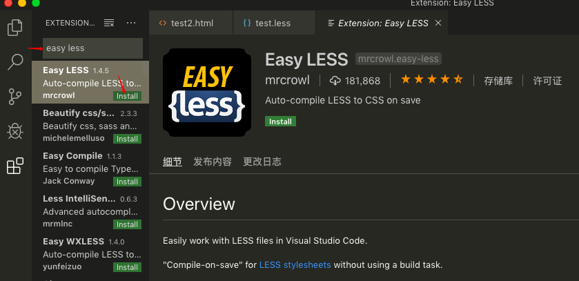
After the easy less plug-in is installed (some versions of vscode need to be restarted), as long as we save the Less file we wrote, a CSS file with the same name will be automatically generated in the same level directory.
3.4.5 Less nesting
<!DOCTYPE html>
<html lang="en">
<head>
    <meta charset="UTF-8">
    <meta name="viewport" content="width=device-width, initial-scale=1.0">
    <meta http-equiv="X-UA-Compatible" content="ie=edge">
    <link rel="stylesheet" href="./test.css">
    <title>Document</title>
</head>
<body>
    <header>
        <div class="content">
            <a href="">China</a>
            <a href="">Henan</a>
            <a href="">Zhengzhou</a>
            <a href="" class="address">Beat corn/a>
        </div>
    </header>
</body>
</html>
// test.less
header{
    height: 50px;
    background: red;
    // Lower level can be nested directly
    .content{
        height: 30px;
        background: green;
        // Lower level can be nested directly
        a{
            color: orange;
            font-size: 14px;
            // Pseudo class needs to be preceded with a & sign
            &:hover{
                color: chartreuse;
            }
            // Pseudo elements also need to be preceded by a & sign
            &::after{
                content: 'I'm so handsome';
            }
            // Intersection should also be preceded by a sign
            &.address{
                text-decoration: none;
            }
        }
    }
}
/* Compile the generated test.css */
header {
  height: 50px;
  background: red;
}
header .content {
  height: 30px;
  background: green;
}
header .content a {
  color: orange;
  font-size: 14px;
}
header .content a:hover {
  color: chartreuse;
}
header .content a::after {
  content: 'Scholar';
}
header .content a.address {
  text-decoration: none;
}
3.4.6 Less operation
Any number, color, or variable can participate in the operation. That is, Less provides the arithmetic operations of plus (+), minus (-), multiplication (*), division (/).
// test.less
/* There are also files generated by this annotation compilation */
// This comment does not exist in the compiled file

@border: 10px + 5;
div {
    height: 300px * 1.5;
    width: 300px / 2;
    border: @border solid red;
    // It can also run more complex operations
    border-radius: (@border - 5) * 2;


    // Since the first four ffff s have been converted to the decimal system to 255 respectively, the addition will overflow,
    // So even if you add 20, it's still 255, so it's still ffff
    // Calculation method of the last two digits:
    // Hex to decimal 60 = 6 * 16 + 0 = 96
    // Using decimal 96 + 20 = 116
    // If the result after operation is converted to hexadecimal 116 / 16 and the result is more than 7, then the result of operation is 74
    // So the final result of ffff60 + 20 should be: ffff74
    color: #ffff60 + 20;

    // 40 + 20 = 60 converted to hex 60 / 16 equals to more than 3 12, so the result is 3c
    // 50 + 20 = 70 converted to hexadecimal 70 / 16 equals 4 more than 6, so the result is 46
    // 60 + 20 = 80 converted to hexadecimal 80 / 16 is equal to 5 more than 0, so the result is 50
    // Therefore, the result should be ා 3c4650
    color: rgb(40, 50, 60) + 20;

}
- There is a space between operators, such as 10px + 5
- For the operation between values of two different units, the value of the operation result is the unit of the first value
- If only one value between two values has a unit, the operation result will take that unit
3.4.7 importing external files
We know that in css, we can import other styles, such as:
/* index.css */

/*
Use @ import + style path to import other styles here
 Be careful:
	1. You must use @ import at the beginning of css
	2. There must be a semicolon at the end
*/
@import "./common.css";
/* Both are correct */
@import url("./common.css");

div:nth-child(1){
    width: 100px;
    height: 100px;
    background-color: aqua;
}
/* common.css */
div:nth-child(2){
    width: 100px;
    height: 100px;
    background-color: darkmagenta;
}
In fact, in less, it can be directly handled according to the writing method of css, but it also has a similar usage, which is slightly different from the original css:
// index.less
// You don't need a suffix here
// In fact, it is equivalent to copying the content of the file to be imported
@import "./common";

div:nth-child(1){
    width: 100px;
    height: 100px;
    background-color: aqua;
}
// common.less
div:nth-child(2){
    width: 100px;
    height: 100px;
    background-color: darkmagenta;
}
4. rem adaptation scheme
Purpose and Thinking:
- The purpose is to make all kinds of display screen sizes display well, and at the same time, it can achieve full scaling with equal proportion as far as possible
- Multiple design drafts can be designed for different screen width (or only one standard draft can be adopted, but a little display effect may be sacrificed for extreme screen, but basically nothing, other design drafts can be directly scaled according to the standard draft)
- Use rem as a unit for each design document to achieve equal scaling within a size range
- Use media query to switch between design drafts
- All in all: use media query to set the font size of html according to the scale of different devices, and then use rem as the size unit of page elements. When the font size of html changes, the element size will also change, so as to achieve the adaptation of proportional scaling.
Specific to the realization scheme at the technical level:
- less + rem + media query
- flexible.js + rem
4.1 less + rem + media query scheme
① Suppose the design draft is 750px
② Suppose we divide the whole screen into 15 equal parts (the standard can be either 20 or 10 equal parts)
③ Each copy as html font size, here is 50px
④ So in a 320px device, a font size of 320 / 15 is 21.33px
⑤ Divide the size of our page elements by the size of different html fonts, and you will find that their proportions are the same
⑥ For example, we use 750 as the standard design draft
⑦ A 100100 pixel page element on a 750 screen, that is, 100 / 50 to REM is 2rem2rem and the ratio is 1 to 1
⑧ 320 screen, when the html font size is 21.33, 2rem = 42.66px, the width and height are 42.66, but the ratio of width and height is 1:1
⑨ But it has been able to achieve the effect of equal scaling of page element box under different screens
Conclusion:
① The final formula: rem value of page element = page element value (px) / (screen width / number of partitions)
② Screen width / number of copies divided is the font size of html
③ Or: rem value of page element = page element value (px) / font size font size of html
Case: Suning Homepage
Suning mobile home address: http://m.suning.com
1. Technology selection
Scheme: we take the scheme of making mobile page independently
Technology: the layout adopts rem adaptive layout (less + rem + media query)
Design drawing: the design drawing adopts 750px design dimension
2. Build document structure
css/
images/
upload/
index.html
3. Label the viewport and bring in the initialization style
<meta name="viewport" content="width=device-width, user-scalable=no, initial-scale=1.0, maximum-scale=1.0, minimum-scale=1.0">

<link rel="stylesheet" href="css/normalize.css">
4. Set public common.less file
- New common.less is mainly used to set the most common screen size, and use media query to set different html font size, because in addition to the front page, other pages also need to be processed for different screen width.
- We are interested in 320px, 360px, 375px, 384px, 400px, 414px, 424px, 480px, 540px, 720px, 750px
- The number of shares divided is 15
- Because our pc can also open our Suning mobile home page, we default the html font size to 50px, note that this sentence is written on the top
// common.less
// For the effect of width other than the width set below, it must be written to the top, otherwise it will cover other effects, and the media query effect will be invalid
html {
    font-size: 50px;
}
// The number of divisions we defined this time is 15
@no: 15;
// 320
@media screen and (min-width: 320px) {
    html {
        font-size: 320px / @no;
    }
}
// 360
@media screen and (min-width: 360px) {
    html {
        font-size: 360px / @no;
    }
}
// 375 iphone 678
@media screen and (min-width: 375px) {
    html {
        font-size: 375px / @no;
    }
}

// 384
@media screen and (min-width: 384px) {
    html {
        font-size: 384px / @no;
    }
}

// 400
@media screen and (min-width: 400px) {
    html {
        font-size: 400px / @no;
    }
}
// 414
@media screen and (min-width: 414px) {
    html {
        font-size: 414px / @no;
    }
}
// 424
@media screen and (min-width: 424px) {
    html {
        font-size: 424px / @no;
    }
}

// 480
@media screen and (min-width: 480px) {
    html {
        font-size: 480px / @no;
    }
}

// 540
@media screen and (min-width: 540px) {
    html {
        font-size: 540px / @no;
    }
}
// 720
@media screen and (min-width: 720px) {
    html {
        font-size: 720px / @no;
    }
}

// 750
@media screen and (min-width: 750px) {
    html {
        font-size: 750px / @no;
    }
}
4.2 flexible.js + rem scheme
This is a simple and efficient mobile terminal scalable adaptation library developed by the mobile Taobao team. With it, we no longer need to write media queries on different screens, because js handles it.
Its principle is to divide the current equipment into 10 equal parts, but the proportion is the same under different equipment.
What we need to do is to determine the html text size of our current device. For example, the current design draft is 750px, so we only need to set the html text size to 75px(750px / 10).
Calculation method of rem value of page element in: px value of page element / 75
github address: https://github.com/amfe/lib-flexible After downloading, just import index.js or index.min.js into our project. Others have this file to help us deal with it automatically.
Note: this project was originally called: lib flexible, because there is a problem, now it is called amfe flexible
Conclusion:
Because flexible divides the screen into 10 equal parts by default, but when the screen is larger than 750, you don't want to reset the html font anymore, so you need to set it through the media query by yourself, and you need to raise the weight to the highest.
@media screen and (min-width: 750px) {
    html {
        font-size: 75px!important;
    }
}
Attachment:
VSCode plug-in cssrem can automatically convert our pixel units to rem units. However, cssrem references HTML {font size: 16px} for conversion, so it needs to be configured according to its own actual situation.
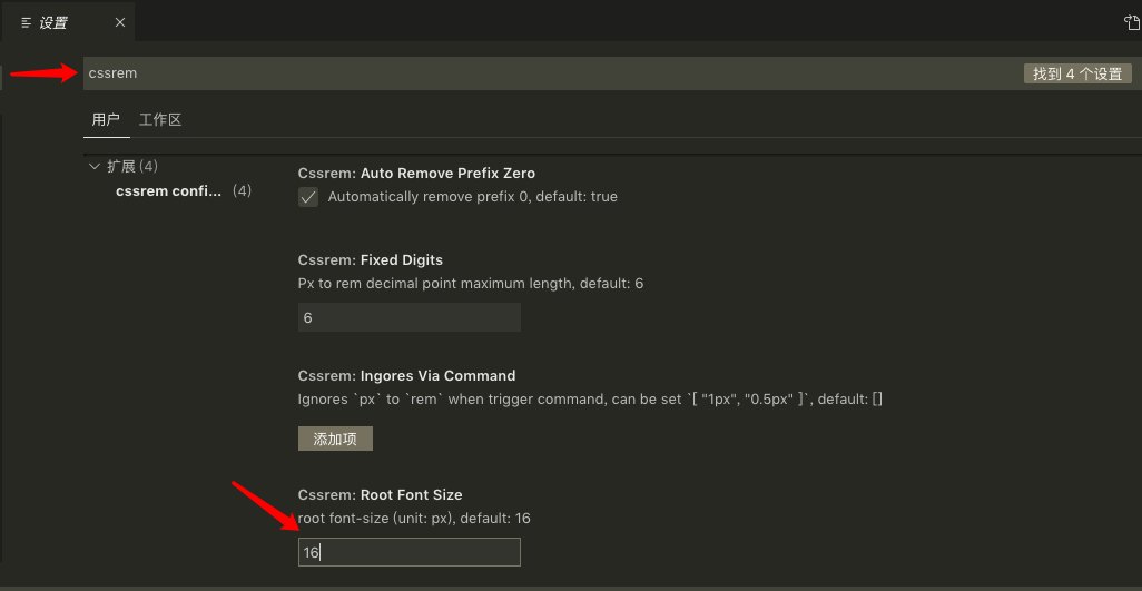
Just modify according to our own requirements. Restart vs code after modification.

