I. Basic Concepts (composition)
- matplotlib consists of three layers: scripting, artist and backend
- In the whole matplotlib, all the elements that can be seen in the graph belong to Artist object, that is, all the elements composed of title, axis label, scale, etc. are instances of Artist object
(1) if Artist is compared to drawing, Figure is equivalent to drawing board, axes is equivalent to drawing white paper, axis is equivalent to drawing coordinate system on white paper
Therefore, it can be said that a canvas (figure) can have multiple axes (coordinate system), and a coordinate system can have multiple axes (coordinate axis), including two 2D coordinate systems and three 3D coordinate systems
(2) a plot is actually a special case (subset) of axes, that is, to draw more axes (coordinate system) on a canvas, and then reduce it to a specific location, that is, a plot. It is equivalent to a graph in MATLAB that has several coordinate systems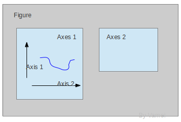
II. Introduction application
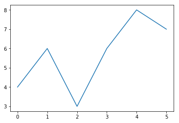
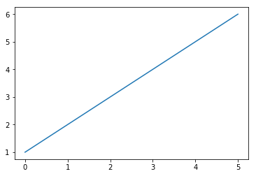
1. Draw a line
import matplotlib.pyplot as plt
# When there is only one list of parameters in plot, the numbers in the list represent the ordinate, and the abscissa starts from 0
plt.plot([4, 6, 3, 6, 8, 7])
plt.show()
import matplotlib.pyplot as plt
# When there are two lists of parameters in plot, the first group represents abscissa and the second group represents ordinate
plt.plot([0, 1, 2, 3, 4, 5, ], [1, 2, 3, 4, 5, 6])
plt.show()
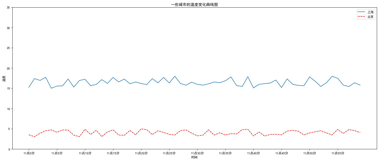
2. Simple application: draw temperature change line chart
import matplotlib.pyplot as plt
import random

# figsize is to set the picture size, dpi is to set the picture transparency, the larger the number, the higher the transparency
plt.figure(figsize=(20, 8), dpi=80)

# Code Chinese display problem. Input these two lines of code to make the Chinese in the figure display normally
plt.rcParams['font.sans-serif']=['SimHei']
plt.rcParams['axes.unicode_minus']=False

# Prepare the data of x, y coordinates
x = range(60)  # Abscissa
# Shanghai weather ordinate
y_shanghai = [random.uniform(15, 18) for i in x]
# Beijing weather ordinate
y_beijing = [random.uniform(3, 5) for i in x]
# Abscissa time data
x_ch = ["11 spot{}branch".format(i) for i in x]
# Ordinate data
y_ticks = range(40)

# Shanghai line drawing
plt.plot(x, y_shanghai, label='Shanghai')
# Beijing line drawing (x for X axis, y for Y axis, color for line color, linestyle for line style, label for binding label 'Beijing')
plt.plot(x, y_beijing, color='r', linestyle='--', label='Beijing')

# Display scale, interval (step)
plt.xticks(x[::5], x_ch[::5])  # Abscissa step interval 5
plt.yticks(y_ticks[::5])  # Abscissa step interval 5

# Various attributes of a graph
plt.xlabel("time")  # Abscissa attribute
plt.ylabel("temperature")  # Ordinate properties
plt.title("Temperature curve of some cities")  # Axis title

# Add notes to the picture (mark in the upper right corner of the picture)
plt.legend(loc="best")

# Save the picture (my picture location is: C:\Users\admin)
plt.savefig("matplotlib.png")

# display
plt.show()
The operation results are as follows: