Taro Design
A simple, easy-to-use, easy to expand and integrate mobile page editor
characteristic
- Publishing to npm market can easily integrate it into your project.
- You can easily write a component to run in this editor, or simply modify your existing component to run in the editor.
- The edited data supports applet, H5 and React Native at the same time, and needs to be used in Taro3 projects.
- The component style follows the Flex layout based on React Native style and can be used by designers and developers at the same time.
- After exporting to React components, you can continue secondary development.
- The template market provides you with the function of storing and using templates. You can quickly create pages through public templates, or you can create templates according to your own needs.
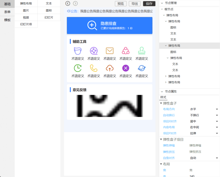
Operating principle
The edited data is run and stored in json. The following example embeds a text component in the json of a view component.
[
  {
    "child": [
      {
        "style": {},
        "text": "Text content",
        "nodeName": "text",
        "key": "2e0l1-19tg00",
        "child": []
      }
    ],
    "style": {},
    "nodeName": "view",
    "key": "2e0l1VzIiw00"
  }
]
The corresponding JSX code is as follows. These components are not native Taro components and are encapsulated. Therefore, you can see that the text of the following text component is not like this: < text > text content < text >, but assigns the text content to its text attribute, and the structure of other components is roughly the same.
<View>
  <Text text='Text content' />
</View>
Online experience
Click to go to the online address
The online template does not open the registered account and management function. Please use the account password below to experience.
- User name: admin
- Password: 123456
GitHub address: https://github.com/ShaoGongBra/taro-design
Shortcut key support
ctrl + z undo operation
ctrl + shift + z resume operation
ctrl + c copy node
ctrl + v paste node
Delete delete node
Basic Usage
yarn add taro-design
- If you do not have the following components in your dependency library, please add them
yarn add classnames
- Add configuration
  h5: {
    esnextModules: [
      'taro-design'
    ]
}- Editor usage example
import React from 'react'
import { Design } from 'taro-design/design'
import { TopView } from 'taro-design'


export default () => {
  return <TopView>
    <Design
      // Default data node
      defaultNodes={[]}
      // When the event triggered during editing occurs, you can return a Promise object, which will display a loading that is being saved
      onChange={nodes => {}}
      // The event triggered when you click the Save button. The Save button will appear only when you configure this option. You can return a Promise object and a saving loading will be displayed
      onSave={nodes => {}}
      // Open template is enabled by default
      templateOpen
      // Enable export: on by default
      exportOpen
      // You can also control the style applied to the outermost layer through. Taro design
      style={{ }}
    />
  </TopView>
}- Rendering mode usage example
import React from 'react'
import { TopView, Create } from 'taro-design'

export default () => {
  return <TopView>
    <Create nodes={[]} />
  </TopView>
}- Global style
In order to keep the style consistent with the rn side, you need to add the following styles to your global style code.
The following global styles may cause confusion in your existing project styles. You need to debug yourself temporarily. It is recommended to use them in new projects.
/*postcss-pxtransform rn eject enable*/
view,
page,
.taro_page,
taro-view-core {
  display: flex;
  flex-direction: column;
  position: relative;
  border-style: solid;
  border-width: 0;
}
input,
textarea,
taro-view-core,
view {
  box-sizing: border-box;
}
taro-view-core,
taro-text-core {
  line-height: 1;
}
taro-text-core {
  font-size: 28px;
  color: #333;
}
.taro_page taro-image-core {
  width: auto;
  height: auto;
}
.taro_page .taro-video-container {
  position: relative;
}
/*postcss-pxtransform rn eject disable*/
Because of the style coverage problem, you need to insert the following style after the body of your index.html
taro-view-core {
  display: flex;
  flex-direction: column;
}
Export to another project to run
Taro H5 uses the js code fragment in index.html to control the transformation of the basic value of rem unit. If you do not have this control in the back end, you can set the designWidth in config configuration to 375 and then package it (this value is 750 by default).
You may need to upgrade Taro3 to a newer version, which does not fully support this configuration.
designWidth: 375
More usage
Run your own components in taro design
You can simply develop a component and run it through the registration function provided by taro design, including editor and runtime.
Custom icon library
The built-in Icon Library of the system contains some common icons Click the View icon , if you need to add a new icon library, see this.
Basic components
Some common components are exported. You can import them into your project
import { TopView, PullView, Modal, Icon, Button, Loading, ScrollView, KeyboardAvoiding } from 'taro-design'Basic function
The project references the dependency taro tools, which integrates several common functions, including request, date, color, object, string, form verification, event system, etc. you can directly import them into your project.
import { request, searchQuick, setRequestConfig, dateToStr, dateDiff, colorToRgb, deepCopy, verify, event, ... } from 'taro-tools'