1 Collapsing Toolbar Layout layout
Collapsing Toolbar Layout is based on the layout of Toolbar. It can make the effect of Toolbar more gorgeous.
** Note: ** Collapsing ToolbarLayout can only be used as a direct sublayout of AppBarLayout.
Now let's create an empty activity to show the details of the cat:
Then we write the interface layout in activity_cat.xml, which is divided into two parts, one is the title bar, the other is the content:
<?xml version="1.0" encoding="utf-8"?>
<android.support.design.widget.CoordinatorLayout xmlns:android="http://schemas.android.com/apk/res/android"
    xmlns:material="http://schemas.android.com/apk/res-auto"
    android:layout_width="match_parent"
    android:layout_height="match_parent">

    <!--Title bar layout-->
    <android.support.design.widget.AppBarLayout
        android:id="@+id/app_bar_layout"
        android:layout_width="match_parent"
        android:layout_height="250dp">

        <android.support.design.widget.CollapsingToolbarLayout
            android:id="@+id/collapsing_toolbar_layout"
            android:layout_width="match_parent"
            android:layout_height="match_parent"
            android:theme="@style/ThemeOverlay.AppCompat.Dark.ActionBar"
            material:contentScrim="?attr/colorPrimary"
            material:layout_scrollFlags="scroll|exitUntilCollapsed">

            <ImageView
                android:id="@+id/cat_image_view"
                android:layout_width="match_parent"
                android:layout_height="match_parent"
                android:scaleType="centerCrop"
                material:layout_collapseMode="parallax" />

            <android.support.v7.widget.Toolbar
                android:id="@+id/toolbar"
                android:layout_width="match_parent"
                android:layout_height="?attr/actionBarSize"
                material:layout_collapseMode="pin" />

        </android.support.design.widget.CollapsingToolbarLayout>
    </android.support.design.widget.AppBarLayout>

    <!--Content layout-->
    <android.support.v4.widget.NestedScrollView
        android:layout_width="match_parent"
        android:layout_height="match_parent"
        material:layout_behavior="@string/appbar_scrolling_view_behavior">

        <LinearLayout
            android:layout_width="match_parent"
            android:layout_height="wrap_content"
            android:orientation="vertical">

            <android.support.v7.widget.CardView
                android:layout_width="match_parent"
                android:layout_height="wrap_content"
                android:layout_marginBottom="15dp"
                android:layout_marginLeft="15dp"
                android:layout_marginRight="15dp"
                android:layout_marginTop="35dp"
                material:cardCornerRadius="4dp">

                <TextView
                    android:id="@+id/cat_text_view"
                    android:layout_width="wrap_content"
                    android:layout_height="wrap_content"
                    android:layout_margin="10dp" />
            </android.support.v7.widget.CardView>

        </LinearLayout>

    </android.support.v4.widget.NestedScrollView>

    <!--Suspension buttons for comments-->
    <android.support.design.widget.FloatingActionButton
        android:layout_width="wrap_content"
        android:layout_height="wrap_content"
        android:layout_margin="16dp"
        android:src="@drawable/comment"
        material:layout_anchor="@id/app_bar_layout"
        material:layout_anchorGravity="bottom|end" />
</android.support.design.widget.CoordinatorLayout>
- The overall layout uses Coordinator Layout.
- xmlns:material="http://schemas.android.com/apk/res-auto" namespace is defined.
Title bar layout:
- The title bar layout uses AppBarLayout, and the Collapsing Toolbar Layout is nested in the inner layer.
- contentScrim in Collapsing Toolbar Layout specifies the background color when the title bar tends to fold and fold; scroll in layout_scroll Flags indicates that Collapsing Toolbar Layout scrolls as the content scrolls; and exitUntil Collapsed in layout_scroll Flags indicates that folding will remain in the interface (will not be removed from the screen).
- In Collapsing Toolbar Layout, ImageView and Toolbar are defined. That is to say, the title bar is composed of ordinary title bar and pictures. There is a layout_collapseMode attribute that sets the collapse mode. Pin means to use hold during folding, as if held by a pin; parallax means parallax occurs during folding.
Content Layout:
- The outer layer uses NestedScrollView, which not only supports scrolling to view data off the screen, but also nests responses to scrolling events. We also specify layout behavior by layout_behavior.
- Because NestedScrollView only allows for a direct sub-layout, we can nest a LinearLayout first and then put more content inside it.
- TextView is used here to display the content and then put it into CardView.
- We set the outer margin and rounded corners for CardView. All this work is to make the page look better.
Finally, we added a Floating Action Button:
- First, put the button picture png under the drawable folder.
- The anchor is set by layout_anchor, so that the suspension button appears in the title bar area.
- Make the button appear in the lower right corner of the title bar area by layout_anchorGravity.
2 activity category
public class CatActivity extends AppCompatActivity {


    /**
     * Cat name
     */
    public static final String CAT_NAME = "cat_name";

    /**
     * Cat pictures ID
     */
    public static final String CAT_IMAGE_ID = "cat_image_id";


    @Override
    protected void onCreate(Bundle savedInstanceState) {
        super.onCreate(savedInstanceState);
        setContentView(R.layout.activity_cat);

        Toolbar toolbar = (Toolbar) findViewById(R.id.toolbar);
        setSupportActionBar(toolbar);
        ActionBar actionBar = getSupportActionBar();
        if (actionBar != null) {//Enable the HomeAsUp button (return arrow)
            actionBar.setDisplayHomeAsUpEnabled(true);
        }

        Intent intent = getIntent();

        //Set title
        CollapsingToolbarLayout layout = (CollapsingToolbarLayout) findViewById(R.id.collapsing_toolbar_layout);
        String catName = intent.getStringExtra(CAT_NAME);
        layout.setTitle(catName);

        //Set pictures
        int catImageId = intent.getIntExtra(CAT_IMAGE_ID, 0);
        ImageView imageView = (ImageView) findViewById(R.id.cat_image_view);
        Glide.with(this).load(catImageId).into(imageView);//Loading pictures

        //Set contents
        TextView contentView = (TextView) findViewById(R.id.cat_text_view);
        contentView.setText(generateContent(catName));

    }

    /**
     * Generated content
     *
     * @param catName Cat name
     * @return
     */
    private String generateContent(String catName) {
        //In practice, the corresponding content is returned according to the parameter name.
        return "Russian Blue Cat Russian Blue),Historically known as the Archian Blue Cat, it has three different names. Originally the Archian Blue Cat, it did not have its current name until the 1940s, and for some time it was called the Maltese Cat. Evidence shows that the cat is indeed native to Russia, because the same species of cat has been found in the Russian frigid zone. The Russian blue cat has a slender body, large and upright pointed ears, small and round feet, and walks like a toe. Dressed in short silvery-blue coat, with slender body and light gait, it shows the aristocratic demeanor of a school of cats.";
    }

    @Override
    public boolean onOptionsItemSelected(MenuItem item) {
        switch (item.getItemId()){
            case android.R.id.home://When clicking the HomeAsUp button
                finish();//Close the current activity (that is, return to the previous activity)
                return true;
        }
        return super.onOptionsItemSelected(item);
    }
}
- We enabled the Home AsUp button (return arrow) in the title bar to close the current activity.
- The cat type passed in by Collapsing Toolbar Layout is used as the title.
- Then use Glide to load the image.
- Then set the content.
- Finally, the click event of the Home AsUp button is processed in onOptions Item Selected.
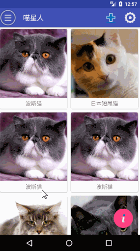
Now we have to deal with the click event of RecyclerView on the homepage activity. When we click on a cat, we open its details activity page:
public class CatAdapter extends RecyclerView.Adapter<CatAdapter.ViewHolder> {

    private Context context;

    private List<Cat> cats = new ArrayList<>();

    public CatAdapter(List<Cat> cats) {
        this.cats = cats;
    }

    @Override
    public ViewHolder onCreateViewHolder(ViewGroup parent, int viewType) {
        if (context == null) {//Setting up context environment
            context = parent.getContext();
        }
        View view = LayoutInflater.from(context).inflate(R.layout.cat_item, parent, false);

        //Handling RecyclerView Click Events
        final ViewHolder holder = new ViewHolder(view);
        holder.cardView.setOnClickListener(new View.OnClickListener() {
            @Override
            public void onClick(View v) {
                int position = holder.getAdapterPosition();
                Cat cat = cats.get(position);
                Intent intent = new Intent(context, CatActivity.class);
                intent.putExtra(CatActivity.CAT_NAME, cat.getType());
                intent.putExtra(CatActivity.CAT_IMAGE_ID, cat.getImgId());
                context.startActivity(intent);
            }
        });

        return holder;
    }

   ...
}
Operation effect:
3 Fusion System Top Status Bar
Using the fitsSystem Windows property, we can merge the picture in the title bar with the status bar at the top of the system.
Note: Because our ImageView is deeply nested here, we must set it and fitsSystem Windows in its ancestral layout to true in order to really take effect:
<?xml version="1.0" encoding="utf-8"?>
<android.support.design.widget.CoordinatorLayout xmlns:android="http://schemas.android.com/apk/res/android"
   xmlns:material="http://schemas.android.com/apk/res-auto"
   android:layout_width="match_parent"
   android:layout_height="match_parent"
   android:fitsSystemWindows="true"
   >

   <!--Title bar layout-->
   <android.support.design.widget.AppBarLayout
       android:id="@+id/app_bar_layout"
       android:layout_width="match_parent"
       android:layout_height="250dp"
       android:fitsSystemWindows="true"
       >

       <android.support.design.widget.CollapsingToolbarLayout
           android:id="@+id/collapsing_toolbar_layout"
           android:layout_width="match_parent"
           android:layout_height="match_parent"
           android:theme="@style/ThemeOverlay.AppCompat.Dark.ActionBar"
           material:contentScrim="?attr/colorPrimary"
           material:layout_scrollFlags="scroll|exitUntilCollapsed"
           android:fitsSystemWindows="true"
           >

           <ImageView
               android:id="@+id/cat_image_view"
               android:layout_width="match_parent"
               android:layout_height="match_parent"
               android:scaleType="centerCrop"
               material:layout_collapseMode="parallax"
               android:fitsSystemWindows="true"
               />

       ...
       </android.support.design.widget.CollapsingToolbarLayout>
   </android.support.design.widget.AppBarLayout>


...
</android.support.design.widget.CoordinatorLayout>
Then set the color of the status bar to transparent, i.e.
<item name="android:statusBarColor">@android:color/transparent</item>
Because this attribute only appears from API21 (Android 5.0+), we have to do differential implementation.
Create a new values-v21 directory under the res directory, and then create a styles.xml:
<resources>
    <!--Android 5.0+-->
    <style name="catActivityTheme" parent="AppTheme">
        <!--The status bar color is specified as transparent-->
        <item name="android:statusBarColor">@android:color/transparent</item>
    </style>
</resources>
This is designed because only Android 5.0 + reads the file.
We also need to create a new catActivityTheme in values/styles.xml that does not contain the actual content to ensure that the previous version of Android 5.0 does not throw errors:
<!--less than Android 5.0-->
<style name="catActivityTheme" parent="AppTheme">
</style>
Finally, the CatActivity activity in Android Manifest. XML sets the theme just defined:
 <activity android:name=".CatActivity"
            android:theme="@style/catActivityTheme"
            ></activity>
Operation effect: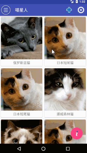
Even today's Liu Haiping can also be adapted very well O()O~