background
Tailwind It is a CSS framework based on atomic / utility first specification. It provides basic tool classes (such as preset classes such as inner margin padding, font text and font, animation transition, etc.), which can be directly combined in script markup language to build the design you want.
The current mainstream UI framework, such as ant design, directly provides ready-made components (such as button, button, form, etc.). Developers can use the components provided by the framework to quickly build pages, but because the styles of components are generally preset and encapsulated in advance, to customize the styles, they need to cover a large number of built-in styles of components.
Tailwind does not provide ready-made components, but provides various general style classes. Developers can directly add various basic classes to HTML tags, set corresponding UI styles for elements, and build the required appearance through the "superposition and combination" of various basic classes, so as to efficiently carry out customized website development. In other words, in tailwind CSS, there are many subclasses representing CSS declarations. When creating components, you only need to reference some of the subclasses to create the components you need.
Semantic CSS | Atomic/Utility-First CSS
Semantic CSS
To make a button style, we usually add a semantic class name to the html or jsx structure, and then write the style of the corresponding class in the css style. For example: make a button button in the style of danger.
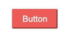
  <div class="box">
    <button class="danger-button">Button</button>
  </div>

.danger-button {
  height: 32px;
  padding: 4px 15px;
  font-size: 14px;
  border-radius: 2px;
  color: #fff;
  border-color: #ff4d4f;
  background: #ff4d4f;
  text-shadow: 0 -1px 0 rgb(0 0 0 / 12%);
  box-shadow: 0 2px #0000000b;
}
The above is the most common and conventional writing method, which is called Semantic CSS (Semantic CSS) specification. Under this standard, we pursue the separation of concerns, let the structure and style perform their respective duties, and make the structure more semantic. However, it also faces many problems:
- Adding a style to the tag requires racking your brains to think about the class name, which should not only be semantic, but also comply with the code specification and its function;
- There are often many style rules in each class. Only when the semantics and styles of the structure are exactly the same can we achieve real reuse. If there are differences, it is difficult to achieve style reuse;
- If we migrate html or jsx structures, we should also migrate the corresponding css at the same time, and the migrated styles may become disordered with the context.
- ......
Atomic/Utility-First CSS
Atomic / utility first css is opposite to Semantic CSS. Utility first css (function class first css) does not put component styles in one class like Semantic CSS, but provides us with a toolbox composed of different function classes. We can mix them and apply them to html elements. In the physical world, atom is the smallest unit of general matter, while in the css world, it follows the only css rule in a class.
Tailwind CSS, similar to Bootstrap, refers to styles through class names. The biggest difference is also the core of tailwind CSS, that is, it is a CSS framework based on atomic / utility first CSS.
Tailwind CSS benefits
Highly customizable:
Tailwind comes with a default configuration. You can override the default configuration by using "tailwind.config.js" in the project. Everything from colors, spacing sizes to fonts can be easily customized using profiles. And each part of the configuration file is optional. You only need to specify what to change. The missing part will use the default configuration of tailwind.
- Reduce the pain of naming class.
- No context switching: Tailwind provides almost everything you need out of the box, and developers no longer need to switch from HTML to CSS hundreds of times.
Responsive design
- Tailwind CSS follows the design pattern of mobile first, and the breakpoint system is very flexible. For example, implementing a media query requires different picture widths according to different screen widths. The traditional wording is as follows:
@media only screen and (max-width:1280px) {
    .content {
         width:196px;
    }
}
@media only screen and (max-width: 760px) {
    .content {
        width:128px;
    }
}
In Tailwind CSS, it is expressed as follows:
<div class="w-16 md:w-32 lg:w-48" src="...">
Use skills
Select numeric labels instead of semantic labels
TailwindCss has good semantics, but using the default naming scheme will greatly increase the memory cost of developers. For example, the font thickness value is defined from thin (100) to black (900).
Using digital tags can reduce the cost of converting the value of UI tools to TailwindCss class. For example, font weight: 600 does not know whether it corresponds to font bold or font SemiBold, but font-600 is very clear.
Semantic tags are always bad, but digital tags can't cover all scenarios. We need to determine which way we can benefit more from using them.
fontWeight: {
    thin: '100',
    extralight: '200',
    light: '300',
    normal: '400',
    medium: '500',
    semibold: '600',
    bold: '700',
    extrabold: '800',
    black: '900',
}

fontWeight: {
    100: '100',
    200: '200',
    300: '300',
    400: '400',
    500: '500',
    600: '600',
    700: '700',
    800: '800',
    900: '900',
}
@ apply is not recommended
Extract component
Tailwind is a utility first framework, so the created component will contain a collection of utility classes. This means that when you create the same component, you write the same set of utility classes. That is, when you want to change a utility class for this component, you need to change all components with the same "intention".
To overcome this problem, tailwind provides a solution, namely "extracting components". Tailwind provides the pseudo instruction @ apply, which allows you to combine multiple utility classes at once. For example, you have a button component with the following structure:
<button class="button">
    Button
</button>
<style>
.button {
  @apply bg-blue-600 text-white px-4 py-2 rounded;
}
</style>
Functionally speaking, using @ apply to generate new function classes will generate redundant css. We should try not to use it, which is contrary to the design of TailwindCss.
Using Tailwind
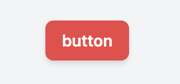
Make a basic button
<button type="button" class="py-2 px-4 bg-red-500 text-white font-semibold rounded-lg shadow-md">
  button
</button>
Responsive layout
Each utility class in Tailwind can be conditionally applied at different breakpoints, which makes it easy to build a complex responsive interface without leaving HTML.
Inspired by common device resolutions, Tailwind provides five breakpoints:
- sm is suitable for equipment with a minimum width of 640px;
- md is applicable to equipment with a minimum width of 768px;
- lg for equipment with a minimum width of 1024px;
- xl for equipment with a minimum width of 1280px;
- 2xl for equipment with a minimum width of 1536px.
The following is a simple example of a marketing page component that uses a stacked layout on a small screen and a side-by-side layout on a large screen (resize the browser to see its actual effect):
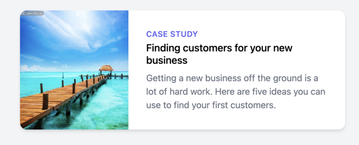
<div class="max-w-md mx-auto bg-white rounded-xl shadow-md overflow-hidden md:max-w-2xl">
  <div class="md:flex">
    <div class="md:flex-shrink-0">
     <img class="h-48 w-full object-cover md:h-full md:w-48" src="https://gimg2.baidu.com/image_search/src=http%3A%2F%2Fpic.5tu.cn%2Fuploads%2Fallimg%2F1706%2Fpic_5tu_big_201705201558243571.jpg&refer=http%3A%2F%2Fpic.5tu.cn&app=2002&size=f9999,10000&q=a80&n=0&g=0n&fmt=jpeg?sec=1637733958&t=28299dabd6e0330e876dcf7195742f1f" alt="Man looking at item at a store">
    </div>
    <div class="p-8">
      <div class="uppercase tracking-wide text-sm text-indigo-500 font-semibold">Case study</div>
      <a href="#" class="block mt-1 text-lg leading-tight font-medium text-black hover:underline">
        Finding customers for your new business
      </a>
      <p class="mt-2 text-gray-500">Getting a new business off the ground is a lot of hard work. Here are five ideas you can use to find your first customers.
      </p>
    </div>
  </div>
</div>
Add button status
Similar to Tailwind's handling of responsive design, style elements such as hover and focus can be implemented by adding appropriate state variables in front of the utility. For example, add hover:bg-red-700.
<button class="... hover:bg-red-700">
    Button
</button>
summary
The above is the introduction and practice sharing of Tailwind CSS in this issue. In later articles, we will continue to explore how to use the low code platform of full image cloud to build a fixed asset management system. Coming soon.
In addition, in the near future, the installation package and installer of the low code platform of the full image cloud will be open-source. You are welcome to download and experience at that time.
About holomorphic cloud
Full image cloud platform( https://portal.clouden.io )It is a low code platform independently developed by Qingyun technology. It is a tool and integration platform based on cloud and used to assist in building various digital applications of enterprises.
At present, the platform provides two application development modes: no code and low code on the cloud, shielding the complexity of the technology. It supports visual designer, so that developers and business users can quickly complete application development through simple drag and drop, parameter configuration, etc. At the same time, it integrates IDaaS identity authentication capability and container DevOps capability to support the integration of enterprise stock business and full image cloud business. The platform also contains rich development interfaces and powerful plug-in mechanisms. Developers can continuously expand the application capabilities of the platform as needed.
The vision of full image cloud is to provide software components or support services in all quadrants and links of enterprise production and operation.