Review review
Python provides a large number of excellent function packages for data display. Among them, matplotlib module can easily draw and make high-quality data packages such as line chart, histogram and scatter chart.
About the matplotlib module, we have studied the basic framework and common methods of matplotlib in the early stage
Python matplotlib drawing pie chart_
python matplotlib drawing line chart_
Python object-oriented programming: class inheritance and its derived terms
Python object-oriented programming: deep understanding of class_
Among the charts provided by the matplotlib module, in addition to the line chart, the histogram is also the chart for our daily data analysis.
In this issue, we begin to learn the attributes and methods related to drawing histogram, let's go~
1. Histogram overview
-
What is a histogram
- Bar chart, also known as bar chart, is a statistical chart with the length of rectangle as variable data
- A histogram is used to compare two or more types
- The bar graph has only one variable with the length of the rectangle
- The histogram can be displayed horizontally or in a multidimensional manner
-
Histogram usage scenario
- The histogram is suitable for the analysis of smaller data sets
- It is applicable to two-dimensional data sets. Only one dimension data difference item is compared
- Visually display the data differences between individuals
- Representing discrete time series
-
Histogram drawing steps
- Import the matplotlib.pyplot module
- To prepare the data, you can use numpy/pandas to organize the data
- Call pyplot.bar() to draw the histogram
-
Case display
This time, we analyze the annual sales of products in the past five years
-
The data used in the case are as follows:
import random x_data = ["20{}year".format(i) for i in range(16,21)] y_data = [random.randint(100,300) for i in range(6)] Copy code -
Draw histogram
import matplotlib.pyplot as plt

plt.rcParams["font.sans-serif"]=['SimHei']
plt.rcParams["axes.unicode_minus"]=False

for i in range(len(x_data)):
    plt.bar(x_data[i],y_data[i])

plt.title("Sales analysis")
plt.xlabel("particular year")
plt.ylabel("sales volume")

plt.show()
Copy code
-
2. Histogram attribute
-
Columnar color fill
-
facecolor (fc) keyword
-
color keyword
-
Color abbreviation:
Attribute value explain Attribute value explain "b"/"bule" blue "m"/"magenta" Fuchsin "g" /"green" green "y"/"yellow" yellow "r"/"red" gules "k"/"black" black "c"/"cyan" Cyan "w"/"white" white -
rgb:
- Format: (r,g,b)
- Value range: 0 ~ 1
-
-
Cylindrical stroke settings
-
Column border color
- edgecolor or ec
-
Column border style
-
linestyle or ls
-
Line style:
Attribute value explain "-" ,"solid" Default solid line display "--","dashed" Dotted line "-." "dashdot" Dotted line ":","dotted" Dotted line "None" """" empty -
-
Column border width
- linewidth or lw
-
-
Histogram fill pattern
- hatch: set fill pattern
- Attribute values: {'/', '', '|' - ',' + ',' x ',' o ',' o ','. ',' * '}|
-
Histogram scale label
- tickle label: the default number label is used
-
We add a border style of "-" to the first section of the histogram, add the specified rgb color and fill in the circle
for i in range(len(x_data)):
   plt.bar(x_data[i],y_data[i],color=(0.2*i,0.2*i,0.2*i),linestyle="--",hatch="o")
Copy code

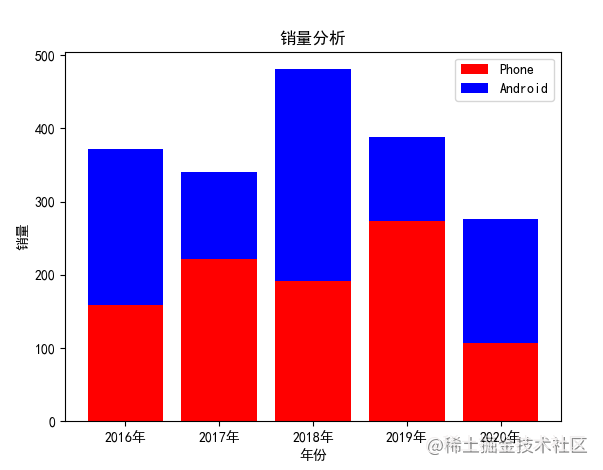
3. Stacked histogram
In the histogram, we will compare the manifestations of two groups of data in the same category at the same time, so we need to draw a stacked histogram
-
bottom: the y coordinate of the strip base. The default value is 0
-
In the case of section 1, add a set of y-axis data, all of which are as follows:
x_data = ["20{}year".format(i) for i in range(16,21)] y_data = list(random.randint(100,300) for i in range(5)) y2_data = list(random.randint(100,300) for i in range(5)) Copy code -
Add the pyplot.bar method again and add the bottom attribute
 plt.bar(x_data,y_data,lw=0.5,fc="r",label="Phone")
 plt.bar(x_data,y2_data,lw=0.5,fc="b",label="Android",bottom=y_data)
Copy code
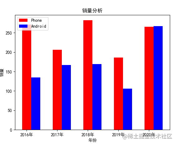
4. Parallel histogram
In drawing a side-by-side histogram, you can use the width attribute to control the position and size of each column
-
Width: sets the width of each group of columns
-
X-axis: the width of x-axis should also be set directly for each group
-
For example, continue to modify the above case. After adding the width attribute to bar1 and bar2, set the width of the x-axis side by side to 0.3
x_width = range(0,len(x_data))
x2_width = [i+0.3 for i in x_width]


plt.bar(x_width,y_data,lw=0.5,fc="r",width=0.3,label="Phone")
plt.bar(x2_width,y2_data,lw=0.5,fc="b",width=0.3,label="Android")

plt.xticks(range(0,5),x_data)
Copy code
5. Horizontal histogram
In the histogram, sometimes we need to place the histogram horizontally to compare the differences. At this time, we need to use the barh method
-
pyplot.barh(y,width): draw a horizontal histogram
-
Combined with the above cases, the barh method is used
  x_data = ["20{}year".format(i) for i in range(16,21)]
  y_data = list(random.randint(100,300) for i in range(5))
  y2_data = list(random.randint(100,300) for i in range(5))

  x_width = range(0,len(x_data))
  x2_width = [i+0.3 for i in x_width]

  plt.barh(x_width,y_data,lw=0.5,fc="r",height=0.3,label="Phone")
  plt.barh(x2_width,y2_data,lw=0.5,fc="b",height=0.3,label="Android")
  plt.yticks(range(0,5),x_data)

  plt.legend()

  plt.title("Sales analysis")
  plt.ylabel("particular year")
  plt.xlabel("sales volume")

  plt.show()
Copy code
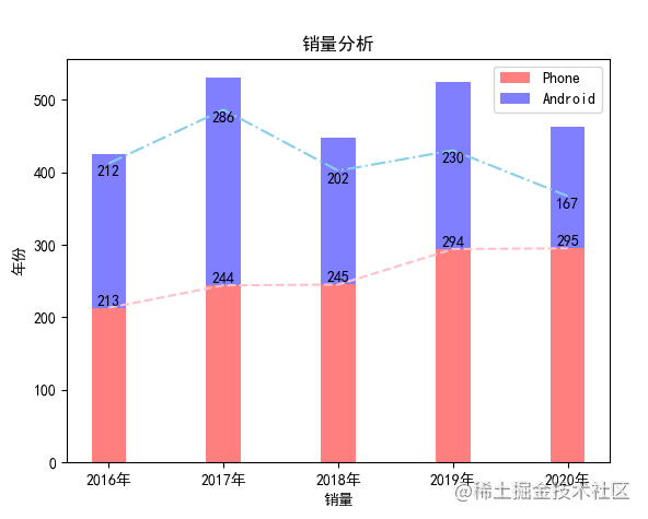
6. Add a broken line histogram
When viewing the histogram, we sometimes need auxiliary polylines to view it
-
Use the pyplot.plot() method to summarize the line chart
-
Also use pyplot.text() to display coordinate values
-
When stacking a graph, you need to calculate the relative position of the broken line
plt.plot(x_data,y_data,color="pink",linestyle="--")

plt.plot(x_data, y2_data+200, color="skyblue", linestyle="-.")

# Histogram
plt.bar(x_data,y_data,lw=0.5,fc="r",width=0.3,label="Phone",alpha=0.5)
plt.bar(x_data,y2_data, lw=0.5, fc="b", width=0.3, label="Android",alpha=0.5,bottom=y_data)

for i,j in zip(x_data,y_data):

   plt.text(i,j+0.05,"%d"%j,ha="center",va="bottom")

for i2,j2 in zip(x_data,y2_data):

   plt.text(i2,j2+180,"%d"%j2,ha="center",va="bottom")
Copy code
7. Positive and negative histogram
We need to use the Axes object to set the position of the coordinate axis
-
First, create the axes object using the pyplot.gca() method
-
Then use the matplotlib.spines module to call set_position sets the axis position
-
set_position sets the axis position point
-
spines [] options include "left"|"bottom"|"width"|"height"
-
set_ The format of position value is (position type, quantity); Location type; "outward"|"axes"|"data"|; Quantity: Center - > ("axis", 0.5), zero - > ("data", 0.0)
y_data = np.random.randint(100, 300,5)
y2_data = np.random.randint(100, 300,5)

ax = plt.gca()
ax.spines["bottom"].set_position(('data', 0))

plt.bar(x_data,+y_data,lw=0.5,fc="r",width=0.3,label="Phone")
plt.bar(x_data,-y2_data, lw=0.5, fc="b", width=0.3, label="Android")

for i,j in zip(x_data,y_data):

    plt.text(i,j,"%d"%j,ha="center",va="top")

for i2,j2 in zip(x_data,y2_data):

    plt.text(i2,-j2,"%d"%j2,ha="center",va="bottom")
Copy code
summary
In this issue, we learn the attributes and methods related to drawing various columnar icons in detail in the matplotlib module. When we need to visually display the differences of discrete data points, we can use bar() or barh() to draw beautiful charts.
The above is the content of this issue. Welcome to praise and comment. See you in the next issue~