1. Toolbar
Knowledge Point 1: The difference between Toolbar and ActionBar?
Toolbar is similar to ActionBar, but ActionBar can only be located at the top of the activity, and can not achieve Material Design effect. It is not flexible to use. Generally, ActionBar is not displayed in the theme of app when developing, as follows:
    <style name="AppTheme" parent="Theme.AppCompat.Light.NoActionBar">
        <item name="colorPrimary">@color/colorPrimary</item>
        <item name="colorPrimaryDark">@color/colorPrimaryDark</item>
        <item name="colorAccent">@color/colorAccent</item>
</style>- 1
- 2
- 3
- 4
- 5
- 1
- 2
- 3
- 4
- 5
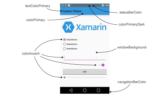
Knowledge Point 2: Which color values are set by color Primary, color Accent and so on?
Use Toolbar instead of ActionBar, as follows:
<android.support.v7.widget.Toolbar xmlns:app="http://schemas.android.com/apk/res-auto"
                android:id="@+id/tool_bar"
                android:layout_width="match_parent"
                android:layout_height="@dimen/titlebar_height"
                android:background="@color/colorPrimary"
                app:contentInsetStart="0.0dp"
                app:popupTheme="@style/ThemeOverlay.AppCompat.Light"
app:theme="@style/ToolbarStyle">- 1
- 2
- 3
- 4
- 5
- 6
- 7
- 8
- 1
- 2
- 3
- 4
- 5
- 6
- 7
- 8
Knowledge Point 3: Why specify a new xmlns:app namespace?
Because Material Design is in Android 5.0 system only appeared, many Material attributes did not exist before 5.0. In order to be compatible with the old system, we can not use Android: Atrributes directly, but should use app:attribute.
app:theme is the theme for setting toolbar, app: popup Theme is the theme for setting pop-up menu items, and it is a light theme.
Knowledge Point 4: Write the Toolbar in xml, how should the code be used?
Toolbar toolbar = (Toolbar) findViewById(R.id.tool_bar);//Get an instance of Toolbar
setSupportActionBar(toolbar);//The Toolbar instance is passed in, which ensures that the Toolbar is used and that its appearance and functionality are consistent with that of ActionBar.- 1
- 2
- 1
- 2
Knowledge Point 5: How to set the return button and title for Toolbar?
- Setting the title
Method 1: Add android:label attribute in the corresponding activity registration information of AndroidMainfest.xml.
Method 2: Call the setTitle() method in Toolbar, but when using it, you should pay attention to it. Sometimes, when you set it, you find that the title bar does not change with you, because you are using the wrong posture. Both of the following methods can successfully set the title of Toolbar
(1) Call the setTitle method of ToolBar before setSupportActionBar(titletoolbar).
(2) Called in the onResume cycle of Activity.
Method 3: I add the TextView control in the Toolbar, hide the title of the system, and then set the value of the TextView control I defined directly.
        ActionBar actionBar = getSupportActionBar();
        if (actionBar != null) {
            //Remove the default Title display
            actionBar.setDisplayShowTitleEnabled(false);
}- 1
- 2
- 3
- 4
- 5
- 1
- 2
- 3
- 4
- 5
2 Set the return button
Method 1: Utilize Toolbar's own return
getSupportActionBar().setDisplayHomeAsUpEnabled(true); // Displays the return key.
You can also customize the return button
ActionBar actionBar = getSupportActionBar();
        if (actionBar != null) {
            actionBar.setDisplayHomeAsUpEnabled(true);
            actionBar.setHomeAsUpIndicator(R.mipmap.icon_back);
}- 1
- 2
- 3
- 4
- 5
- 1
- 2
- 3
- 4
- 5
Method 2: Customize the ImageButton control inside the Toolbar layout and set its icon
2. Sliding menu DrawLayout
KNOWLEDGE POINT 1: DrawLayout can contain several child controls. What is their relationship?
The menu can be displayed by sliding left or right on the home screen, as shown in the following figure: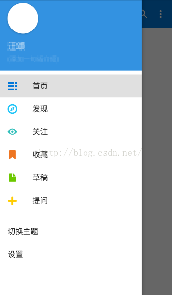
DrawerLayout allows two direct sub-controls to be placed in the layout. The first sub-control is the content displayed on the home screen and the second sub-control is the content displayed on the sliding menu.
<android.support.v4.widget.DrawerLayout
    xmlns:app="http://schemas.android.com/apk/res-auto"
    xmlns:tools="http://schemas.android.com/tools"
    android:id="@+id/drawer_layout"
    android:layout_width="match_parent"
    android:layout_height="match_parent"
    android:fitsSystemWindows="true"
    tools:openDrawer="start">
     <include
        layout="@layout/app_bar_main"
        android:layout_width="match_parent"
        android:layout_height="match_parent" />

    <android.support.design.widget.NavigationView
        android:id="@+id/nav_view"
        android:layout_width="wrap_content"
        android:layout_height="match_parent"
        android:layout_gravity="start"
        android:fitsSystemWindows="true"
        app:headerLayout="@layout/nav_header_main"
        app:menu="@menu/main"
        />
</android.support.v4.widget.DrawerLayout>- 1
- 2
- 3
- 4
- 5
- 6
- 7
- 8
- 9
- 10
- 11
- 12
- 13
- 14
- 15
- 16
- 17
- 18
- 19
- 20
- 21
- 22
- 23
- 1
- 2
- 3
- 4
- 5
- 6
- 7
- 8
- 9
- 10
- 11
- 12
- 13
- 14
- 15
- 16
- 17
- 18
- 19
- 20
- 21
- 22
- 23
The layout_gravity attribute in the second child control must be specified, telling DrawerLayout whether the sliding menu is on the left or right side of the screen, that left means the sliding menu is on the left, and that right means the sliding menu is on the right. start will judge according to the system language. If the system language is from left to right, such as English, Chinese, etc., the sliding menu is on the left. If the system language is from right to left, such as Arabic, the sliding menu is on the right.
Knowledge Point 2: If you want to click a button in the main interface to pop up a left-sliding menu bar, how to achieve?
You can add a navigation bar button to the title bar of the main interface and set the response mode of the click as follows:
mDrawerLayout.open(GravityCompat.START);//Open the left menu bar
mDrawerLayout yes xml Defined in DrawerLayout Examples.- 1
- 2
- 1
- 2
If you want to close the menu, call mDrawerLayout. close Drawers ();
Knowledge Point 3: What's special about Navigation View?
Navigation View is a pull-down menu launched after Android 5.0. The menu bar is divided into two parts as a whole. The top part is called Header Layout, and the clicks below are menu.
menu is defined as follows:
<menu xmlns:android="http://schemas.android.com/apk/res/android">
    <item
        android:id="@+id/favorite"
        android:icon="@mipmap/ic_launcher"
        android:title="Collection"/>
    <item
        android:id="@+id/wallet"
        android:icon="@mipmap/ic_launcher"
        android:title="wallet"/>
    <item
        android:id="@+id/photo"
        android:icon="@mipmap/ic_launcher"
        android:title="Album"/>
    <item
        android:id="@+id/file"
        android:icon="@mipmap/ic_launcher"
        android:title="file"/>
</menu> - 1
- 2
- 3
- 4
- 5
- 6
- 7
- 8
- 9
- 10
- 11
- 12
- 13
- 14
- 15
- 16
- 17
- 18
- 1
- 2
- 3
- 4
- 5
- 6
- 7
- 8
- 9
- 10
- 11
- 12
- 13
- 14
- 15
- 16
- 17
- 18
Each item represents a menu, android:icon specifies the icon of the menu, android:title specifies the text displayed on the menu.
3. Floating Action Bar
 <android.support.design.widget.FloatingActionButton
            style="@style/layout_ww"
            android:layout_alignParentBottom="true"
            android:layout_alignParentRight="true"
            android:layout_margin="15dp"
            android:src="@mipmap/actionbar_add_icon"
android:id="@+id/add_fab"/>- 1
- 2
- 3
- 4
- 5
- 6
- 7
- 1
- 2
- 3
- 4
- 5
- 6
- 7
It will be suspended on the current interface. The default background color of the button is the application theme color Accent. It can also customize the background color value. app:backgroundTint can set button clicks and normal color values here.
It can also be used in conjunction with Coordinator Layout to set app:layout_behavior and app:layout_scrollFlags= "scroll|enterAlways|snap" so that buttons can be hidden when the list slides up and displayed when it slides down.
4. CardView of Card Layout
CardView is similar to FrameLayout in that it provides additional effects such as rounded corners and shadows, and it looks like it has a three-dimensional feel.
<android.support.v7.widget.CardView
    android:id="@+id/cardView"
    android:layout_width="match_parent"
    android:layout_height="wrap_content"
    android:background="@color/white"
    android:padding="10dp"
    app:cardCornerRadius="4dp"
app:elevation="4dp">- 1
- 2
- 3
- 4
- 5
- 6
- 7
- 8
- 1
- 2
- 3
- 4
- 5
- 6
- 7
- 8
App: Card Corner Radius is the radian of the specified corner of the card. The greater the value, the greater the radian of the corner.
app:elevation specifies the height of the card. The larger the value, the larger the projection range and the less projection effect.
5. Drop-down refresh Swipe Refresh Layout
Wrap Swipe Refresh Layout outside the layout that needs to be refreshed.
<android.support.v4.widget.SwipeRefreshLayout
       android:id="@+id/demo_swiperefreshlayout"
       android:layout_width="fill_parent"
       android:layout_height="fill_parent"
        android:scrollbars="vertical"
        >
       <android.support.v7.widget.RecyclerView
           android:id="@+id/demo_recycler"
           android:layout_width="fill_parent"
           android:layout_height="fill_parent"
           ></android.support.v7.widget.RecyclerView>
   </android.support.v4.widget.SwipeRefreshLayout>
//Use in specific code:
demo_swiperefreshlayout.setOnRefreshListener(new SwipeRefreshLayout.OnRefreshListener() {
            @Override
            public void onRefresh() {
                //Refresh operation
            }
}); - 1
- 2
- 3
- 4
- 5
- 6
- 7
- 8
- 9
- 10
- 11
- 12
- 13
- 14
- 15
- 16
- 17
- 18
- 19
- 1
- 2
- 3
- 4
- 5
- 6
- 7
- 8
- 9
- 10
- 11
- 12
- 13
- 14
- 15
- 16
- 17
- 18
- 19
6. Collapsing Toolbar Layout
Collapsing Toolbar Layout is a layout that acts on the basis of Toolbar. Collapsing Toolbar Layout can only be used as a direct sub-layout of AppBarLayout. AppBarLayout must also be a Coordinator Layout sublayout.
Specific uses are as follows:
<android.support.design.widget.CoordinatorLayout xmlns:android="http://schemas.android.com/apk/res/android"
        xmlns:app="http://schemas.android.com/apk/res-auto"
        android:id="@+id/main_content"
        android:layout_width="match_parent"
        android:layout_height="match_parent"
        android:fitsSystemWindows="true">

        <android.support.design.widget.AppBarLayout
            android:id="@+id/appbar"
            android:layout_width="match_parent"
            android:layout_height="200dp"
            android:fitsSystemWindows="true"
            android:theme="@style/ThemeOverlay.AppCompat.Dark.ActionBar">

            <android.support.design.widget.CollapsingToolbarLayout
                android:id="@+id/collapsing_toolbar"
                android:layout_width="match_parent"
                android:layout_height="match_parent"
                android:fitsSystemWindows="true"
                app:contentScrim="?attr/colorPrimary"
                app:expandedTitleMarginEnd="64dp"
                app:expandedTitleMarginStart="48dp"
                app:layout_scrollFlags="scroll|exitUntilCollapsed">

                <ImageView
                    android:id="@+id/logo"
                    android:layout_width="match_parent"
                    android:layout_height="match_parent"
                    android:background="@mipmap/header_img"
                    android:contentDescription="@null"
                    android:fitsSystemWindows="true"
                    android:scaleType="fitCenter"
                    app:layout_collapseMode="parallax"
                    app:layout_collapseParallaxMultiplier="0.1" />

                <android.support.v7.widget.Toolbar
                    android:id="@+id/toolbar"
                    android:layout_width="match_parent"
                    android:layout_height="?attr/actionBarSize"
                    app:layout_collapseMode="pin"
                    app:popupTheme="@style/ThemeOverlay.AppCompat.Light" />

            </android.support.design.widget.CollapsingToolbarLayout>

        </android.support.design.widget.AppBarLayout>

        <android.support.v4.widget.NestedScrollView
            android:id="@+id/nested_scroll_view"
            android:layout_width="match_parent"
            android:layout_height="match_parent"
            app:layout_behavior="@string/appbar_scrolling_view_behavior">

            <TextView
                android:layout_width="match_parent"
                android:layout_height="wrap_content"
                android:text="@string/large_text" />

        </android.support.v4.widget.NestedScrollView>

        <android.support.design.widget.FloatingActionButton
            android:id="@+id/floating_action_button"
            android:layout_width="wrap_content"
            android:layout_height="wrap_content"
            android:layout_margin="@dimen/fab_margin"
            android:clickable="true"
            android:src="@mipmap/ic_star_black_24dp"
            app:layout_anchor="@id/appbar"
            app:layout_anchorGravity="bottom|right|end" />

</android.support.design.widget.CoordinatorLayout>- 1
- 2
- 3
- 4
- 5
- 6
- 7
- 8
- 9
- 10
- 11
- 12
- 13
- 14
- 15
- 16
- 17
- 18
- 19
- 20
- 21
- 22
- 23
- 24
- 25
- 26
- 27
- 28
- 29
- 30
- 31
- 32
- 33
- 34
- 35
- 36
- 37
- 38
- 39
- 40
- 41
- 42
- 43
- 44
- 45
- 46
- 47
- 48
- 49
- 50
- 51
- 52
- 53
- 54
- 55
- 56
- 57
- 58
- 59
- 60
- 61
- 62
- 63
- 64
- 65
- 66
- 67
- 68
- 69
- 70
- 1
- 2
- 3
- 4
- 5
- 6
- 7
- 8
- 9
- 10
- 11
- 12
- 13
- 14
- 15
- 16
- 17
- 18
- 19
- 20
- 21
- 22
- 23
- 24
- 25
- 26
- 27
- 28
- 29
- 30
- 31
- 32
- 33
- 34
- 35
- 36
- 37
- 38
- 39
- 40
- 41
- 42
- 43
- 44
- 45
- 46
- 47
- 48
- 49
- 50
- 51
- 52
- 53
- 54
- 55
- 56
- 57
- 58
- 59
- 60
- 61
- 62
- 63
- 64
- 65
- 66
- 67
- 68
- 69
- 70
Specific instructions can be found in another blog of mine: http://blog.csdn.net/smileiam/article/details/61643006
Collapsing Toolbar Layout defines an ImageView and a Toolbar, which will be composed of a common title bar and a picture.
app:layout_collapseMode is used to specify the folding mode of the current control in the Collapsing Toolbar Layout folding process. Toolbar is designated as pin, which means that it remains unchanged during the folding process. ImageView is set to parallax, which means that there will be some offset during the folding process.
7. How to realize the immersion status bar?
To integrate the background map with the system bar, you need to set android:fitsSystemWindows= "true" to indicate that the control will appear in the system status bar with the help of the android:fitsSystemWindows property, but you need to set all the parent layouts of the control to this property. You also need to specify the status bar color in the theme as transparent. Set the android: status BarColor attribute value in the theme to @android:color/transparent. However, this property is only available from Android 5.0 system. You need to create a values-21 directory and set styles.xml to set the status bar color value inside, while you do not set the status bar color value in styles.xml of the default values folder.