This film is a detailed analysis of Drawer Layout and a summary of the problems encountered in development.
DrawerLayout is a control supporting side-slip effect in SupportLibrary. In the development, it mainly cooperates with Navigation View + Toolbar to realize side-slip menu and see the effect concretely.
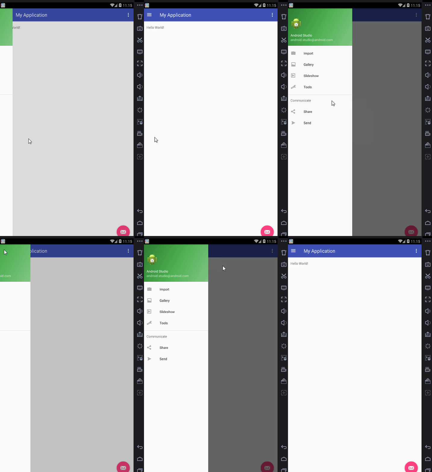
This effect template can be achieved, here is a simple use of instructions, the focus is not here.
Layout:
<?xml version="1.0" encoding="utf-8"?>
<android.support.v4.widget.DrawerLayout
    xmlns:android="http://schemas.android.com/apk/res/android"
    xmlns:app="http://schemas.android.com/apk/res-auto"
    xmlns:tools="http://schemas.android.com/tools"
    android:id="@+id/drawer_layout"
    android:layout_width="match_parent"
    android:layout_height="match_parent"
    android:fitsSystemWindows="true"
    tools:openDrawer="start">

   //The first ViewGroup is the content area
    <include
        layout="@layout/app_bar_main"
        android:layout_width="match_parent"
        android:layout_height="match_parent"/>
   //The first ViewGroup is the sideslip area.
    <android.support.design.widget.NavigationView
        android:id="@+id/nav_view"
        android:layout_width="wrap_content"
        android:layout_height="match_parent"
        android:layout_gravity="start"
        android:fitsSystemWindows="true"
        app:headerLayout="@layout/nav_header_main"
        app:menu="@menu/activity_main_drawer"/>

</android.support.v4.widget.DrawerLayout>
1: The first ViewGroup is the content area, which must be put in the first place. The latter ViewGroup is the sideslip area.
2: android:layout_gravity= "start" indicates the direction of sideslip, start slides from left to right and end slides from right to left.
3: app:headerLayout="@layout/nav_header_main" Custom NavigationView Header Layout
4: app:menu="@menu/activity_main_drawer" definition menu item
activity_main_drawer:
<?xml version="1.0" encoding="utf-8"?>
<menu xmlns:android="http://schemas.android.com/apk/res/android">

    <group android:checkableBehavior="single">
        <item
            android:id="@+id/nav_camera"
            android:icon="@drawable/ic_menu_camera"
            android:title="Import"/>
        <item
            android:id="@+id/nav_gallery"
            android:icon="@drawable/ic_menu_gallery"
            android:title="Gallery"/>
        <item
            android:id="@+id/nav_slideshow"
            android:icon="@drawable/ic_menu_slideshow"
            android:title="Slideshow"/>
        <item
            android:id="@+id/nav_manage"
            android:icon="@drawable/ic_menu_manage"
            android:title="Tools"/>
    </group>

    <item android:title="Communicate">
        <menu>
            <item
                android:id="@+id/nav_share"
                android:icon="@drawable/ic_menu_share"
                android:title="Share"/>
            <item
                android:id="@+id/nav_send"
                android:icon="@drawable/ic_menu_send"
                android:title="Send"/>
        </menu>
    </item>

</menu>
Navigation View Implements On Navigation Item Selected Listener Click Listener
 @SuppressWarnings("StatementWithEmptyBody")
    @Override
    public boolean onNavigationItemSelected(MenuItem item) {
        // Handle navigation view item clicks here.
        int id = item.getItemId();

        if (id == R.id.nav_camera) {
            // Handle the camera action
        } else if (id == R.id.nav_gallery) {

        } else if (id == R.id.nav_slideshow) {

        } else if (id == R.id.nav_manage) {

        } else if (id == R.id.nav_share) {

        } else if (id == R.id.nav_send) {

        }

        DrawerLayout drawer = (DrawerLayout) findViewById(R.id.drawer_layout);
        drawer.closeDrawer(GravityCompat.START);
        return true;
    }
Question 1: How to remove the background shadows attached to the sideslip?
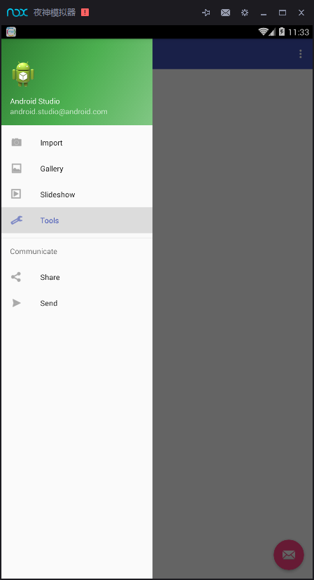
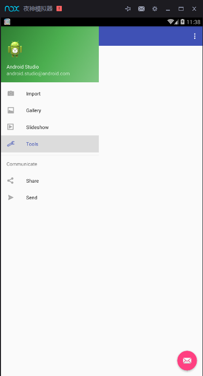
As can be seen from the picture, the background transparency is changed when sliding sideways.
Solution: idDrawer Layout. setScrimColor (Color. TRANSPARENT); Set the color of the part not covered by the drawer when it opens.
Question 2: How to prevent the content area from responding to clicks when clicking on a side-slip menu
Look at the effect
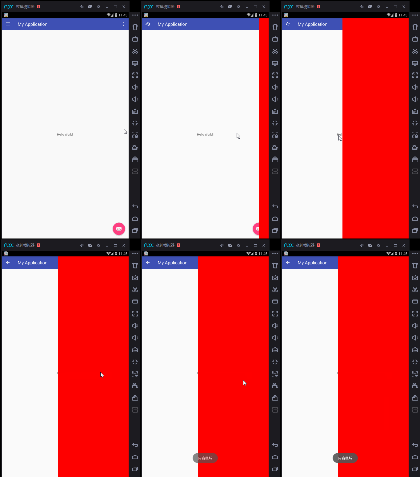
Click in the left menu area and the content area responds to the click event, which is definitely not possible. Of course, this is for custom layout. If you use Navigation View collocation, there is no problem. The key is to see the requirements.
Solve:
//Side Slide Click Monitor
        idDrawerLayout.addDrawerListener(new DrawerLayout.DrawerListener() {
            @Override
            public void onDrawerSlide(View drawerView, float slideOffset) {

            }

            @Override
            public void onDrawerOpened(View drawerView) {
                drawerView.setClickable(true);
            }

            @Override
            public void onDrawerClosed(View drawerView) {

            }

            @Override
            public void onDrawerStateChanged(int newState) {

            }
        });
In the side slip monitor, listen to the onDrawerOpened method and set drawerView.setClickable(true); that's all.
Question 3: How to extend the Drawer Layout background color to the status bar
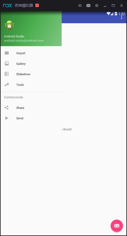
Solution:
Set the status bar to transparent
Set the corresponding padding Top according to the value of StatusBar for Toolbar
Set Fits System Windows (true) for Drawer Layout as the root layout
setClipToPadding(false) for Drawerlayout as the root layout
   private void handleStatusBar() {
        if(Build.VERSION.SDK_INT>=Build.VERSION_CODES.KITKAT){
            WindowManager.LayoutParams manager=getWindow().getAttributes();
            manager.flags=
           (WindowManager.LayoutParams.FLAG_TRANSLUCENT_STATUS|manager.flags);
            drawer.setFitsSystemWindows(true);
            drawer.setClipToPadding(false);
        }
    }
Question 4: How to actively open or hide drawer s
All of the above are controlled by drawer itself by sliding or clicking to open or close.
Actively Open View 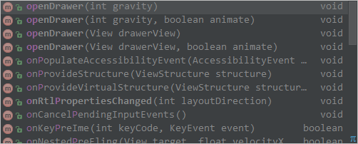
Actively Close Views 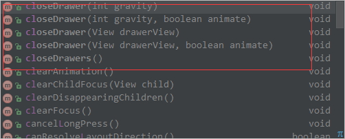
Question 5: How to cancel the sliding effect of drawers

-
There are four locking modes:
LOCK_MODE_LOCKED_CLOSED: Close the sliding operation of the drawer and retrieve the drawer
LOCK_MODE_LOCKED_OPEN: Close the sliding operation of the drawer and open the drawer
LOCK_MODE_UNDEFINED: Reset the lock mode to the default state
LOCK_MODE_UNLOCKED: Unlock Sliding Operational Locking of Drawers
drawer.setDrawerLockMode(DrawerLayout.LOCK_MODE_LOCKED_CLOSED, Gravity.RIGHT)It can lock the gesture sliding, and can only actively open or close drawer.