1. Whenever there is a big disaster, many websites become grey. How to make the websites grey quickly? CSS code is very simple, using the filter function of css.
The code is as follows:
html {
   filter: grayscale(100%);//IE browser
  -webkit-filter: grayscale(100%);//Chrome
  -moz-filter: grayscale(100%);//Firefox
  -ms-filter: grayscale(100%);
  -o-filter: grayscale(100%);
  filter:progid:DXImageTransform.Microsoft.BasicImage(grayscale=1);
  -webkit-filter: grayscale(1);//Chrome
}
In some websites, the color of FLASH animation can not be controlled by CSS filters and can be inserted between the sum of FLASH code:
<param value="false" name="menu"/>
<param value="opaque" name="wmode"/>
2. DIV can be edited to make a div look like an input box.
Add the content Editable= "true" attribute to the div, as follows:
<div id="div1" contentEditable="true"  ></div>

<div id="div2" contentEditable="true" ></div>

 <div contentEditable="true"  id="div3"></div>
Among them, I have an editor's article behind me. http://www.haorooms.com/post/js_guangbiao This function is used! This is the name of the parent node where the iframe cursor is located, and the content Editable= "true" attribute is used in iframe.
3. In order to prevent users from replicating, some websites have set the function of div forbidding selection, setting the following attributes:
unselectable="on" onselectstart="return false;"
Specific code:
<div unselectable="on" onselectstart="return false;">
sdfsdfswerwer324234234234
</div>
In this way, the contents of DIV can not choose to copy!
4. Form form alignment in CSS
form forms are often preceded by names, ages, company names, etc. Some are two words, some are four words, how to align the words? Some people's practice is to make a few blanks, but this is not very accurate, the best way is as follows:
css code:
 .test1 {
            text-align:justify;
            text-justify:distribute-all-lines;/*ie6-8*/
            text-align-last:justify;/* ie9*/
            -moz-text-align-last:justify;/*ff*/
            -webkit-text-align-last:justify;/*chrome 20+*/
        }
        @media screen and (-webkit-min-device-pixel-ratio:0){/* chrome*/
            .test1:after{
                content:".";
                display: inline-block;
                width:100%;
                overflow:hidden;
                height:0;
            }
        }
html code:
<div class="box1">
    <div class="test1">Full name</div>
    <div class="test1">Name and Name</div>
    <div class="test1">Name name</div>
    <div class="test1">Location</div>
    <div class="test1">Work unit</div>
</div>
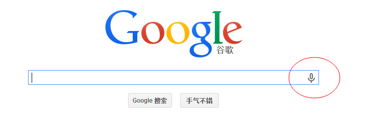
5. input Sound input Button. (Support Google tightly)
The buttons in the red box are shown below.
The code is as follows:
<input type="text" class="box" name="s" id="s" class="inputText" placeholder="Input keywords" x-webkit-speech>
Add the x-webkit-speech attribute.
6. Set the color for the placeholder of input
The setting method is as follows:
::-webkit-input-placeholder { /* WebKit browsers */
    color:    #999;
}
:-moz-placeholder { /* Mozilla Firefox 4 to 18 */
    color:    #999;
}
::-moz-placeholder { /* Mozilla Firefox 19+ */
    color:    #999;
}
:-ms-input-placeholder { /* Internet Explorer 10+ */
    color:    #999;
}
7,css3 implements a div to set multiple background pictures and background-image attributes
8,CSS check status modification, Google scroll axis modification
9,css input[type=file] style beautification, input upload button beautification
10. CSS: after and: before selectors
after selector is usually used in clear, and the usage is as follows:
.clearfix:after{display:block;visibility:hidden;clear:both;height:0;content:'.';font-size:0}
Writing this clearfix allows the outer div to wrap the entire inner div, in line with Google's closure mechanism.
It can also be appended before or after an element, for example:
p:after
{
content:"haorooms: -";
background-color:yellow;
color:red;
font-weight:bold;
}
Each p tag is followed by a - haorooms
11. Transparency
opacity: .9;
filter:alpha(opacity=90)
opacity in IE7 and IE6 is useless. In IE6, the DIV transparent method is usually filter ed.
.haorooms{opacity: 0; cursor:pointer; -ms-filter:"progid:DXImageTransform.Microsoft.Alpha(Opacity=0)";filter: alpha(opacity=0);}
12. Over-length display ellipsis
Single line text display...
Generally, you specify the width, and then give the following four attributes.
display:bolck;
overflow:hidden;
white-space:nowrap;
text-overflow:ellipsis;
Case code:
.haorooms{width:200px;display:bolck;overflow:hidden;white-space:nowrap;text-overflow:ellipsis;}
Multi-line text display...
Main attributes - webkit-line-clamp
p {
    overflow : hidden;
    text-overflow: ellipsis;
    display: -webkit-box;
    -webkit-line-clamp: 2;
    -webkit-box-orient: vertical;
}
This property is suitable for WebKit browsers or mobile browsers (most of which are WebKit kernels).
Cross-browser compatible solutions
A relatively simple way to do this is to set the relative positioning of the container height, using an ellipsis sign (... ) Element simulation implementation of the system;
p {
    position:relative;
    line-height:1.4em;
    /* 3 times the line-height to show 3 lines */
    height:4.2em;
    overflow:hidden;
}
p::after {
    content:"...";
    font-weight:bold;
    position:absolute;
    bottom:0;
    right:0;
    padding:0 20px 1px 45px;
   // Background: URL (a background image with the same color as the background of a web page) repeat-y;
  background-color:#fff;
}
Be careful:
The height of height is exactly three times that of line-height.
At the end of the ellipsis, translucent png is used to make the effect of fading, or setting the background color.
IE6-7 does not display content, so to be compatible with IE6-7, you can add a label to the content, such as using... To simulate.
To support IE8, we need to replace:: after with: after;
13. Shadow effect
-webkit-box-shadow: 0 1px 1px rgba(0,0,0,.2);
-moz-box-shadow: 0 1px 1px rgba(0,0,0,.2);
box-shadow: 0 1px 1px rgba(0,0,0,.2);
14. CSS Forces Line Breaking and Non-Line Breaking
Automatic line feed
div{
word-wrap: break-word;
word-break: normal;
}
Force English word line breaks
div{
word-break:break-all;
}
Force no line change
div{
white-space:nowrap;
}
15. CSS rounded corners
IE 9, Opera 10.5, Safari 5, Chrome 4 and Firefox 4 all support the border-radius attributes mentioned above. Early versions of Safari and Chrome support - webkit-border-radius attributes, and early versions of Firefox support - moz-border-radius attributes. At present, in order to ensure compatibility, we only need to set - moz-border-radius and border - radius at the same time.
-moz-border-radius: 15px;
border-radius: 15px;
(Note: border-radius must be placed in the final declaration, otherwise it may become invalid.)
In addition, the earlier version of Firefox had a slightly different single rounded statement from the standard grammar.
- moz-border-radius-top left (standard grammar: border-top-left-radius)
- moz-border-radius-top right (standard grammar: border-top-right-radius)
- moz-border-radius-bottom left (standard grammar: border-bottom-left-radius)
- moz-border-radius-bottom right (standard grammar: border-bottom-right-radius)
16,Summary of Compatibility Problems of css Browsers (IE6, etc.)
17,The Best Way to Make png Background Transparent in IE6 and Talk about IE6 and My Blog
18. CSS 3 elastic box
#haorooms ul {// father
            display: -moz-box;
            display: -webkit-box;
            display: box;
            -moz-box-orient: horizontal;
            -webkit-box-orient: horizontal;
            box-orient: horizontal;
        }
        #Haorooms UL Li {// son settings
            -moz-box-flex: 1;
            -webkit-box-flex: 1;
            box-flex: 1;
            float:none;
}
As for box-flex of css3 elastic box model, I haven't written any articles in my blog for the time being, because this attribute does not support IE and is used in the old version.
New version usage:
html is as follows:
<div class="m_topnav">
    <a class="m_navli m_current" href="#">Employee Management</a>
    <a class="m_navli" href="#">Employee Dynamics</a>
</div>
css is as follows:
.m_topnav{ display: -webkit-flex;display: -moz-flex;display:flex;width:100%;height:1rem;background-color:#fff;border-bottom:1px solid #ddd;}
.m_navli{-webkit-flex:1;-moz-flex:1;flex:1;position: relative;font-size:.24rem;text-align: center;line-height: 1rem;}
Direct use display:flex method, support IE11 + and all mainstream browsers.
In addition, jquery mobile has a set of grid layout method, very good, support IE, have time to refer to, or study how they write, refer to their own methods can be rewritten!
As for the flexible box layout, you can also see bootstrap,bootstrap put forward a view of grid class. After you introduce his css, you can use col-mid-* for layout. For example:
<div class="row">
  <div class="col-md-6">.col-md-6</div>
  <div class="col-md-6">.col-md-6</div>
</div>
Half stop each!
<div class="row">
  <div class="col-md-8">.col-md-8</div>
  <div class="col-md-4">.col-md-4</div>
</div>
The front is two-thirds of the whole width, and the back is one-third of the whole width!
See bootstrap's style explanation specifically: http://v3.bootcss.com/css/
19. textarea prohibits dragging
resize: none; //No drag
The following are the values of resize attributes:
none: Users can not manipulate the mechanism to adjust the size of elements;
both: Users can adjust the width and height of elements;
horizontal: users can adjust the width of elements;
vertical: allows users to adjust the height of elements;
inherit: default inheritance.
20. Summary of div vertical centering method
div vertically centered How to do this? Look at an article I wrote. http://www.haorooms.com/post/css_div_juzhong
21. The Method of Vertical Centralization of Internal Elements in DIV with Fixed Width and Height by css
Unlike the above 20, here's how a div's internal elements are vertically centered. See specifically: http://www.haorooms.com/post/div_guding_inner_center
22. Pure css making mouse move up to display picture effect
See one of my articles specifically: http://www.haorooms.com/post/css_hover_jqs
23. Summary of some prefixes in CSS3
In order to be more compatible with multiple browsers, css3 usually adds a lot of prefixes in front of it. Sometimes it feels annoying, and prefixes are easy to forget or omit. Here's a summary!
-webkit  /*For Chrome/Safari*/
-moz  /*For Firefox*/
-ms   /*For IE*/
-o  /*For Opera*/
Take rotation as an example
-webkit-transform:rotate(-3deg); /*For Chrome/Safari*/
-moz-transform:rotate(-3deg); /*For Firefox*/
-ms-transform:rotate(-3deg); /*For IE*/
-o-transform:rotate(-3deg); /*For Opera*/
transform:rotate(-3deg); /*For nothing*/
Take border-radius as an example (in case 15 above, CSS rounded corners have already mentioned the problem of rounded corners, let's repeat it below):
-moz-border-radius: 12px; /* FF1-3.6 */
-webkit-border-radius: 12px; /* Saf3-4, iOS 1-3.2, Android <1.6 */
border-radius: 12px; /* Opera 10.5, IE9, Saf5, Chrome, FF4, iOS 4, Android 2.1+ */
FF4, Saf5 and Chrome all support border-radius attributes, so we don't need to write the above two. The code becomes:
border-radius: 12px;
So some commonly used CSS3 effects, because browsers support, do not need a prefix, but for the sake of insurance, you can also add a prefix!
box-sizing of css3
Given two div percentage widths with borders side by side, if box-sizing is not used, the width of the borders will be displayed in the line. With box-sizing: border-box, the occupancy of the border can be removed.
The browser supports IE9 and Firefox, Google, Opera, etc.
The cases are as follows:
<style>
div.container
{
width:30em;
border:1em solid;
}
div.box
{
box-sizing:border-box;
-moz-box-sizing:border-box; /* Firefox */
-webkit-box-sizing:border-box; /* Safari */
width:50%;
border:1em solid red;
float:left;
}
</style>
</head>
<body>

<div class="container">
<div class="box">this div Occupy the left half.</div>
<div class="box">this div Occupy the right half.</div>
</div>
Syntax:
box-sizing: content-box|border-box|inherit;
25. Blur mask efficiency, Blur filter effect
-webkit-filter: blur(3px);
-moz-filter: blur(3px);
-o-filter: blur(3px);
-ms-filter: blur(3px);
filter: blur(3px);
Blur: Blur effect. The image in the selected area can be rendered virtual, and the hard part of the image can be smoothly transformed.
Gradient effect
The default gradient is the code from top to bottom as follows:
background:#ed4a60;
background: -webkit-linear-gradient(#ed5a5e, #ed3a61);
background: -o-linear-gradient(#ed5a5e, #ed3a61);
 background: -moz-linear-gradient(#ed5a5e, #ed3a61);
background: linear-gradient(#ed5a5e, #ed3a61);
By adding a parameter, right,left,bottom,top, etc., you can specify the gradient direction:
background:-moz-linear-gradient(left,#ace,#f96);/*Mozilla*/
background:-webkit-gradient(linear,0 50%,100% 50%,from(#ace),to(#f96));/*Old gradient for webkit*/
background:-webkit-linear-gradient(left,#ace,#f96);/*new gradient for Webkit*/
background:-o-linear-gradient(left,#ace,#f96); /*Opera11*/
You can also start from the top left, right top, and so on. The code is as follows:
background: -moz-linear-gradient(left top, #ace, #f96);
background: -webkit-linear-gradient(left top, #ace, #f96);
background: -o-linear-gradient(left top, #ace, #f96);
In addition, you can specify the gradient angle, which is an angle generated by the horizontal line and gradient, counterclockwise direction. Therefore, using 0deg will produce a left-to-right lateral gradient, and 90 degrees will create a vertical gradient from bottom to top.
The code is as follows:
background: -moz-linear-gradient(<angle>, #ace, #f96);
background: -webkit-gradient(<type>,<angle>, from(#ace), to(#F96); / / Old Writing
background: -webkit-linear-gradient(<angle>, #ace, #f96);
background: -o-linear-gradient(<angle>, #ace, #f96);

.deg45 {
  background: -moz-linear-gradient(45deg, #ace, #f96);
  background: -webkit-gradient(linear,0 100%,100% 0%,from(#ace),to(#f96));
  background: -webkit-linear-gradient(45deg, #ace, #f96);
  background: -o-linear-gradient(45deg, #ace, #f96);
}
That's all for gradients!