Now that front-end pages are becoming more and more effective, the default input component style obviously does not meet the design requirements.A few years ago, development projects happened to meet the related requirements, and in this particular collation, modify the methods of radio, CheckBox, style.
Principle: The general principle is to use a native checkbox or input tag followed by an associated label element.Set the <input>element to be transparent, and then let the user see the <label>element by positioning it, use the native properties of css to judge the user's actions, and set the selected label style, input[type=checkbox]:checked+label{}
Style modification using css3 pseudo elements
html code
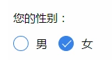
   <p>Your gender:</p>
    <div class="radio-sex">
        <input type="radio" id="sex1" name="sex">
        <label for="sex1"></label>
        <span>male</span>
    </div>
    <div class="radio-sex">
        <input type="radio" id="sex2" name="sex">
        <label for="sex2"></label> female
    </div>
css styles
.radio-sex {
    position: relative;
    display: inline-block;
    margin-right: 12px;
}

.radio-sex input {
    vertical-align: middle;
    margin-top: -2px;
    margin-bottom: 1px;
    /* The first three lines of code are to align the radio radio buttons with the text */
    width: 20px;
    height: 20px;
    appearance: none;/*Clear default style*/
    -webkit-appearance: none;
    opacity: 0;
    outline: none;
    /* Note that cannot be set to display:none*/
}

.radio-sex label {
    position: absolute;
    left: 0;
    top: 0;
    z-index: -1;
    /*Note the hierarchical relationship, if you do not set the label hierarchy to the lowest, the input will be obscured and the radio will not be selected*/
    width: 20px;
    height: 20px;
    border: 1px solid #3582E9;
    border-radius: 100%;
}

.radio-sex input:checked+label {
    background: #3582E9;
}

.radio-sex input:checked+label::after {
    content: "";
    position: absolute;
    left: 8px;
    top: 2px;
    width: 5px;
    height: 12px;
    border-right: 1px solid #fff;
    border-bottom: 1px solid #fff;
    transform: rotate(45deg);
}
Advantages: Take full advantage of CSS3, no js and pictures are needed, just pure CSS3 will do it
Disadvantages: poor compatibility, support IE9+only
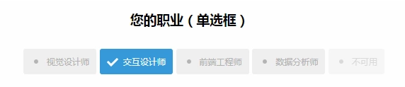
Case:
Style modification using pictures
Implementation ideas 1. Set the input property hidden to hide the input
<input type="radio" name="type" id="adviceRadio1" value="1" checked hidden/>
2. Bind input by id with label for tag, so when you click label, you actually click input
<input type="radio" name="type" id="adviceRadio1" value="1" checked hidden/>
                <label for="adviceRadio1" class="advice"></label>
3. Define the style of the label and set the background image of the unchecked state
.advice{
                    height: 12px;
                    width: 12px;
                    display: inline-block;
                    background-image: url('https://caiyunupload.b0.upaiyun.com/newweb/imgs/icon-unchecked.png');
                    background-repeat: no-repeat;
                    background-position: center;
                    vertical-align: middle;
                    margin-top: -4px;
                }
    ```
4.Use adjacent selectors to set the selected state label Style
```css
input[type="radio"]:checked + .advice{
                    background-image: url('https://caiyunupload.b0.upaiyun.com/newweb/imgs/icon-checked.png');
                }
The above is the implementation code for the radio radio radio radio radio box, and checkbox is similar to defining input type as checkbox
Using plug-ins to implement
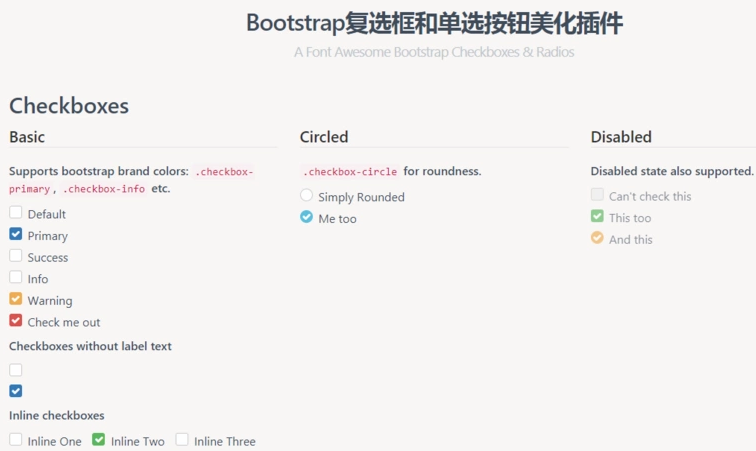
awesome-bootstrap-checkbox plugin
awesome-bootstrap-checkbox is a plug-in that beautifies the Bootstrap check boxes and radio buttons.It is written in pure CSS without any javascript files.It beautifies beautifully by making small changes to the native Bootstrap components.
Demo address: http://awesome-bootstrap-checkbox.okendoken.com/demo/index.html
Plug-in download: https://www.bootcdn.cn/awesome-bootstrap-checkbox/
Note: awesome-bootstrap-checkbox.css, font-awesome.css and font awesome font files need to be introduced
pretty.css
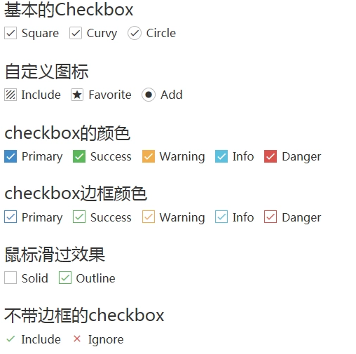
pretty.css is a beautiful checkbox and radio beautification of pure css3.pretty.css can be used in conjunction with several font icons to beautify native checkboxes and radios, and to animate button clicks.
Demo address: http://www.htmleaf.com/Demo/201708164688.html
Plug-in download: https://www.bootcdn.cn/pretty-checkbox/
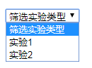
Selectect drop-down list style modification
select original style:
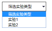
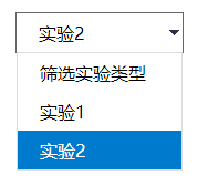
Modified Style:
select {
    /*Chrome Unlike the border inside Firefox, so rewrite it*/
    border: solid 1px #000;
    outline: 0;
    width: 150px;
    height: 32px;
    line-height: 32px;
    padding-left: 20px;
    /*Critical: Clear the default select box style*/
    appearance: none;
    -moz-appearance: none;
    -webkit-appearance: none;
    /*Show small arrow picture in the far right middle of the selection box*/
    background: url("http://ourjs.github.io/static/2015/arrow.png") no-repeat scroll right center transparent;
    /*Set aside a point for the drop-down arrows to avoid being overwritten by text*/
    padding-right: 14px;
}

/*Clear ie's default selection box style Clear, Hide drop-down arrow*/

select::-ms-expand {
    display: none;
}
The style of the option cannot be modified because the option is an inherent element of html; therefore, any modification will not work on the browser.To modify the option style, you can only simulate the select function through div ul li;
html code:
    <div class="select">
        <p>Screening experimental types</p>
        <ul>
            <li>Screening experimental types</li>
            <li>Experiment 1</li>
            <li>Experiment 2</li>
        </ul>
    </div>
css code:
@charset "utf-8";
*{
    margin: 0;
    padding: 0;
}
ul,li{
    list-style: none;
}
.select{
    border: 1px solid #666;
    width: 150px;
    height: 35px;
    line-height: 35px;
    margin: 50px auto;
    cursor: pointer;
    background: url("http://ourjs.github.io/static/2015/arrow.png") no-repeat scroll right center transparent;
}
.select p{
    padding-left: 20px;
}
.select ul{
    border: 1px solid #ddd;
    display: none;
}
.select ul li{
    padding-left: 20px;
}
.select ul li:hover{
    background: #007ACC;
    color: #fff;
}
jq code:
$(".select p").click(function () {
    $(this).next().slideToggle();
})
$(".select ul li").click(function () {
    let txt = $(this).text();
    $(this).parent().prev().text(txt);
    $(this).parent().slideUp();
})